Use the Grid List Box nodes to create scrollable lists of items arranged in a grid. As you add items to a Grid List Box node, the Grid List Box node places them either in its first row or column:
When the items in the Grid List Box node reach the set width or height of the Grid List Box node, the Grid List Box node places the items in the next row or column.
When there are more items than fit in the width and height you set for a gird list box, the items become visible as you scroll the Grid List Box node. For example, if you set the height of a Grid List Box 3D to 10 and set Layout Direction property to Down, adding three radius 5 spheres adds the second sphere below the first one, but since the third one does not fit into the same column, the Grid List Box node adds it to the next row and users can access it by scrolling the Grid List Box node.
To select an item in a Grid List Box node click or tap the item.
Note that items in all list box nodes (Grid List Box nodes and Trajectory List Box 3D node) are not its child nodes, even though in Kanzi Studio it seems so when you add items to a list box. Because list box items are not child nodes of a list box, you cannot refer to these items from outside of a list box using paths or aliases. If you need to refer from a list box item to an object outside of a list box, use bindings and aliases. See Binding to properties outside of a Grid List Box node and Navigating to Page nodes from a Grid List Box node.
Creating a Grid List Box node
To create a Grid List Box node:
In the Projectpress Alt and right-click the node where you want to create a Grid List Box node and select either Grid List Box 3D, or Grid List Box 2D. Note that you can create a 3D node only inside 3D nodes, and 2D node only inside 2D nodes.
In the Project add items to the Grid List Box node. For example, if you created a Grid List Box 3D, add several Sphere nodes, if you created a Grid List Box 2D, add several Image nodes. As you add items, the Grid List Box node arranges them in a grid from the top-left towards the bottom-left corner of the Grid List Box node. See Setting how a Grid List Box node arranges its items. To browse the items in a Grid List Box node, in the Preview click and drag the items in the Grid List Box node.
(Optional) If you cannot see the content you added to a Grid List Box node or the content does not fully fit, add and set the Cell Height and Cell Width properties.
(Optional) To set the scrolling axis of the Grid List Box node, add and set the Scroll Axis property. For example, to set the Grid List Box node so that users scroll along the y axis to browse the Grid List Box items, set the Scroll Axis attributes X to 0 and Y to 1.
Setting how a Grid List Box node arranges its items
You can set the Grid List Box node so that it arranges its items either along the x or y axis.
In the Properties set the Layout Direction property to either:
Right to arrange the items along the y axis. When adding items, the Grid List Box node places each new item to the right of the item preceding it. When an item reaches or exceeds the width of the Grid List Box node, the Grid List Box node places that item into a new row.
Down to arrange the items along the x axis. When adding items, the Grid List Box node places each new item below the item preceding it. When an item reaches or exceeds the height of the Grid List Box node, the Grid List Box node places that item into a new column.
Binding to properties outside of a Grid List Box node
Use an alias when you want to bind a property of a list box item to a property of a node outside of the list box.
For example, if you have a Grid List Box 3D or a Trajectory List Box 3D node with a Text Block 3D node item and want to set the Text property value of the Text Block 3D node to a value of an Empty Node 3D node property that is not in the list box:
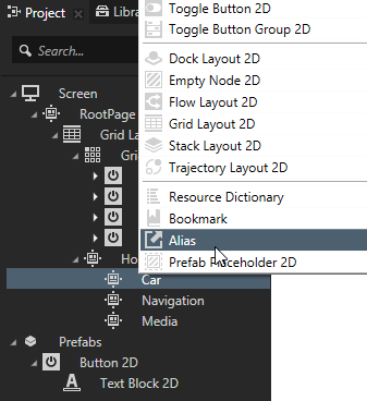
In the Projectpress Alt and right-click the nodes that contain the property to which you want to bind and select Alias. See Using aliases. For example, create an alias for the Empty Node 3D node.
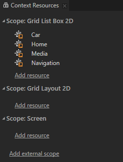
In the Window select Context Resources and in the Context Resources window make sure that the aliases you created are in the resource dictionary that the list box node can access. For example, place all aliases to the resource dictionary of the Screen node, or create a resource dictionary in the list box node and place the aliases to that resource dictionary. See Using local and global resources.
Create the binding:
In the Project select the node inside the list box node from which you want to bind to a node outside of the list box node.
In the Properties add the Bindings property and create the binding using the alias to bind to the property in a node outside of the list box node. For example, in the Text Block 3D node create a binding to the Empty Node 3D node using the alias you created in the first step. See Reference for bindings expressions. For example, use this binding expression
{#Empty Node 3D/TextBlock.Text}
. The Text property in the Text Block 3D node gets the value of the Text property from the Empty Node 3D node.
Click Save.
Navigating to Page nodes from a Grid List Box node
Use an alias when you want to navigate to a Page node from a node that is inside a list box node. For example, if you use a Grid List Box or a Trajectory List Box 3D node to create an address book and want to show the content of an address book entry in a Page node.
To navigate to Page nodes from a list box node:
In the Projectpress Alt and right-click each Page node to which you want to navigate to and select Alias. Kanzi Studio creates an alias that points to the node from which you created it, and places the alias to the nearest resource dictionary.
In the Window select Context Resources and in the Context Resources window make sure that the aliases you created are in the resource dictionary that the list box node can access. For example, place all aliases to the resource dictionary of the Screen node, or create a resource dictionary in the list box node and place the aliases to that resource dictionary. See Using local and global resources.
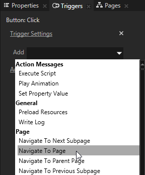
Add and set the Navigate to Page action:
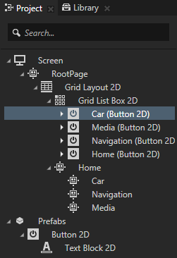
In the Project in the list box node select the node that contains the trigger you want to use to navigate to one of the Page nodes for which you created the alias in the first step.
In the Triggers in the trigger you want to use to navigate to the Page node add the Navigate to Page action.
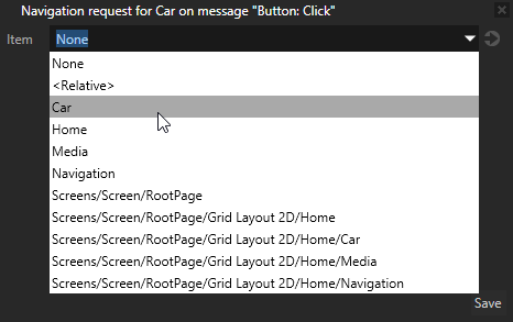
In the Navigate to Page settings window set the Item property to the alias of the Page node to which you want to navigate.
Click Save.
In the Preview when you click the node that contains the Navigate to Page action, you activate the Page node selected in the action.
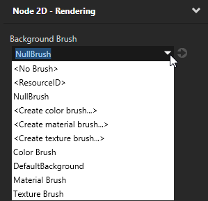
Setting the background of a Grid List Box 2D node
Use brushes to set the background of 2D nodes. In Kanzi all 2D nodes by default have transparent background.
To set the background:
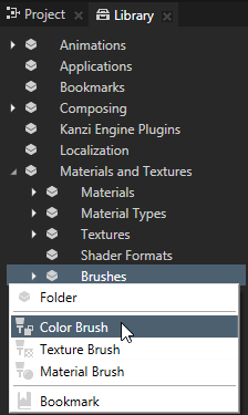
Create a Color Brush, a Texture Brush, or a Material Brush. See Using brushes.
In the Project select the 2D node the background of which you want to paint. Note that you can set only the background of 2D nodes.
In the Properties click , add the Background Brush property, and select the brush you created in the first step.
Using the Grid List Box 3D node in the API
To create a Grid List Box 3D:
// Create a Grid List Box 3D named MyListBox.
GridListBox3DSharedPtr gridListBox = GridListBox3D::create(domain, "MyListBox");
To configure the grid area:
// Make each grid cell be a 1x1x1 cube.
gridListBox->setCellWidth(1.0f);
gridListBox->setCellHeight(1.0f);
gridListBox->setDepth(1.0f);
// Make the grid contain three rows that are filled column by column.
gridListBox->setHeight(3.0f);
gridListBox->setDirection(GridListBoxConcept::GridDirectionDown);
// Make the grid contain 10 columns. Items that are dragged beyond these columns are made invisible.
gridListBox->setWidth(10.0f);
// Change the resting position when the list is scrolled to the beginning or end, so that items are not right at the grid edge.
gridListBox->setItemAreaBegin(0.2f);
gridListBox->setItemAreaEnd(0.8f);
To add items to the list box:
// Create cube meshes and add them as items of the list box.
// Items on the grid appear in the order you add them to the list.
Model3DSharedPtr item1 = Model3D::createCube(domain, "item1", 1.0f, KanziThemeRed);
Model3DSharedPtr item2 = Model3D::createCube(domain, "item2", 1.0f, KanziThemeGreen);
Model3DSharedPtr item3 = Model3D::createCube(domain, "item3", 1.0f, KanziThemeBlue);
Model3DSharedPtr item4 = Model3D::createCube(domain, "item4", 1.0f, KanziThemeOrange);
Model3DSharedPtr item5 = Model3D::createCube(domain, "item5", 1.0f, KanziThemeYellow);
gridListBox->addItem(item1);
gridListBox->addItem(item2);
gridListBox->addItem(item3);
gridListBox->addItem(item4);
gridListBox->addItem(item5);
// Create a Grid List Box 2D named MyListBox.
GridListBox2DSharedPtr gridListBox = GridListBox2D::create(domain, "MyListBox");
To configure the grid area:
// Make each grid cell be a 100x100 square.
gridListBox->setCellWidth(100.0f);
gridListBox->setCellHeight(100.0f);
// Make the grid contain three rows that are filled column by column.
gridListBox->setHeight(300.0f);
gridListBox->setDirection(GridListBoxConcept::GridDirectionDown);
// Make the grid contain 10 columns. Items that are dragged beyond these columns are made invisible.
gridListBox->setWidth(1000.0f);
// Change the resting position when the list is scrolled to the beginning or end, so that items are not right at the grid edge.
gridListBox->setItemAreaBegin(0.2f);
gridListBox->setItemAreaEnd(0.8f);
To add items to the list box:
// Create images and add them as items of the list box.
// Items on the grid appear in the order you add them to the list.
for(int i = 0; i < 5; ++i)
{
    Image2DSharedPtr item = Image2D::create(domain, "item" + to_string(i));
    item->setImageResourceID(ResourceID("DefaultTexture"));
    // Make the images shrink to the cell size.
    item->setHorizontalAlignment(Node::HorizontalAlignmentStretch);
    item->setVerticalAlignment(Node::VerticalAlignmentStretch);
    gridListBox->addItem(item);
}
 , add the Background Brush property, and select the brush you created in the first step.