Factory Content assets
The Factory Content assets contain ready-made components and materials which you can use to create prototype projects faster. Here you can find all the Factory Content components and materials. To learn about using the Factory Content assets, see Using the Factory Content assets.
Interactivity control components
Factory Content includes interactivity control components you can use to make your application interactive.
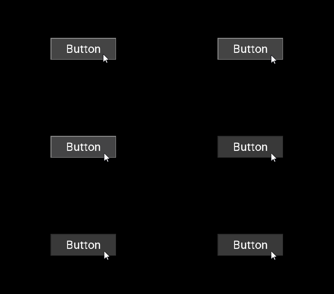
- Use the Button to create a button that receives user input.
In the Node Components use triggers and actions to set how the button reacts to user input. See Using the Button nodes and Using triggers.


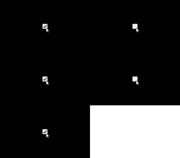
- Use the Checkbox to create a checkbox that receives user input.
In the Properties set:- CheckboxDisabled to enable or disable the use of the checkbox.
- Selected to select or deselect the checkbox.
In the Node Components use triggers and actions to set how the checkbox reacts to user input. See Using triggers.


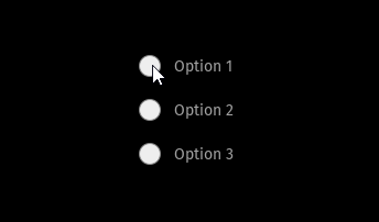
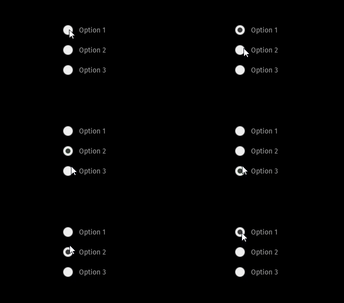
- Use the Radio Buttons to create radio buttons that receive user input.
In the Node Components use triggers and actions to set how radio buttons react to user input. See Using the Button nodes and Using triggers.
.

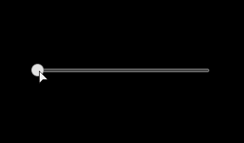
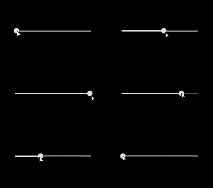
- Use the Slider to create a slider that receives user input.
In the Properties set:- Minimum Value and Maximum Value properties to set the minimum and maximum values for the slide
- Value property to set the current position of the knob on the slider rail. You can use bindings control another property with the position of the slider. See Using the Slider nodes and Using bindings.


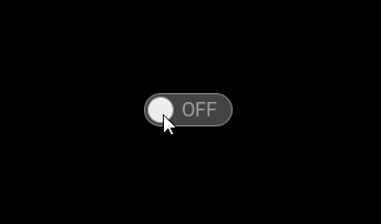
- Use the Toggle Button to create a toggle button that receives user input.
In the Node Components use triggers and actions to set how the toggle button reacts to user input. See Using the Toggle Button nodes and Using triggers.


Progress components
Factory Content includes progress components you can use to indicate that a task is in progress.
- Use the Processing Indicator to indicate that the system is processing a task.


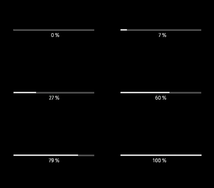
- Use the Progress Bar to show the progress of a task visually and in percentages.
In the Properties set the Progress property to set the value of the Progress Bar. You can use bindings to control another property with the progress of the Progress Bar. See Using bindings.


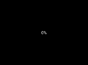
- Use the Progress Indicator to indicate that a task is in progress and show the progress in percentages.
In the Properties set the Progress property to set the value of the Progress Indicator. You can use bindings to control another property with the progress of the Progress Indicator. See Using bindings.


Complete user interface components
Factory Content includes complete user interface components you can use to add functionality to your application.
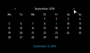
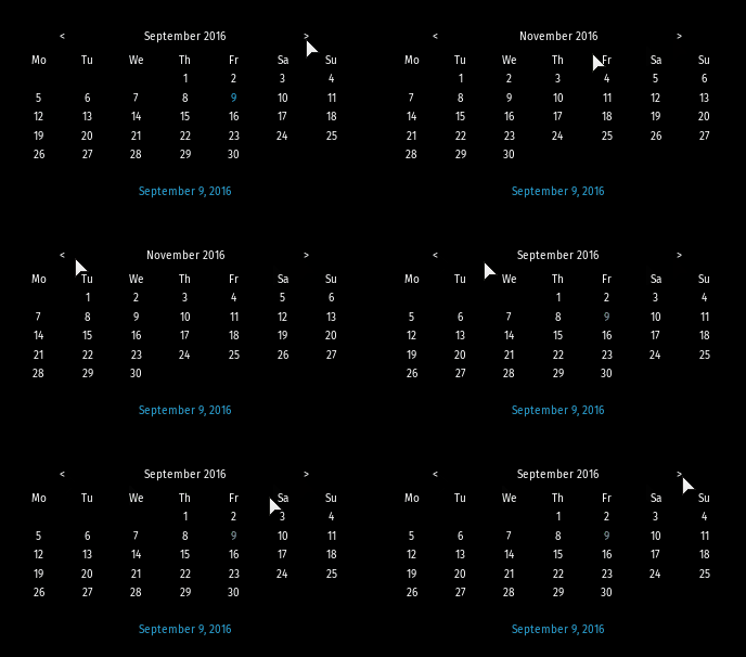
- Use the Calendar to add a calendar to your application.


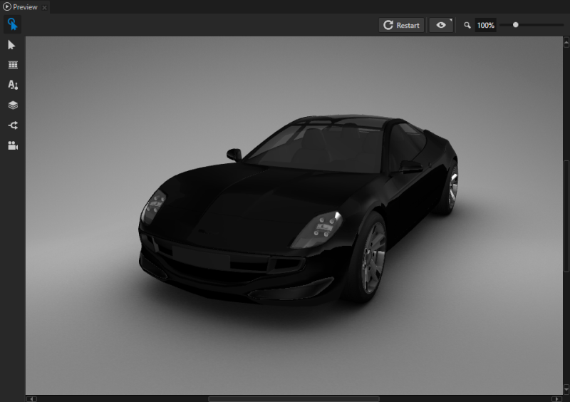
- Use the Car to add a car model.
In the Preview use either the Node tool or the Camera tool to position the car. See Editing your application in the Previewand Using the Camera node.
In the Assets drag and drop materials to the Preview to set the material for the different parts of the Car. See Using the Factory Content assets.

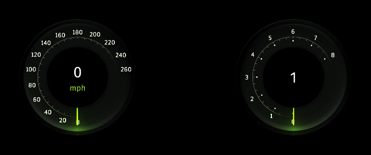
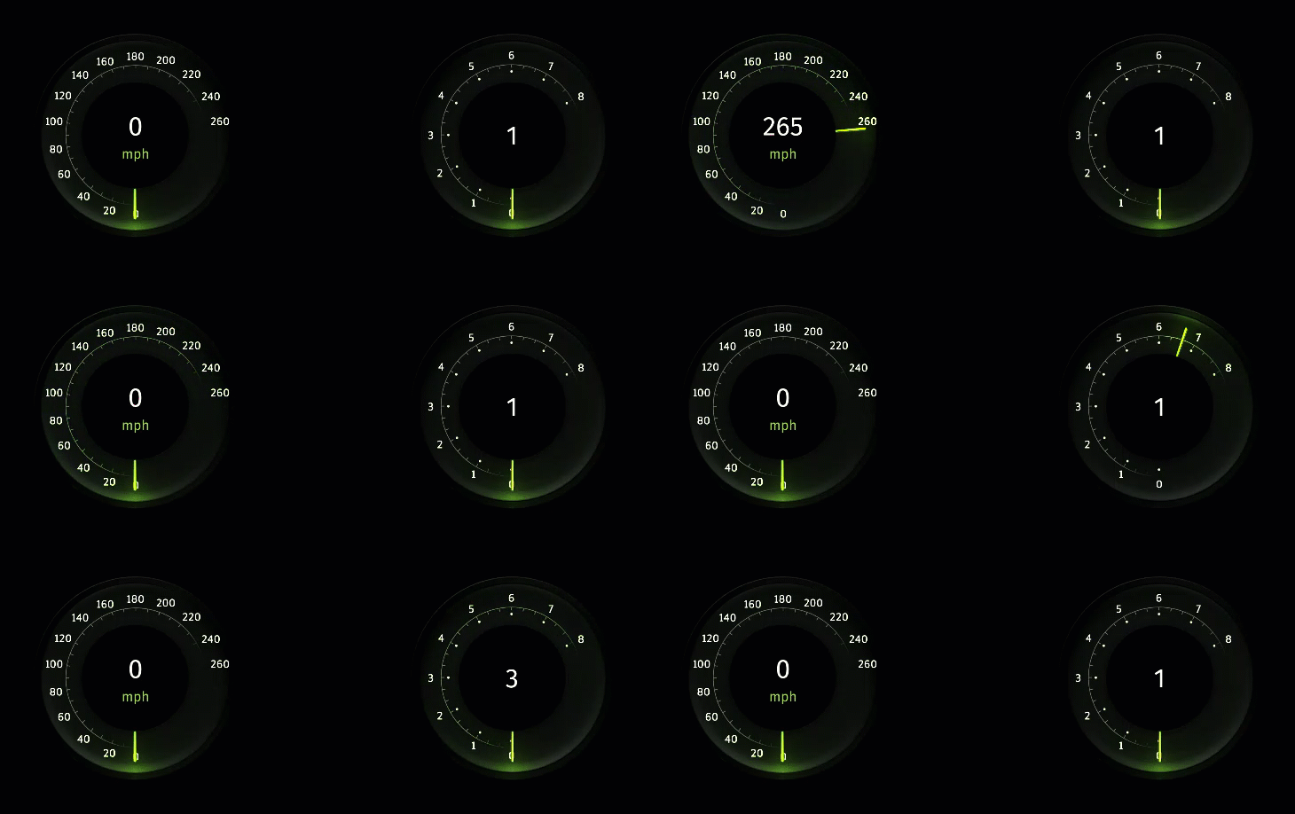
- Use the Cluster Gauges to create a car cluster with speed, RPM, and gear gauges.
In the Properties add and set:- Gauges.Speed to move the speed needle
- Gauges.RPM to move the RPM needle
- Gauges.Gear to change the gear
See Tutorial: Create gauges.


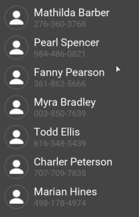
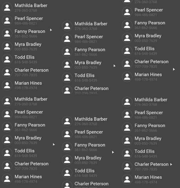
- Use the Contact List to create a contact list which shows the name, profile picture, and phone number for each contact.
In the Properties use:- Items Source to provide a data source for the list items
- Selection Behavior to set how a list item reacts to user input
Use a data source to display your own data in the component. See Using a data source and Tutorial: Get application data from a data source.


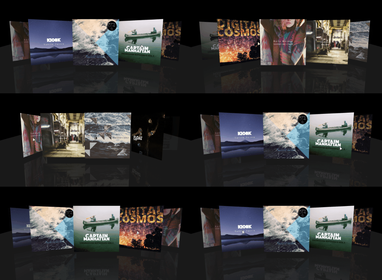
- Use the Coverflow to create a list of album covers.
In the Properties use:- Items Source to provide a data source for the list items
- Selection Behavior to set how a list item reacts to user input
Use a data source to display your own data in the component. See Using the Trajectory List Box 3D node, Using a data source, and Tutorial: Get application data from a data source.


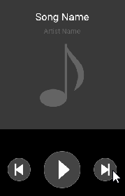
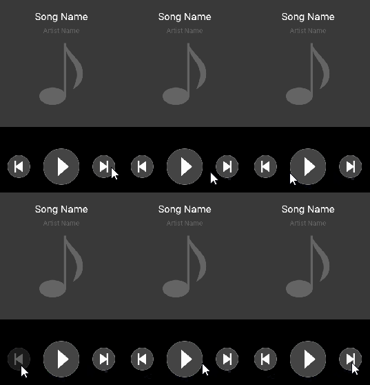
- Use the Music Player to create a music player with buttons that receive user input.
In the Node Components use triggers and actions to set how buttons react to user input. See Using triggers.


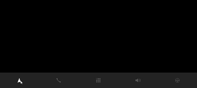
- Use the Navigation Bar to create a navigation bar with toggle buttons that receive user input.
In the Node Components use triggers and actions to set how buttons react to user input. See Using triggers


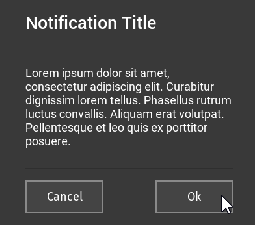
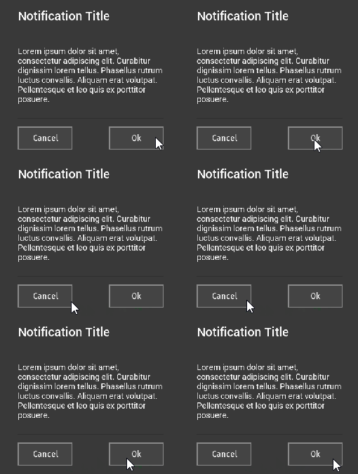
- Use the Notification Pop-up to create a notification window with buttons that receive user input.
In the Node Components use triggers and actions to set how buttons react to user input. See Using triggers.


Materials
Factory Content includes materials you can apply to 3D content in your project.
 Aluminium Material
Uses normal map textures.
 Car Paint Material
 Carbon Fiber Material
Uses normal map textures.
 Chrome Material
 Glass Material
 Leather Material
Uses normal map textures.
 Mask Texture Material
 Rubber Material
Uses normal map textures.
To learn about using Factory Content materials in your Kanzi application, see Using Factory Content materials in your project.
See also
Using the Factory Content assets
3D assets
Material types and materials
Tutorial: Materials, textures, and rendering
Using prefabs

Open topic with navigation

