In this tutorial you learn how to create a button that changes its appearance based on user actions. You create the button in Kanzi Studio using triggers and actions.
This tutorial assumes you understand the basics of working with Kanzi Studio. The best entry points for getting familiar with Kanzi Studio are:
Complete the tutorial by watching the video, or by following the written instructions.
Assets for the tutorial
The starting point of this tutorial is the Button.kzprojKanzi Studio project file stored in the <KanziWorkspace>/Tutorials/Button/Assets directory.
The <KanziWorkspace>/Tutorials/Button/Completed directory contains the completed project of this tutorial.
Create a button
In this section you create and position the button.
To create a button:
In Kanzi Studio open the project stored in the <KanziWorkspace>/Tutorials/Button/Assets directory.
Create the button:
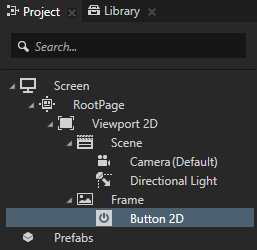
In the Projectpress Alt and right-click the node where you want to create a button and select Button 2D. For example, create a Button 2D node in the Frame node.
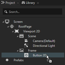
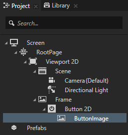
From the Assets window drag the Released image to the Button 2D node in the Project, press the F2 key, and rename the node to ButtonImage.
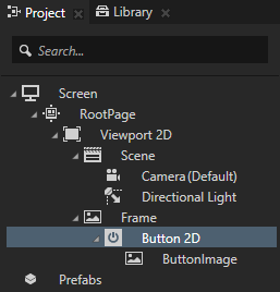
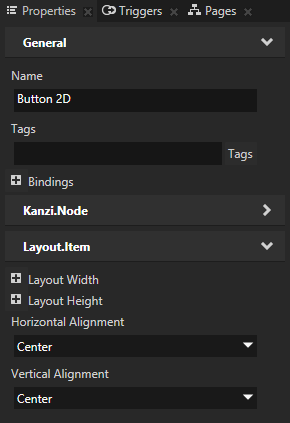
In the Project select the Button 2D node and in the Properties set the Horizontal Alignment and Vertical Alignment properties to Center.
Add and set the button triggers and actions
In this section you add and set the triggers and actions to define what the button looks like when each of the triggers is set off. Button: Click trigger is the default trigger that Kanzi Studio adds to each new button. User sets off a Button: Click trigger when they first press the button and then release the button while the pointer is still within the button area.
To add and set the button triggers and actions:
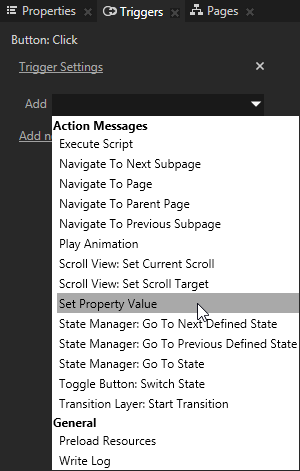
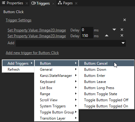
In the Project select the Button 2D node and in the Triggers add actions to the Button: Click trigger. These actions define the appearance of the button when the user presses and then releases the button while the pointer is still within the button area. The first action defines what the button looks like immediately after the user releases the button. The second action defines the final appearance of the button after a short delay to give the user a visual confirmation of their action.
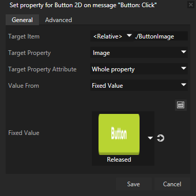
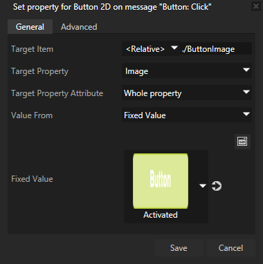
In the Button: Click trigger click the Add drop-down menu, select the Set Property Value action, and set:
Target Item to <Relative> and set the path to ./ButtonImage.
Target Property to Image
Fixed Value to the Released image.
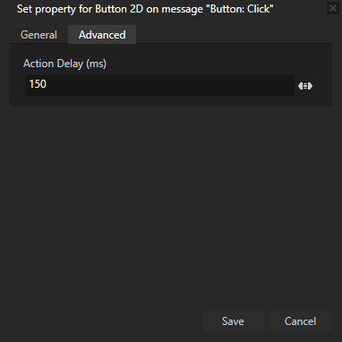
In the Advanced tab set the Action Delay (ms) property to 150 ms.
Click Save. You use this action to define the final appearance of the button after a short delay.
In the Button: Click trigger click the Add drop-down menu, select the Set Property Value action, and set:
Target Item to <Relative> and set the path to ./ButtonImage.
Target Property to Image
Fixed Value to the Activated image.
Click Save. You use this action to define the appearance immediately after the user releases the button.
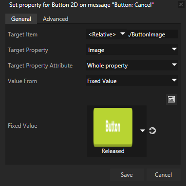
In the Project select the Button 2D node, right-click in the Triggers, select Add Triggers > Button, and add the Button: Cancel trigger. In the Button: Cancel trigger click the Add drop-down menu, select the Set Property Value action, and set:
Target Item to <Relative> and set the path to ./ButtonImage.
Target Property to Image
Fixed Value to the Released image
Click Save. User sets off a Button: Cancel trigger when they first press down the button, then move the pointer outside of the button area, and lift the pointer.
In the Project select the Button 2D node, right-click in the Triggers, select Add Triggers > Button, and add the Button: Down trigger. Tip When you need to create an action that is similar to an already existing one, you can copy and paste the action to the trigger where you need it. To copy and paste an action:
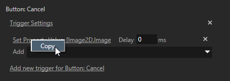
Right-click the action you want to copy and select Copy.
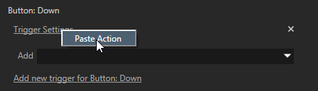
Right-click the Trigger Settings in the trigger where you want to paste the action and select Paste Action.
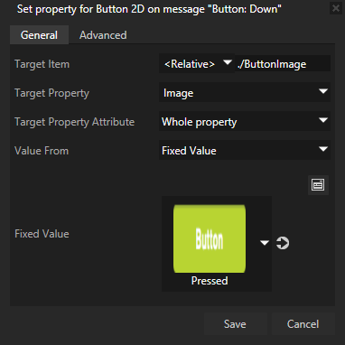
In the Button: Down trigger click the Add drop-down menu, select the Set Property Value action, and set:
Target Item to <Relative> and set the path to ./ButtonImage.
Target Property to Image
Fixed Value to the Pressed image.
Click Save. User sets off a Button: Down trigger when they press down the button.
Add to the Button 2D node the Button: Enter trigger, add to the trigger the Set Property Value action, and set:
Target Item to <Relative> and set the path to ./ButtonImage.
Target Property to Image
Fixed Value to the Pressed image.
Click Save. User sets off a Button: Enter trigger when they press down the button, move the pointer outside of the button area, and then move the pointer back to the button area while the still holding down the pointer.
Add to the Button 2D node the Button: Leave trigger, add to the trigger the Set Property Value action, and set:
Target Item to <Relative> and set the path to ./ButtonImage.
Target Property to Image
Fixed Value to the Canceled image.
Click Save. User sets off a Button: Leave trigger when they press down the button and then move the pointer outside of the button area.
What's next?
In this tutorial you learned how to create a button that changes its appearance based on user actions. Now you can: