Control panel example
This example shows how you can create an application that you can use as a remote control in demos.
You can install the application on a portable device and use it to control the behavior and runtime data of the connected services.
You can find the this example in the <KanziConnectInstallation>/SDK/examples/ControlPanel directory.
Main features
Connectivity through Kanzi Connect
Display a list of connected devices (Client Service)
Control runtime data values (System Service)
Control media playback (Media Service)
Enable and disable motion sensors and visualize their current data (Sensor Service)
Project structure
The main layout is defined by a Grid Layout 2D node (RootPage > MainGrid) which splits the screen into rows:
The first row contains the content page that usually reflects the state of a connected service.
The second row contains a navigation bar that allows the user to change the content page.
The project contains these content Page nodes (visible in the Pages window:)
Status page is used to monitor Kanzi Connect Client devices that are currently connected to a Kanzi Connect Server. The page also shows whether the control panel itself is connected to a Kanzi Connect Server (Client Service).
Data page is used to set the data values on a Kanzi Connect Server (System Service).
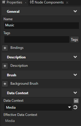
Music page, used to view and control the currently playing media track in the current playlist (Media Service).
G-Meter page, used to control the state of motion sensors and to see their current data values (Sensor Service).
Data binding
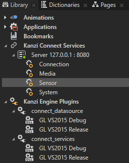
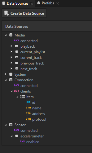
The data sources in this project are imported from the Kanzi Connect. The Data Sources window lists all the data sources in the project. Nodes under the RootPage > MainGrid node use different data sources. The available data sources are:
Media
System
Connection
Sensor
Status page
The Status page uses the Connection data source, which is set in the RootPage > MainGrid > Status node.
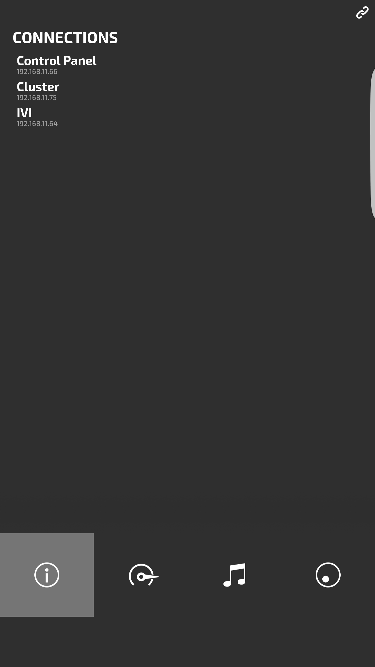
“List of Connected Clients” has its binding in RootPage > MainGrid > Status > Connection Stack > ConnectionsList
‘Items Source’ property of the list is mapped to the ‘clients’ in the data source (list data).
‘Item Template’ property defines the prefab template that is instantiated per list item (Prefabs > ConnectionItem).
The list item prefab template has its bindings to a particular list item in Prefabs > ConnectionItem > Client Name and Prefabs > ConnectionItem > Client Address nodes.
“Connection Status” has its binding in the RootPage > MainGrid > Status > ConnectionStatus node.
The state of the connection is connected to the ‘connected’ property of the Connection data source, which is used to animate the opacity of the icon with a state manager.
Data page
All the data sliders on the DataSlider page show the title, slider, and the current value. It allows you to configure the range of the slider.
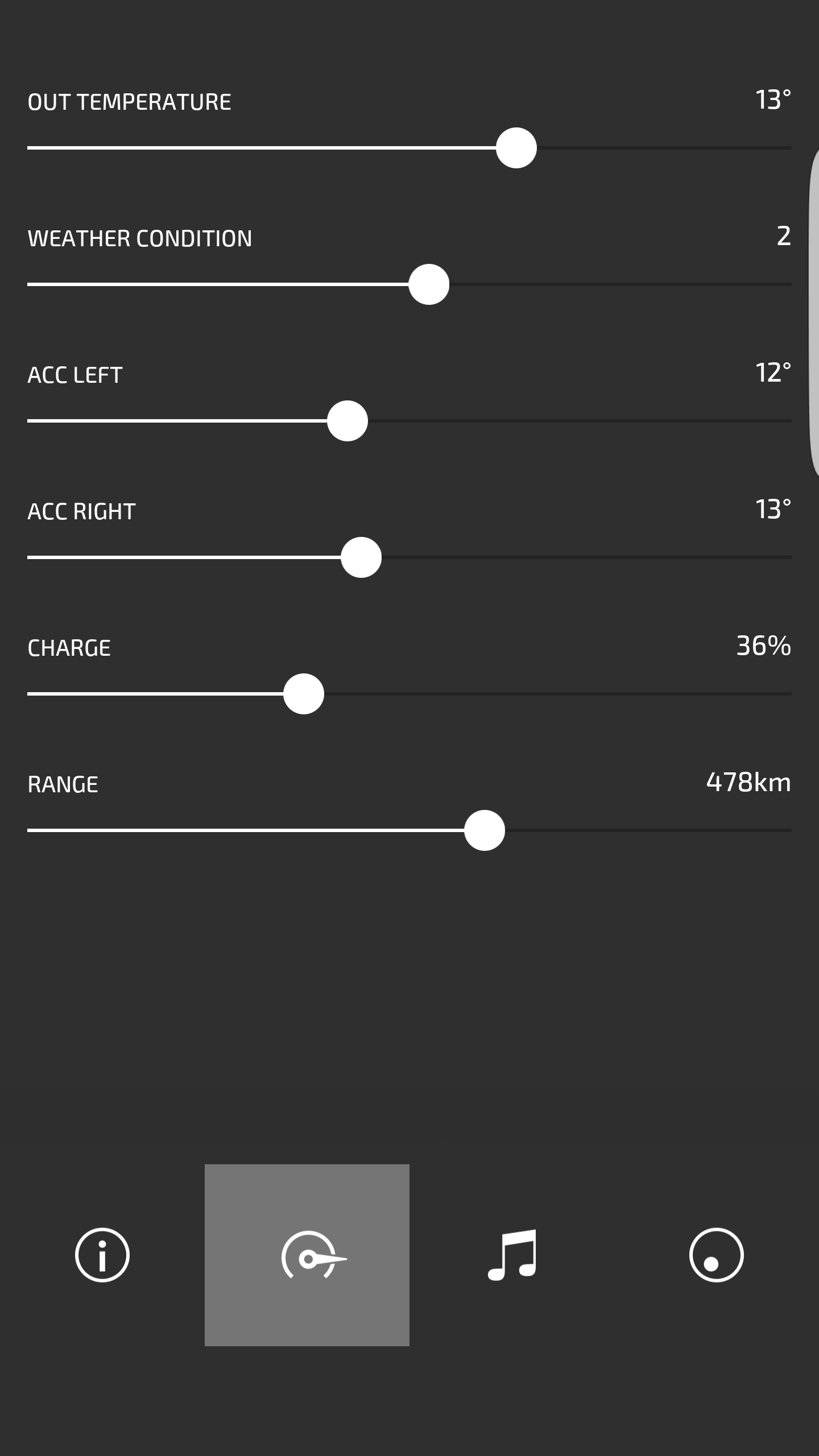
“Value” has its binding in the root of the prefab that binds the ‘SliderValue’ property to the ‘RangeConcept.Value’ property of the inner slider.
“Title Text” has its binding in DataSlider > Title that connects it to the ‘DataSlider Title’ property in the prefab root.
“Value Text” has its binding in DataSlider > VALUE that connects it to the ‘SliderValue’ and ‘Unit String’ properties in root and formats the result to contain both value and unit.
“Range” has its binding in DataSlider > 2D_Slider that connects the minimum and maximum value to the values specified in the prefab root.
There is one instance of this prefab per data value in the page, which sends the slider value to the connected service (System Service).
“Temperature” slider in RootPage > MainGrid > Data > DataSliders > Temperature has a trigger that listens for changes in the ‘SliderValue’ property and performs the System:setDemoTemperature action.
“WeatherCondition” slider in RootPage > MainGrid > Data > DataSliders > WeatherCondition has a trigger that listens for changes in the ‘SliderValue’ property and performs the System:setDemoWeather action.
“Left Seat Climate” slider in RootPage > MainGrid > Data > DataSliders > ACC_Left has a trigger that listens for changes in the ‘SliderValue’ property and performs the System:setDemoClimateTemperatureLeft action.
“Right Seat Climate” slider in RootPage > MainGrid > Data > DataSliders > ACC_Right has a trigger that listens for changes in the ‘SliderValue’ property and performs the System:setDemoClimateTemperatureRight action.
“Charge” slider in RootPage > MainGrid > Data > DataSliders > Charge has a trigger that listens for changes in the ‘SliderValue’ property and performs the System:setDemoCharge action.
“Range” slider in RootPage > MainGrid > Data > DataSliders > Range has a trigger that listens for changes in the ‘SliderValue’ property and performs the System:setDemoRange action.
Music page

Currently playing media track:
“Current Track Album Art” has its binding in RootPage > MainGrid > Music > AlbumImageContainer > CurrentAlbumImage, which binds the ‘Image’ property of the node to the current media track image.
“Current Track Artist” has its binding in RootPage > MainGrid > Music > NowPlayingStack > Artist.
“Current Track Name” has its binding in RootPage > MainGrid > Music > NowPlayingStack > Song.
“Playback State” has its binding in Prefabs > PlayerControls > MediaButtonContainer.
Player controls:
Player controls are implemented as a prefab (Prefabs/PlayerControls).
“Previous Track” button in Prefabs > PlayerControls > PreviousButton has a trigger that performs the Media:previous action.
“NextTrack” button in Prefabs > PlayerControls > NextButton has a trigger that performs the Media:next action.
“Playback state” is controlled by a state manager in Prefabs > PlayerControls > MediaButtonContainer.
The ‘MediaButtonController’ property is connected to the playback state of the media service and used to control the state manager which toggles between the Play and Pause buttons.
“Pause” button in Prefabs > PlayerControls > PlayerControls > MediaButtonContainer > Pause has a trigger that performs the Media:pause action.
“Play” button in Prefabs > PlayerControls > PlayerControls > MediaButtonContainer > Play has a trigger that performs the Media:play action.
G-Meter page
All data fields in this page use the prefab GmeterData which shows a title and x, y, and z values of the connected sensor.
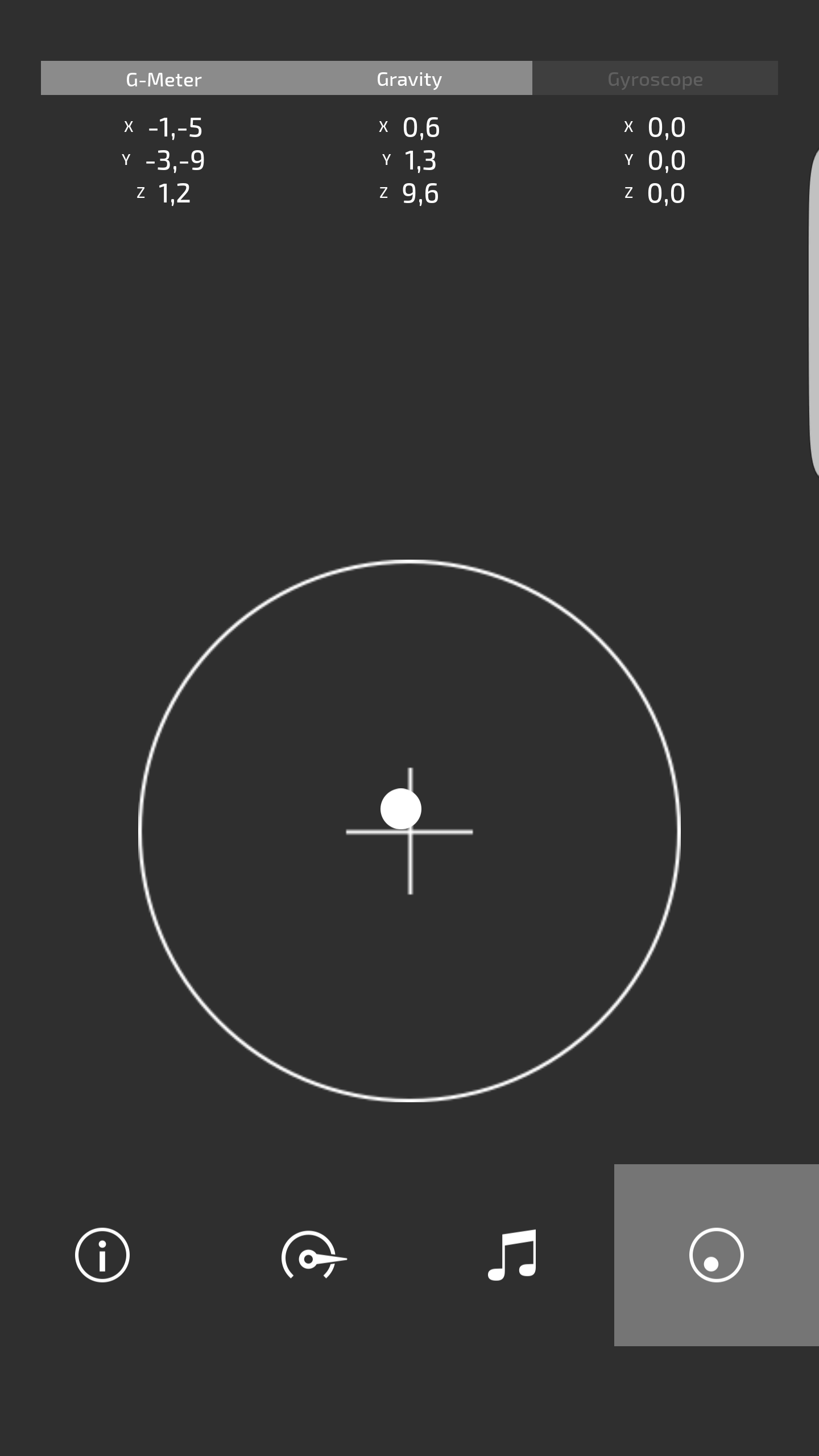
Topic node contains a binding which binds the Text property of that node to the DataGroup property set in the GmeterData prefab.
“Sensor Value” is picked up from the data context that is currently active for this prefab instance.
“Data Fields” use the prefab DataField, which shows a name of the field and its value, there is one instance of this prefab for each component of the data vector.
“Data Field Title” has its binding in the DataField > DataField > X prefab, which binds the Text property of the text block to the ‘Field’ property in the root of the prefab.
“Data Field Value” has its binding in the DataField > DataField > Value prefab, which binds the Text property of the text block to the ‘Value’ property in the root of the prefab.
Data Field prefab is used for every component (x, y, z) of the sensor data:
“X” value has its prefab placeholder and bindings in Prefabs > GmeterData > GmeterData > DataField.
“Y” value has its prefab placeholder and bindings in Prefabs > GmeterData > GmeterData > DataField_1.
“Z” value has its prefab placeholder and bindings in Prefabs > GmeterData > GmeterData > DataField_2.
Accelerometer, Gravity and Gyroscope
“Accelerometer Enabled” toggle button RootPage > MainGrid > G-Meter > GMeterGrid > GMeterData > Gmeter Toggle Button has triggers to enable and disable the accelerometer.
“Accelerometer Sensor Data” values have their binding in RootPage > MainGrid > G-Meter > GMeterGrid > GMeterData > Gmeter Toggle Button > GmeterDataStack, which sets the ‘Data Context’ property of the prefab to Accelerometer Sensor data.
“Gravity Enabled” toggle button RootPage > MainGrid > G-Meter > GMeterGrid > GMeterData > Gravity Toggle Button has triggers to enable and disable the gravity sensor.
“Gravity Sensor Data” values have their binding in RootPage > MainGrid > G-Meter > GMeterGrid > GMeterData > Gravity Toggle Button > GmeterDataStack, which sets the ‘Data Context’ property of the prefab to Gravity Sensor data.
“Gyroscope Enabled” toggle button RootPage > MainGrid > G-Meter > GMeterGrid > GMeterData > Gyroscope Toggle Button has triggers to enable and disable the gyroscope.
“Gyroscope Sensor Data” values have their binding in RootPage > MainGrid > G-Meter > GMeterGrid > GMeterData > Gyroscope Toggle Button > GmeterDataStack, which sets the ‘Data Context’ property of the prefab to Gyroscope Sensor data.