Cluster example
This example shows how you can create a Kanzi Connect instrument cluster application using Kanzi Studio.
You can find this example in the <KanziConnectInstallation>/SDK/examples/Cluster directory.
Main features
Connectivity through Kanzi Connect
Display engine simulation data (Cluster Service)
Display date, time, and mock-up data (System Service)
Display accelerometer sensor data (Sensor Service)
Display currently playing media track (Media Service)
Project structure
The background mask image for the instrument cluster is rendered by an image node (RootPage > Cluster_BG).
The layout is defined by a grid layout node (RootPage > MainGrid)
Splits the contents in a 3x3 grid layout
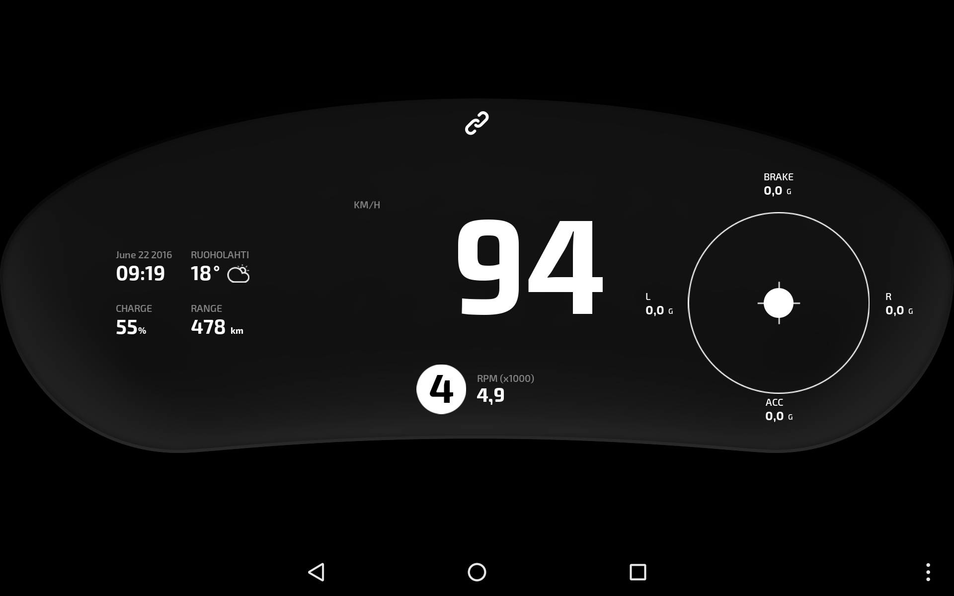
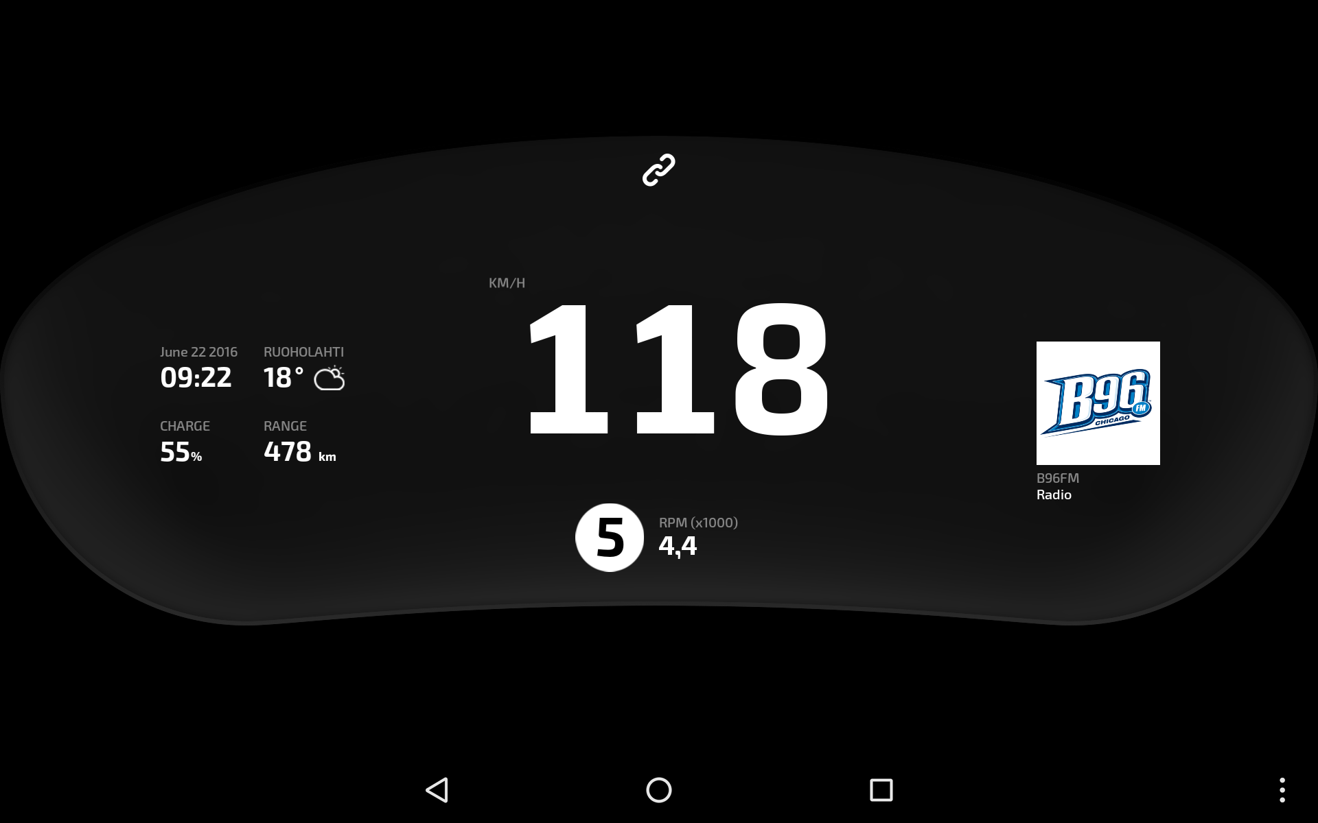
[top, center] cell hosts a location for a connectivity icon that shows whether the application is currently connected to Kanzi Connect Server
[center, left] cell hosts a location for a status grid that contains data that is retrieved from the System Service
[center, center] cell hosts a location for a speed value that is retrieved from the Cluster Service
[bottom, center] cell hosts a location for gear and rpm values that are retrieved from the Cluster Service
[center, right] cell hosts a location for dynamic data that varies according to system state: Accelerometer visualization (if enabled), otherwise current media track
Data binding
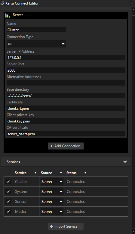
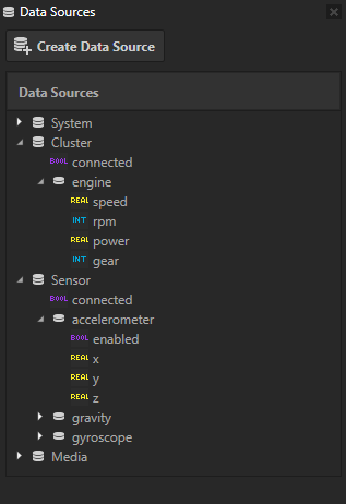
The data sources in this project are imported from the Kanzi Connect. The Data Sources window lists all the data sources in the project:
Cluster
System
Sensor
Media
Here is an overview of the data binding in this project:
Connection State - the data binding in RootPage > MainGrid > ConnectionStatus sets the opacity of the connection icon according to the state of the Cluster data source connection.
The container for the status data, which is always visible, is in the RootPage > MainGrid > StatusGrid node. The Data Context property of this node is set to the System Kanzi Connect service, the value of which the child nodes of the StatusGrid node inherit.
“Date and Time” stack layout is a container for two text blocks that have bindings to date and time (RootPage > MainGrid > StatusGrid > Date and Time)
“Weather” is a container for the child nodes of the weather widget that have bindings to temperature and weather icon (RootPage > MainGrid > StatusGrid > Weather)
“Charge” has its data binding in RootPage > MainGrid > StatusGrid > Charge > Value+Icon > Value.
“Range” has its data binding in RootPage > MainGrid > StatusGrid > Range > Value+Icon > Value.
Engine simulation
“Speed” has its data binding in RootPage > MainGrid > Speed. Its Data Context property is set to the Cluster data source.
“Power” has its data source defined in RootPage > MainGrid > Gear and Power nodes. The power value is mapped in RootPage > MainGrid > Gear and Power > Power > Power Value.
Sensor data has a page (RootPage > MainGrid > Right panel > GMeter) for accelerometer state, which is transitioned in whenever the accelerometer is enabled. It inherits the data context from its parent Right panel node.
“Accelerometer state” is set as the data context for the page, which removes the need to write full paths to the data in the GMeter UI tree.
Visualization is split into UI elements, which describe the brake, acceleration, left, and right components of the sensor data.
Each of the UI elements utilizes the same prefab template, which allows to feed the data value to the root of the prefab (the “ValueText” property).
Each of the UI elements transforms the sensor data to a formatted string that only contains the part of the data that is meaningful for that particular direction:
“Brake” component has its data binding in RootPage > MainGrid > Right panel > GMeter > G-Grid > Brake.
“Acceleration” component has its data binding in RootPage > MainGrid > Right panel > GMeter > G-Grid > ACC.
“Left” component has its data binding in RootPage > MainGrid > Right panel > GMeter > G-Grid > L.
“Right” component has its data binding in RootPage > MainGrid > Right panel > GMeter > G-Grid > R.
Current media track has a page (RootPage > MainGrid > Right panel > Media) for a currently playing media track, which is visible if the accelerometer is inactive. The data source is set to Media.
“Album Image” has its data binding in RootPage > MainGrid > Right panel > Media > CurrentMedia > AlbumImage.
“Artist” has its data binding in RootPage > MainGrid > Right panel > Media > CurrentMedia > CurrentArtist.
“Track Name” has its data binding in RootPage > MainGrid > Right panel > Media > CurrentMedia > CurrentSong.
Events
The ‘Right panel’ page is set to keep active, which means it is always visible. The right panel also has a property (GMeterEnabled) and a binding to connect it to the accelerometer sensor state.
The changes in the dynamic state of the right panel are achieved by transitioning its subpages in and out according to these rules:
If the accelerometer sensor is enabled, the right panel shows the G-Meter as its contents.
If the accelerometer sensor is disabled, the right panel shows the currently playing media track as its contents.
Two kinds of triggers are used to set this up. You can find them in the ‘Right panel’ page (RootPage > MainGrid > Right panel).
Page Activated - this is to update the initial state of the right panel
Condition: GMeterEnabled = True, Navigate to GMeter sub-page
Condition: GMeterEnabled = False, Navigate to Media sub-page
On Property Changed - this is to update the state of the right panel when the accelerometer state changes
Condition: GMeterEnabled = True, Navigate to GMeter sub-page
Condition: GMeterEnabled = False, Navigate to Media sub-page