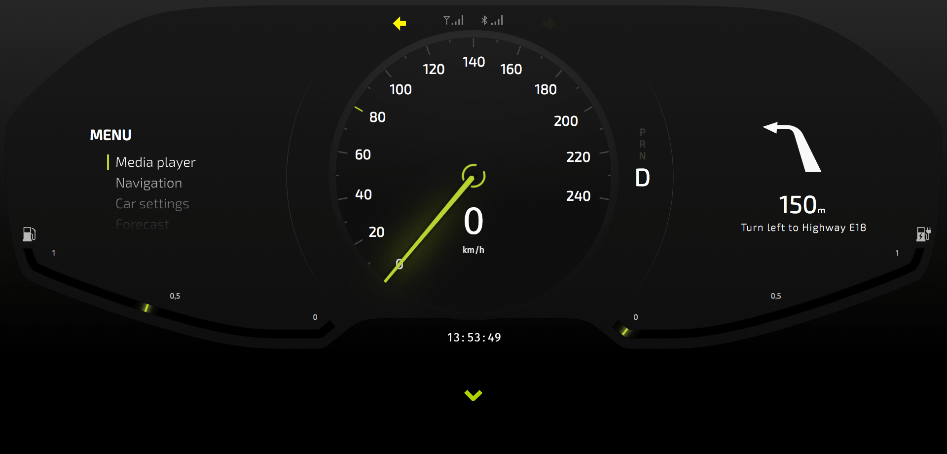
Step 2 - Control the demo mode
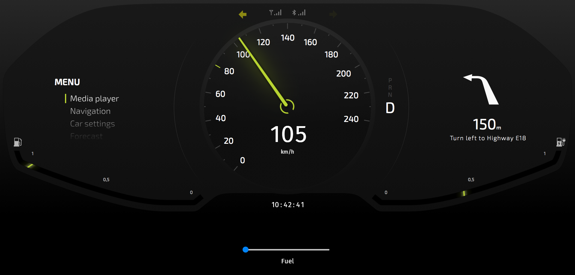
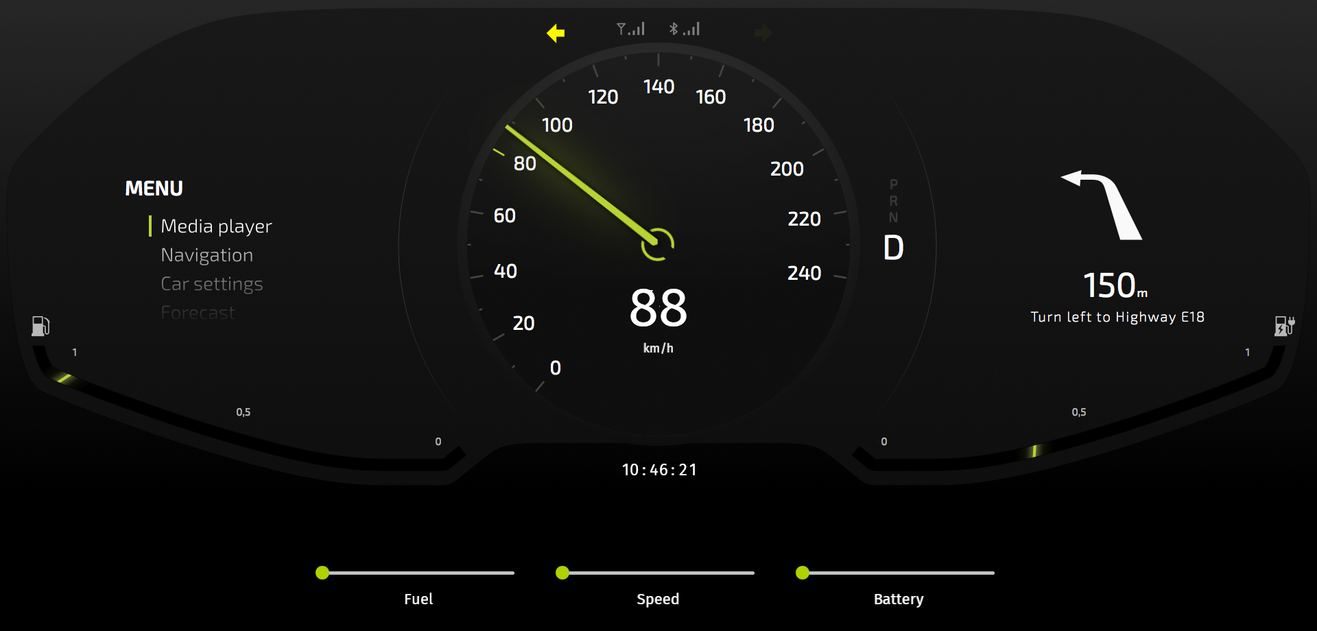
In this step you create controls for the demo mode. The controls you create in this step allow you to manually control the position of the needles in the cluster. When you change the values manually, the application exits the demo mode. If you do not change any of the values for a set amount of time, the application returns to the demo mode.
Switch the demo mode on and off
In this section you create a state manager and a controller property that you use to switch the demo mode on and off.
To switch the demo mode on and off:
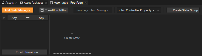
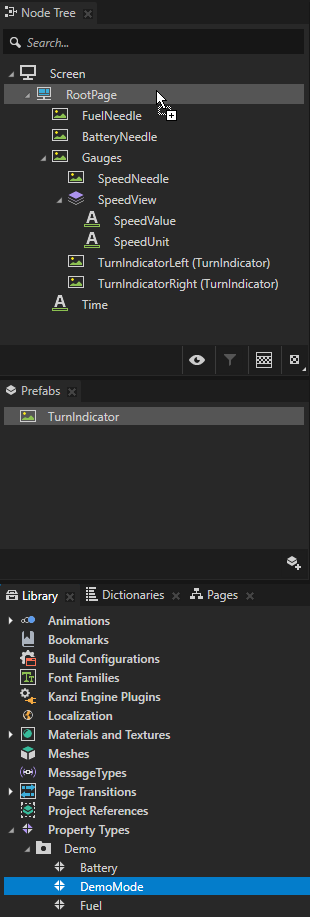
In the Node Tree select the RootPage node and in the State Tools click Create State Manager.
You can find the State Tools window below the Preview window.
Kanzi Studio creates a state manager and assigns it to the RootPage node.
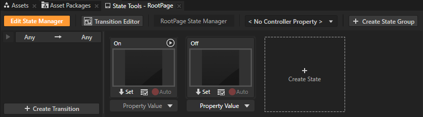
In the State Tools click Create State twice to create two states, double-click the name of each state, and rename the states.
For example, name one state On and the other Off.
The On state defines the state of your application when the demo mode is switched on, the Off state when the demo mode is switched off.
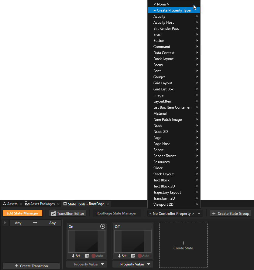
In the State Tools click <No Controller Property> and select + Create Property Type.
In a state manager the value of the property you select as the Controller Property defines the conditions when each state in a state group is active.
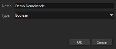
In the Create Property Type window set:
Name to Demo.DemoMode
Type to Boolean
Click OK.
In the State Tools set the value of the controller property for each state. For the On state set the value to True, and for the Off state leave the value set to False.
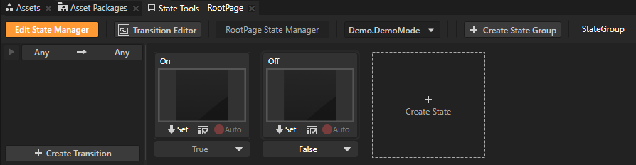
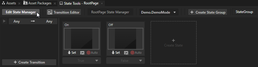
In the State Tools click Edit State Manager to deactivate the State Tools.
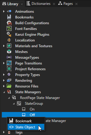
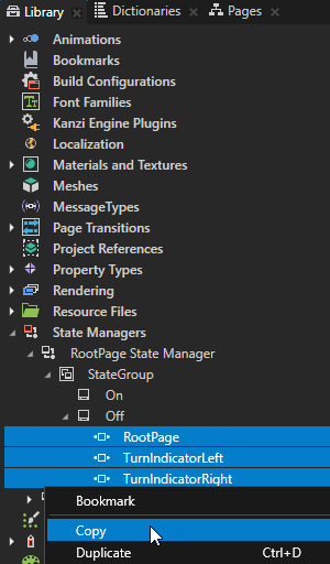
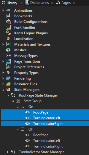
In the Library > State Managers > RootPage State Manager > StateGroup press Alt and right-click the Off state and create State Object items:
RootPage
TurnIndicatorLeft
TurnIndicatorRight
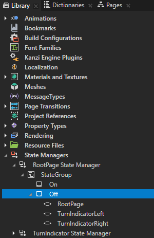
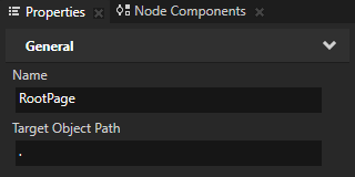
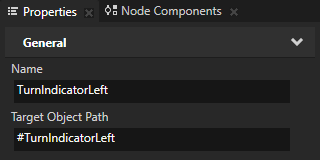
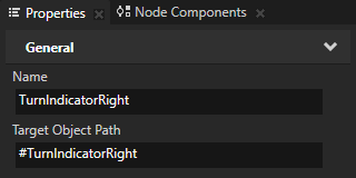
In the Library select each State Object that you created in the previous step and in the Properties set the Target Object Path property for each State Object:
RootPage to .
TurnIndicatorLeft to #TurnIndicatorLeft
TurnIndicatorRight to #TurnIndicatorRight
The Target Object Path property sets which node this State Object affects. Aliases #TurnIndicatorLeft and #TurnIndicatorRight point to the TurnIndicatorLeft and TurnIndicatorRight nodes.
Copy all State Object items in the Off state and paste them to the On state.
Move the On Timer triggers from the nodes to the State Object items that you just created:
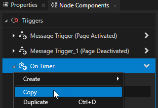
In the Node Tree select the RootPage node, in the Node Components > Triggers right-click the On Timer trigger, and select Copy.
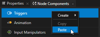
In the Library > State Managers > RootPage State Manager > StateGroup > On state select the RootPage State Object, in the Node Components right-click Triggers, and select Paste.
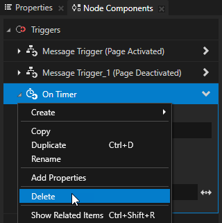
In the Node Tree select the RootPage node, in the Node Components > Triggers right-click the On Timer trigger, and select Delete.
Repeat the procedure for the On Timer triggers in the TurnIndicatorLeft and TurnIndicatorRight nodes and their State Object items.
By moving the triggers from the nodes to the State Object items, you make the triggers effective only when the RootPage node is in the On state, that is when the application is in the demo mode.
In the Node Tree select the RootPage node and in the Properties add the Demo.DemoMode property.
Tip
To add a custom property to a node, you can drag that property type from the Library > Property Types to the node in the Node Tree.
By enabling and disabling the Demo.DemoMode property you enable and disable the demo mode in the application.
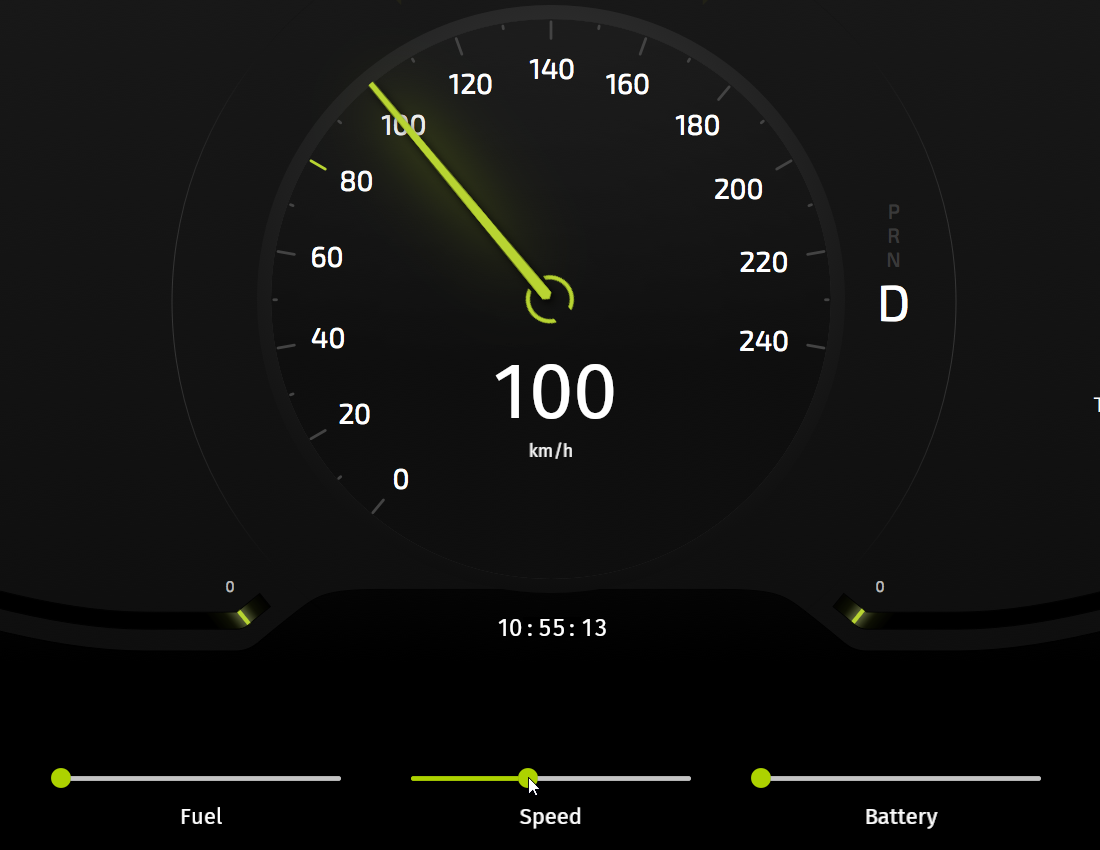
Control the position of the needles manually
In this section you create controls that allow you to manually control the position of the needles in the cluster.
To control the position of the needles manually:
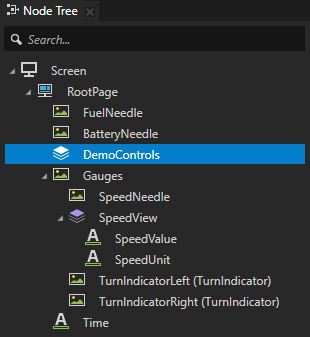
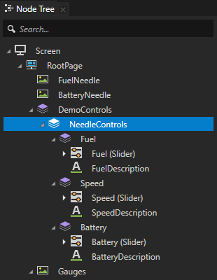
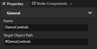
In the Node Tree press Alt and right-click the RootPage node, select Stack Layout 2D, name it DemoControls, and move it between the BatteryNeedle and Gauges nodes.
When you place the DemoControls node above the Gauges node, in the UI you can slide the controls under the Gauges node when you do not need them.
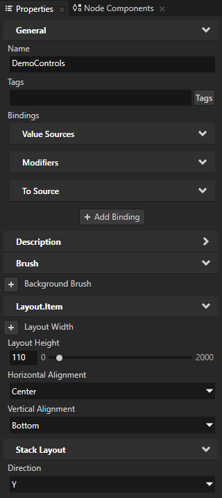
In the Node Tree select the DemoControls node and in the Properties add and set:
Layout Height to 110
Horizontal Alignment to Center
Vertical Alignment to Bottom
Direction to Y The Direction property sets the axis along which a Stack Layout 2D node arranges its child nodes.
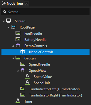
In the DemoControls node create a Stack Layout 2D node, name it NeedleControls, in the Properties add the Vertical Alignment property, and set it to Center.
The NeedleControls node positions the controls for each needle that you create in the next step.
Create the controls for each needle:
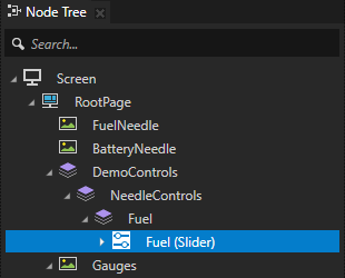
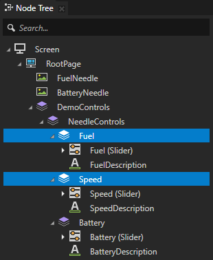
In the NeedleControls node create a Stack Layout 2D node, name it Fuel, and in the Properties set the Direction property to Y.
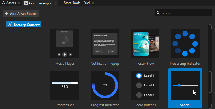
In the Asset Packages window select the Factory Content asset source.
The Factory Content asset packages contain ready-made components and materials that you can use to create prototype projects faster.

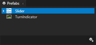
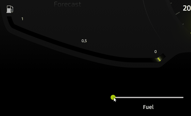
From the Asset Packages window drag the Slider to the Node Tree window, drop it on the Fuel node, and rename the Slider to Fuel.
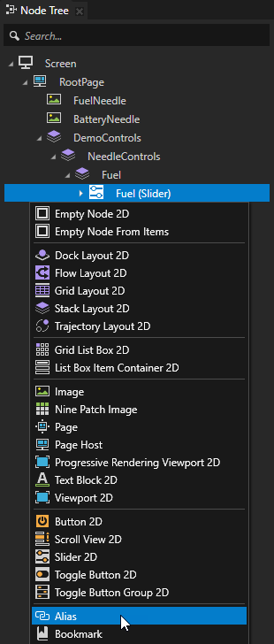
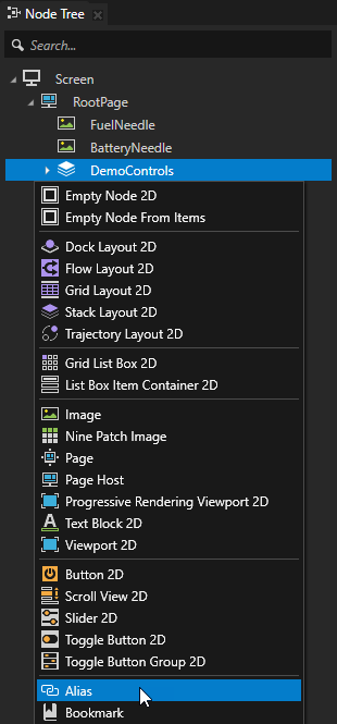
In the Node Tree press Alt and right-click the Fuel Slider node and select Alias.
Kanzi Studio creates an alias pointing to the node from which you created the alias and adds it to the resource dictionary of its nearest ancestor node that contains a resource dictionary.
Here you use the alias for easy access to the node in the JavaScript script.
Tip
You can see in the Dictionaries window the list of resources in the resource dictionaries that the node selected in the Node Tree can access.
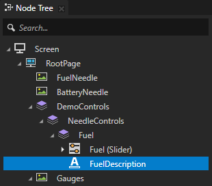
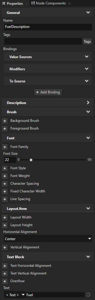
In the Node Tree press Alt and right-click the Fuel Stack Layout 2D node, select Text Block 2D, name it FuelDescription, and in the Properties add and set:
Font Size to 22
Horizontal Alignment to Center
Text to Fuel
Repeat the previous step to add to the NeedleControls node the controls for the Speed and Battery needles.
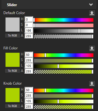
In the Prefabs select the Slider prefab and in the Properties set the Fill Color and Knob Color properties:
Hue (H) property field to 50
Lightness (L) property field to 105
This way you set the color of the active slider rail and the slider knob in all instances of the Slider prefab.
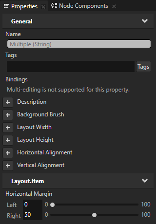
In the Node Tree select the Fuel and Speed Stack Layout 2D nodes and in the Properties add and set the Horizontal Margin Right property field to 50.
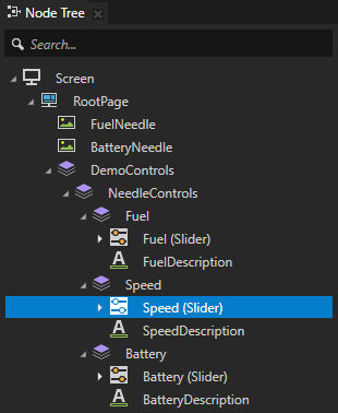
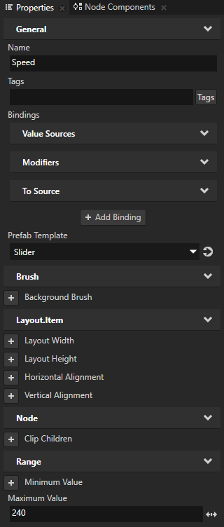
In the Node Tree select the Speed Slider node and in the Properties add and set the Maximum Value property to 240.
Connect the sliders in the DemoControls node to the needles:
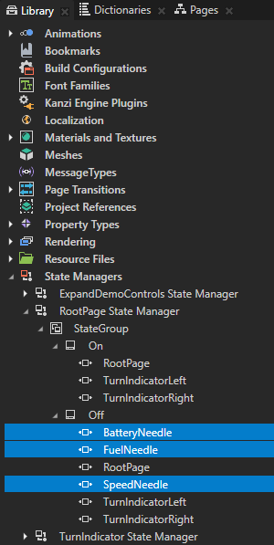
In the Library > State Managers > RootPage State Manager > StateGroup > Off state create a State Object for each needle:
BatteryNeedle
FuelNeedle
Speed Needle
You use these state objects to set the position of the battery, fuel, and speed needles when the application is not in the demo mode.
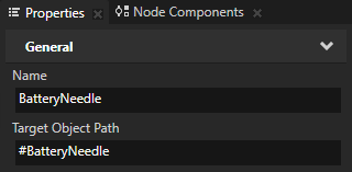
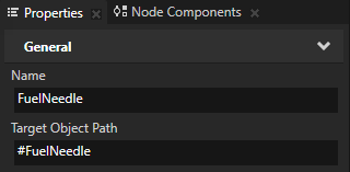
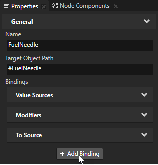
In the Library select each State Object that you created in the previous step and in the Properties set the Target Object Path property for each State Object:
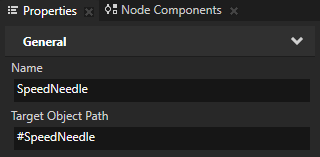
BatteryNeedle to #BatteryNeedle
FuelNeedle to #FuelNeedle
SpeedNeedle to #SpeedNeedle
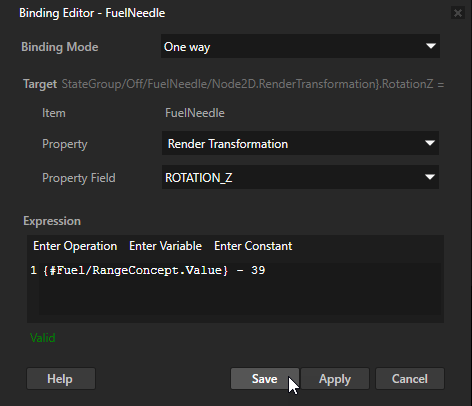
In the Library > State Managers > RootPage State Manager > StateGroup > Off state select the FuelNeedle state object, in the Properties click + Add Binding, and in the Binding Editor set:
Property to Transform 2D Render Transformation
Property Field to Rotation Z
Expression to
{#Fuel/RangeConcept.Value} - 39You have to subtract 39 from the value of the property to correctly position the needle at value 0 on the gauge, when the value of the Fuel property is 0.
Tip
You can retrieve alias target nodes with bindings, the Kanzi Engine API, or scripting using the hash sign (
#) followed by the name of the alias, regardless of the node location in the project.
Click Save.
With this binding you control the rotation around the z axis of the FuelNeedle node with the Fuel Slider slider in the DemoControls node when the application is not in the demo mode.
Repeat the previous step for the BatteryNeedle and SpeedNeedle state objects:
In the BatteryNeedle state object use binding expression
-{#Battery/RangeConcept.Value} + 39In the SpeedNeedle state object use binding expression
{#Speed/RangeConcept.Value} - 140
Connect the Speed slider to the node that shows the current speed as a numerical value:
In the Node Tree press Alt and right-click the RootPage > Gauges > SpeedView > SpeedValue node, and select Alias.
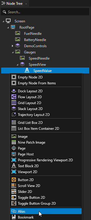
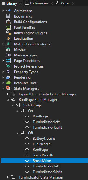
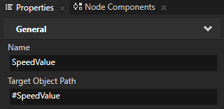
In the Library > State Managers > RootPage State Manager > StateGroup > Off state create a State Object, name it SpeedValue, and in the Properties set the Target Object Path property to #SpeedValue.
You use this state object to show the current speed as a numerical value when the application is not in the demo mode. You use the alias, which you created in the previous step, to point to the SpeedValue node.
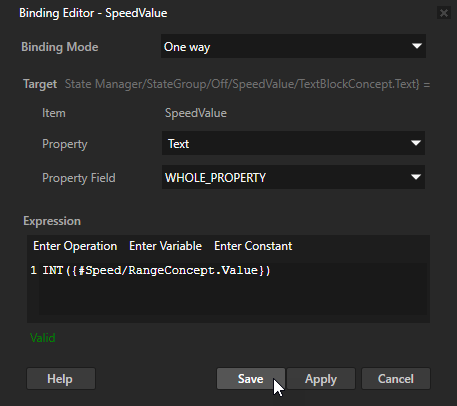
In the Properties click + Add Binding and in the Binding Editor set:
Property to Text
Expression to
INT({#Speed/RangeConcept.Value})
Click Save.
With this binding you show in the SpeedValue node the current value of the Speed Slider node as an integer when the application is not in the demo mode.
Expand and collapse the manual controls
In this section you create a control which you use to expand and collapse the manual controls that you created in the previous section.
To expand and collapse the manual controls:
In the Node Tree press Alt and right-click the DemoControls node and select Alias.
In the Node Tree press Alt and right-click the DemoControls node, select Toggle Button 2D, name it ExpandDemoControls, and in the Properties add and set:
Horizontal Alignment to Center
Vertical Alignment to Center
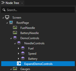
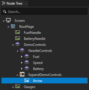
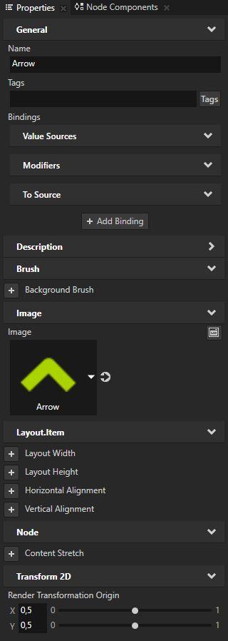
In the Node Tree press Alt and right-click the ExpandDemoControls node, select Image, name it Arrow, and in the Properties add and set:
Image to Arrow
Render Transformation Origin property X and Y property fields to 0,5 In Kanzi by default the origin of all 2D nodes is in the upper left corner of the node. You use the Render Transformation Origin property to set the origin of the Arrow node to the center of the node.
In the Node Tree select the ExpandDemoControls node, in the State Tools click Create State Manager to create a state manager, click Create State twice to create two states, and name one Expand and the other Collapse.
The Expand state defines the state of your application when the manual controls are opened, the Collapse state when the manual controls are closed.
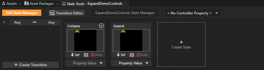
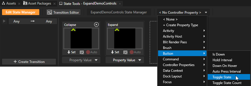
In the State Tools click <No Controller Property> and select Button > Toggle State.
In the State Tools set the value of the controller property for each state. For the Expand state set the value to 1, and for the Collapse state leave the value set to 0.
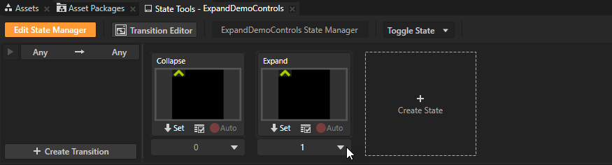
In the State Tools click Edit State Manager to deactivate the State Tools.
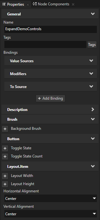
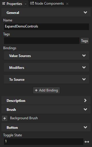
In the Node Tree select the ExpandDemoControls node, in the Properties add the Toggle State property, and set it to 1.
When you set in the ExpandDemoControls node the Toggle State Controller Property to 1, the panel with the controls for the gauges is shown by default when you start the application.
Create and define the State Object items that you want to control with this state manager:
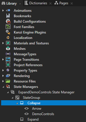
In the Library > State Managers > ExpandDemoControls State Manager > State Group > Collapse state create these State Object items:
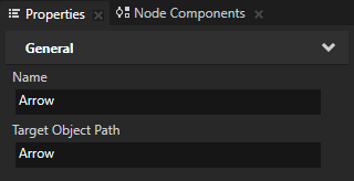
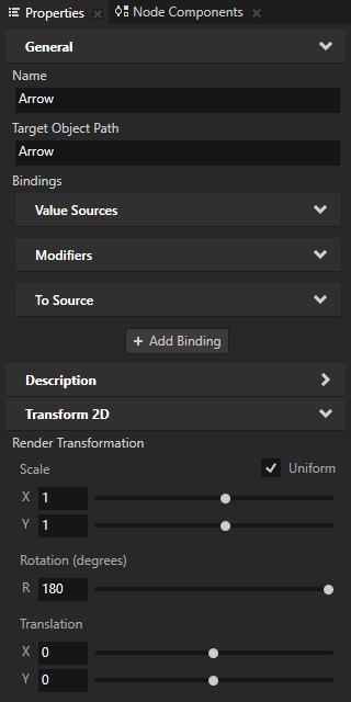
Arrow and in the Properties set the Target Object Path to Arrow.
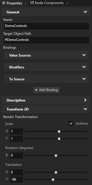
DemoControls and in the Properties set the Target Object Path to #DemoControls.
In the Library select the Arrow State Object, in the Properties add the Render Transformation property, and set its Rotation property field to 180.
In the Library select the DemoControls State Object, in the Properties add the Render Transformation property, and set its Translation Y property field to -96.
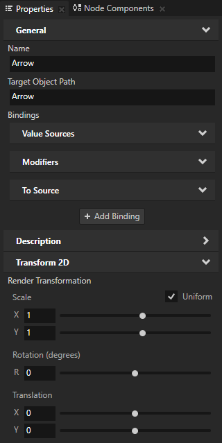
Repeat the previous step for the Expand state, but set:
Arrow Render Transformation property prope property field to 0.
DemoControls Render Transformation property Translation Y property field to -10.

When you click the arrow in the Preview, you expand and collapse the manual controls.

Add a script that controls the demo mode
When you enable the demo mode the scripts control the position of the needles and the activation state of the turn indicators. In this section you add a script which switches off the demo mode to allow you to manually control the position of the needles in the cluster.
To add a script that controls the demo mode:
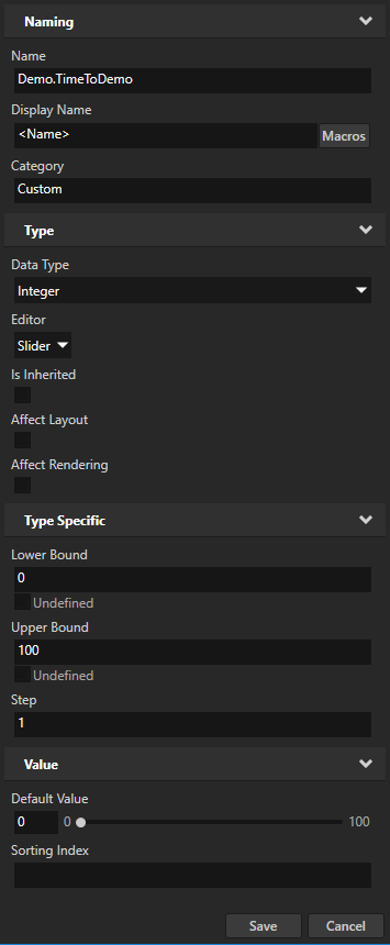
In the Library press Alt and right-click Property Types and select Property Type.

In the Property Type Editor set:
Name to Demo.TimeToDemo
Data Type to Integer
Lower Bound to 0
Upper Bound to 100
Click Save to create a property type with the properties you defined.
You use this custom property type in the script you create in this section to keep track of the time when the application goes into the demo mode.
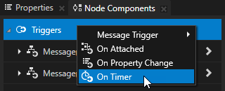
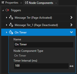
In the Node Tree select the RootPage node, in the Node Components > Triggers create an On Timer trigger, and set the Timer Interval (ms) of the trigger to 100.
In the On Timer trigger create an Execute Script action and in the Script Editor use this script:
// Get the value of the property that keeps track of the time when the
// application goes into the demo mode. You use this as a counter.
var count = node.getProperty('Demo.TimeToDemo');

// Get the Slider node Speed.
var speedNeedleSlider = node.lookupNode('#Speed');

// Get the current value of the Speed slider.
var speedSliderValue = speedNeedleSlider.getProperty('RangeConcept.Value');

// Get the Slider node Battery.
var batteryNeedleSlider = node.lookupNode('#Battery');

// Get the current value of the Battery slider.
var batterySliderValue = batteryNeedleSlider.getProperty('RangeConcept.Value');

// Get the Slider node Fuel.
var fuelNeedleSlider = node.lookupNode('#Fuel');

// Get the current value of the Fuel slider.
var fuelSliderValue = fuelNeedleSlider.getProperty('RangeConcept.Value');

// If the sum of the Speed, Battery, and Fuel values has not changed,
// increase the value of the counter by 1.
// Otherwise disable the demo mode and reset the counter.
if(node.stateRecord == speedSliderValue + batterySliderValue + fuelSliderValue)
{
    node.setProperty("Demo.TimeToDemo", count + 1);
}
else
{
    node.setProperty("Demo.DemoMode", 0);
    node.setProperty("Demo.TimeToDemo", 0);
    count = 0;
}

// When the value of the counter reaches 20, enable the demo mode.
if(count >= 20)
{
    node.setProperty("Demo.DemoMode", 1);
}

// Store the sum of the Speed, Battery, and Fuel values.
node.stateRecord = speedSliderValue + batterySliderValue + fuelSliderValue;
When you use the sliders in the DemoControls node to manually set the values for the needles, this script exits the demo mode. If you do not change the values for any of the needles for 2 seconds, this script puts the application back into the demo mode.
What’s next?
In this tutorial you learned how to use JavaScript scripts to create a demo mode for an application and how to create manual controls for the needles in the application. You can use the approach you learned in this tutorial to add the controls for the indicators.
You can also:
Learn how to control the position of gauge needles with custom properties. See Tutorial: Create gauges.
Learn how to create a cluster indicator and control it with a property. See Tutorial: Creating cluster indicators.
Learn how to use Kanzi Data Sources to separate the user interface from the application data. See Tutorial: Get application data from a data source.
Learn how to set the values of properties using the Kanzi Engine API, see Tutorial: Hello world! and Tutorial: Kanzi Engine API advanced use.
See also
To find out more about using JavaScript scripts, see Using scripts and Scripting reference.
To learn more about the Kanzi state manager, see State manager.
To learn more about triggers and actions, see Triggers.
To learn more about aliases in Kanzi, see Using aliases.
To learn more about using bindings, see Using bindings and Bindings expressions reference.