Step 3 - Create an overlay
In this step you create an overlay that opens on top of the Settings application screen. You set the overlay to close when the user presses a keyboard key.
Create an overlay
In this section you create an overlay that opens when the user selects a specific item in a List Box.
To create an overlay:
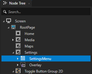
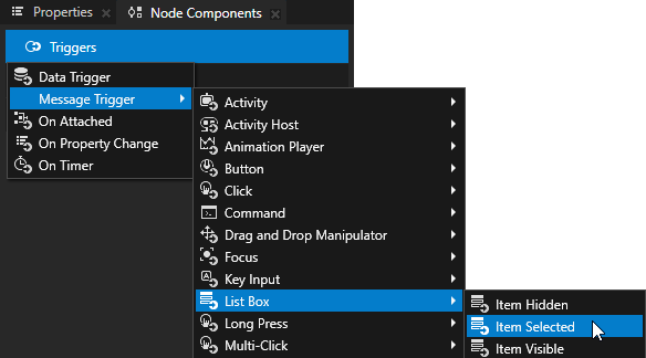
In the Node Tree select the Settings > SettingsMenu node and in the Node Components create a List Box: Item Selected trigger.
You use this trigger to show the overlay when the user selects a specific item in a List Box.
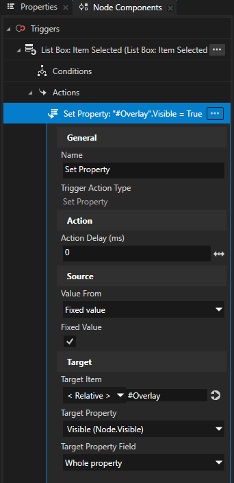
In the List Box: Item Selected trigger create a Set Property action and set:
Target Item to #Overlay
Target Property to Node > Visible
Value From to Fixed value
Fixed Value to enabled
You set the Overlay to be visible when the user selects an item in the List Box node SettingsMenu. In the next step, you set which list item the user must select for the overlay to appear.
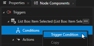
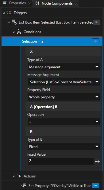
In the Node Components in the List Box: Item Selected trigger right-click Conditions, select Trigger Condition, and in the condition set:
A
Type of A to Message argument
Message Argument to Selection
Operation to =
B
Type of B to Fixed
Fixed Value to 2
With this condition you set the overlay to appear when the user selects the third item in the List Box node SettingsMenu. In the SettingsMenu node the third item is Car with the red warning indicator.
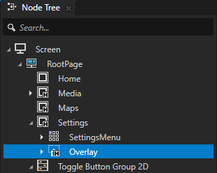
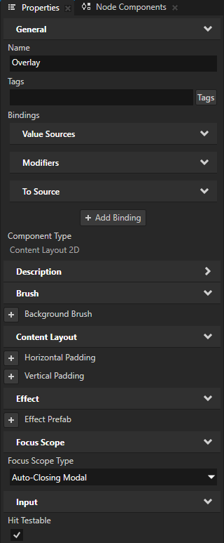
In the Node Tree select the Settings > Overlay node and in the Properties add and set:
Focus Scope > Focus Scope Type to Auto-Closing Modal
Input > Hit Testable to enabled
This way you make the Overlay node an auto-closing modal overlay which loses focus when key and touch input comes from outside of its boundaries.
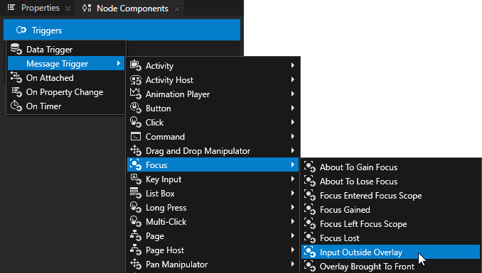
In the Node Components > Triggers, create a Focus > Input Outside Overlay message trigger.
Kanzi sets off the Focus: Input Outside Overlay trigger when the user taps the application area outside the Overlay node.
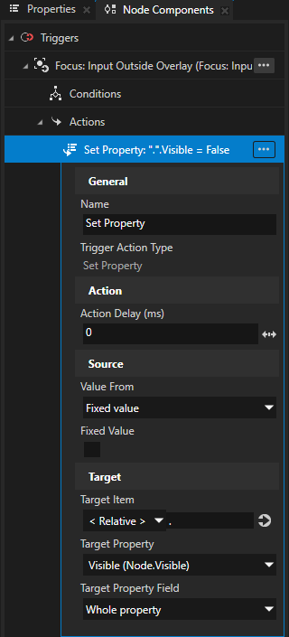
In the Focus: Input Outside Overlay trigger, create a Set Property action, and set:
Target Property to Node > Visible
Value From to Fixed Value
Fixed Value to disabled
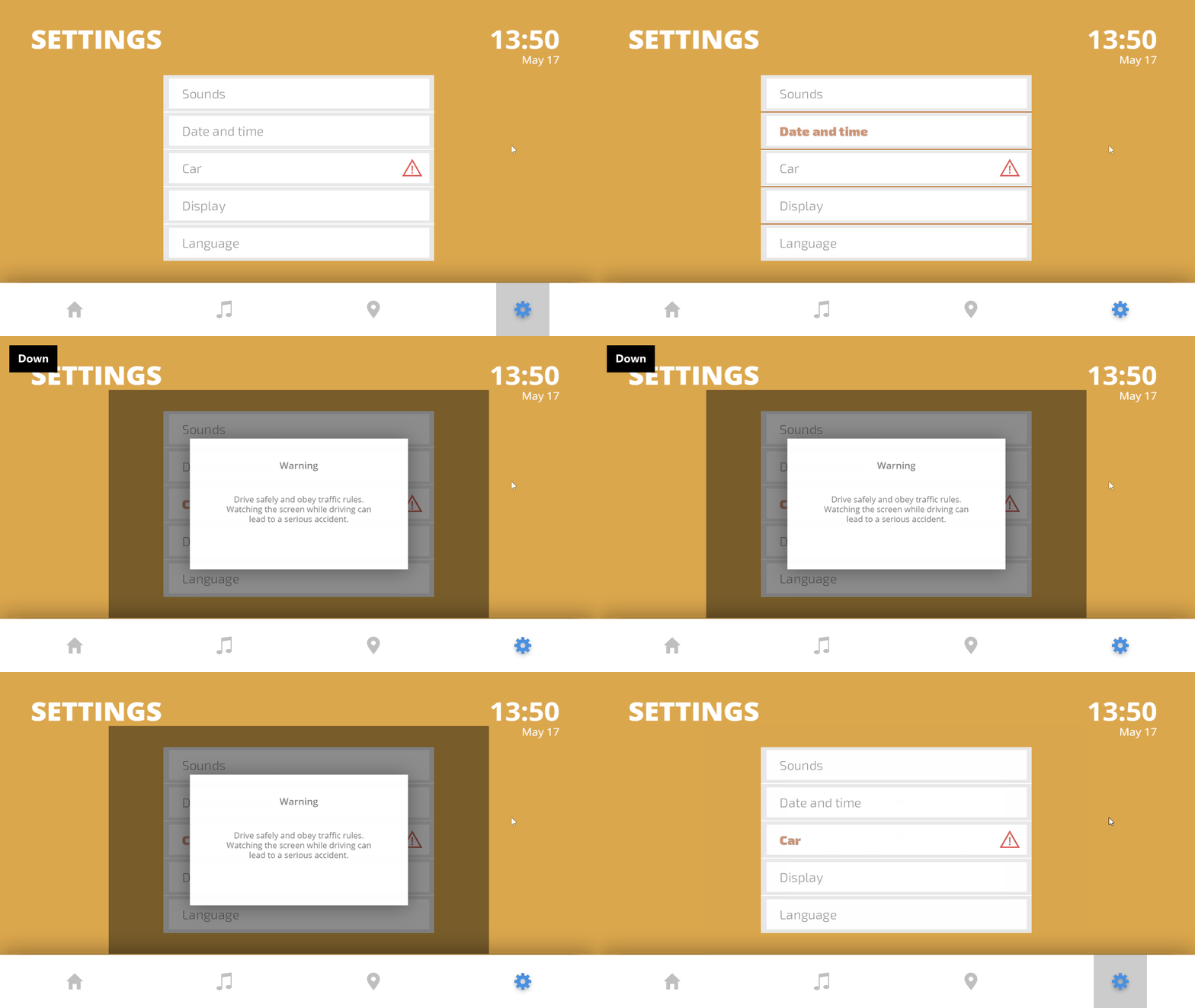
This way you hide the Overlay node when the user taps outside it. When you hide the Overlay node, focus moves back to the SettingsMenu node.
In the Settings application, when in the SettingsMenu you select the Car item Kanzi shows the overlay. To close the overlay click anywhere outside the overlay.
Close the overlay with a key
In this section you set the overlay to close when the user presses a specific keyboard key.
To close the overlay with a key:
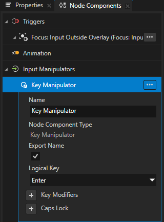
In the Node Tree select the Settings > Overlay node, in the Node Components > Input Manipulators create a Key Manipulator, and set the Logical Key to Enter.

In the Node Components > Triggers, create a Key Input: Key Pressed trigger.
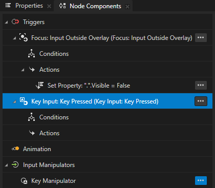
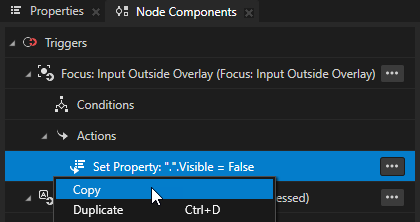
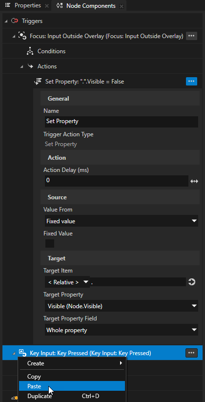
In the Node Components, from the Focus: Input Outside Overlay trigger, copy the Set Property action to the Key Input: Key Pressed trigger.
You use this action to hide the Overlay node when the user presses the Enter key. This way you close the overlay and return the focus to the SettingsMenu node.
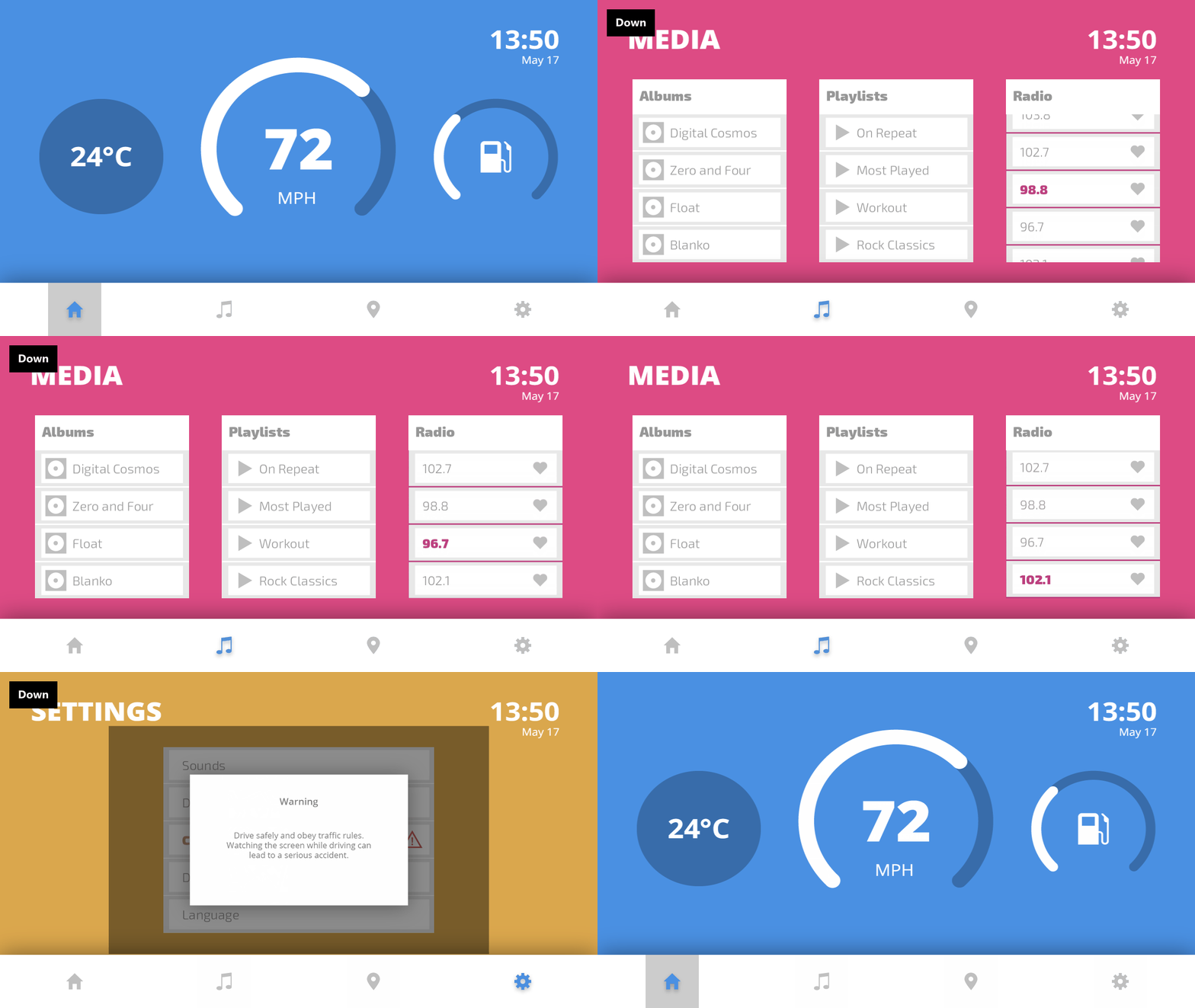
Now you can use these keyboard keys to move the focus in the application:
Tab and Shift Tab keys to navigate between the application screens.
↑ key to move focus to the Media and Settings applications.
In the Media screen:
Tab and Shift Tab keys to navigate between the List Box nodes.
↑ and ↓ keys to scroll the items in the List Box nodes.
Esc key to move focus back to the navigation bar.
In the Settings screen:
↑ and ↓ keys to scroll the items in the List Box node.
Enter key to close the overlay.
Esc key to move focus back to the navigation bar.
What’s next?
In this tutorial you learned how to set which UI elements in your application receive focus and how to move the focus between those elements.
Now you can:
Learn how to use a Grid List Box to create a contacts list. See Tutorial: Create a contacts list with a Grid List Box.
Learn how to define an XML data source and how to use the data from that data source in a Kanzi Studio project to provide the data to a Kanzi application. See Tutorial: Get application data from a data source.
See also
To learn more about focus, see Focus.
To learn more about triggers and actions, see Triggers.