List Box nodes
Use the List Box nodes to arrange items in scrollable lists. For example, use List Box nodes to create contact lists, album lists in a media player, or car settings lists. While the layout control nodes arrange their items in a static layout, the List Box nodes arrange their items in a list where the user can see only a set number of items at a time. To access more items, the user scrolls the list box. See Layout control nodes.
Use the Grid List Box nodes to create scrollable lists of items arranged in a grid. Learn about the Grid List Box nodes > 
|
Use the Trajectory List Box 3D node to create scrollable lists of items arranged along a trajectory in 3D space. Learn about the Trajectory List Box 3D nodes > 
|
Use the List Box Item Container prefabs to change the appearance of the currently selected item in a list box. Learn about the List Box Item Container prefabs > 
|
Setting the size of the visible area
To set the size of the area in which the items in a List Box node are visible, use these properties:
Layout Height to set the height of the visible area of a Grid List Box or Trajectory List Box 3D node.
Layout Width to set the width of the visible area of a Grid List Box or Trajectory List Box 3D node.
Layout Depth to set the depth of the visible area of a Trajectory List Box 3D node.
Selecting an item and defining its selection behavior
You can set which item in a List Box node is selected and how an item reacts when the user selects it. For example, you can bring the selected item to the center of the list box visible area.
To set which item in a list box is selected, use the Selected Item Index property. The indexing starts from 0.
To set a list box to bring an item to the center of the list box area when the user selects that item, use the Selection Behavior property. See Bringing the selected item to the center of a Grid List Box and Using the Trajectory List Box 3D node.
Accessing the number and position of items
To get the number and position of items in a List Box node, use these read-only properties:
List Box > Item Count to get the number of items in a list box, including virtual items.
For example, use the Item Count property to set the maximum value of a Slider that the user can use to:
Select an item in a List Box node. See Creating a two-way binding.
Scroll a Grid List Box node. See Scrolling a Grid List Box node with a slider.
List Box Item Container > Item Index to get the position of an item in a list box. The indexing starts from 0.
For example, use the Item Index property in a binding that sets the appearance of a list box item based on its distance from the selected item. Use the List Box > Selected Item Index property to get the index of the selected item. You can use this approach to decrease the size and opacity of items that are farther from the selected item.
Defining the items for List Box nodes
You can define where the content for list box items comes from and how you want to present that content. For example, you can use an item template which sets the appearance of each item and get the data for the items from a data source. See Using a data source.
To set the data object which provides the data for the items in a List Box node, use the Items Source property. See Using list data objects.
To set which prefab template you want a List Box node to use for the items in its list, use the Item Template property. See Using list data objects.
To share functionality between the items in a list box, use the Item Container Template property. When you set the Item Container Template property, each item in the list box inherits the functionality from the List Box Item Container prefab. For example, the Item Container Template can contain a state manager which changes the scale of the selected item in the list box. This way you do not need to set the functionality for each item. See Using the List Box Item Container prefabs.
To set how many items you want to keep loaded in the working memory at a time, use the Keep Alive Item Count property.
The smaller the value you set in the Keep Alive Item Count property, the more working memory you release for other tasks. This can cause a delay of items appearing in the list box if you scroll the list box quickly.
Controlling whether a List Box node is in use
To control whether a List Box node is in use, use the Input > Enabled property. A disabled List Box node does not react to user input. When you disable a List Box node, Kanzi stops ongoing gestures and preserves the selected item and scroll position of that List Box node.
When you disable the Enabled property of a node, you effectively disable that node and its descendant nodes in the same overlay focus scope.
To observe whether a node is effectively enabled, use the Input > Effectively Enabled property in a state manager or a binding. For example, to visually indicate to the user whether a node is in use, create a state manager and use the Effectively Enabled property as its controller property.
Handling the key focus in a List Box node
The List Box nodes that you create in Kanzi Studio have the Focus Scope Type property set to Group by default. This means that the List Box nodes are focus scopes and handle the key focus and key input by default. See Focus.

You can navigate the focusable list items and focusable nodes in each list item:
In the forward direction by pressing the Tab key
In the backward direction by pressing the BackTab key or Shift Tab keys
When you enable the Focus > Focusable property in any nodes in a list item, you make those nodes focusable and enable them to receive key input.
These nodes have the Focusable property enabled and can receive focus by default:
Button, Toggle Button, Slider, and Text Box nodes that you create using the Kanzi Engine API or Kanzi Studio.
Scroll View nodes that you create using Kanzi Studio.

Kanzi by default synchronizes the item selection and key focus in a List Box node, so that:
If the key focus of the application is in the List Box node and a focusable item in that List Box gets selected, that item gets the key focus.
Note that a virtualized list item cannot get the focus.
Tip
To move the key focus from anywhere in the application to the node that the user presses, you can use the Focus > Focus On Press property. See Setting focus to a node that the user presses.
When the key focus moves to a list item, Kanzi sets that list item as selected.
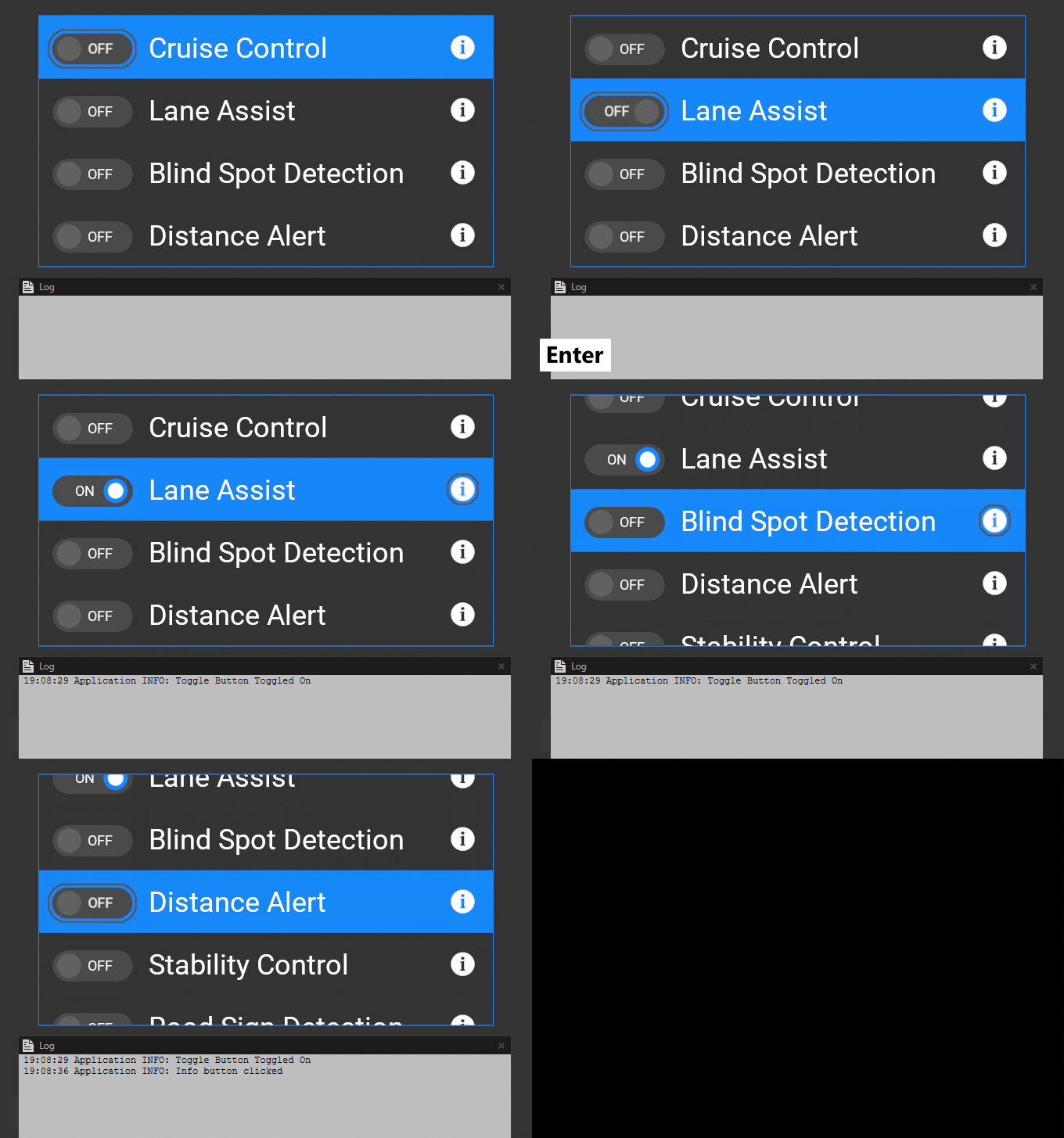
For example, this video demonstrates an example Grid List Box 2D node that shows a list of safety control settings. Each list item contains a Toggle Button node and a Button node that shows an information icon. A gray outline visualizes the node that has the key focus. To learn how to change the appearance of a user interface element when that element has focus, see Showing when a user interface element has focus.
When the user browses the list:
When the key focus of the application is in the List Box node and the user presses the Tab key, Kanzi moves the focus through the focusable nodes in the list item. From the last focusable node in a list item, the focus moves to the next list item, which Kanzi sets as selected.
If the Selection Behavior property of the List Box node is set to Bring Center, Kanzi brings the selected item to the center of the list box area.
When the user clicks a list item to select it, Kanzi sets the key focus to the first focusable node in that item and the user can interact with that node through key input.
For example, the user can press the Enter key to toggle a Toggle Button or to press a Button.

List box triggers
Use the List Box triggers to react when the user interacts with a List Box node. For example, you can set the appearance of a List Box node when the user scrolls that node. See Reacting when the user interacts with a Grid List Box node and Reacting when the user interacts with a Trajectory List Box 3D node.
See also
Using the Trajectory List Box 3D node
Using the List Box Item Container prefabs