Using the Toggle Button Group nodes
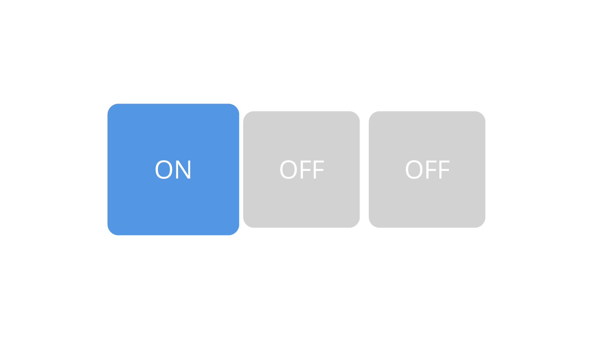
Use the Toggle Button Group nodes to allow users to select only one option from a set of options that are mutually exclusive.
Toggle buttons in a toggle button group behave like radio buttons, where only one toggle button can be active at a time.
Use Toggle Button Group 3D to group 3D toggle buttons in 3D space, and Toggle Button Group 2D to group 2D toggle buttons in 2D space.
A toggle button group is a node that can contain Toggle Button nodes and manages their states, but does not provide a visual shape.
When a Toggle Button node in a Toggle Button Group has focus, it receives click input from the keyboard keys Space, Enter, and Enter on the numeric pad by default.
Creating a toggle button group
To create a toggle button group:
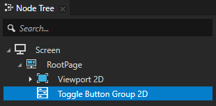
In the Node Tree or Prefabs press Alt and right-click the node where you want to create a Toggle Button Group and select either Toggle Button Group 2D, or Toggle Button Group 3D.
Note that you can create a 3D node only inside 3D nodes, and a 2D node only inside 2D nodes.
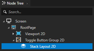
In the Toggle Button Group create a layout that arranges the Toggle Button nodes in the Toggle Button Group node.
For example, if you created a Toggle Button Group 2D, create a Stack Layout 2D node, if you created a Toggle Button Group 3D, create a Stack Layout 3D node. See Using the Stack Layout nodes.
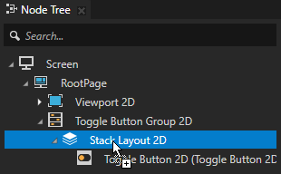
In the layout create Toggle Button nodes.
For example, if you created a 2D toggle button group with a Stack Layout 2D node, in the Prefabs create a Toggle Button 2D prefab and add to the Stack Layout 2D node multiple instances of that prefab. See Using the Toggle Button nodes.
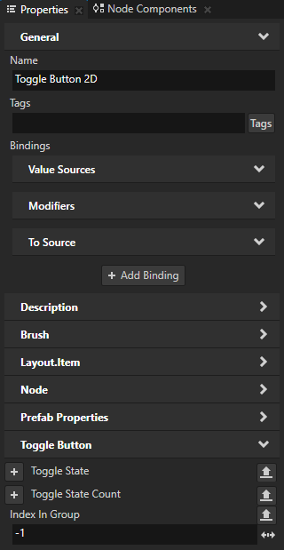
(Optional) To manually set the indexes of the Toggle Button nodes in the Toggle Button Group node, in each Toggle Button set the value of the Index in Group property to a different value.
Kanzi uses the Index in Group property to keep track of which Toggle Button nodes belong to a Toggle Button Group node.
When you create a Toggle Button node, the value of its Index in Group property is -1, which means that the Toggle Button:
Belongs to its nearest ascendant Toggle Button Group node.
If you remove the Index in Group property from a Toggle Button node, that Toggle Button does not belong to a Toggle Button Group.
Gets a group index based on its position among the Toggle Button nodes in the same Toggle Button Group node. The first Toggle Button in a Toggle Button Group gets the index 0, the second one gets the index 1, and so on.
Tip
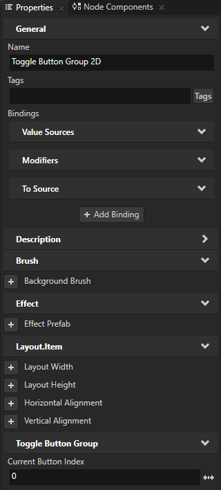
Use the Toggle Button Group > Current Button Index property to access the index of the Toggle Button node that is toggled on in a Toggle Button Group node. For example, you can create an application navigation bar to allow the user to switch between application screens. See Activating Activities with a Toggle Button Group.
(Optional) To set one of the Toggle Button nodes in the Toggle Button Group node to be toggled on when the application starts, select the Toggle Button Group node, in the Properties add the Current Button Index property, and set it to the index of the Toggle Button node that you want to toggle on.
For example, if you did not manually set the indexes of the Toggle Button nodes, to set the first Toggle Button in the Toggle Button Group to be toggled on when the application starts, set the Current Button Index property to 0.
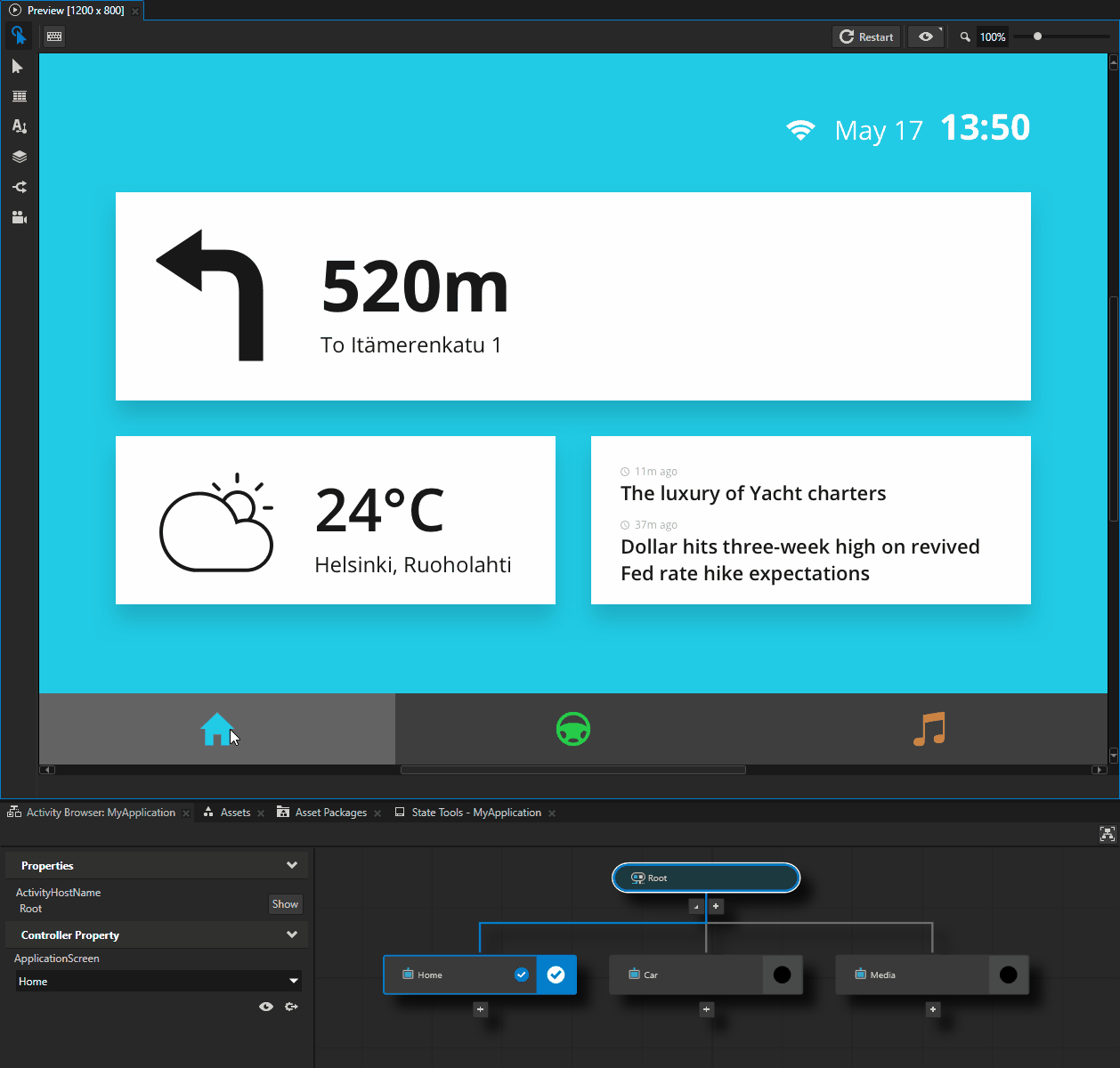
In the Preview when you click the Toggle Button nodes in the Toggle Button Group node, the Toggle Button Group node toggles the states in Toggle Button nodes.

Reacting when any Toggle Button in a Toggle Button Group is toggled
You can set off a trigger when the user toggles the state of any Toggle Button in a Toggle Button Group. To learn how to react when the user toggles a specific Toggle Button in a Toggle Button Group, see Reacting to toggle changes.
To react when any Toggle Button in a Toggle Button Group is toggled:
Select the Toggle Button Group to which you want to add a trigger which Kanzi sets off when the user toggles the state of any Toggle Button in that Toggle Button Group. See Creating a toggle button group.
In the Node Components press Alt and right-click Triggers and select Message Trigger > Toggle Button Group: Toggled.
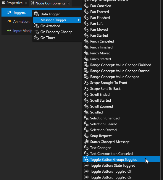
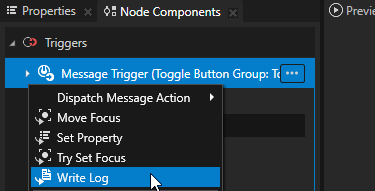
In the Node Components > Triggers press Alt and right-click the Toggle Button Group: Toggled trigger, and select the action that you want to set off when the toggle state of any Toggle Button in the Toggle Button Group changes.
For example, select the Write Log action and set Log Text to the message that you want to write to the Log window when the trigger is set off. The Write Log action is useful when you want to verify that the node received the input.
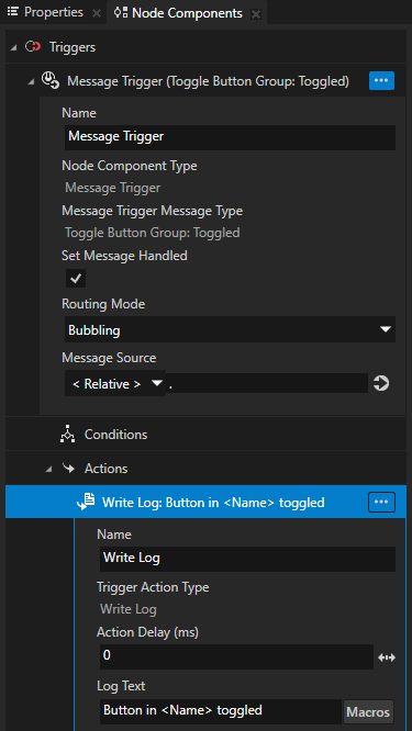
Now when you change the toggle state of any of the buttons in the Toggle Button Group, Kanzi prints to the Log window the message that you set as the value of the Log Text property.
To open the Log window, in the main menu select Window > Log.
Activating Activities with a Toggle Button Group
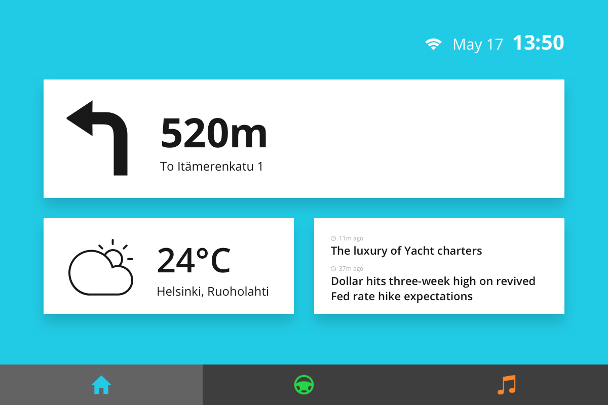
You can use the Toggle Button nodes in a Toggle Button Group to activate Activities in an Activity Host. For example, you can create an application navigation bar to allow the user to switch between application screens.
To activate Activities with a Toggle Button Group:
Create an Activity Host with several Activities whose activation state you control with a Controller Property.
For example, create an Exclusive Activity Host with Activities that show different application screens and use a Controller Property to control which Activity is active. See Using an Exclusive Activity Host.
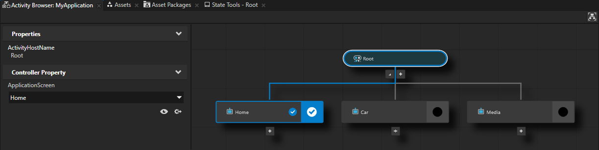
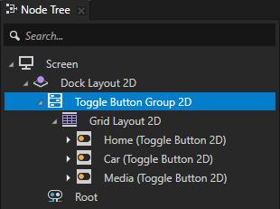
Create a Toggle Button Group with a Toggle Button node for each Activity that you created in the previous step. See Creating a toggle button group.
In the Toggle Button Group order the Toggle Button nodes in the same order as the enumeration options that you use to control the Activities.
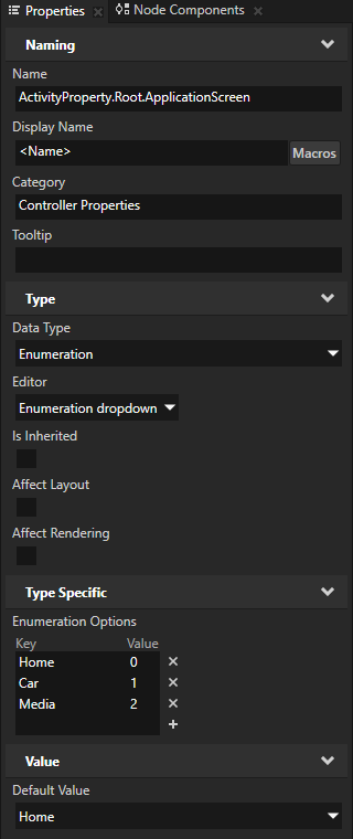
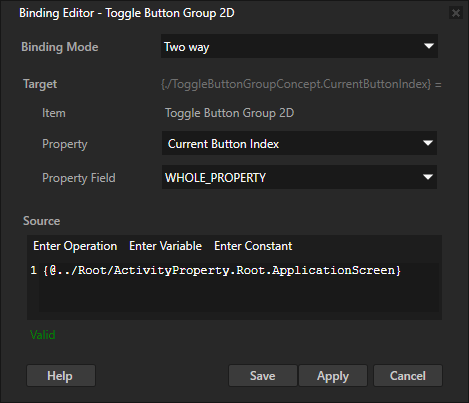
Select the Toggle Button Group, in the Properties click + Add Binding, and in the Binding Editor set:
Binding Mode to Two way
Property to Current Button Index
You use the Current Button Index property to access the index of the Toggle Button that is toggled on in the Toggle Button Group.
Source to the controller property in the Activity Host that controls which Activity is active in that Activity Host.
Click Save.
With this binding you create a two-way connection between the toggle button that is toggled on in the toggle button group and the Activity that is active in the Activity Host.
Now when you activate an Activity, Kanzi toggles on the corresponding Toggle Button, and when you toggle on a Toggle Button, Kanzi activates the corresponding Activity.
Setting the appearance of a Toggle Button Group 2D node
To set the appearance of 2D nodes:
You can fill 2D nodes with a solid color, a texture, or a material. See Adjusting the appearance of 2D nodes.


You can apply a post-processing effect to a 2D node. See Effects for 2D nodes.


You can rotate a 2D node around all three axes to create a 3D perspective effect. See Creating a 3D perspective effect for 2D nodes.

You can apply custom rendering to 2D nodes to create post-processing effects. See Applying custom rendering to 2D nodes.
Using the Toggle Button Group 3D node in the API
To create a Toggle Button Group 3D node with three Toggle Button nodes:
// Create a Toggle Button Group 3D named Toggle button group and add it to the scene.
ToggleButtonGroup3DSharedPtr toggleButtonGroup3D = ToggleButtonGroup3D::create(domain, "Toggle button group");
scene->addChild(toggleButtonGroup3D);
// Create a Stack Layout 3D named Stack layout and add it to the Toggle button group.
// This stack layout is used only for arranging the items in the Toggle button group.
StackLayout3DSharedPtr stackLayout3D = StackLayout3D::create(domain, "Stack layout");
toggleButtonGroup3D->addChild(stackLayout3D);

// Create three Toggle Button nodes and add them to the Stack Layout node.
ToggleButton3DSharedPtr buttons[3];

for (auto i = 0u; i < 3; ++i)
{
    buttons[i] = ToggleButton3D::create(domain, "Toggle button");
    // Set the Button Group Index property to -1, which makes the Toggle Button to register itself to the
    // Toggle Button Group and tells to the Toggle Button Group node to set the index of the Toggle Button node.
    buttons[i]->setIndexInGroup(-1);
    stackLayout3D->addChild(buttons[i]);
}

// Initially all Toggle Buttons in the Toggle Button Group are toggled off.
optional<size_t> currentButtonIndex = toggleButtonGroup3D->getCurrentButtonIndex();
if (!currentButtonIndex)
{
    std::cout << "No toggled Toggle Button in the Toggle Button Group." << endl;
}

// Toggle on the second Toggle Button in the Toggle Button Group.
buttons[1]->setToggleState(1);

// Print the index of the toggled Toggle Button to show that the second Toggle Button is toggled on.
optional<size_t> currentButtonIndexAfterToggle = toggleButtonGroup3D->getCurrentButtonIndex();
std::cout << (currentButtonIndexAfterToggle ? *currentButtonIndexAfterToggle : -1) << endl;
For details, see the ToggleButtonGroup3D class in the Kanzi Engine API reference.
Using the Toggle Button Group 2D node in the API
To create a Toggle Button Group 2D node with three Toggle Button nodes:
// Create a Toggle Button Group 2D named Toggle button group and add it to the scene.
ToggleButtonGroup2DSharedPtr toggleButtonGroup2D = ToggleButtonGroup2D::create(domain, "Toggle button group");
viewportNode->addChild(toggleButtonGroup2D);
// Create a Stack Layout 2D named Stack layout and add it to the Toggle button group.
// This stack layout is used only for arranging the items in the Toggle button group.
StackLayout2DSharedPtr stackLayout2D = StackLayout2D::create(domain, "Stack layout");
toggleButtonGroup2D->addChild(stackLayout2D);

// Create three Toggle Button nodes and add them to the Stack Layout node.
ToggleButton2DSharedPtr buttons[3];

for (auto i = 0u; i < 3; ++i)
{
    buttons[i] = ToggleButton2D::create(domain, "toggle button");
    // Set the Button Group Index property to -1, which makes the Toggle Button to register itself to the
    // Toggle Button Group and tells to the Toggle Button Group node to set the index of the Toggle Button node.
    buttons[i]->setIndexInGroup(-1);
    stackLayout2D->addChild(buttons[i]);
}

// Initially all Toggle Buttons in the Toggle Button Group are toggled off.
optional<size_t> currentButtonIndex = toggleButtonGroup2D->getCurrentButtonIndex();
if (!currentButtonIndex)
{
    std::cout << "No toggled Toggle Button in the Toggle Button Group." << endl;
}

// Toggle on the third Toggle Button in the Toggle Button Group.
buttons[2]->setToggleState(1);

// Print the index of the toggled Toggle Button to show that the third Toggle Button is toggled on.
optional<size_t> currentButtonIndexAfterToggle = toggleButtonGroup2D->getCurrentButtonIndex();
std::cout << (currentButtonIndexAfterToggle ? *currentButtonIndexAfterToggle : -1) << endl;
For details, see the ToggleButtonGroup2D class in the Kanzi Engine API reference.
Toggle Button Group property types and messages
For lists of the available property types and messages for the Toggle Button Group nodes, see Toggle Button Group 2D and Toggle Button Group 3D.