Using focus
Keyboard focus forwards hardware key messages to the correct user interface element in your application. For example, the user can press the arrow keys on the keyboard to move a slider or press the Enter key to click a button.
You can set which user interface elements in your application can receive focus and use the default keys that Kanzi uses to navigate focus, or set a specific keyboard key.
Kanzi includes in the focus chain all focus scope nodes and the nodes for which you enable the Focusable property. The Button, Toggle Button, Scroll View, Slider, and Text Box nodes have the Focusable property enabled by default.
To handle focus in your Kanzi application, you can:
Set focus to a specific user interface element. See Setting focus.
Set the order in which user interface elements receive focus. See Moving focus in the focus chain.
Move the focus within a user interface element. See Moving the focus within a group of nodes.
Set how a popup window reacts to user input. See Creating a popup-type window.
Change the appearance of a user interface element when that element has focus. See Showing when a user interface element has focus.
Define keyboard navigation for your application. See Setting a specific keyboard key to move focus.
Learn how to use focus by completing a tutorial. See Tutorial: Move focus in an application.
Setting focus
Set focus to a node when you want to enable the user to use keyboard keys to interact with the user interface element that that node represents.
To set focus:
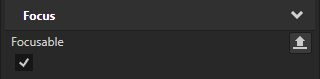
Select the node to which you want to set focus and in the Properties add and enable the Focus > Focusable property.
Tip
The Button, List Box, Scroll View, Slider, and Text Box nodes have the Focusable property enabled and can receive focus by default.
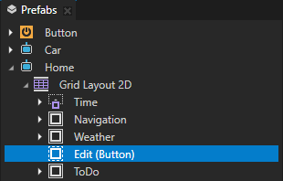
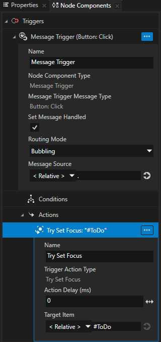
Select the node that you want to use to set the focus and in the Node Components create a trigger that you use to set off the action that sets the focus.
For example, in a Button node use the Button: Click trigger.
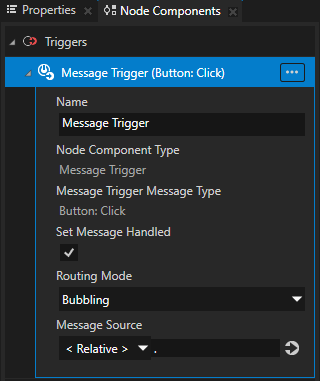
In the trigger create a Try Set Focus action.
For example, by creating a Try Set Focus action in a Button: Click trigger you set the application to set focus to a node when the user clicks the Button node.
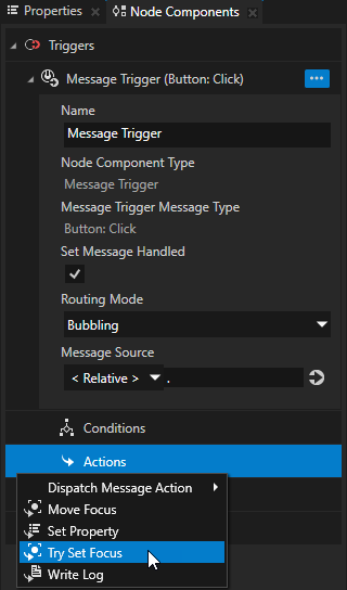
In the Try Set Focus action set the Target Item to the node to which you want to set the focus.
Tip
Aliases provide a convenient way to set the node to which you want to set the focus. See Using aliases.
Moving focus in the focus chain
Focus chain is a sequence of nodes that defines the order in which Kanzi sets focus to those nodes. Kanzi includes in the focus chain all nodes in your project that have the Focusable property enabled.
Tip
The Button, List Box, Scroll View, Slider, and Text Box nodes have the Focusable property enabled and can receive focus by default.
By default the focus chain moves the focus from each node based on the order of the nodes in the node tree:
To the next focusable node in the focus scope when the user navigates in the forward direction by pressing the Tab key.
To the previous focusable node in the focus scope when the user navigates in the backward direction by pressing the BackTab key or the Shift Tab keys.
To control how the focus chain moves the focus, you can set for each focusable node the position of the node in the focus chain.
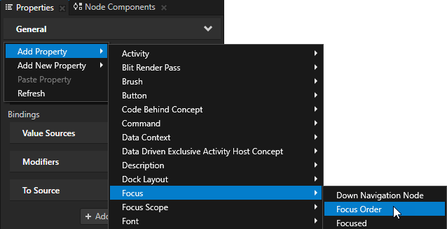
To manually set the order of nodes in the focus chain, in the Node Tree select each node whose position in the focus chain you want to set and in the Properties add and set the Focus Order property.
You set the focus to move between the nodes based on their Focus Order property value:
In the ascending order when the user navigates in the forward direction.
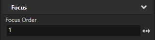
For example, when the node whose Focus Order property is set to 1 has focus and the user presses the Tab key, the focus moves to the node whose Focus Order property is set to 2.
In the descending order when the user navigates in the backward direction.
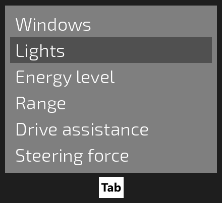
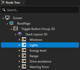
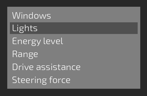
Moving the focus within a group of nodes
Use a focus group to handle navigation between nodes that form a user interface element.
You can set a node to be a focus group to forward the focus from that node to a child node. When you set focus to a focus group, Kanzi forwards the focus to the focusable child node of that group which has the smallest Focus Order property value or is positioned first in the node tree. When you move the focus from a focus group node, that focus group remembers the last-focused node. This way, when that focus group receives focus again, Kanzi sets focus to the node that was last focused.
To set a focus group:
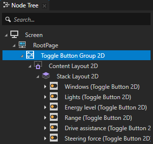
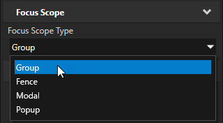
In the Node Tree select the node that you want to set as a focus group, in the Properties add the Focus Scope > Focus Scope Type property, and set it to Group.
When you set focus to the focus group node, that focus group forwards the focus to the first focusable child node. For example, if you set a Toggle Button Group node as a focus group, by default the first Toggle Button node in that Toggle Button Group receives focus. You can use the Tab and BackTab or Shift Tab keyboard keys to move the focus between the Toggle Button nodes.
Tip
The Button, List Box, Scroll View, Slider, and Text Box nodes have the Focusable property enabled and can receive focus by default.
Tip
Use a state manager to change the appearance of a user interface element when that element has focus. See Showing when a user interface element has focus.
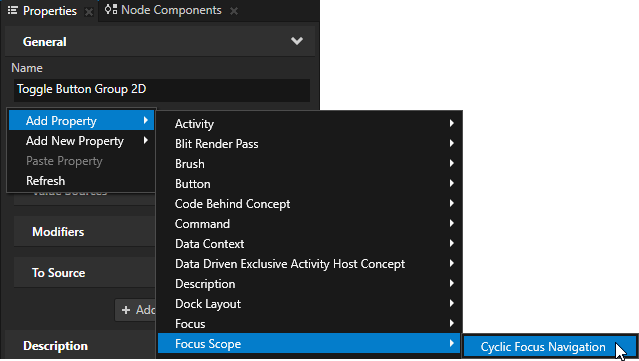
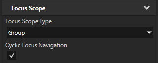
(Optional) To make the focus move in the focus group cyclically, in the Properties add and enable the Focus Scope > Cyclic Focus Navigation property.
When you enable the Cyclic Focus Navigation property:
When the user navigates forward by pressing the Tab key, and the focus reaches the last focusable node of the focus group, the focus moves back to the first focusable node.
When the user navigates backward by pressing the BackTab or Shift Tab keys, and the focus reaches the first focusable node of the focus group, the focus moves back to the last focusable node.
(Optional) To manually set which node in the focus group first gets the focus, in the Node Tree select the child node of the focus scope node to which you want to set focus, in the Properties add the Focus > Focus Order property, and set it to 1.
When focus moves to the focus group node, the child node with the smallest Focus Order property value receives focus. If the focus group node has several child nodes with the same smallest Focus Order property value, the focus manager sets focus to the first child node in the node tree of the focus scope.
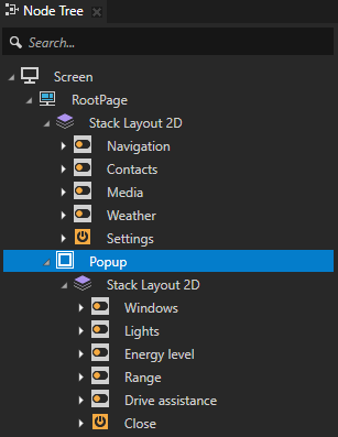
Creating a popup-type window
You can create a popup-type window which opens on top of other parts of your application. Use a focus scope to set how the popup-type window reacts to user input:
Modal scope is a focus scope which handles focus in a popup window. A modal scope blocks the key and touch input that comes from outside of the popup window and keeps the focus navigation within the popup boundaries.
Popup scope is a focus scope which handles focus in a popup window. A popup scope allows the popup window to lose focus when the key and touch input comes from outside of the popup boundaries.
Tip
Use a state manager to change the appearance of a user interface element when that element has focus. See Showing when a user interface element has focus.
To create a popup-type window:
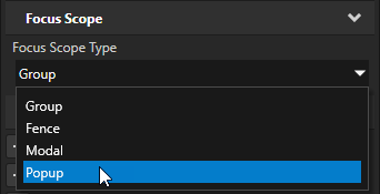
In the Node Tree select the node which you want to display as a popup window, in the Properties add the Focus Scope > Focus Scope Type property, and set it to:
Modal to create a popup window which blocks the key and touch input that comes from outside of the popup window and keeps the focus navigation within the popup boundaries.
Popup to create a popup window which closes with touch input inside or outside of the popup boundaries.
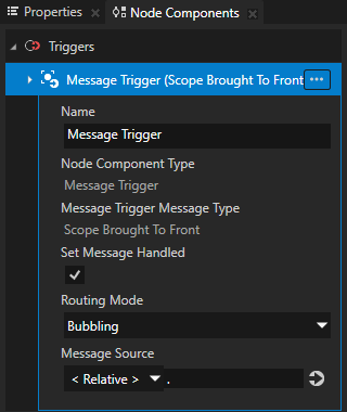
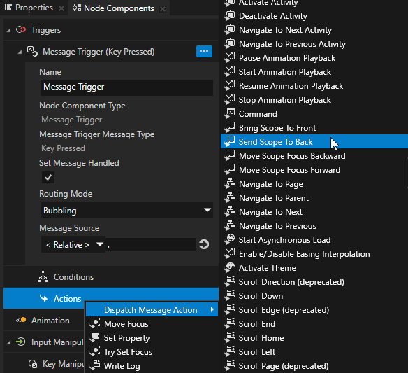
In the Node Tree select the node that you set as a popup window, in the Node Components press Alt and right-click Triggers, and select Message Trigger > Scope Brought To Front.
You use this trigger to set the focus to the popup window when that window opens.
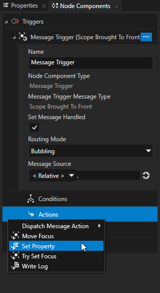
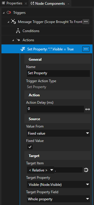
In the Scope Brought To Front trigger create a Set Property action and in that action set:
Target Property to Visible
Fixed Value to enabled
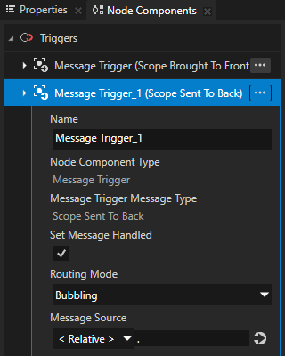
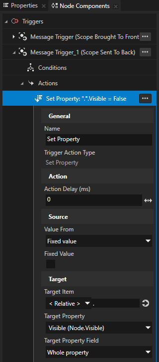
In the Node Components press Alt and right-click Triggers, select Message Trigger > Scope Sent To Back, in the trigger create a Set Property action, and in that action set:
Target Property to Visible
Fixed Value to disabled
You use this trigger and action to remove the focus from the popup window when that window closes.
Create a control to open the popup window.
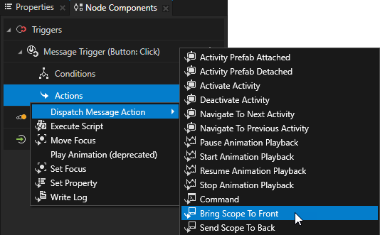
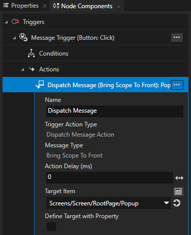
In the Node Tree select the node that you want to use as the control to open the popup window and in the Node Components use a trigger with the Bring Scope To Front action.
For example, select a Button 2D node, in the Button: Click trigger create a Bring Scope To Front action, and in that action set the Target Item to the node which you set as the popup window.
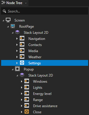
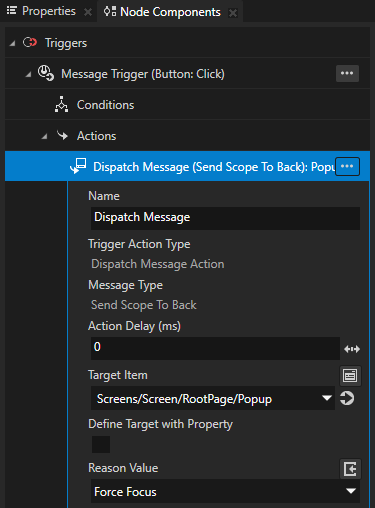
Create a control to close the popup window.
In the Node Tree select the node that you want to use as the control to close the popup window and in the Node Components use a trigger with the Send Scope To Back action.
For example, select a Button 2D node, in the Button: Click trigger create a Send Scope To Back action, and in that action set the Target Item to the node which you set as the popup window.
You can now:
Open the popup window when the button that you set as the control to open that popup window is focused and you press the Enter key on your keyboard.
Close the popup window when the button that you set as the control to close that popup window is focused and you press the Enter key on your keyboard.
If you set the Focus Scope Type property to Popup, you can close the popup window by clicking outside of the popup window boundaries in the Preview window.
Showing when a user interface element has focus
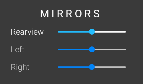
You can set a user interface element to change appearance when that element or any of its child elements has focus. For example, you can change the colors of a slider control when that slider has focus or highlight a group of UI controls when one of those controls has focus.
You can use these Focus properties to observe whether a user interface element has focus:
The Contains Focus property reports whether a node or any of its descendant nodes has focus.
The Focused property reports whether a node has focus.
To visually indicate to the user whether a user interface element has focus, either:
Create a state manager and use the Contains Focus or Focused property as its controller property. See Using a state manager to show when a user interface element has focus.
Create a binding where you set a property based on the value of the Contains Focus or Focused property. See Using a binding to show when a user interface element has focus.
Using a state manager to show when a user interface element has focus
Using a state manager to show when a user interface element has focus is convenient when you want to change the values of multiple properties to visually indicate the focus. With a state manager you can also animate the change in the appearance.
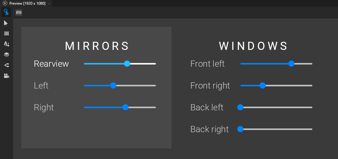
In this example, you use the Focus > Contains Focus property as the controller property in a state manager to change the appearance of a slider and its label when that slider has focus.
To use a state manager to show when a user interface element has focus:
Select the user interface element for which you want to create focus visualization.
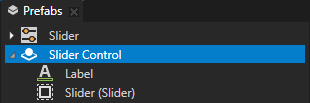
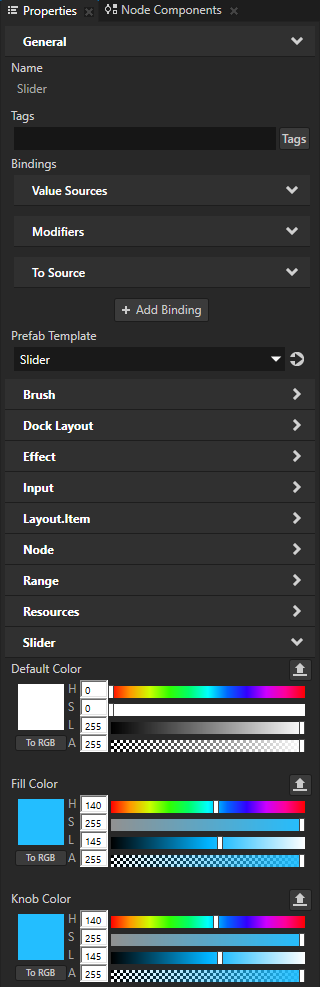
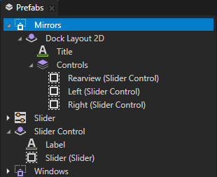
For example, create a prefab that contains a Slider and a Text Block node that shows the slider label.
Tip
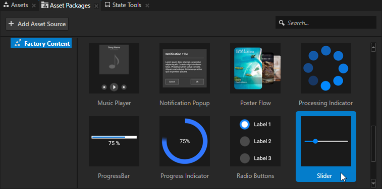
The Kanzi Factory Content contains a 2D slider that you can use. See Using the slider from the Factory Content.
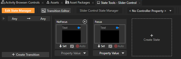
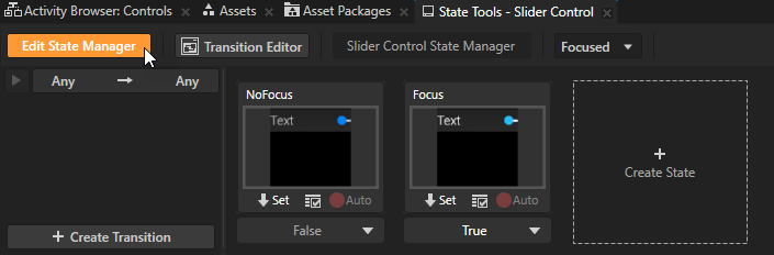
In the State Tools create a state manager with two states, one that defines the appearance of the prefab when it contains the focus, and another that defines the prefab when it does not contain the focus.
For example, name the states NoFocus and Focus.
In the prefab for which you create focus visualization select each node whose appearance you want to change and set the values of the properties that you want to change when a node in the prefab has focus.
For example, change the colors of the slider label and slider when the slider has focus.
In the State Tools click
 below the state which defines how the prefab looks when it contains the focus to save the current property values to that state.
For example, click
below the Focus state.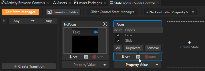
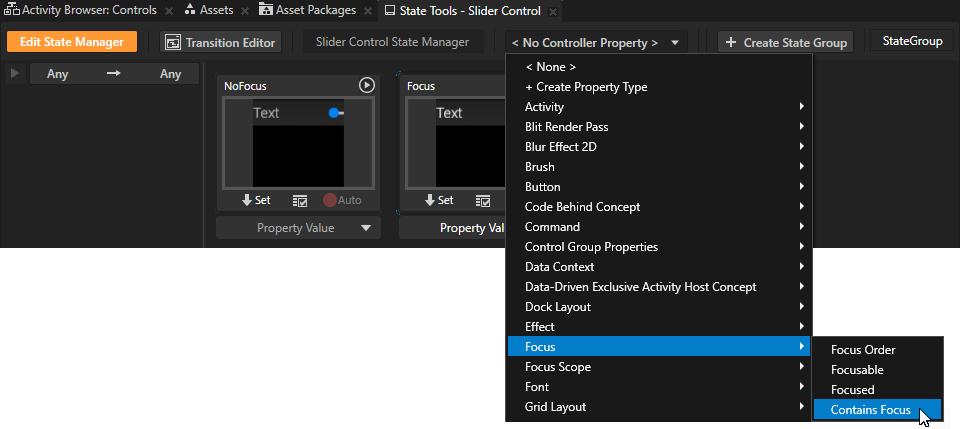
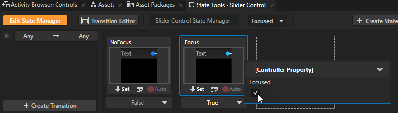
In the State Tools set the Controller Property to Focus > Contains Focus.
The Contains Focus property indicates whether a node or one of its descendant nodes has focus.
In the State Tools set the value of the controller property in the Focus state to True.
This way you set your application to use:
The NoFocus state when the node or any of its descendant nodes does not have the focus.
The Focus state when the node or one of its descendant nodes has focus and receives keyboard input.
In the State Tools click Edit State Manager to deactivate the State Tools.
When you set focus to the slider in the slider control prefab that you created, the appearances of the slider and slider label change.
Using a binding to show when a user interface element has focus
Using a binding to show that a user interface element has focus is convenient when you want to change the value of only one property to visually indicate the focus.
When you use a binding to show that a user interface element has focus, the change happens immediately without a transition animation.
To use a binding to show when a user interface element has focus:
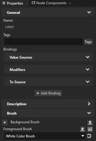
Select the node for which you want to create focus visualization.
In the Properties click + Add Binding and in the Binding Editor set:
Property to the property whose value you want to change when the node or its descendant node has focus.
For example, set it to Background Brush.
Expression to set the Property to different values depending on the focus status.
You can use:
The Focused (
Node.Focused) property to find out whether a node has focus.The Contains Focus (
Node.ContainsFocus) property to find out whether a node or any of its descendant nodes has focus.
For example, to set a brush when the node or one of its descendant nodes has focus:
{@./Node.ContainsFocus} ? Acquire("Medium Gray Color Brush") : Acquire("NullBrush")See ? (conditional) and Acquire.
Click Save.
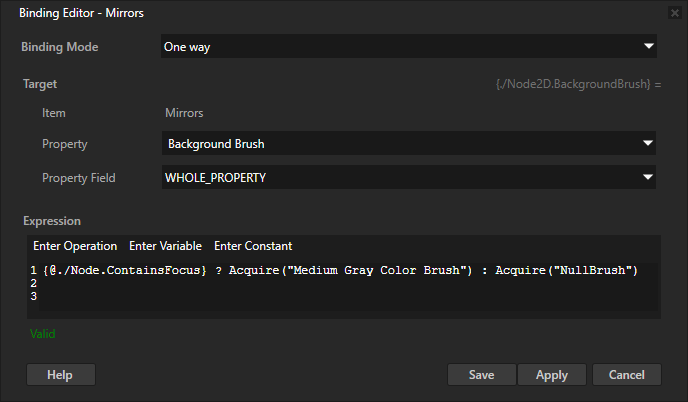
For example, when you add the binding to a node that contains a group of UI controls whose appearance you change when they have focus, the background brush of the node changes when any of those UI controls has focus.
Setting a specific keyboard key to move focus
When creating keyboard navigation for your application, you can use the Key Manipulator to set which keyboard keys the user can use to navigate the application. You can override the default focus navigation keys and use a specific key to set focus to a node, open or close a popup-type window, or move focus in the focus chain. See Default keyboard navigation keys.
To set a specific keyboard key to move focus:
In the Node Tree select the node from which you want to move focus to another node with a specific keyboard key.
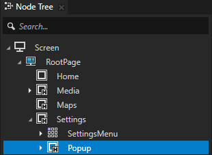
For example, to close a popup-type window with a specific keyboard key, select the node which represents that window. You move the focus to the previously focused node.
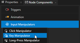
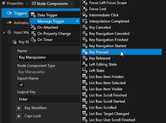
In the Node Components press Alt and right-click Input Manipulators, and select the Key Manipulator.
You use the Key Manipulator to set the node to react to input from a keyboard key.
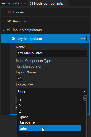
In the Key Manipulator you created in the previous step set the Logical Key to the keyboard key to which you want the node to react.
For example, to close a popup-type window when the user presses the Enter key, set the Logical Key to the Enter key.
In the Node Components create a Key Pressed trigger, and add to that trigger an action.
For example, to close a popup-type window when the user presses the Enter key, add to the Key Pressed trigger a Send Scope To Back action.
To set how the popup-type window closes, use a Scope Sent To Back trigger with an action which sets how the window closes. See Creating a popup-type window.
When the user presses down the Enter key you set in the Key Manipulator, the Key Pressed trigger sets off the action which closes the popup-type window and sets focus to the previously focused user interface element.
Using focus in the API
For details, see the FocusNavigationManipulator class in the Kanzi Engine API reference.