Using the Grid List Box nodes
Use the Grid List Box nodes to create scrollable lists of items arranged in a grid.
Learn how to use the Grid List Box nodes by completing a tutorial. See Tutorial: Create a contacts list with a Grid List Box.
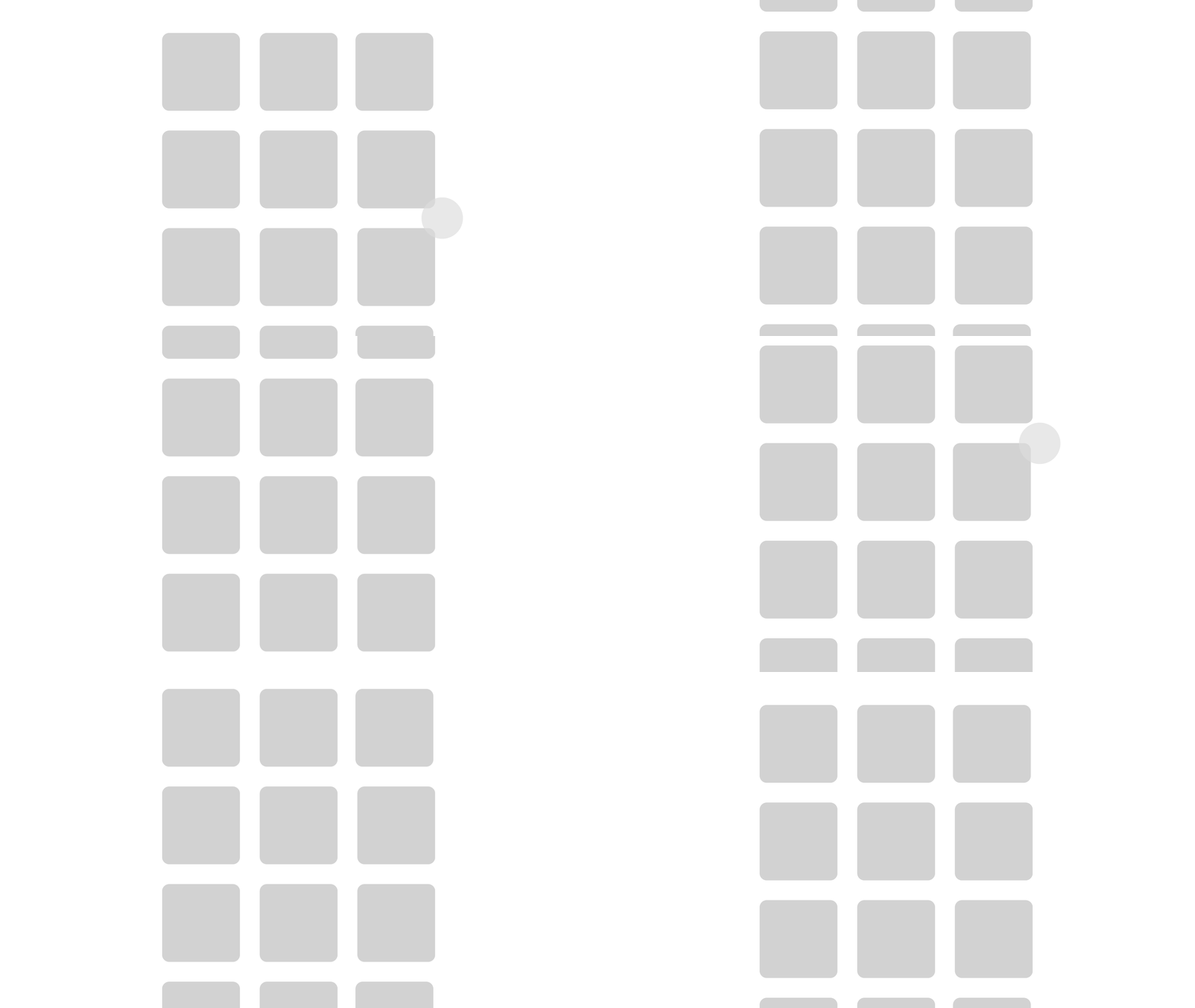
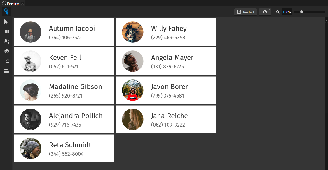
As you add items to a Grid List Box node, the Grid List Box node places them either in its first row or column:
When the items in the Grid List Box node reach the set width or height of the Grid List Box node, the Grid List Box node places the items in the next row or column.
When there are more items than fit in the width and height you set for a grid list box, the items become visible as you scroll the Grid List Box node.
To select an item in a Grid List Box node click that item.
The Grid List Box node arranges its items based on what you set in the Layout Direction property:
Right to arrange the items along the x axis.
When adding items, the Grid List Box node places each new item to the right of the item preceding it. When an item reaches or exceeds the width of the Grid List Box node, the Grid List Box node places that item into a new row.
Users can scroll the Grid List Box node on the y axis.

Down to arrange the items along the y axis.
When adding items, the Grid List Box node places each new item below the item preceding it. When an item reaches or exceeds the height of the Grid List Box node, the Grid List Box node places that item into a new column.
Users can scroll the Grid List Box node on the x axis.

The List Box nodes that you create in Kanzi Studio have the Focusable property enabled and can receive focus by default. When a Grid List Box node has focus use these keyboard keys:
↑ and ↓ to scroll the list items in a vertical list box
→ and ← to scroll the list items in a horizontal list box
Home to select the first list item
End to select the last list item
Page Up and Page Down to go to the beginning and end of the visible area of a list box
Note
Items in all list box nodes (Grid List Box nodes and Trajectory List Box 3D node) are not its child nodes, even though in Kanzi Studio it seems so when you add items to a list box. Because list box items are not child nodes of a list box, you cannot refer to these items from outside of a list box using paths or aliases. If you need to refer from a list box item to an object outside of a list box, use bindings and aliases. See Binding to properties outside of a Grid List Box node and Navigating to Page nodes from a Trajectory List Box 3D node.
Creating a Grid List Box node
To create a Grid List Box node:
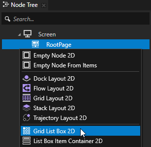
In the Node Tree press Alt and right-click the node where you want to create a Grid List Box node and select either Grid List Box 3D, or Grid List Box 2D.
Note that you can create a 3D node only inside 3D nodes, and a 2D node only inside 2D nodes.
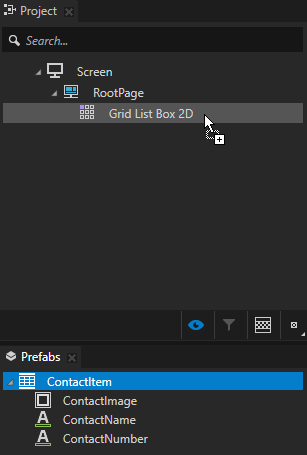
In the Node Tree add items to the Grid List Box node.
Use a data source to add items to a List Box node. See Using a data source.
For example, to create a contact list, add several nodes which represent the contacts in the list. See Using the List Box Item Container prefabs.
As you add items, the Grid List Box node arranges them in a grid from the top-left towards the bottom-right corner of the Grid List Box node. See Setting how a Grid List Box node arranges its items.
To browse the items in a Grid List Box node, in the Preview click and drag the items in the Grid List Box node.
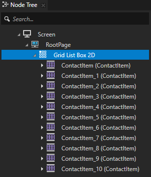
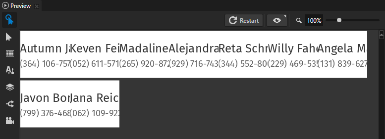
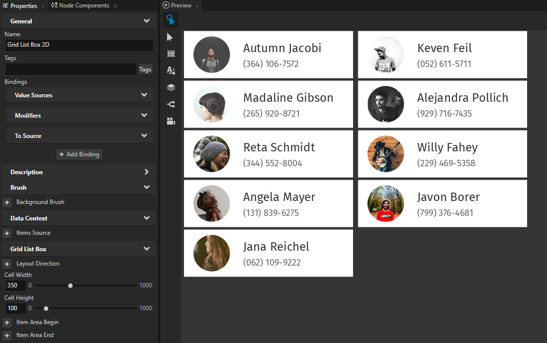
(Optional) If you cannot see the content you added to a Grid List Box node or the content does not fully fit, add and set the Cell Height and Cell Width properties.
You set the area reserved for each element inside the list box. The cell size clips the items if the items do not fit in the cell.
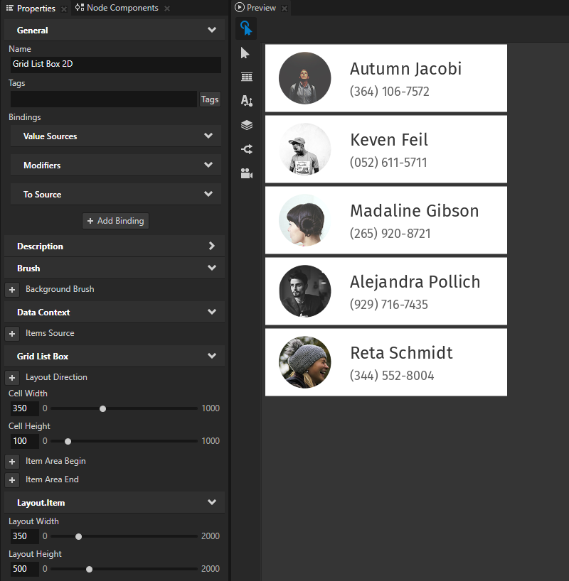
In the Node Tree select the Grid List Box node and in the Properties set the Layout Height and Layout Width properties.
You set the area in which the items in the Grid List Box node are visible. If all items in the Grid List Box node do not fit in the area, Kanzi clips those items which do not fit. The user can scroll the Grid List Box node to access all items.
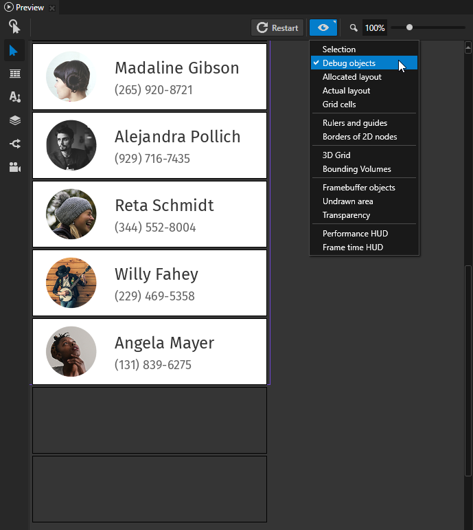
(Optional) In the Preview click
 to enter the Analyze mode, right-click
  , and select Debug objects.
This way you visualize the borders of the Grid List Box node and the items in the Grid List Box node.
Setting how a Grid List Box node arranges its items
You can set the Grid List Box node so that it arranges its items either along the x or y axis.
To set how a Grid List Box arranges its items:
Create a Grid List Box node and add items to it. See Creating a Grid List Box node.
In the Properties set the Layout Direction property to either:
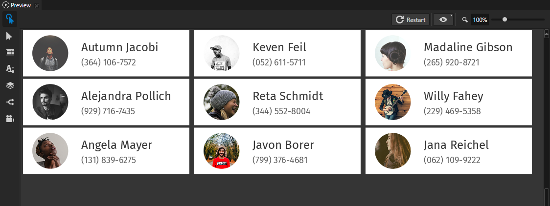
Right to arrange the items along the x axis.
When adding items, the Grid List Box node places each new item to the right of the item preceding it. When an item reaches or exceeds the width of the Grid List Box node, the Grid List Box node places that item into a new row.
Use the Layout Width and Layout Height properties to set the size of the Grid List Box node area.
Users can scroll the Grid List Box node on the y axis.
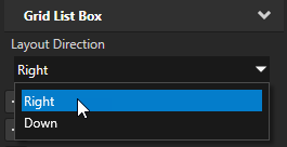
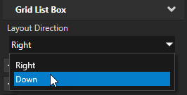
Down to arrange the items along the y axis.
When adding items, the Grid List Box node places each new item below the item preceding it. When an item reaches or exceeds the height of the Grid List Box node, the Grid List Box node places that item into a new column. Use the Layout Width and Layout Height properties to set the size of the Grid List Box node area.
Users can scroll the Grid List Box node on the x axis.
Bringing the selected item to the center of a Grid List Box
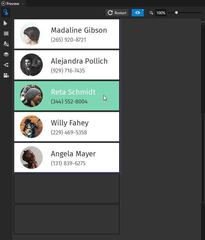
You can set a Grid List Box node to bring the item to the center of the list box area when a user clicks that item.
To set items in a Grid List Box node to the center when the user selects them:
Create a Grid List Box node and add items to it. See Creating a Grid List Box node.
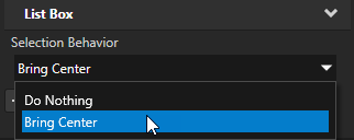
In the Properties add the Selection Behavior property and set it to Bring Center.
You set the Grid List Box node to scroll an item to the center of the node area when the user selects that item. The Grid List Box node centers its items based on the value you set in the Layout Direction property. See Setting how a Grid List Box node arranges its items.
In the Properties add and set:
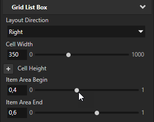
Item Area Begin to the offset where you want the area for the items in the Grid List Box node to begin.
For example, set it to 0.4.
Item Area End to the offset where you want the area for the items in the Grid List Box node to end.
For example, set it to 0.6.
Use the Item Area Begin and Item Area End properties to:
Grid List Box 2D. Set the items at the beginning and end of the list to also align to the center of the list when the user selects one of those items. For example, if the Grid List Box node has five items visible at a time, each of those items takes up 0.2 of the total area of the Grid List Box node. The centermost item takes up 0.1 of the space above it and 0.1 of the space below it.
Grid List Box 3D. Set the value of the Visible Amount In Parent property. Use the Visible Amount In Parent property to set shaders to change the appearance of an item based on the location of that object in the list box. For example, if you use the Visible Amount In Parent property to gradually change the visibility of an item, set the Item Area Begin property to a larger value and the Item Area End property to a smaller value. This way you limit the area where that item is visible.
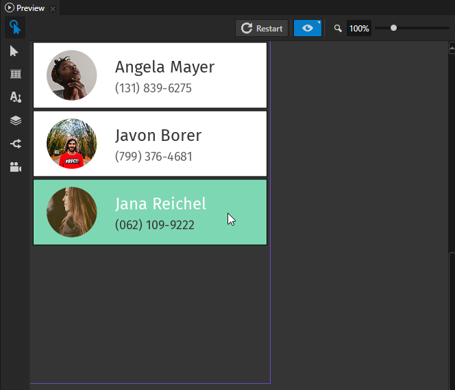
Nesting Grid List Box nodes
You can nest Grid List Box nodes to create a Grid List Box node within a Grid List Box node, each of which you can scroll independently. For example, you can create:
A list of albums with a vertically scrollable Grid List Box node of album categories which contains a nested Grid List Box node which you can scroll horizontally to browse each category.
A list of contacts with a vertically scrollable Grid List Box node of contacts which contains a nested Grid List Box node which you can scroll horizontally to edit or delete a contact.
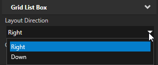
In a Grid List Box node use the Layout Direction property to set how Grid List Box node arranges its items and to set the axis on which users can scroll. Set the Layout Direction to:
Right to scroll the list items on the y axis.
Down to scroll the list items on the x axis.
To nest Grid List Box nodes:
Create a Grid List Box node. See Creating a Grid List Box node.
By default the value of the Layout Direction property is Right and you can scroll the list items on the y axis. To scroll the list items on the x axis, set the Layout Direction property to Down.

Create the structure for each list item of the Grid List Box node you created in the previous step.
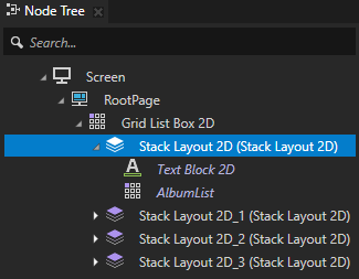
For example, if you want to create several nested Grid List Box nodes which contain albums, in the Prefabs create a Stack Layout 2D node, and inside it create a Text Block 2D node.
You use the Stack Layout 2D node to position each nested Grid List Box and the album category title, and the Text Block 2D node to show the category title. See Using the Stack Layout nodes.

Create a Grid List Box node that you want to nest in the Grid List Box that you created in the first step, and set it to scroll on a different axis than its parent Grid List Box node. If you set the Layout Direction property to Right for the parent Grid List Box node, for the nested Grid List Box node set that property to Down to scroll that Grid List Box on the x axis.
For example, if you created a Stack Layout 2D prefab in the previous step, in that Stack Layout 2D create a Grid List Box node, and drag to the Node Tree to the Grid List Box node several instances of that prefab.


Add items to each nested Grid List Box node.
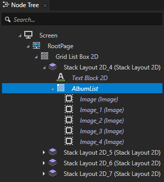
For example, to create a vertically scrollable Grid List Box which contains horizontally scrollable Grid List Box of albums, in the Prefabs create an Image node you use to represent each album, and drag to each nested Grid List Box several instances of that prefab.
You can add items to a Grid List Box using a data source. See Using a data source.

Binding to properties outside of a Grid List Box node
Use an alias when you want to bind a property of a list box item to a property of a node outside of the list box.
For example, if you have a Grid List Box 3D or a Trajectory List Box 3D node with a Text Block 3D node item and want to set the Text property value of the Text Block 3D node to a value of an Empty Node 3D node property that is not in the list box:
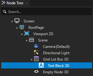
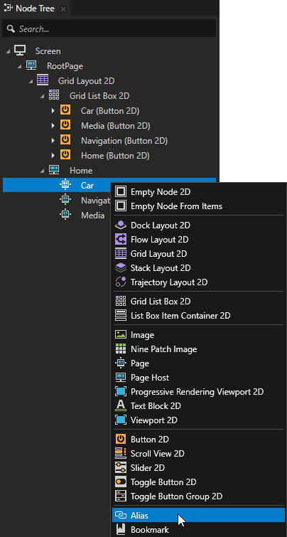
In the Node Tree press Alt and right-click the nodes that contain the property to which you want to bind and select Alias. See Using aliases.
For example, create an alias for the Empty Node 3D node.
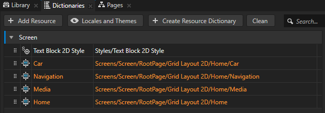
In the Dictionaries make sure that the aliases you created are in the resource dictionary that the list box node can access.
For example, place all aliases to the resource dictionary of the Screen node, or create a resource dictionary in the list box node and place the aliases to that resource dictionary. See Using resource dictionaries.
Create the binding:
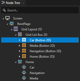
In the Node Tree select the node inside the list box node from which you want to bind to a node outside of the list box node.
In the Properties click + Add Binding and create the binding using the alias to bind to the property in a node outside of the list box node.
For example, in the Text Block 3D node create a binding to the Empty Node 3D node using the alias you created in the first step. See Bindings expressions reference.
For example, use this binding expression:
{#Empty Node 3D/TextConcept.Text}The Text property in the Text Block 3D node gets the value of the Text property from the Empty Node 3D node.
Click Save.
Reacting when the user interacts with a Grid List Box node
Use the List Box triggers to react when the user interacts with a Grid List Box node. For example, you can set the appearance of a Grid List Box node when the user scrolls that node.
You can use these List Box triggers with the Grid List Box nodes:
Name |
Description |
|---|---|
List Box: Item Hidden |
List Box: Item Hidden trigger is set off when an item in a list box node is unloaded from the working memory. To set how many items you want to keep loaded in the working memory at a time, use the Keep Alive Item Count property. |
List Box: Item Selected |
List Box: Item Selected trigger is set off when the user selects an item in a list box. |
List Box: Item Visible |
List Box: Item Visible trigger is set off when an item in a list box is created and loaded to the working memory. To set how many items you want to keep loaded in the working memory at a time, use the Keep Alive Item Count property. |
List Box: Scroll Finished |
List Box: Scroll Finished trigger is set off when the scrolling of a list box ends. |
List Box: Scroll Started |
List Box: Scroll Started trigger is set off when the scrolling of a list box starts. |
List Box: Scrolled |
List Box: Scrolled trigger is set of whenever a list box scrolls. |
List Box: Target Changed |
List Box: Target Changed trigger is set off when the scroll target of a list box changes. For example, the scroll target changes when the user selects a list box item and the list box scrolls to bring that item to the center of the list box area. |
List Box: User Scroll Finished |
List Box: User Scroll Finished trigger is set off when the user stops scrolling a list box. |
List Box: User Scroll Started |
List Box: User Scroll Started trigger is set off when the user starts to scroll a list box. |
To use the List Box triggers with a Grid List Box node:
Create a Grid List Box node and add items to it. See Creating a Grid List Box node.
For example, create a Grid List Box 2D node.


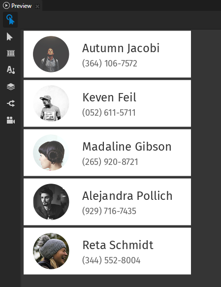
Define the behavior that you want to set with the List Box triggers.
For example, create a state manager where you define the states which set the appearance of the Grid List Box 2D node when the Scroll Started and Scroll Finished triggers are set off. See Creating a state manager.
Add and configure a List Box trigger:
In the Node Tree select the List Box node to which you want to add the trigger, and in the Node Components > Triggers add one of the List Box triggers.
For example, in the Node Tree select the Grid List Box node which you created in the beginning of this procedure, in the Node Components press Alt and right-click Triggers, and select Message Trigger > List Box > Scroll Started.
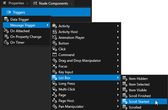
In the Node Components press Alt and right-click the trigger that you created in the previous step, select an action, and configure it.
For example, select the Go to State action and in the action set the State property to the state which sets the appearance of the Grid List Box node when the Scroll Started trigger is set off.
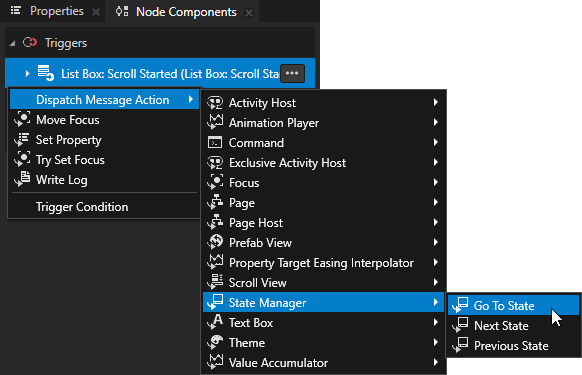
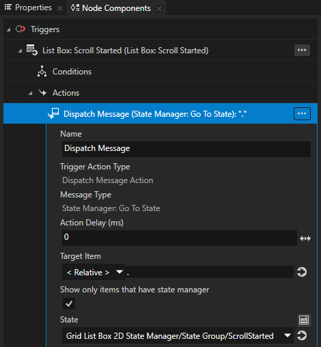
Repeat the previous step to add and configure more List Box triggers.
For example, add the Scroll Finished trigger. In the Go to State action of the trigger set State to the state which sets the appearance of the node when that trigger is set off.
In the Preview when you scroll the Grid List Box node you created, the triggers you added are set off.
Enabling the double-click gesture for Grid List Box items
When you add to a List Box node items that support the double-click gesture, you must enable the double-click gesture for those items in the List Box Item Container prefab.
To learn how to enable the double-click gesture for a node, see Enabling the multi-click gesture for a node.
To enable the double-click gesture for List Box items:
Create a List Box Item Container prefab and set it as the Item Container Template of the List Box node. See Creating a List Box Item Container prefab.
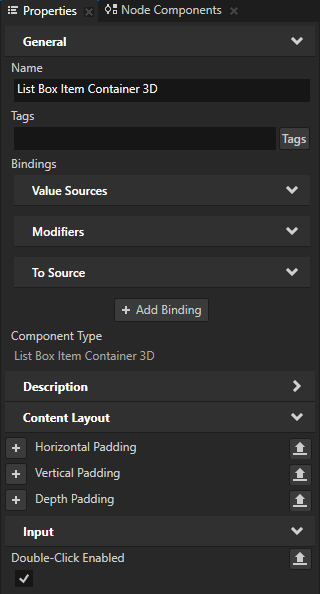
In the Prefabs select the List Box Item Container prefab and in the Properties add and enable the Input > Double-Click Enabled property.
When you enable the Double-Click Enabled property, Kanzi installs in the List Box Item Container prefab a multi-click manipulator that generates double-click messages.
Scrolling a Grid List Box node with a slider
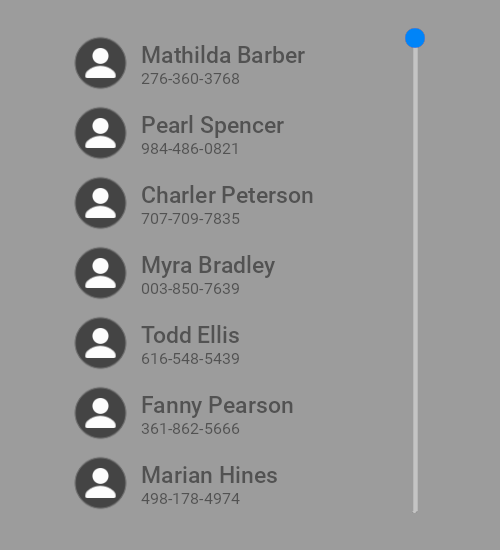
You can use a Slider node to scroll a Grid List Box node. In this example you use a slider to scroll a vertical contacts list.
To use a slider to scroll a Grid List Box node:
Create the Grid List Box node that you want to scroll.
For example:
In the Node Tree create a Stack Layout 2D node.
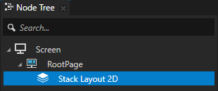
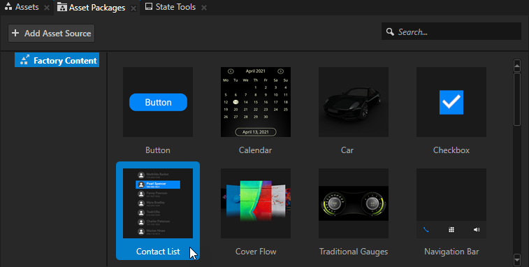
From the Asset Packages > Factory Content drag the Contact List to the Node Tree and drop it on the Stack Layout 2D node. See Factory Content assets.
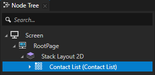
Create the Slider node that you use to scroll the Grid List Box node, and set the size and orientation of the Slider node to match those of the Grid List Box node.
For example:
From the Asset Packages > Factory Content drag the Slider to the Node Tree and drop it on the Stack Layout 2D node.
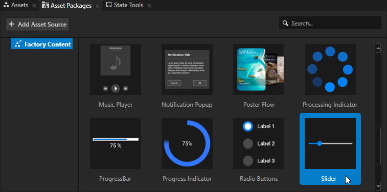
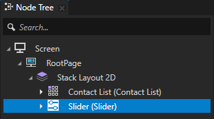
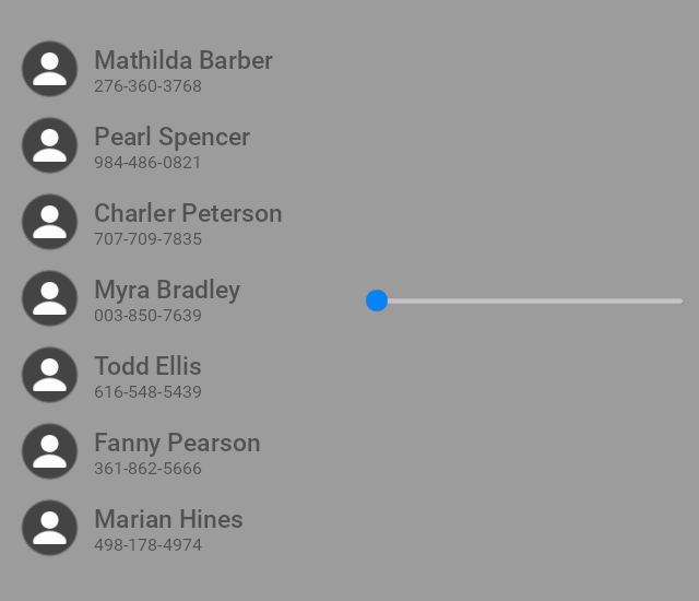
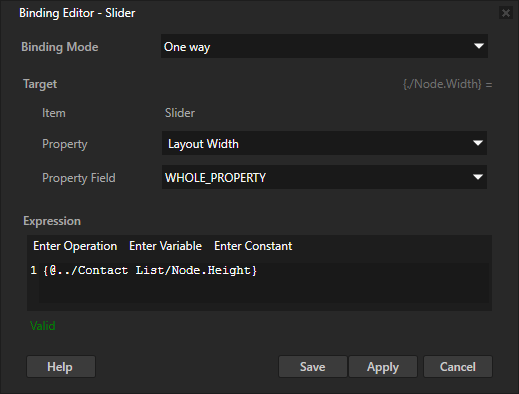
In the Node Tree select the Slider node, in the Properties click + Add Binding, and in the Binding Editor set:
Property to Layout Width
Expression to
{@../Contact List/Node.Height}
This way you make the length of the slider rail match the height of the Contact List node.
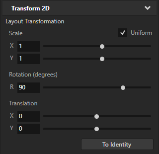
In the Properties add the Transform 2D > Layout Transformation property and set the Rotation property field to 90.
This way you make the slider vertical.
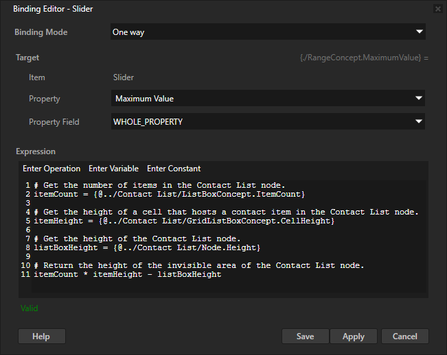
In the Properties click + Add Binding and in the Binding Editor set:
Property to Maximum Value
Expression to
# Get the number of items in the Contact List node.
itemCount = {@../Contact List/ListBoxConcept.ItemCount}

# Get the height of a cell that hosts a contact item in the Contact List node.
itemHeight = {@../Contact List/GridListBoxConcept.CellHeight}

# Get the height of the Contact List node.
listBoxHeight = {@../Contact List/Node.Height}

# Return the height of the invisible area of the Contact List node.
itemCount * itemHeight - listBoxHeight
You bind the highest value of the Slider node to the height of the invisible area of the Contact List node. The lowest value of the Slider node is by default 0. This way you set the range of values in the slider to match the length of the contacts list.
In the Node Tree select the Slider node, in the Properties click + Add Binding, and in the Binding Editor set:
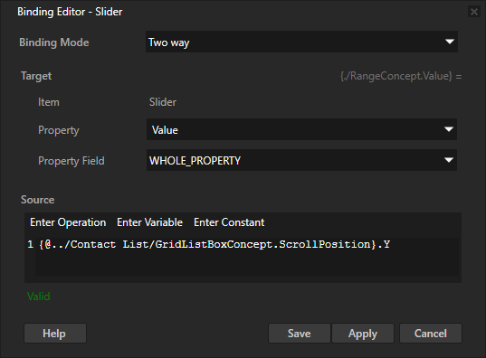
Binding Mode to Two way
Property to Value
Source to the Scroll Position property X or Y property field of the Grid List Box node that you want to scroll.
For example, set it to:
{@../Contact List/GridListBoxConcept.ScrollPosition}.Y
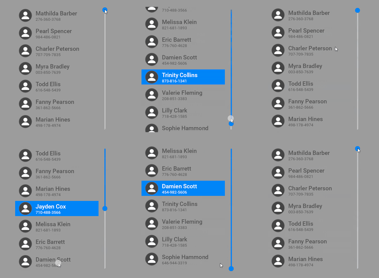
You bind the Value property of the Slider node to the Scroll Position property Y property field of the Contact List node. This way you create a two-way connection between the position of the slider knob and the vertical scroll position of the list box.
In the Preview when you move the slider knob, the contacts list scrolls, and when you scroll the contacts list, the slider knob moves.
Controlling whether a Grid List Box node is in use
To control whether a Grid List Box node is in use, use the Input > Enabled property. A disabled Grid List Box node does not react to user input. When you disable a Grid List Box node, Kanzi stops ongoing gestures and preserves the selected item and scroll position of that Grid List Box node.
When you disable the Enabled property of a node, you effectively disable that node and its descendant nodes in the same overlay focus scope.
To observe whether a node is effectively enabled, use the Input > Effectively Enabled property in a state manager or a binding. For example, to visually indicate to the user whether a node is in use, create a state manager and use the Effectively Enabled property as its controller property.
Setting the appearance of a Grid List Box 2D node
To set the appearance of 2D nodes:
You can fill 2D nodes with a solid color, a texture, or a material. See Adjusting the appearance of 2D nodes.


You can apply a post-processing effect to a 2D node. See Effects for 2D nodes.


You can rotate a 2D node around all three axes to create a 3D perspective effect. See Creating a 3D perspective effect for 2D nodes.

You can apply custom rendering to 2D nodes to create post-processing effects. See Applying custom rendering to 2D nodes.

Using the Grid List Box 3D node in the API
To create a Grid List Box 3D node:
// Create a Grid List Box 3D named MyListBox.
GridListBox3DSharedPtr gridListBox = GridListBox3D::create(domain, "MyListBox");
To configure the grid area:
// Make each grid cell be a 1x1x1 cube.
gridListBox->setCellWidth(1.0f);
gridListBox->setCellHeight(1.0f);
gridListBox->setDepth(1.0f);
// Make the grid contain three rows that are filled column by column.
gridListBox->setHeight(3.0f);
gridListBox->setDirection(GridListBoxConcept::GridDirectionDown);
// Make the grid contain 10 columns. Items that are dragged beyond these columns are made invisible.
gridListBox->setWidth(10.0f);
// Change the resting position when the list is scrolled to the beginning or end, so that items are not right at the grid edge.
gridListBox->setItemAreaBegin(0.2f);
gridListBox->setItemAreaEnd(0.8f);
To add items to the list box:
// Create cube meshes and add them as items of the list box.
// Items on the grid appear in the order you add them to the list.
Model3DSharedPtr item1 = Model3D::createCube(domain, "item1", 1.0f, ThemeRed);
Model3DSharedPtr item2 = Model3D::createCube(domain, "item2", 1.0f, ThemeGreen);
Model3DSharedPtr item3 = Model3D::createCube(domain, "item3", 1.0f, ThemeBlue);
Model3DSharedPtr item4 = Model3D::createCube(domain, "item4", 1.0f, ThemeOrange);
Model3DSharedPtr item5 = Model3D::createCube(domain, "item5", 1.0f, ThemeYellow);
gridListBox->addItem(item1);
gridListBox->addItem(item2);
gridListBox->addItem(item3);
gridListBox->addItem(item4);
gridListBox->addItem(item5);
For details, see the GridListBox3D class in the Kanzi Engine API reference.
Using the Grid List Box 2D node in the API
To create a Grid List Box 2D node:
// Create a Grid List Box 2D named MyListBox.
GridListBox2DSharedPtr gridListBox = GridListBox2D::create(domain, "MyListBox");
To configure the grid area:
// Make each grid cell be a 100x100 square.
gridListBox->setCellWidth(100.0f);
gridListBox->setCellHeight(100.0f);
// Make the grid contain three rows that are filled column by column.
gridListBox->setHeight(300.0f);
gridListBox->setDirection(GridListBoxConcept::GridDirectionDown);
// Make the grid contain 10 columns. Items that are dragged beyond these columns are made invisible.
gridListBox->setWidth(1000.0f);
// Change the resting position when the list is scrolled to the beginning or end, so that items are not right at the grid edge.
gridListBox->setItemAreaBegin(0.2f);
gridListBox->setItemAreaEnd(0.8f);
To add items to the list box:
// Create images and add them as items of the list box.
// Items on the grid appear in the order you add them to the list.
for (int i = 0; i < 5; ++i)
{
    Image2DSharedPtr item = Image2D::create(domain, "item" + to_string(i));
    item->setImage(item->acquireResource<Texture>(ResourceID("DefaultTexture")));
    // Make the images shrink to the cell size.
    item->setHorizontalAlignment(Node::HorizontalAlignmentStretch);
    item->setVerticalAlignment(Node::VerticalAlignmentStretch);
    gridListBox->addItem(item);
}
For details, see the GridListBox2D class in the Kanzi Engine API reference.
Grid List Box property types and messages
For lists of the available property types and messages for the Grid List Box nodes, see Grid List Box 2D and Grid List Box 3D.
