Using the Toggle Button nodes
Use the Toggle Button nodes to create interactions through buttons that can have multiple toggle states.
See Creating a toggle button with two states and Creating a toggle button with more than two states.
Use the Toggle Button 3D to create a 3D toggle button and the Toggle Button 2D to create a 2D toggle button. After you create a Toggle Button node, add to it nodes to create a visual representation of the toggle button.
When you create a Toggle Button, Kanzi by default adds to that node the Toggle Button: triggers:
Toggle Button: Toggled On
Toggle Button: Toggled Off
Toggle Button: State Toggled
See Reacting to toggle changes.
The Toggle Button nodes have the Focusable property enabled and can receive focus by default. When a Toggle Button node has focus, to press that button, you can use the default keyboard keys Space, Enter, and Enter on the numeric pad.
See Using focus.
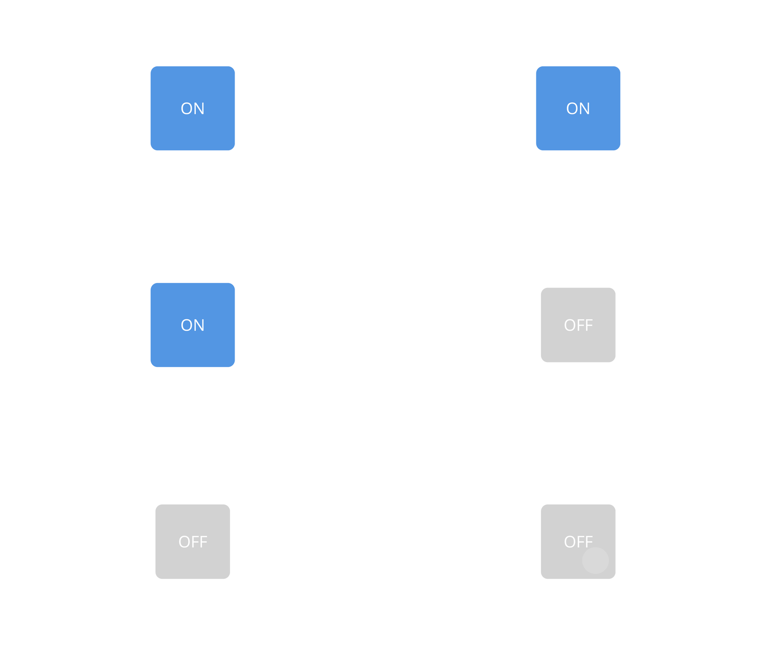
For example, to show the difference between the on and off states of a toggle button, you can:
Switch the material or color of the visual representation of the toggle button.
Attach two different visual representations of the toggle button and switch their visibility.
Attach two different visual representations of the toggle button and transition between the two by animating their Blend Intensity property value.
To learn how to create a toggle button, complete the toggle button tutorial. See Tutorial: Creating a toggle button.
Creating a toggle button with two states
To create a toggle button with two states:
In the Node Tree press Alt and right-click the node where you want to create a toggle button and select either Toggle Button 3D, or Toggle Button 2D.
You can create a 3D node only in a 3D node, such as the Scene node, and a 2D node only in a 2D node.
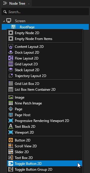
In the Node Tree select the Toggle Button node and in the State Tools click Create State Manager to create a state manager in the Toggle Button node.

In the State Tools, click Create State twice to create two states. Double-click the name of each state and rename the states.
For example, name one state On and the other Off.
The On state defines the state of your application when the toggle button is toggled on, the Off state when the toggle button is toggled off.

In the Node Tree create a visual shape for the Toggle Button node, and set its appearance for when it is in the On state.
For example, if you created a Toggle Button 2D node, add to that node an Image node which represents the indicator that shows when the toggle button is toggled on and off.
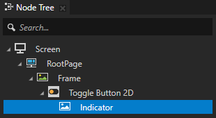
Position the indicator in the Preview and in the State Tools click
 above the On state to save the current appearance to that state.
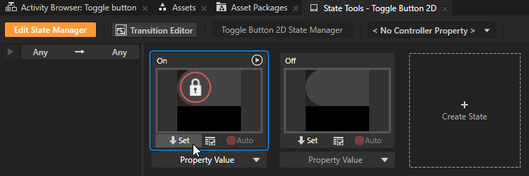
Repeat the previous two steps to create the Off state for the toggle button.

In the State Tools, click the <No Controller Property> dropdown menu and select the Toggle Button > Toggle State property.
In a state manager, the value of the property that you select as the Controller Property defines the conditions when each state in a state group is active.

In the State Tools, set the value of the controller property for each state.
For the On state set the value to 1.
For the Off state leave the value set to 0.
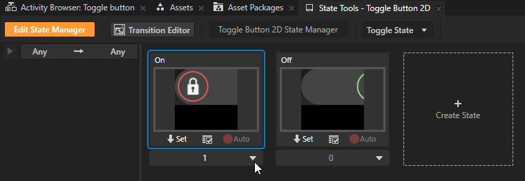
In the State Tools, click Edit State Manager to deactivate the State Tools.
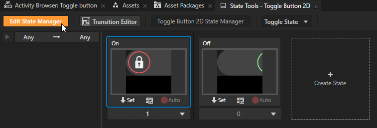
In the Preview when you click the visual representation of the toggle button, you toggle between the states you created, and the appearance of the toggle button changes.
Creating a toggle button with more than two states
To create a toggle button with more than two states:
In the Node Tree press Alt and right-click the node where you want to create a toggle button and select either Toggle Button 3D, or Toggle Button 2D.
You can create a 3D node only in a 3D node, such as the Scene node, and a 2D node only in a 2D node.
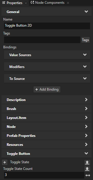
In the Node Tree select the Toggle Button node and in the Properties add and set the Toggle State Count property to as many toggle states you want the toggle button to have.
For example, to create a toggle button with three states, set the Toggle State Count property to 3.
In the Node Tree select the Toggle Button node and in the State Tools click Create State Manager to create a state manager in the Toggle Button node.
In the State Tools click
 as many times as you want to create states, double-click the name of each state, and rename the states.
For example, if you are creating a toggle button with three states name the first state First, the second state Second, and the third state Third. Each state defines the state of your application when the toggle button is in that state.

In the Node Tree create a visual shape for the Toggle Button node, and set its appearance for when it is in the first state.
For example, if you created a 3D toggle button, add a Text Block 3D and set the Text property to First.
In the State Tools click
 above the First state to save the current appearance to that state.
Repeat the previous two steps as many times as you have states in the toggle button. For every state set a different value for the Text property and save the value to a different state.
In the State Tools, click the <No Controller Property> dropdown menu and select the Toggle Button > Toggle State property.
In a state manager, the value of the property that you select as the Controller Property defines the conditions when each state in a state group is active.

In the State Tools set the value of the controller property for each state.
For example, for a toggle button with three states, set the value for the First state to 0, for the Second state to 1, and for the Third state to 2.

In the State Tools, click Edit State Manager to deactivate the State Tools.
In the Preview when you click the visual representation of the toggle button, you toggle between the states you created, and the appearance of the toggle button changes.
Reacting to toggle changes
You can use the Toggle Button triggers to react when the user toggles a toggle button. To learn more about using triggers, see Using triggers.
When you create a Toggle Button node, Kanzi by default adds these triggers to that node:
Name |
Description |
|---|---|
State Toggled |
State Toggled trigger is set off when the toggle state of a Toggle Button node changes. |
Toggled Off |
Toggled Off trigger is set off when a Toggle Button node with two states is toggled off. |
Toggled On |
Toggled On trigger is set off when a Toggle Button node with two states is toggled on. |
To react to toggle changes:
In the Prefabs or Node Tree select the Toggle Button node to whose toggling you want to react.
For example, create a toggle button with two states and select that toggle button. See Creating a toggle button with two states.
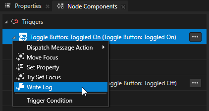
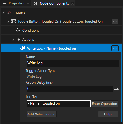
In the Node Components > Triggers press Alt and right-click a Toggle Button trigger, select the action that you want to set off, and configure that action.
For example, in the Toggle Button: Toggled On trigger create a Write Log action and set Log Text to the message that you want to write to the Log window when the user toggles on the toggle button.
To learn more about the Write Log action, see Using Write Log action.
Using a binding to update the toggle state
To update the toggle state of a Toggle Button node with a binding, use a to-source or two-way binding. When you toggle a Toggle Button, that Toggle Button internally overrides any one-way binding that targets the Toggle State property. See Bindings.
For example, to use a to-source binding to update the toggle state:
Create a Toggle Button node whose toggle state you want to update with a binding.
For example:
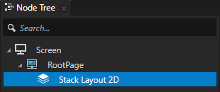
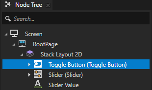
In the Node Tree, create a Stack Layout 2D node.
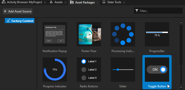
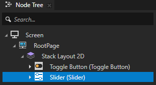
From the Asset Packages > Factory Content, drag the Toggle Button to the Node Tree and drop it on the Stack Layout 2D node. See Factory Content assets.
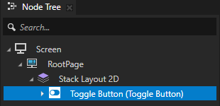
Create a control to which you want to bind the toggle state of the Toggle Button node.
For example:
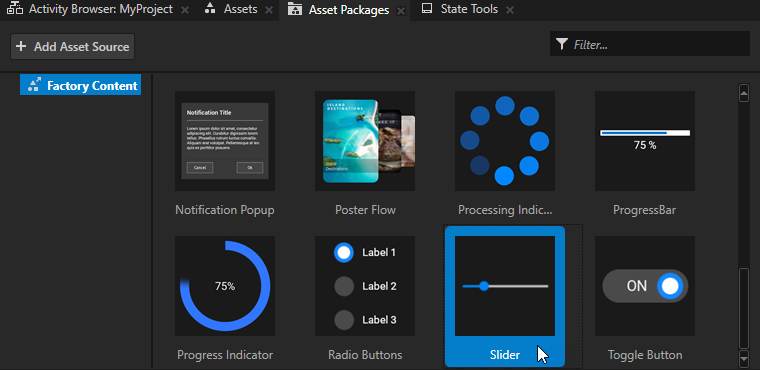
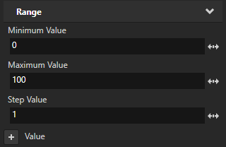
From the Asset Packages > Factory Content, drag the Slider to the Node Tree and drop it on the Stack Layout 2D node. In the Properties, add and set the lowest and highest value of the slider. See Using the slider from the Factory Content.
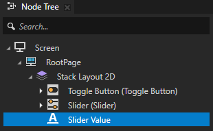
(Optional) In the Stack Layout 2D node, create a Text Block 2D node that shows the slider value.
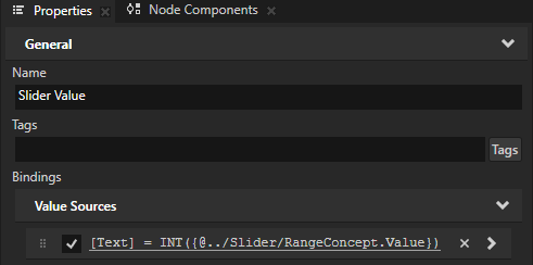
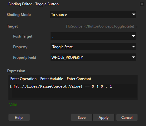
Select the Toggle Button node. In the Properties, click + Add Binding and in the Binding Editor, set:
Binding Mode to To source
Push Target to .
Property to Toggle Button > Toggle State
Expression to the expression that returns the value to which you want to set the toggle state.
For example, set it to
{@../Slider/RangeConcept.Value} == 0 ? 0 : 1This binding uses the conditional operator to toggle the Toggle Button:
Off when the value of the Slider is zero.
On when the value of the Slider is not zero.
See ? (conditional).
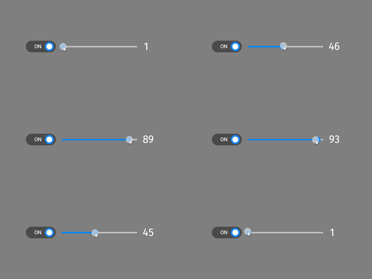
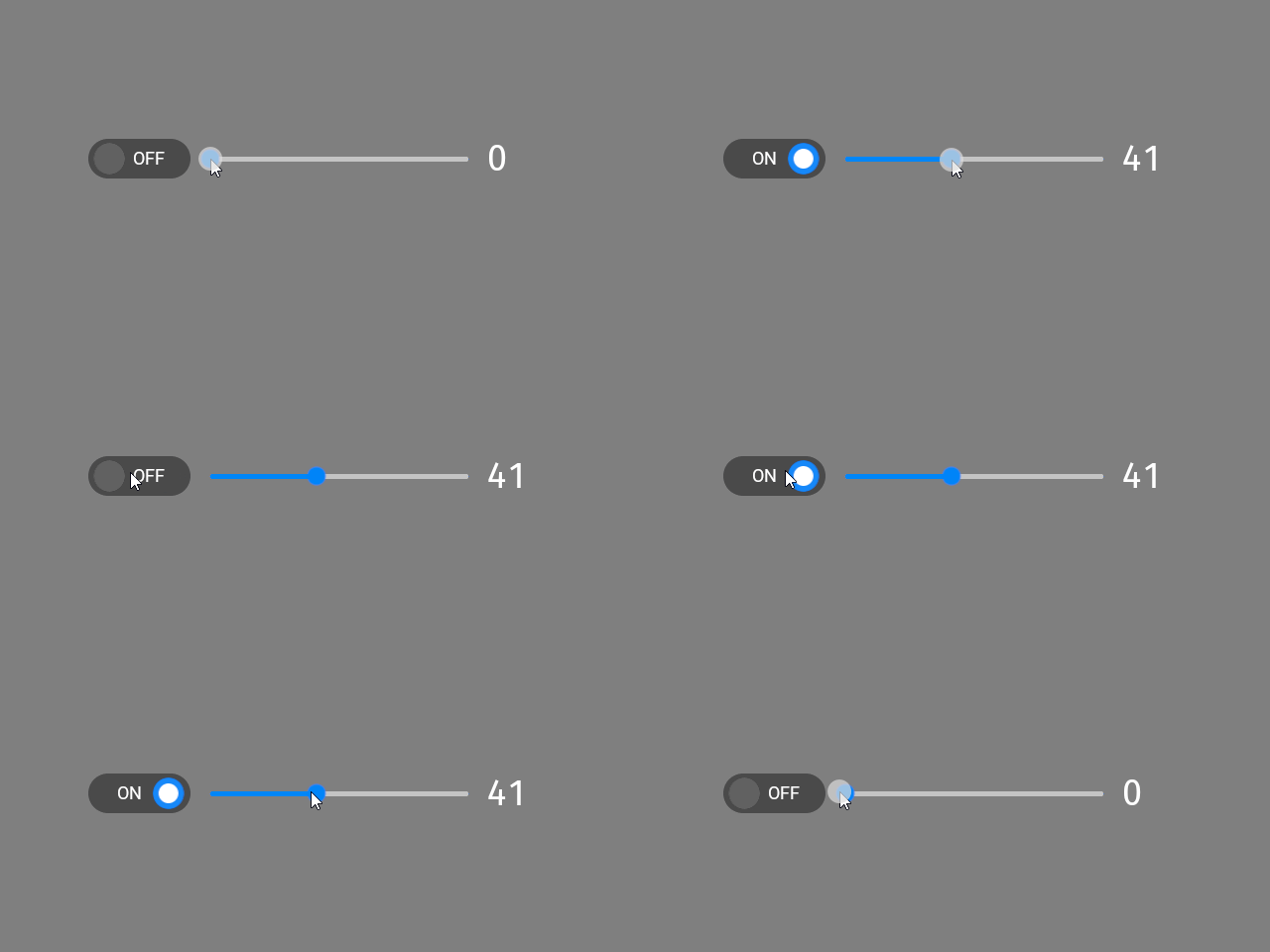
Now, when in the Preview you:
Adjust the slider to a value larger than zero, Kanzi toggles on the toggle button.
Adjust the slider to zero, Kanzi toggles off the toggle button.
Toggle the toggle button, the slider keeps its value.
This enables the user to both adjust the value of a setting and quickly enable and disable the setting. For example, you can create a volume control.
Controlling whether a Toggle Button node is in use
To control whether a Toggle Button node is in use, use the Input > Enabled property. A disabled Toggle Button node does not produce user events, such as button presses. When you disable a Toggle Button node, Kanzi preserves the toggled state of that Toggle Button node.
When you disable the Enabled property of a node, you effectively disable that node and its descendant nodes in the same overlay focus scope.
To observe whether a node is effectively enabled, use the Input > Effectively Enabled property in a state manager or a binding. For example, to visually indicate to the user whether a node is in use, create a state manager and use the Effectively Enabled property as its controller property.
Enabling the double-click gesture for a Toggle Button node
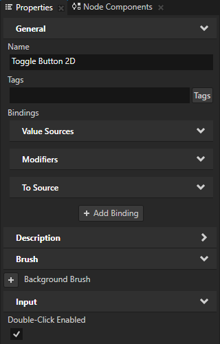
Use the double-click gesture to enable users to double-click or double-tap toggle buttons in your Kanzi application. Use the Multi-Click trigger to react to the double-click gesture. For example, you can change the appearance of a Toggle Button node when the user double-clicks or double-taps that node.
To enable the double-click gesture for a Toggle Button node:
In the Node Tree or Prefabs select the Toggle Button node for which you want to enable the double-click gesture and in the Properties add and enable the Input > Double-Click Enabled property.
When you enable the Double-Click Enabled property, Kanzi installs in the Toggle Button node a multi-click manipulator that generates double-click messages.

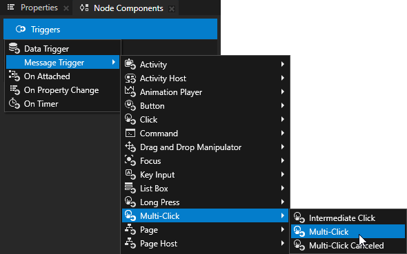
In the Node Components press Alt and right-click Triggers and select Message Trigger > Multi-Click > Multi-Click.
In the Node Components > Triggers press Alt and right-click the Multi-Click trigger, select an action, and configure the action. See Using triggers and Actions and messages reference.
Setting the appearance of a Toggle Button 2D node
To set the appearance of 2D nodes:
You can fill 2D nodes with a solid color, a texture, or a material. See Adjusting the appearance of 2D nodes.


You can apply a post-processing effect to a 2D node. See Effects for 2D nodes.


You can rotate a 2D node around all three axes to create a 3D perspective effect. See Creating a 3D perspective effect for 2D nodes.

You can apply custom rendering to 2D nodes to create post-processing effects. See Applying custom rendering to 2D nodes.
You can render a 2D node as pixel-perfect. See Rendering pixel-perfect 2D nodes.
Using the Toggle Button 3D node in the API
For details, see the ToggleButton3D class.
Using the Toggle Button 2D node in the API
For details, see the ToggleButton2D class.
Toggle Button property types and messages
For lists of the available property types and messages for the Toggle Button nodes, see Toggle Button 2D and Toggle Button 3D.
See also
Tutorial: Creating a toggle button