Layout control nodes
Use layout control nodes to arrange content. Layout control nodes are especially useful for content that is dynamically added or removed during the use of a Kanzi application, or that is loaded from external sources, for example, from files in a directory.
Arrange items in a table with Grid Layout nodes. Learn about the Grid Layout nodes > 
|
Place items next to each other with Stack Layout nodes. Learn about the Stack Layout nodes > 
|
Arrange items in rows with Flow Layout nodes. Learn about the Flow Layout nodes > 
|
Arrange items along a trajectory with the Trajectory Layout nodes. Learn about the Trajectory Layout nodes > 
|
Arrange items relative to each other along the sides of a layout with the Dock Layout nodes. Learn about the Dock Layout nodes > 
|
Present content in a UI control as a single item with the Content Layout nodes. Learn about the Content Layout nodes > 
|
Universal layout properties
To position items in your Kanzi applications you can use these transformation types:
Layout transformation transforms the item before it applies the layout pass.
Render transformation transforms the item after it applies the layout pass, but before it renders the item.
Kanzi applies the render transformation after applying the layout transformation, and does not affect the layout calculations. For example, this allows you to animate nodes within a layout without causing the layout recalculation.
Layout control nodes, such as Stack Layout and Grid Layout nodes, apply their own transformations on all immediate child nodes who in their part define their own layout considering their own child nodes, layout transformations, margins and alignments.
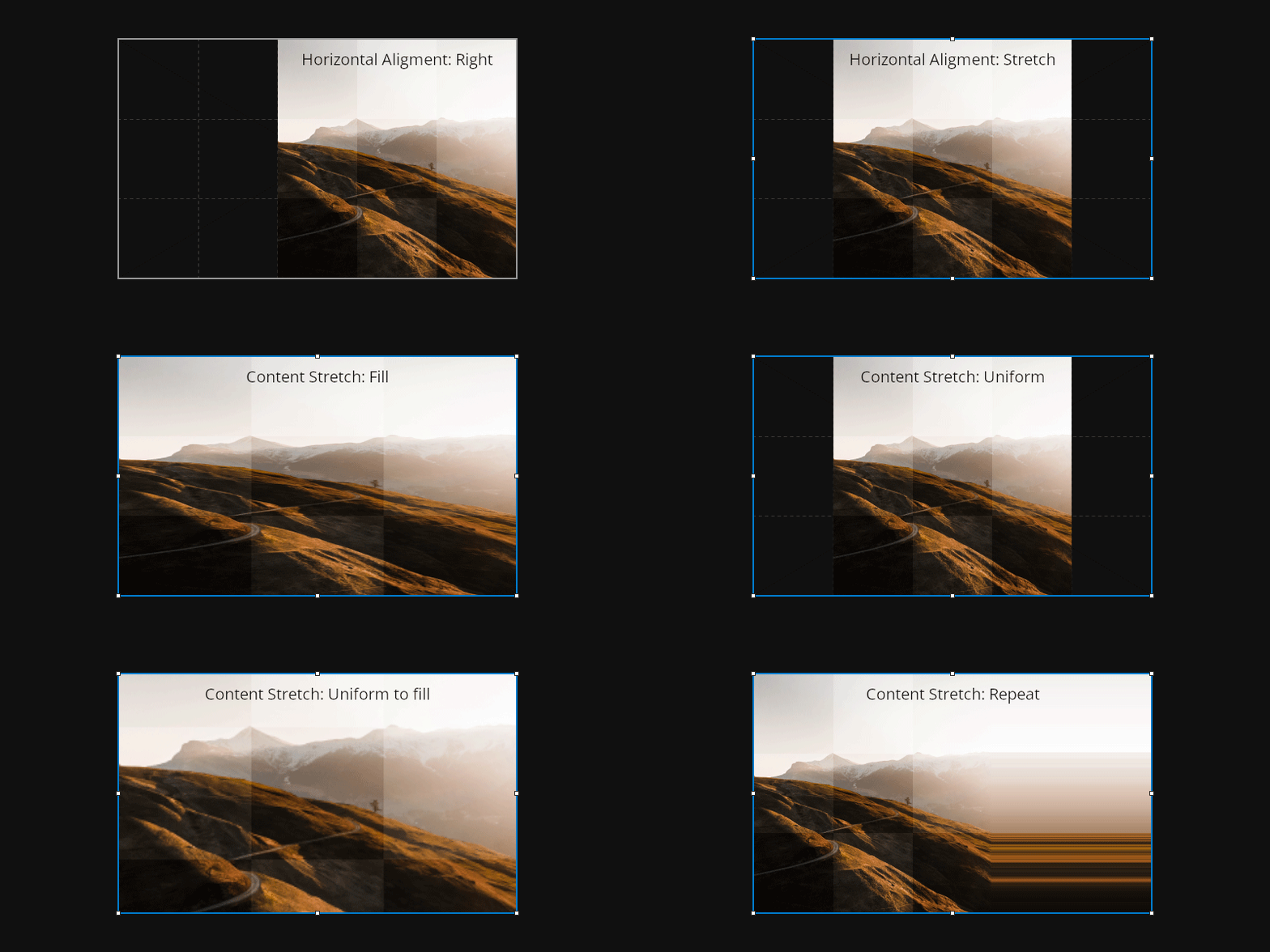
Alignment defines the gravity of the layout. For example, set the Horizontal Alignment property to Right to align the node to the right side of its parent layout. By setting alignment properties to Stretch, the node stretches to the dimensions of its parent layout. Use the Content Stretch property to specify how a layout handles its content.

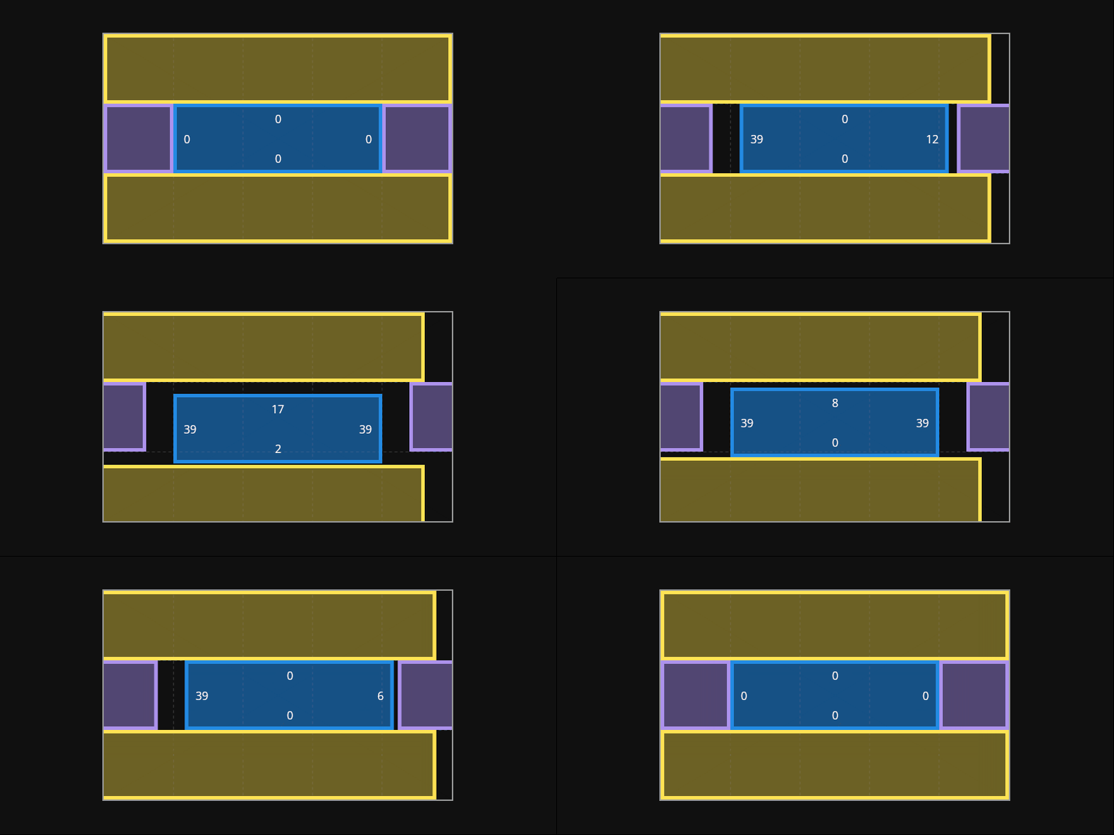
Margin enforces the object spacing relative to the border of its parent layout. For example, set the Horizontal Margin property to set the spacing on the left and right sides of the node in relation to its parent layout.

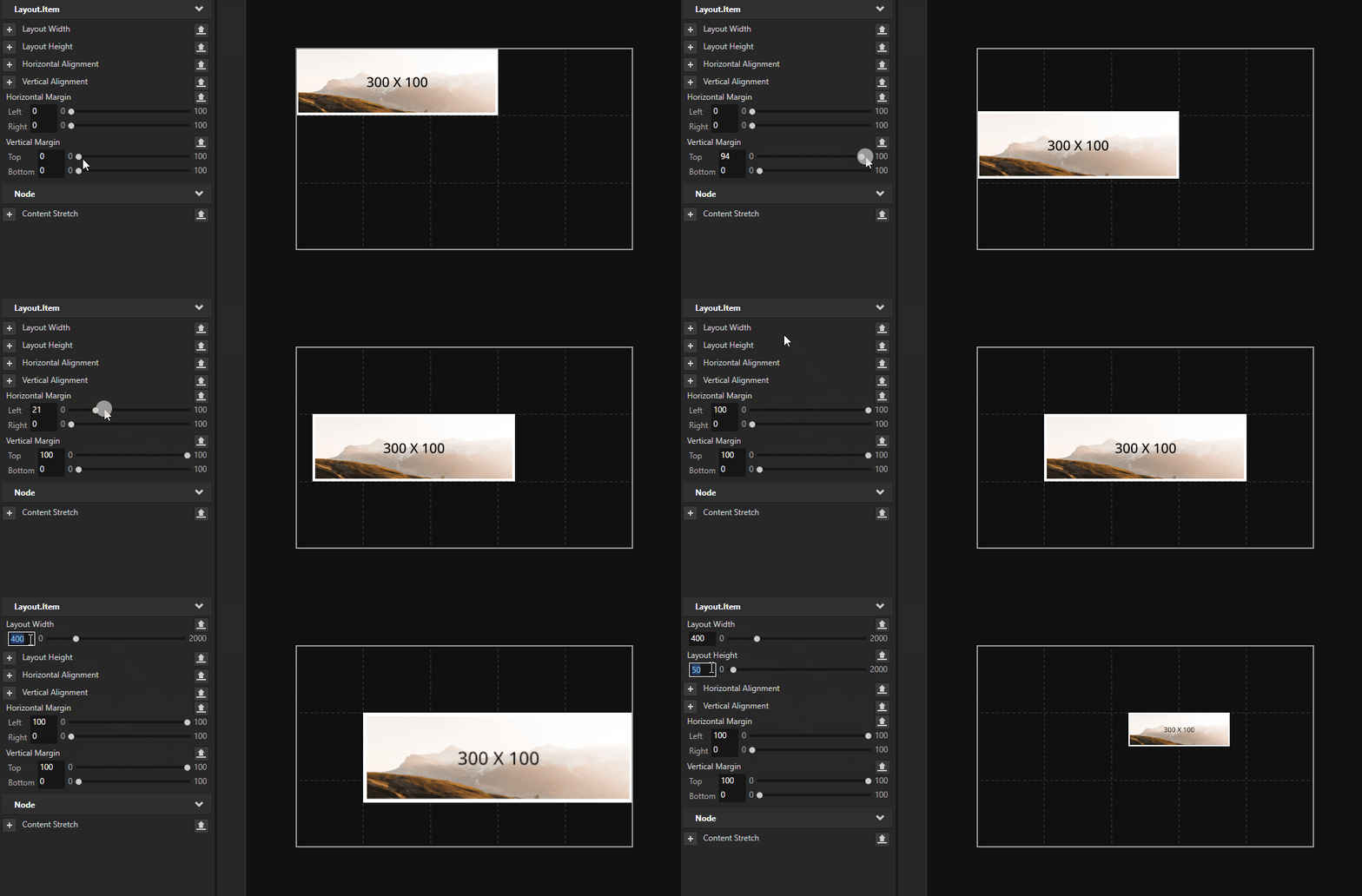
Layout properties override the bounding box size of a node. The default layout size is defined by the size of the node based on its bounding box and margins.

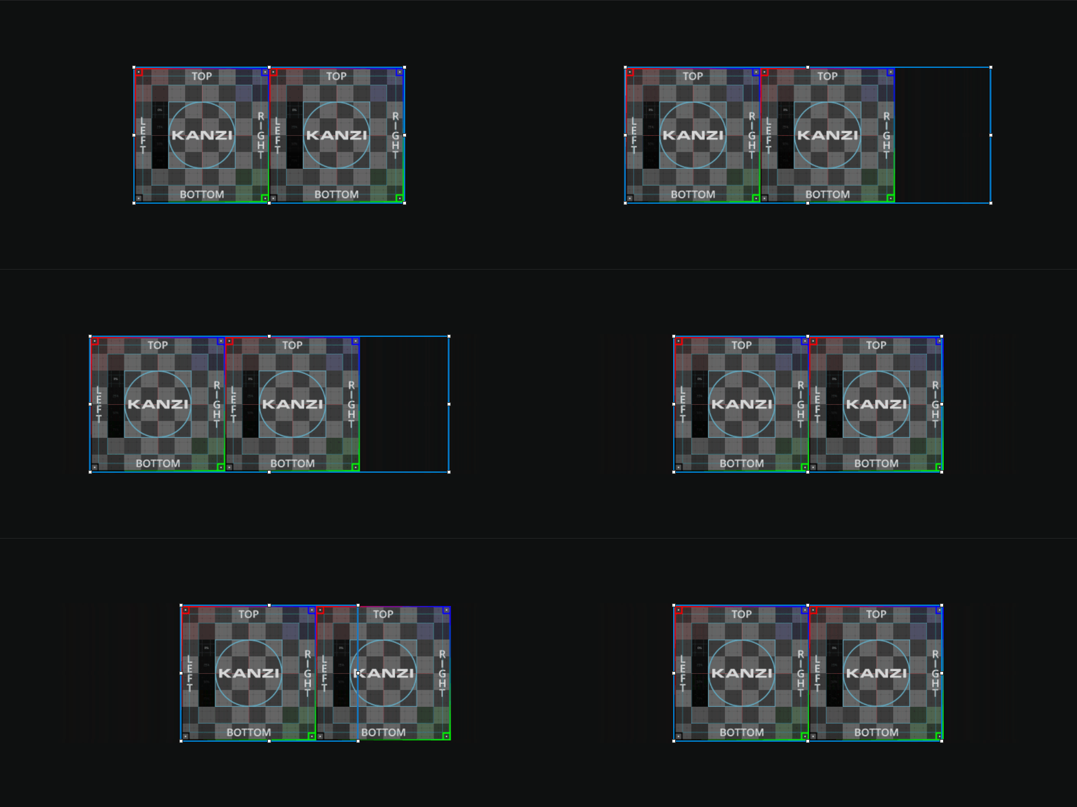
For example, a Stack Layout node set in direction on the x axis places its two child nodes next to each other based on their dimensions (bounding boxes). By using the Layout Width property you can override the width of the bounding box: a value smaller than the size of the node makes the node overlap, and a value larger than the size of the node extends the space between the two nodes.

After all the layout tasks are done, Kanzi applies the final transformations from the parent nodes. The RootPage under the Screen node has special rules for its layout if it is a Viewport 2D or an Empty Node 2D. It inherits the defined screen size, unless defined by the layout properties.
See also
Using the Content Layout nodes
Using the Trajectory Layout nodes
Optimizing the rendering of layouts