Step 2 - Control UI elements
In this step of the tutorial you add widgets to the cluster UI and learn:
How to use the Activity nodes to create a structure that enables you to show the same widget presented in a different layout, depending on the application state.
How to use Activity controller properties to control which node is active in an Activity Host node.
Create the structure for the widgets
In this section you learn how to use the Activities to create a structure that enables you to show the same widget presented in a different layout, depending on the cluster mode:
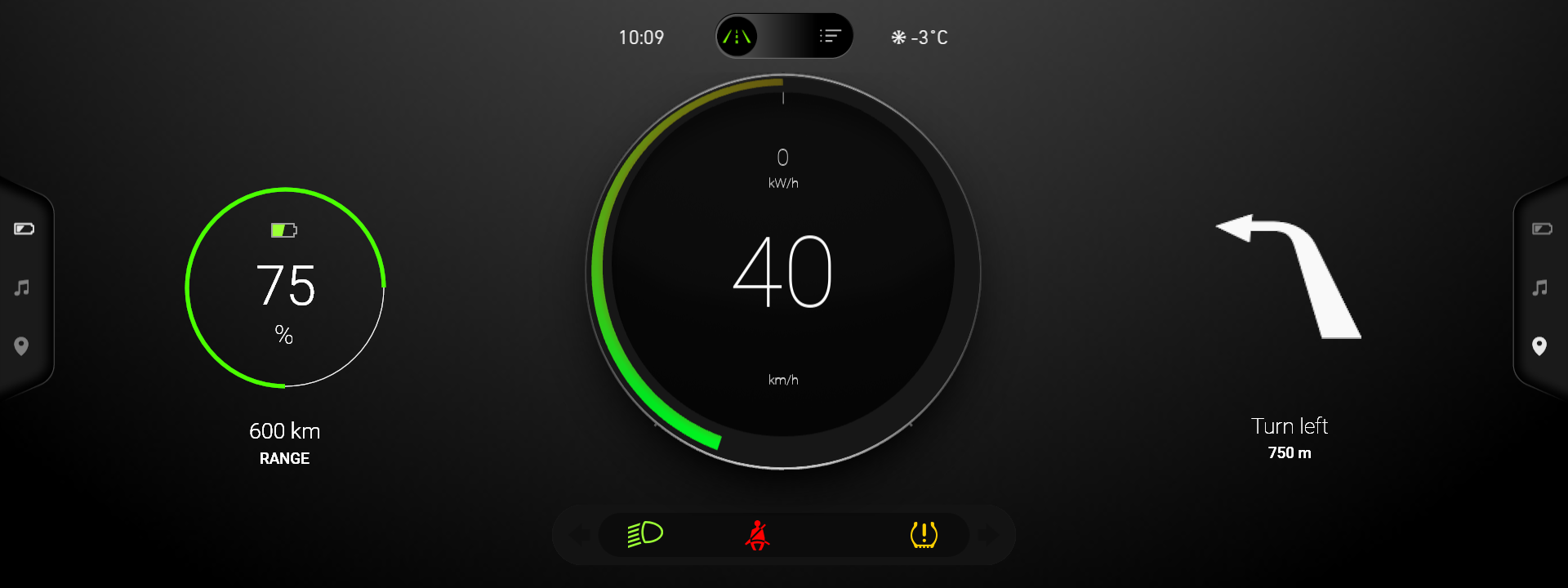
Maximized widget in the Drive mode
Minimized widget in the Browse mode
To create the structures for the widgets:
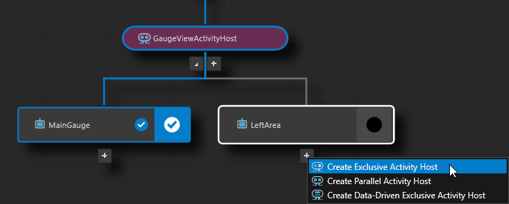
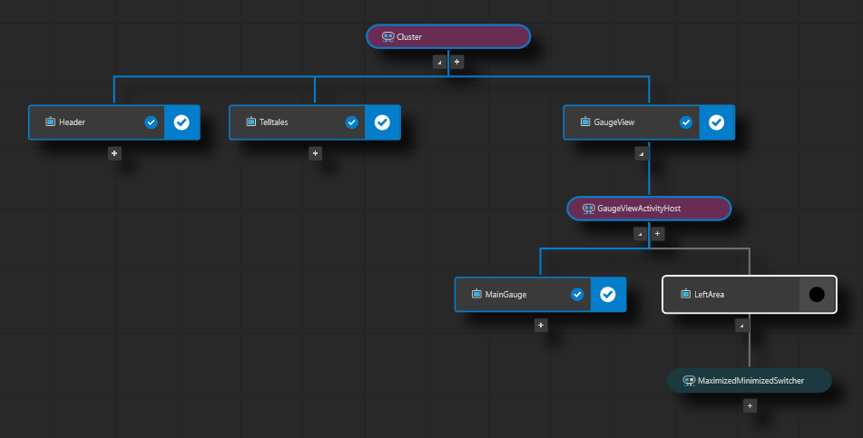
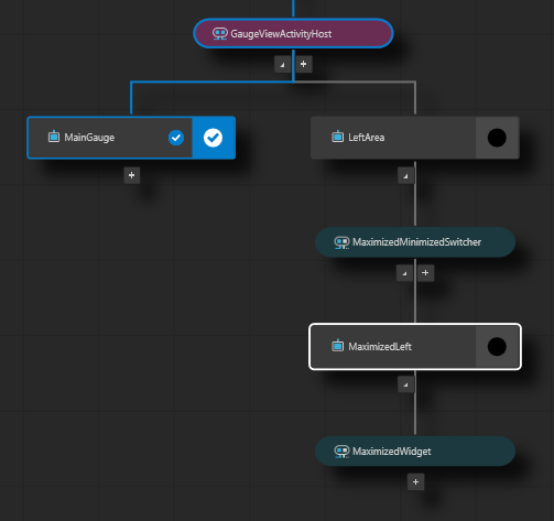
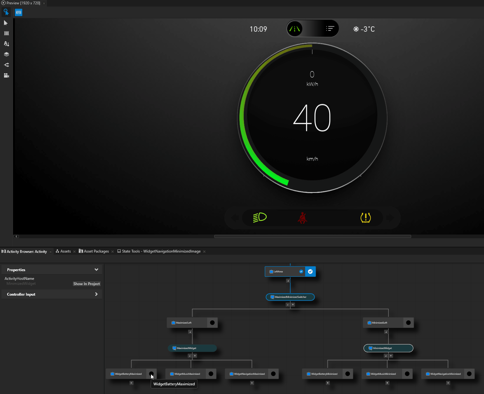
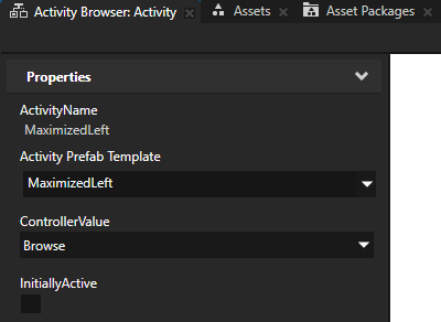
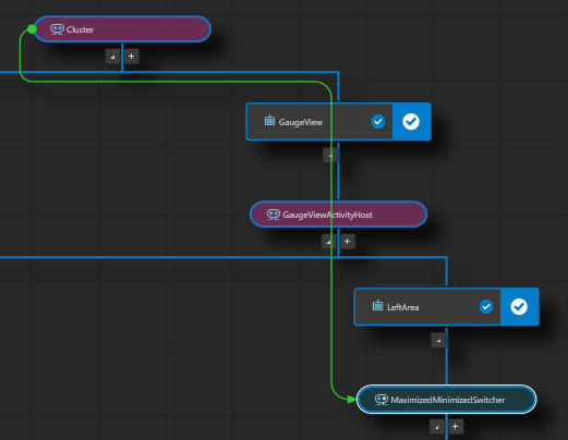
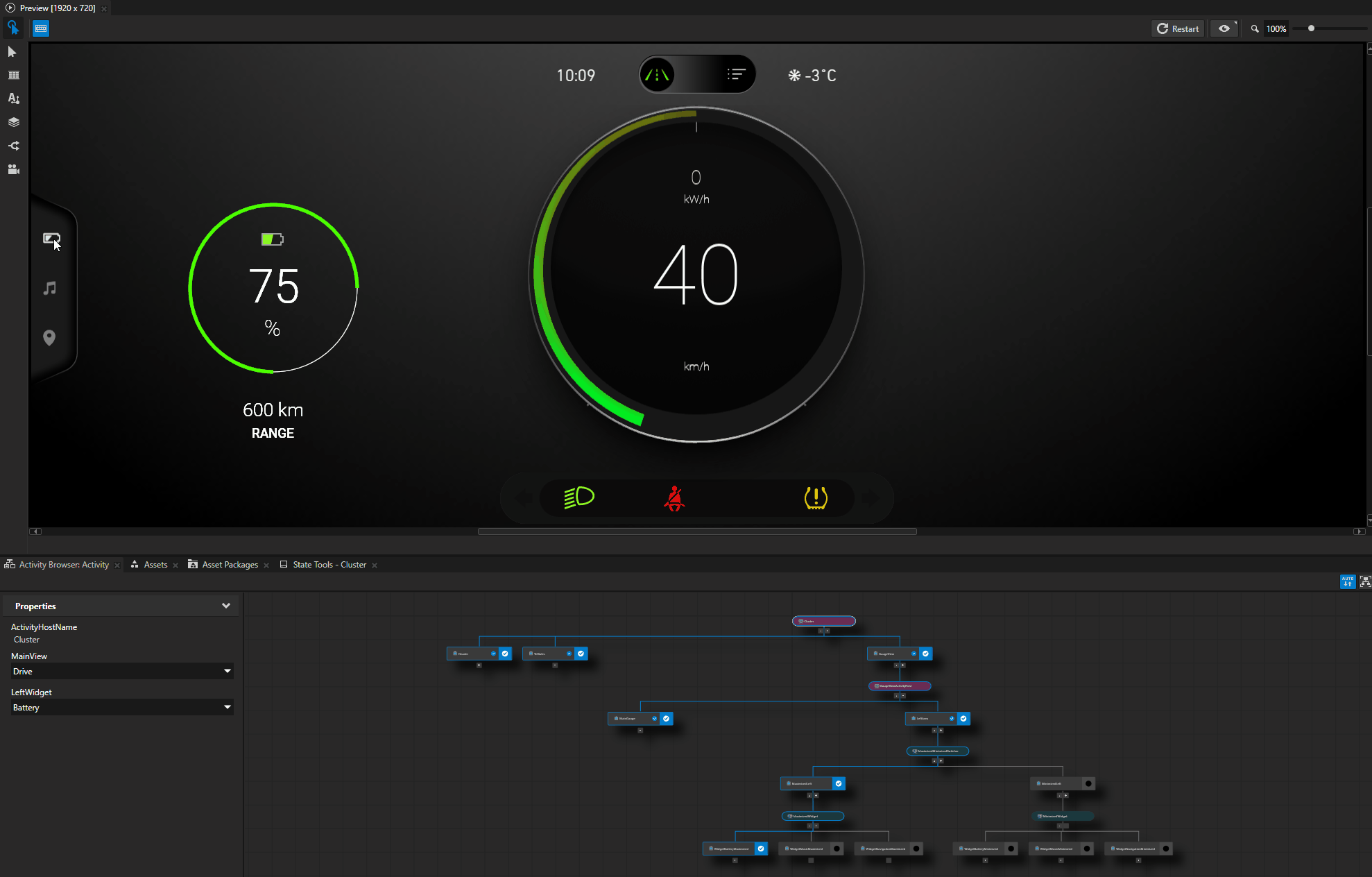
In the Activity Browser, in the GaugeViewActivityHost Activity Host:
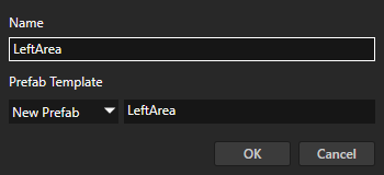
Add an Activity and name it and its prefab LeftArea.
You use the LeftArea Activity to show the widgets on the left side of the main gauge.
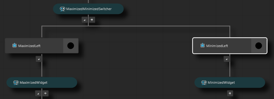
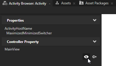
In the LeftArea Activity, create an Exclusive Activity Host named MaximizedMinimizedSwitcher.
You use this Exclusive Activity Host to show either large widgets in the Drive mode or small widgets in the Browse mode.
An Exclusive Activity Host can have only one of its child Activities active at a time. In the Activity Browser Exclusive Activity Hosts are teal.
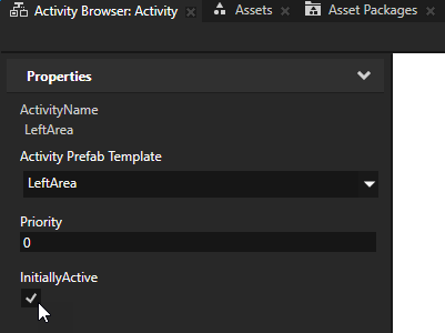
In the Activity Browser, select the LeftArea Activity and in the side panel set the InitiallyActive property to enabled.
This way you set the widgets in the left area to always be visible, regardless of the cluster mode.
In the Activity Browser, create the structure for the widgets when they are maximized:
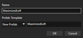
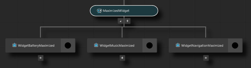
In the MaximizedMinimizedSwitcher Activity Host, add an Activity named MaximizedLeft, and inside it add an Exclusive Activity Host named MaximizedWidget.
You use an Exclusive Activity Host because you want to show in the left area only one maximized widget at a time.
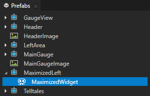
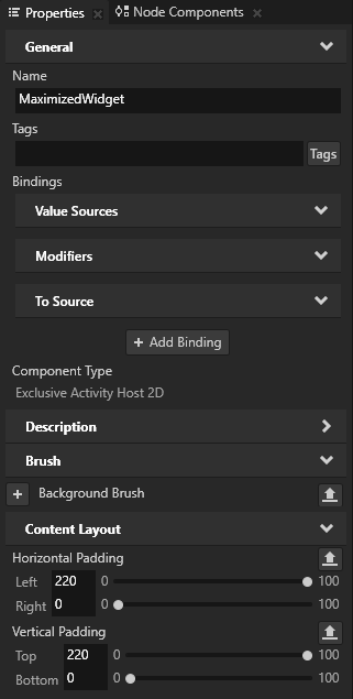
In the Prefabs, select the MaximizedLeft > MaximizedWidget node and in the properties add and set:
Horizontal Padding property Left property field to 220
Vertical Padding property Top property field to 220
For the purpose of this tutorial you use these properties to set the absolute position of maximized widgets in the cluster. In a real project, the best way to position such UI elements is to use one of the Kanzi layouts.
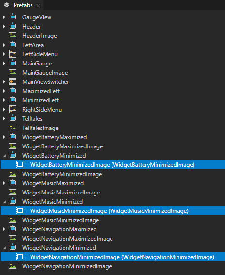
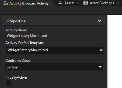
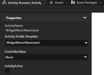
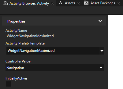
In the Activity Browser, in the MaximizedWidget Activity Host add these Activities:
WidgetBatteryMaximized
WidgetMusicMaximized
WidgetNavigationMaximized
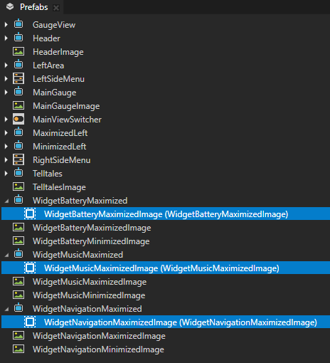
In the Prefabs, drag:
WidgetBatteryMaximizedImage to the WidgetBatteryMaximized prefab
WidgetMusicMaximizedImage to the WidgetMusicMaximized prefab
WidgetNavigationMaximizedImage to the WidgetNavigationMaximized prefab
Tip
The Activity Browser simulates the activation of Activities in your application. To see the content of an Activity in the Preview, you can activate an Activity in the Activity Browser. In the Activity that you want to activate, click
 .
.In the Activity Browser, active Activities are marked with
 and their border is blue.
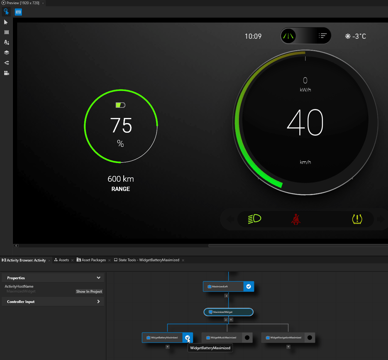
Create the structure for the widgets when they are minimized:
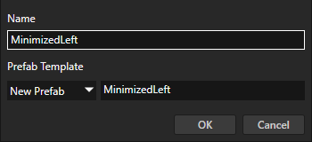
In the MaximizedMinimizedSwitcher Activity Host, add an Activity named MinimizedLeft, and inside it add an Exclusive Activity Host named MinimizedWidget.
You use an Exclusive Activity Host because you want to show in the left area only one minimized widget at a time.
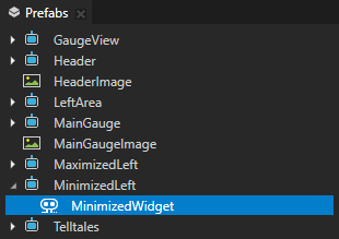
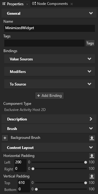
In the Prefabs, select the MinimizedLeft > MinimizedWidget node and in the properties add and set:
Horizontal Padding property Left property field to 200
Vertical Padding property Top property field to 610
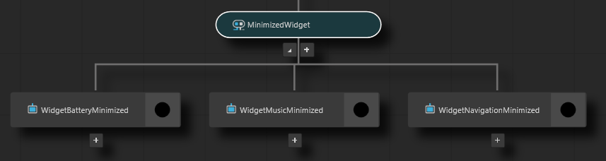
In the Activity Browser, in the MinimizedWidget Activity Host add these Activities:
WidgetBatteryMinimized
WidgetMusicMinimized
WidgetNavigationMinimized
In the Prefabs, drag:
WidgetBatteryMinimizedImage to the WidgetBatteryMinimized prefab
WidgetMusicMinimizedImage to the WidgetMusicMinimized prefab
WidgetNavigationMinimizedImage to the WidgetNavigationMinimized prefab
To see the widgets in the Preview, in the Activity Browser click in the Activity that you want to activate.
Control activation of nodes with a controller property
In this section, you learn how to use activity controller properties to control which node is active in an Activity Host.
To control activation of nodes with a controller property:
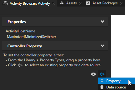
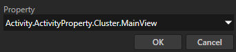
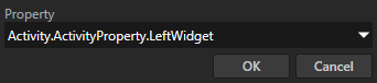
In the Activity Browser, select the MaximizedMinimizedSwitcher Activity Host, in the side panel in the Controller Property click
 , select Property, and set the Property to the Activity.ActivityProperty.Cluster.MainView property.
This way you set the property that you want to use to control which Activities an Activity Host activates.
An Activity node takes the value of a controller property from the closest ancestor node that has the same controller property that you set in that Activity node. In this case this is the Cluster node.
Tip
When you set a controller property, the Activity Browser assigns the values from that controller property to the ControllerValue property of child Activities in that Activity Host. In an Activity node, the value of the ControllerValue property sets when an Activity Host activates that Activity.
If the number of value options in a controller property and the number of child Activities do not match, you must set manually in each child Activity the value of the ControllerValue property.

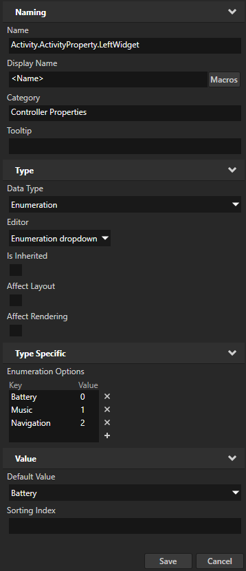
In the Library > Property Types > Activity > ActivityProperty press Alt and right-click, select Property Type, and in the New Property Type window set:
Name to Activity.ActivityProperty.LeftWidget
Category to Controller Properties
Data Type to Enumeration
Enumeration Options to:
Key
Value
Battery
0
Music
1
Navigation
2
You use this Activity Controller Property to control which Activity is active in the MaximizedWidget and MinimizedWidget Activity Hosts.
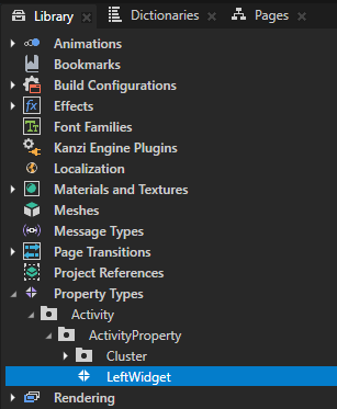
In the Node Tree, select the Cluster node, in the Properties add the Controller Properties > Activity.ActivityProperty.LeftWidget property.
An Activity node takes the value of a controller property from the closest ancestor node that has the same controller property that you set in that Activity node. In this case this is the Cluster node.
After you add a controller property to an Activity Host, you can set the value of that property in the Activity Browser in the side panel.
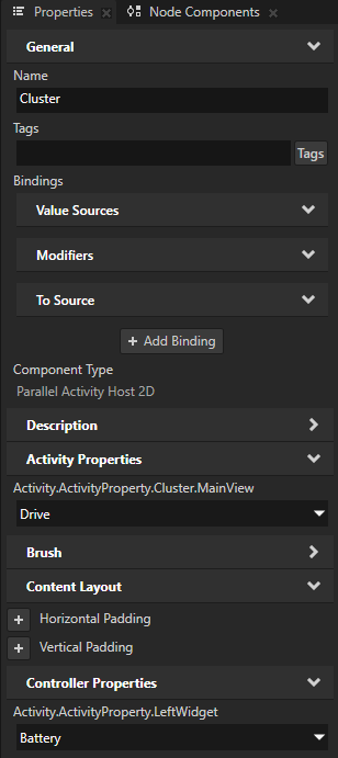
In the Activity Browser, select the MaximizedWidget Activity Host, in the side panel click
, and set the Property to the Activity.ActivityProperty.LeftWidget property.This way you set the MaximizedWidget Exclusive Activity Host to use the Activity.ActivityProperty.LeftWidget property to show a widget when the cluster is in the Drive mode.

The Activity Browser assigns the values from that controller property to the ControllerValue property of child Activities in that Activity Host.
Repeat the previous step for the MinimizedWidget Exclusive Activity Host.
This way you set the cluster to show the same widget in the Browse mode as in the Drive mode, but the minimized version.
Tip
To see in the Activity Browser which Activity Host sets the value of a controller property, select an Exclusive Activity Host and in the side panel click
 .
.
Create a UI element to control the activation of widget Activities.
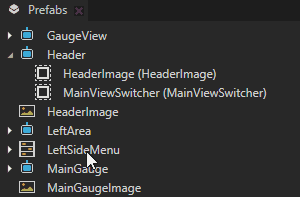
In the Prefabs, drag the LeftSideMenu Toggle Button Group prefab to the Header prefab.
The LeftSideMenu Toggle Button Group contains Toggle Buttons that you can use to control the activation of widget Activities.
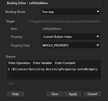
In the Prefabs, select the LeftSideMenu prefab. In the Properties, click + Add Binding, and in the Binding Editor set:
Binding Mode to Two way
Property to Current Button Index
Expression to
{#Cluster/Activity.ActivityProperty.LeftWidget}Click Save.
This binding enables the Toggle Buttons in the LeftSideMenu Toggle Button Group to get and set the value of the Activity.ActivityProperty.LeftWidget property in the Cluster Activity Host. This way the Toggle Buttons control the state of Activities in the MaximizedWidget and MinimizedWidget Activity Hosts.
You can now control which widget is active on the left-hand side in these ways:
In the Preview, click the Toggle Buttons in the LeftSideMenu Toggle Button Group
In the Activity Browser, select the Cluster Activity Host and in the side panel change the value of the LeftWidget property
What’s next?
In this tutorial you learned the basics of how to work with the Kanzi Activity system. You can repeat this entire step of the tutorial to create the structure for the widgets in the right-hand area of the cluster UI. Here are some useful tips for creating that structure:
To keep the structure organized, use the names that indicate that the item is used in the right-hand side of the cluster UI.
For example, name:
The top-level Activity for the right-hand side RightArea
The Activity Controller Property RightWidget
In the MaximizedWidget and MinimizedWidget when you create Activities for widgets, use the same prefabs that you created for the activities in the left-hand area. When you create an Activity, you can select an existing prefab using the dropdown menu.
Set the position of widgets:
In the MaximizedRight > MaximizedWidget node, add and set:
Horizontal Padding property Left property field to 1450
Vertical Padding property Top property field to 220
In the MinimizedRight > MinimizedWidget node, add and set:
Horizontal Padding property Left property field to 1340
Vertical Padding property Top property field to 610
In the RightSideMenu prefab, set the Expression to:
{#Cluster/Activity.ActivityProperty.RightWidget}
The completed tutorial project has the Activity structure for both the left- and right-hand areas. You can find the completed Kanzi Studio project in the <KanziWorkspace>/Tutorials/Activity/Completed directory.
To continue learning how to use the Kanzi Activity system, complete:
See also
To learn more about the Activity system, see Activities.
To learn more about Kanzi layouts, see Layout control nodes.
To learn more about Toggle Button Group, see Using the Toggle Button Group nodes.