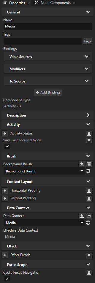
Step 2 - Visualize the focus
In this step, you visualize the key focus in application lists by changing the appearance of:
The list item that has the key focus.
The list that contains the item with key focus.
Finally, you create key navigation for the lists on the Media screen.
Set the appearance of a focused node
In this section, you visualize focus in application lists by changing the appearance of the focused list item.
To set the appearance of a focused node:
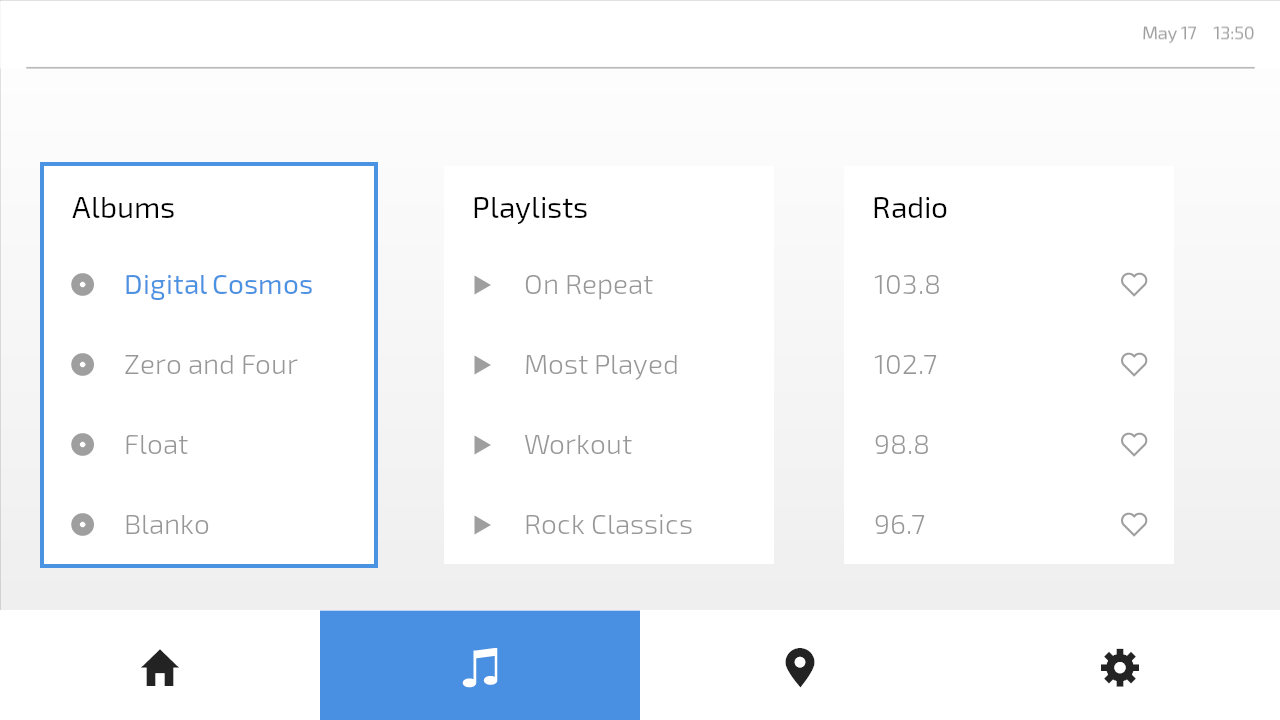
In the Preview, go to the Media screen.
The Media screen contains Grid List Box nodes, which are focus scopes by default. This means that when the key focus moves to a List Box node, that node forwards the focus to its first focusable child node. In these List Box nodes, each list item is a Button and Button nodes are focusable by default.
While you can move the key focus between the list items, you cannot yet see where the key focus is.
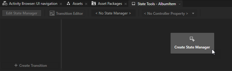
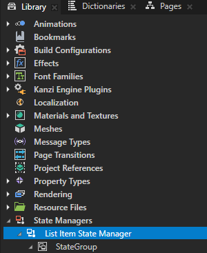
In the Prefabs, select the AlbumItem prefab. In the State Tools, click Create State Manager.
Kanzi Studio creates a state manager and assigns it to the AlbumItem prefab.
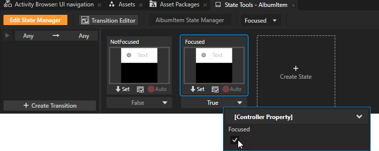
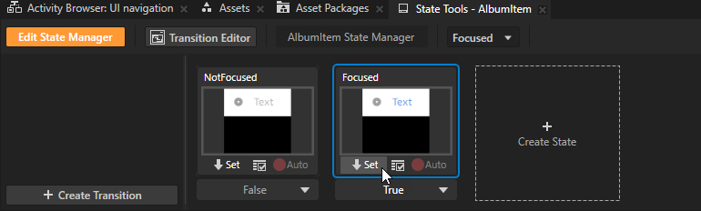
Click Create State twice to create two states and name them NotFocused and Focused.
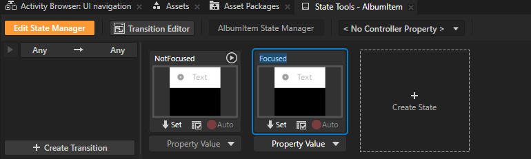
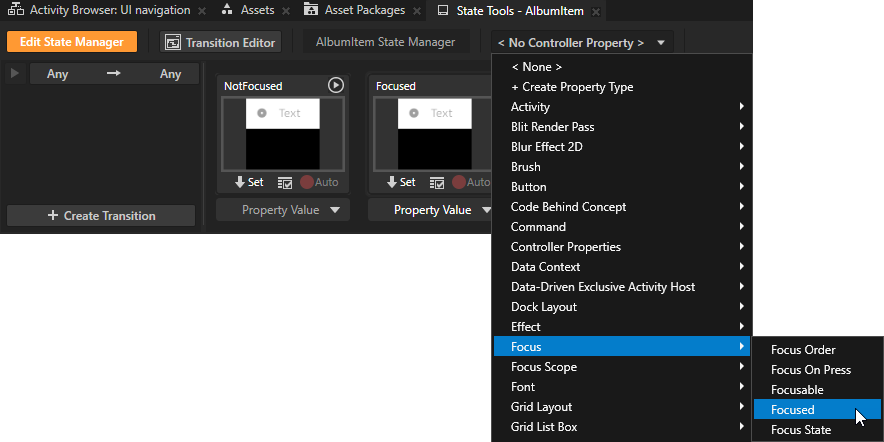
Click <No Controller Property> and select the Focus > Focused property.
The read-only Focused property indicates whether a node is the key focus node. The key focus node is the node that currently receives key input. A Kanzi application can have only one key focus node at a time.
In the Focused state, set the value of the Focused controller property to True.
You use this state to define the appearance of the key focus node.
Define the appearance of the node in the Focused state:
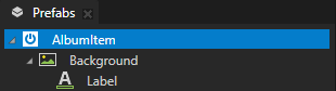
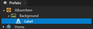
In the Prefabs, select the AlbumItem > Background > Label node.
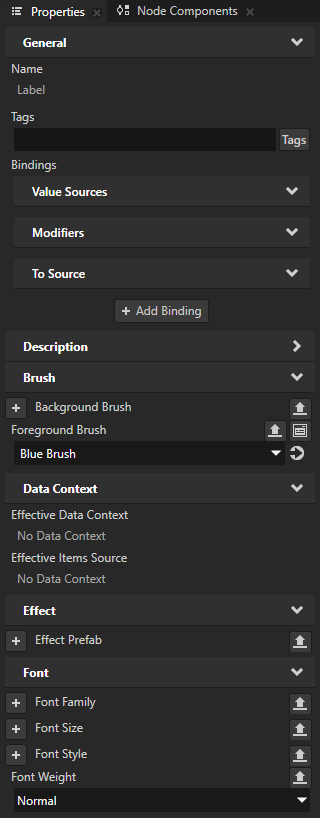
In the Properties, add and set:
Foreground Brush to Blue Brush
Font Weight to Normal
In the State Tools in the Focused state, click Set to save the value of these properties to that state.
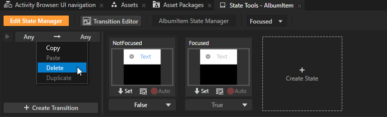
In the State Tools, right-click Any -> Any and select Delete.
You remove the default transition so that the state manager moves between the NotFocused and Focused states instantly.
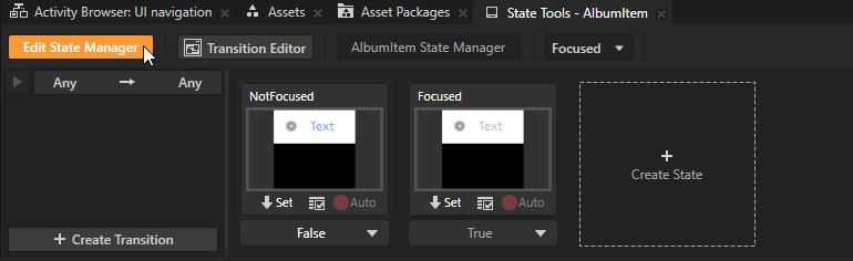
Click Edit State Manager to deactivate the state tools.
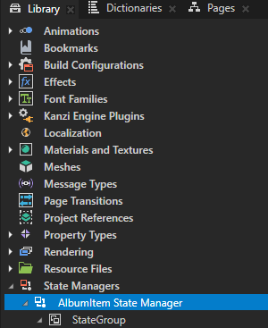
In the Library > State Managers, rename the AlbumItem State Manager to List Item State Manager.
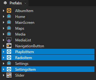
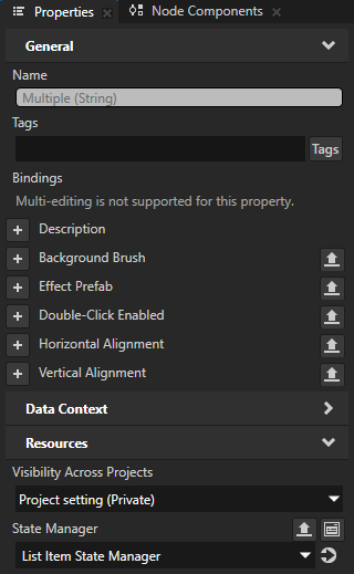
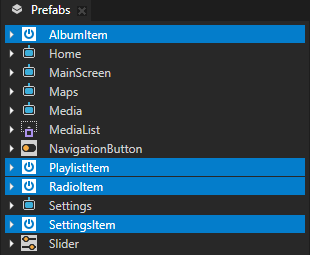
In the Prefabs, select the PlaylistItem, RadioItem, and SettingsItem prefabs. In the Properties, add the Resources > State Manager property and set it to the List Item State Manager.
This way, you set all lists in your application to use the List Item State Manager to change the appearance of the item that has the key focus.
When you select the Preview window, you can use these default keyboard keys to browse the items in the lists:
Tab to move the key focus to the next focusable item
Shift Tab to move the key focus to the previous focusable item
↑ (Up) and ↓ (Down) to scroll the items
Home and End to go to the first and last item
Page Up and Page Down to go to the beginning and end of the visible area of the list
Kanzi by default synchronizes the item selection and key focus in a List Box node. When the key focus moves to a list item, Kanzi sets that list item as selected.
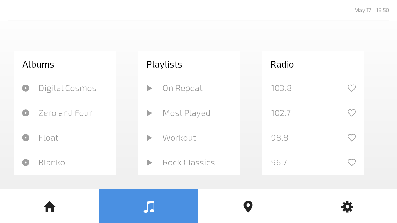
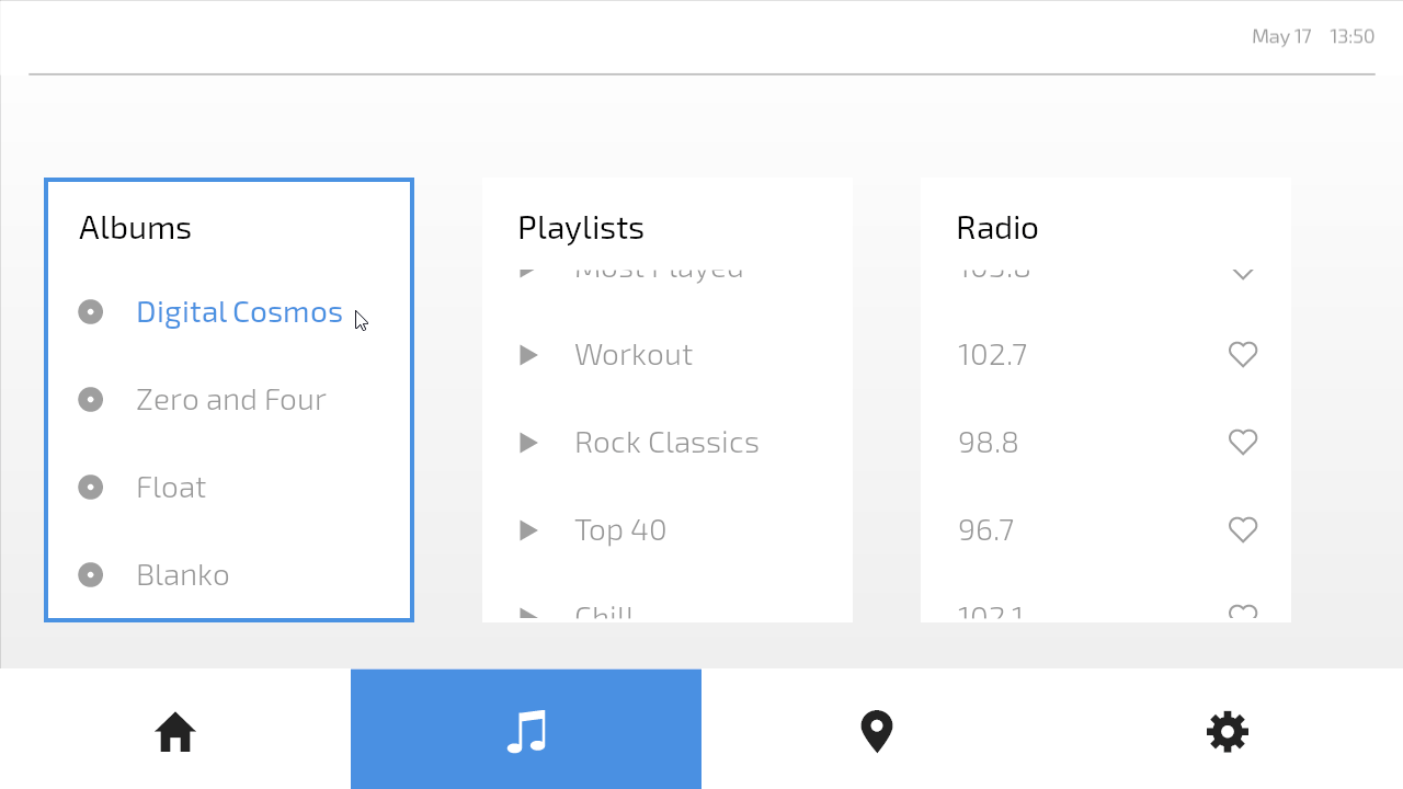
Now, when you move the key focus between the list items:
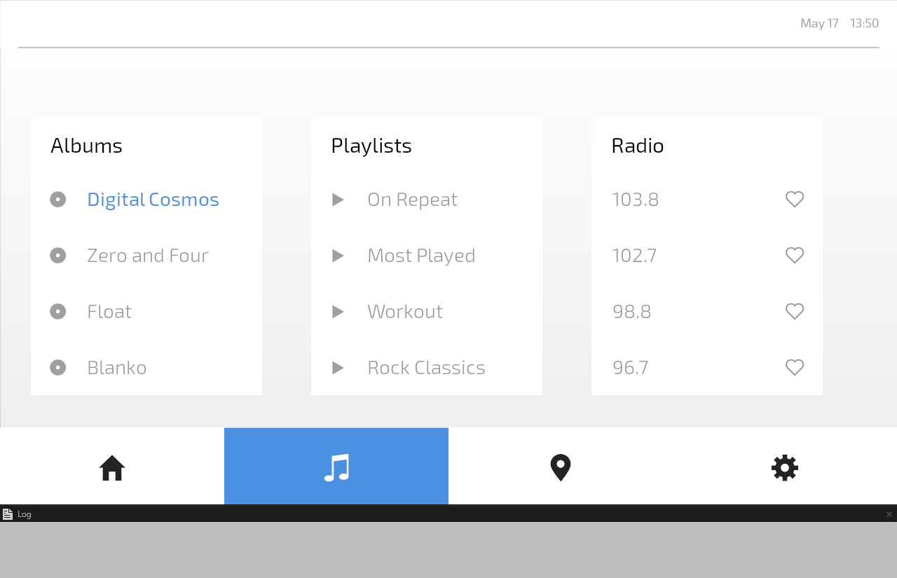
The label of the item that receives key input becomes blue and uses normal font weight.
The labels of all other items are gray and use light font weight.
In this tutorial project, each list item prefab has a Button: Click trigger with a Write Log action that prints a message to the log. When a Button node has the key focus, you can use the Enter or Space key to press that button. This sets off the Button: Click trigger. For example, when the third item in the Albums list has the key focus and you press the Enter key, Kanzi prints to the Log window Play album "Float".
Set the key focus to the list item that the user presses
To set the key focus to the list item that the user presses:
In the Prefabs, select these prefabs:
AlbumItem
PlaylistItem
RadioItem
SettingsItem
These prefabs are Button nodes. Interactivity control nodes, such as the Button and Slider nodes, are by default hit testable and focusable, which means that they can by default receive the key focus and press.
In the Properties, add the Focus > Focus On Press property and set it to Node.
This way, you move the key focus from anywhere in the application to the list item that the user presses.
Tip
A node inherits the value of the Focus On Press property from its parent. For example, to set all interactive nodes in an application screen to receive focus at press, it is enough to set the Focus On Press property in the root node of that application screen.
Now, when you click a list item, that item gets the key focus.

Show when a list contains the key focus
In this section, you set the lists on the Media and Settings screens to change appearance based on whether they contain the item that has the key focus. You do this with the List State Manager that comes with the starting point project of this tutorial.
The List State Manager uses as its controller property the Focus State property, which indicates the focus state of a node or nodes in a focus scope.
For a focus scope, the values of the Focus State property have these meanings:
No Focus: None of the nodes in the focus scope have focus.
Logical Focus: A node in the focus scope is the logical focus node of the overlay to which the scope belongs. By default, a Kanzi application has one overlay, the Screen node.
Key Focus: A node in the focus scope is the key focus node, which receives key input.
To show when a list contains the key focus:
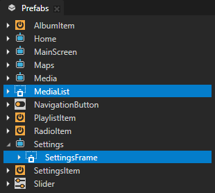
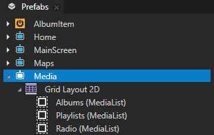
In the Prefabs, select:
The MediaList prefab.
In the Media Activity prefab, the Albums, Playlists, and Radio are instances of the MediaList prefab.
The Settings > SettingsFrame node.
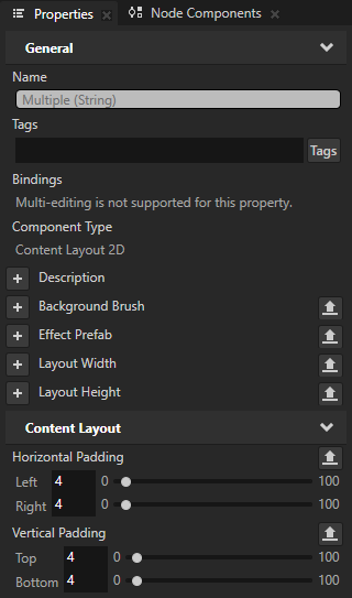
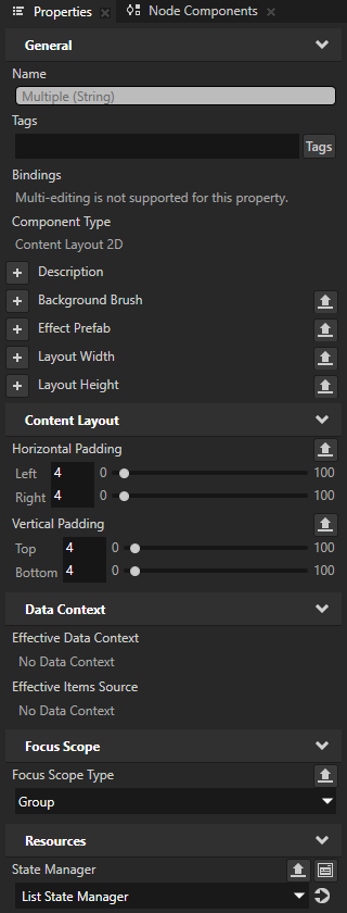
These nodes are Content Layout 2D nodes that have the Horizontal Padding and Vertical Padding properties set to create a border around their child node. This border is not visible, because the MediaList and SettingsFrame nodes have no background brush.
In the Properties, add and set:
Focus Scope > Focus Scope Type to Group
You make the nodes focus scopes, so that you can use the Focus State property to find out whether a descendant node is the key focus node.
Resources > State Manager to List State Manager
The List State Manager sets the Background Brush property of a node:
In the KeyFocus state, to the Blue Brush color brush.
In the NoFocus and LogicalFocus states, to the White Brush color brush.
Now, when you in the Preview click an item in a list, that list gets a blue border.
Navigate the media lists with key input
In this section, you create key navigation for the Media screen. You enable the user to navigate between the lists by using the ← (Left) and → (Right) keys.
To navigate the media lists with key input:
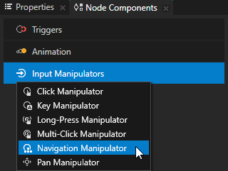
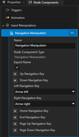
In the Prefabs, select the Media Activity prefab. In the Node Components, press Alt and right-click Input Manipulators and select Navigation Manipulator.
In the Navigation Manipulator, add and set:
Left Navigation Key to Arrow left
Right Navigation Key to Arrow right
This way, you set the Navigation Manipulator to respond to the ← (Left) and → (Right) keys.
Enable navigating to the left:
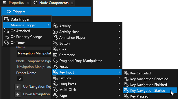
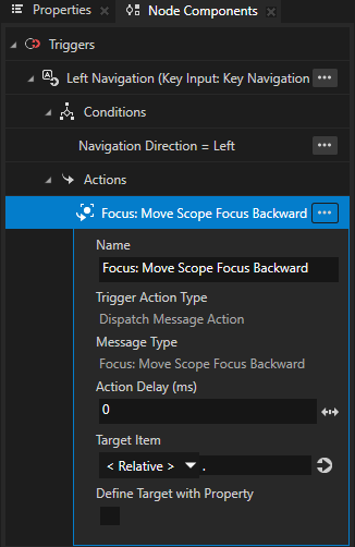
In the Node Components > Triggers, create a Key Input > Key Navigation Started message trigger, and name it Left Navigation.
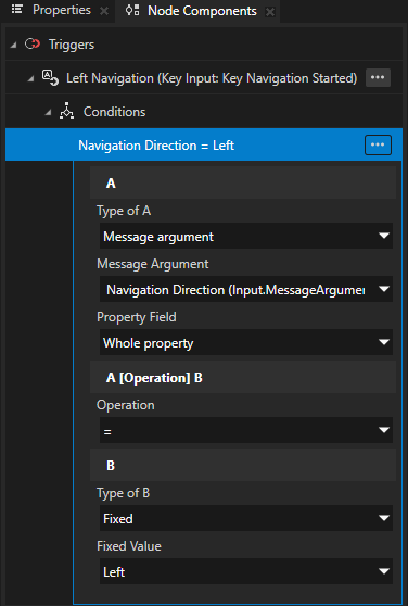
In the Left Navigation trigger, create a Trigger Condition and set:
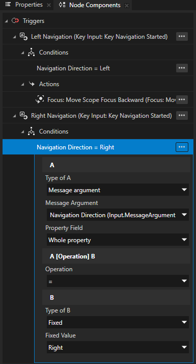
A
Type of A to Message argument
Message Argument to Navigation Direction
Operation to =
B
Type of B to Fixed
Fixed Value to Left
With this condition, you set the Left Navigation trigger to set off when the user presses the ← (Left) key, which you set in the Navigation Manipulator as the Left Navigation Key.
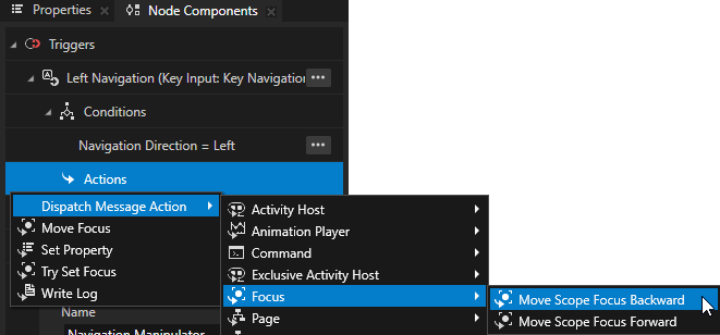
In the Left Navigation trigger, press Alt and right-click Actions and select Dispatch Message Action > Focus > Move Scope Focus Backward.
This action moves the key focus to the previous focusable node in the Media Activity, which is a focus scope.
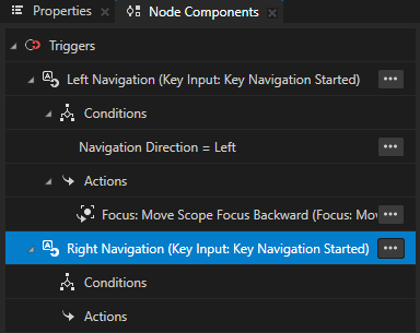
Enable navigating to the right:
In the Node Components > Triggers, create a Key Input > Key Navigation Started trigger and name it Right Navigation.
From the Left Navigation trigger, copy the trigger condition to the Right Navigation trigger. In the condition, set the Fixed Value to Right.
With this condition, you set the Right Navigation trigger to set off when the user presses the → (Right) key, which you set in the Navigation Manipulator as the Right Navigation Key.
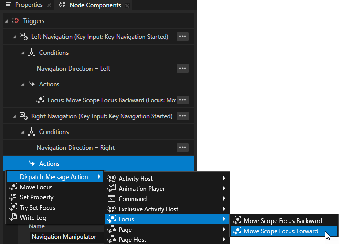
In the Right Navigation trigger, press Alt and right-click Actions and select Dispatch Message Action > Focus > Move Scope Focus Forward.
This action moves moves the key focus to the next focusable node in the Media Activity.
In the Properties, add and enable the Focus Scope > Cyclic Focus Navigation property.
This way:
When the user navigates forward with the → (Right) key, and the focus reaches the last focusable node of the focus scope, the focus moves to the first focusable node.
When the user navigates backward by pressing the ← (Left) key, and the focus reaches the first focusable node of the focus scope, the focus moves back to the last focusable node.
Now, when you in the Preview go to the Media screen, you can use the ← (Left) and → (Right) keys to move the key focus between the lists.
What’s next?
In this tutorial, you learned how to create UI navigation for your application.
Now you can:
Learn how to use the Kanzi input manipulators to enable panning, zooming, rotating, resetting the position, and dropping a pin on a map. See Tutorial: Pan, zoom, tap.
Learn how to use the drag-and-drop manipulator to reorder the buttons in a navigation bar. See Tutorial: Drag and drop.
Learn how to use a Grid List Box to create a contacts list. See Tutorial: Create a contacts list with a Grid List Box.
Learn how to define an XML data source and how to use the data from that data source in a Kanzi Studio project to provide the data to a Kanzi application. See Tutorial: Get application data from a data source.
See also
To learn more about the Kanzi state manager, see State manager.
To learn more about the Content Layout nodes, see Using the Content Layout nodes.
To learn more about focus, see Focus and Using focus.