Step 3 - Navigate between screens
In this step, you first create a header and a footer in the RootNode node, then you create the buttons to navigate between the Activity nodes that you created in the previous step.
Create the header and footer
In this section, you create the application header and footer.
To create the header and footer:
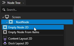
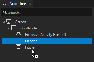
In the Node Tree, press Alt and right-click the RootNode node, and create two Empty Node 2D nodes. Name the nodes Header and Footer.
You use these nodes to set the background and structure for the header and footer in the entire application.
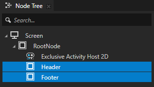
In the Node Tree, select the Header node. In the Properties:
Click
 next to the Layout Height property and set it to 60.
The properties that are frequently used with a certain node type are marked with
in the Properties. When you click , Kanzi Studio adds that property to the node.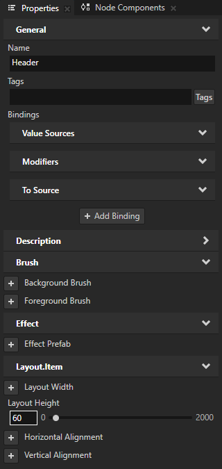
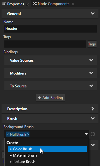
Click
next to the Background Brush to add the property to the Header node:In the Background Brush property, select + Color Brush.
Use brushes to set the background of 2D nodes. In Kanzi, all 2D nodes by default have transparent background.
In Kanzi, these brushes are available:
Use a Color Brush to fill a 2D node with a solid color.
Use a Texture Brush to fill a 2D node with a texture.
Use a Material Brush to fill a 2D node with a material.
Click
 next to the Background Brush property and set the color that you want to use for the Header and Footer background.
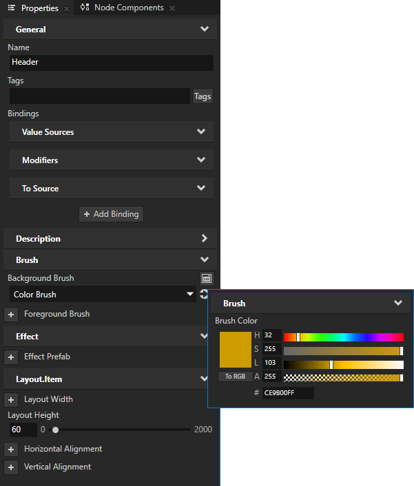
From the Properties window, drag the Layout Height and Background Brush properties to the Node Tree window, and drop them on the Footer node.
This way you add and apply the same properties to the Footer node.
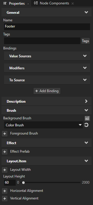
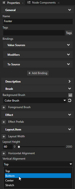
In the Node Tree, select the Footer node. In the Properties, add the Vertical Alignment property, and set it to Bottom.
Kanzi uses the default value of a property until you set it to a different value. The default value of the Vertical Alignment property is Top. This is why both Header and Footer nodes are aligned to the top of their parent node, the RootNode node, until you set the value of the Vertical Alignment property in the Footer node to Bottom.
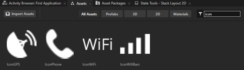
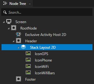
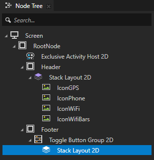
In the Node Tree, press Alt and right-click the Header node and select Stack Layout 2D. From the Assets, drag to the Stack Layout 2D node all Icon images.
You can use layout nodes to position nodes in relation to the application screen and other nodes. Layout consists of properties alignment, margins and layout size and that you can define either specific to a node or as a general rule imposed on child nodes by specific layout containers.
Use a Stack Layout node to place items next to each other.
Add a margin between the icons:
In the Node Tree, in the Stack Layout 2D node, select all the Icon Image nodes. In the bottom-right corner of the Properties, click
 to open the Add Properties window.
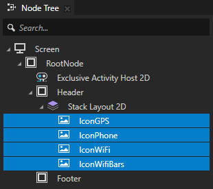
In the left column of the Add Properties window, double-click the Horizontal Margin property to add it to the nodes you selected in the Node Tree.
In the left column of the Add Properties window that opens you can see which properties you can add to the node you selected in the Node Tree window.
To quickly find a property, type a few letters of the property name in the search box of the Add Properties window.
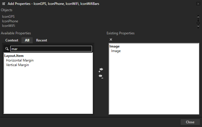
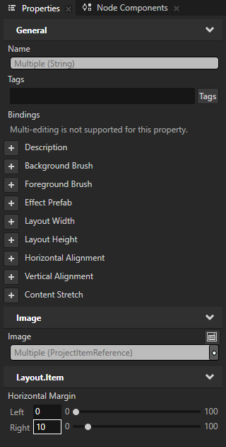
With all Icon Image nodes in the Node Tree still selected, set the value of the Horizontal Margin property Right property field to 10.
This way you create a 10 pixel margin on the right side of the nodes.
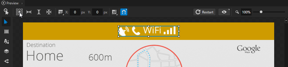
In the Node Tree, select the Stack Layout 2D node. In the Preview, select the Node tool
 and click the center square in the Align tool
  .
.This way you align the Stack Layout 2D to the center of the Header node.
Tip
Use the Align tool to set the Horizontal Alignment and Vertical Alignment properties.
Create a prefab for the navigation button
Use prefabs (prefabricated templates) to structure your application and to create consistent interfaces. Prefabs allow you to create the building blocks of your application and make the application easier to maintain.
In this section, you create a prefab for the toggle button that you then use in the Footer node as a control to navigate between the Activity nodes in your application.
To create a prefab for the navigation button:
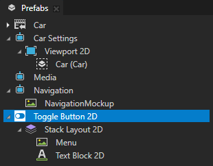
In the bottom-right corner of the Prefabs window, click
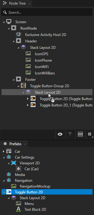
 , create a Toggle Button 2D prefab, and in the Toggle Button 2D:
Create a Stack Layout 2D node.
Drag from the Assets to the Stack Layout 2D node the Menu image.
In the Stack Layout 2D node, create a Text Block 2D node.
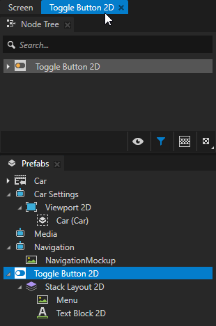
In the Prefabs, double-click the Toggle Button 2D prefab to open only that prefab in the Preview in a separate tab.
When you open a prefab in the Preview, Kanzi Studio shows it as a tab below the main menu. Open prefabs in the Preview when you want to view and adjust the prefab without the distraction of the context where you use that prefab.
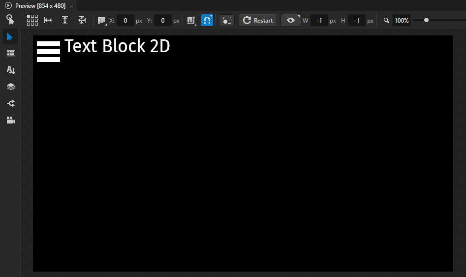
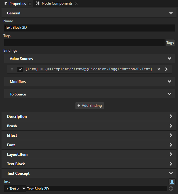
In the Prefabs, select the Toggle Button 2D > Stack Layout 2D > Text Block 2D node. In the Properties, next to the Text property click
 .
.This way you enable the setting of the text for each prefab instance.
A node prefab can contain a tree of nodes, each with their own properties. When you edit the nodes in a prefab or any of its instances in a project, you change those nodes in all instances of that prefab. You can customize each instance of a prefab to have its own property values by overriding the property values of the prefab. For example, when you create a prefab for an address book entry, you want to show a different name, number, and photo for each address book entry.
When you click
, Kanzi Studio:Creates from that property a custom property type.
Adds the custom property type to the root node of the prefab.
Creates a
##Templatebinding to the property in the root node of the prefab.
That way you can set in the root of the prefab instance the text that you want the Text Block 2D node to show.
With the Text Block 2D selected, in the Preview use the Node tool
, and click the center square in the Align tool to align the Text Block 2D to the center of the Stack Layout 2D node.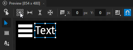
Click the Screen tab under the main menu to show the entire application in the Preview.
In the Node Tree, in the Footer node:
Create a Toggle Button Group 2D node.
Use the Toggle Button Group nodes to allow users to select only one option from a set of options that are mutually exclusive.
Toggle buttons in a toggle button group behave like radio buttons, where only one toggle button can be active at a time.
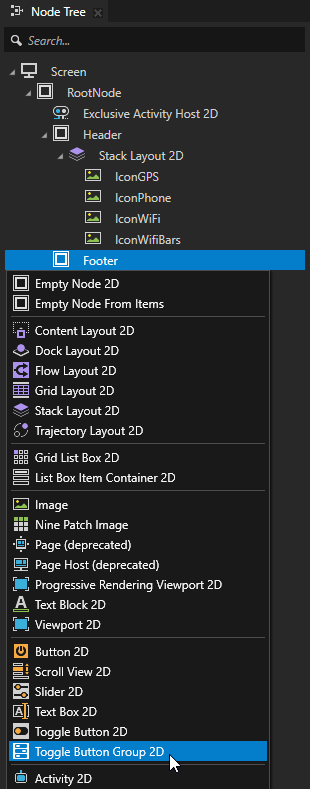
In the Toggle Button Group 2D node create a Stack Layout 2D node.
From the Prefabs, drag Toggle Button 2D prefab three times to the Node Tree and drop it on the Footer > Toggle Button Group 2D > Stack Layout 2D node.
When you drag a prefab from the Prefabs to any node in the Node Tree, Kanzi Studio creates an instance of that prefab in the node tree where you drop the prefab.
In the Node Tree, select each Toggle Button 2D prefab instance, press F2, and name them Navigation, Car, and Media.
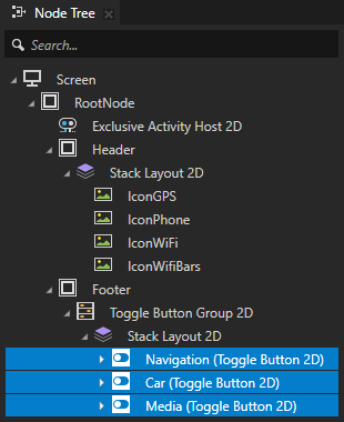
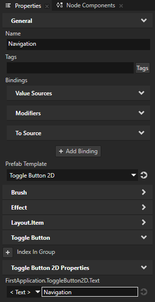
Select each Toggle Button 2D prefab instance and in the Properties add and set the value of the FirstApplication.ToggleButton2D.Text property to Navigation, Car, and Media.
For each Toggle Button 2D prefab instance in the Footer > Toggle Button Group 2D > Stack Layout 2D node:
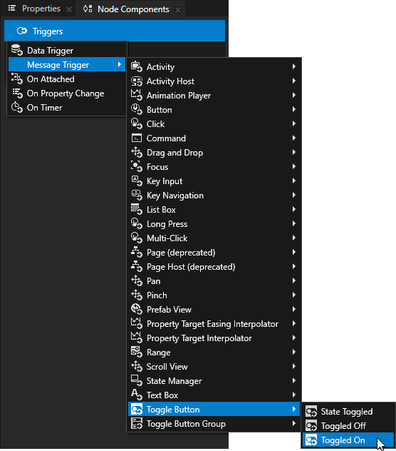
In the Node Components, press Alt and right-click Triggers and select Message Trigger > Toggle Button > Toggled On to add that trigger.
Use triggers and actions to create interactions. Use triggers to set off actions, such as setting a property to a certain value or setting the state of an application.
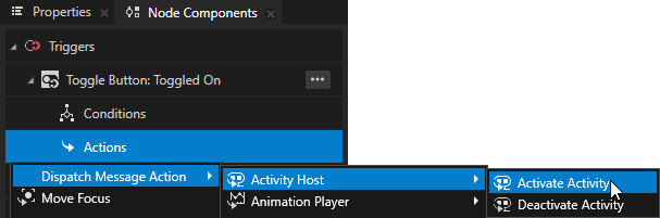
In the Node Components, in the trigger that you created, press Alt and right-click Actions, and select Dispatch Message Action > Activity Host > Activate Activity.
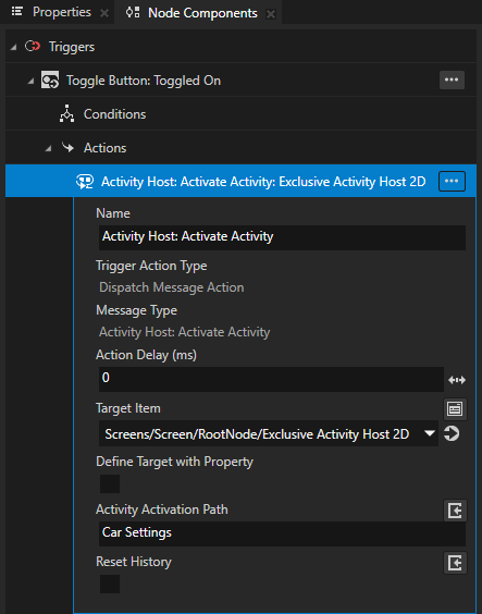
In the Activity Host: Activate Activity action set:
Target Item to the Exclusive Activity Host 2D that holds the Activities
Activity Activation Path to the Activity to which you want the button to navigate
For example, in the Car toggle button, set the action to go to the Car Settings Activity.
In the Preview, click
 to enter the Interact mode.
In the Interact mode, you can interact with your application in the Preview window as you would on a device.
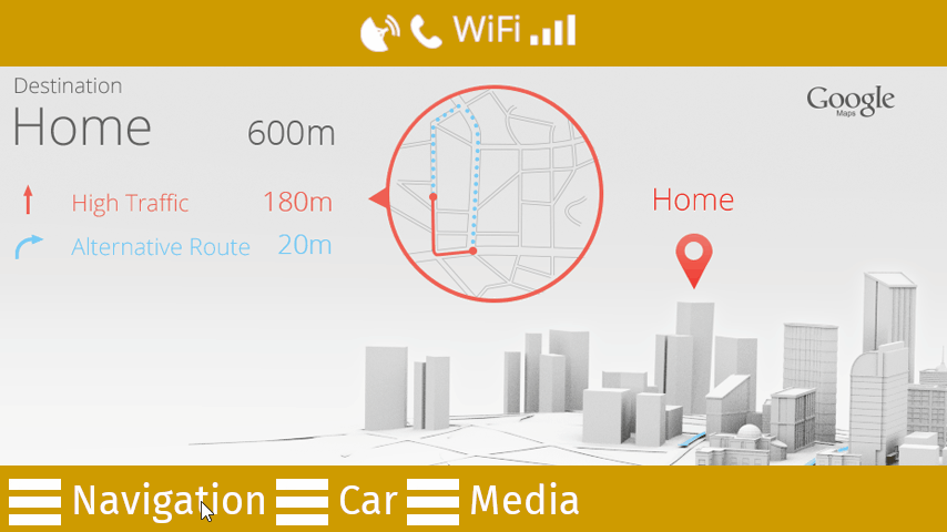
When you restart the Preview and click each button in the Footer node, the trigger in the button sets off an action that transitions to the Activity node you set in each button.
See also
To find out more about working with the Preview tools, see Editing your application in the Preview.
To find out more about working with the layout control nodes, see Layout control nodes.
To find out more about working with prefabs, see Using node prefabs.
To find out more about toggle buttons and toggle button groups, see Buttons.