Tutorial: Creating a toggle button
In this tutorial, you learn how to create a toggle button in Kanzi Studio.
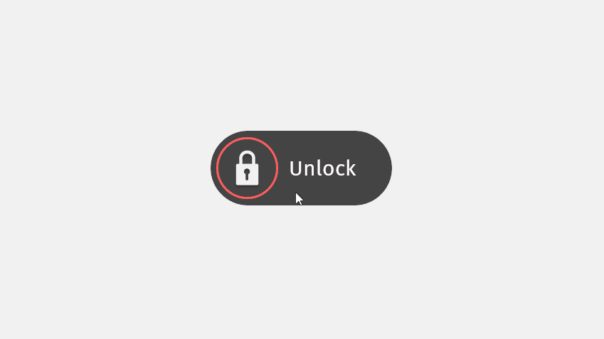
This video shows the result of the tutorial.
This tutorial assumes that you understand the basics of working with Kanzi Studio. The best entry points for getting familiar with Kanzi Studio are:
Assets for the tutorial
The starting point of this tutorial is the <KanziWorkspace>/Tutorials/Toggle button/Start/Toggle button.kzproj Kanzi Studio project.
You can find the completed tutorial in the <KanziWorkspace>/Tutorials/Toggle button/Completed directory.
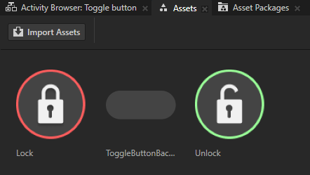
The starting point project contains the images that you use to create a toggle button. You can see the images in the Assets window.
Create a Toggle Button 2D node
In this section, you create and position a Toggle Button 2D node.
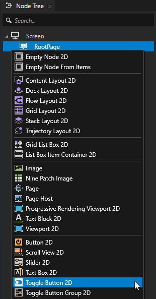
To create a Toggle Button 2D node:
In Kanzi Studio, open the
<KanziWorkspace>/Tutorials/Toggle button/Start/Toggle button.kzprojKanzi Studio project.In the Node Tree, press Alt and right-click the RootPage node, and select Toggle Button 2D.
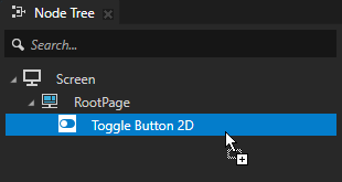
When you create a Toggle Button 2D node, the node does not have a visual appearance. You set the appearance of the toggle button in this tutorial.
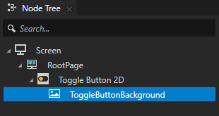
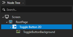
From the Assets window, drag the ToggleButtonBackground image to the Node Tree and drop it on the Toggle Button 2D node.
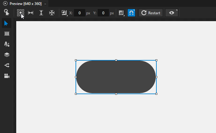
In the Node Tree, select the Toggle Button 2D node, in the Preview select the Node tool
 , and click the center square
  .
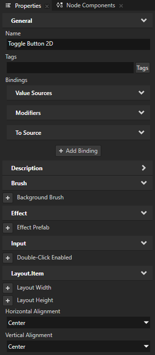
.This way you set the Horizontal Alignment and Vertical Alignment properties to Center, which place the Toggle Button 2D node in the center of the RootPage.
Create the toggle button states
In this section, you use the state manager to set the appearance of the toggle button when it is switched on and off.
To create the toggle button states:
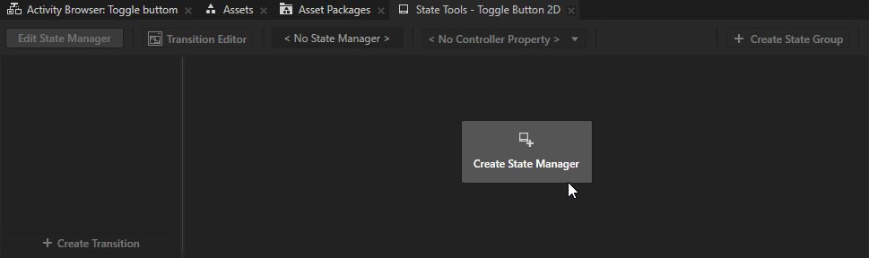
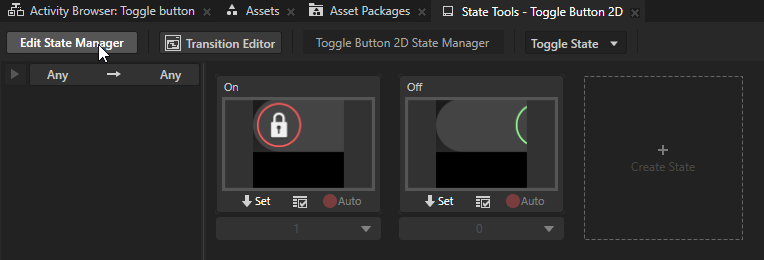
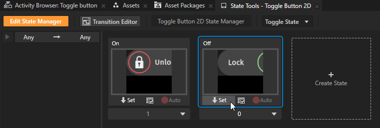
In the Node Tree, select the Toggle Button 2D node. In the State Tools, click Create State Manager.
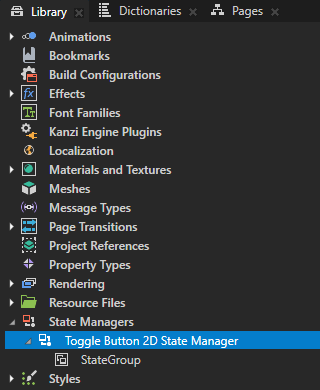
Kanzi Studio creates a state manager and assigns it to the Toggle Button 2D node.
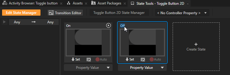
In the State Tools, click Create State twice to create two states. Double-click the name of each state and rename the states.
For example, name the states:
On
Off
The On state defines the state of your application when the toggle button is toggled on, the Off state when the toggle button is toggled off.
Add and position the toggle button indicator:
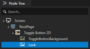
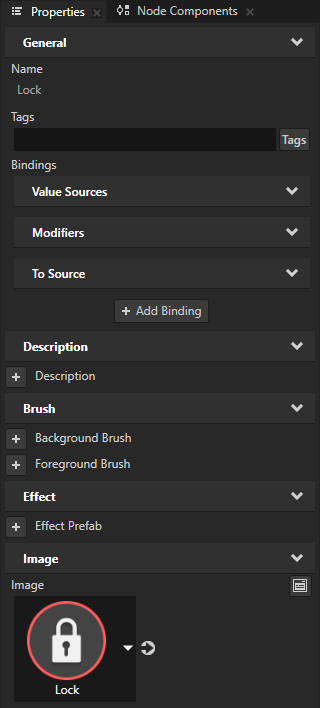
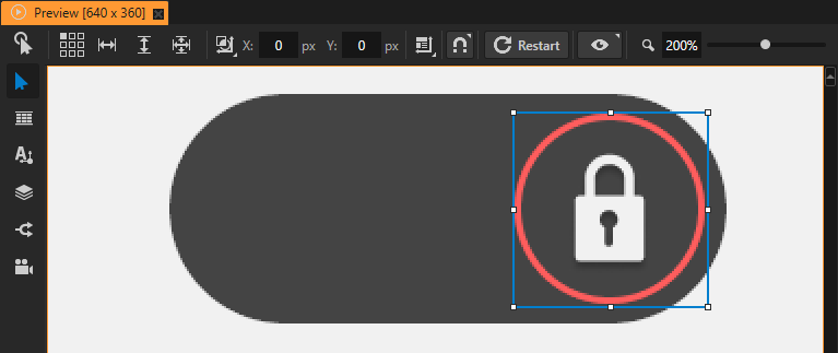
In the Node Tree, press Alt and right-click the Toggle Button 2D node, select Image and name it Lock. In the Properties, set the Image property to the Lock image.
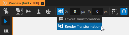
In the Preview, in the Node tool
click  and select Render Transformation for the target transformation.
You can apply transformations in these ways:
Layout transformation transforms the item before it applies the layout pass.
Render transformation transforms the item after it applies the layout pass, but before it renders the item.
Always use the Render Transformation, unless you know that you have to recalculate the layout.
In the Preview select the Node tool
and click  to disable snapping to nodes and guides.
When you disable snapping, you can use the Node tool to move a node in the Preview so that it does not snap to nodes or guides.
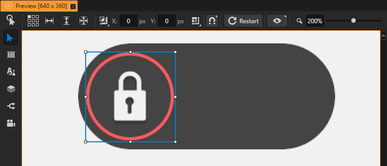
Use the Node tool to place the Lock node on the left-hand side of the toggle button.
Tip
You can adjust the Preview zoom level in the upper right corner of the Preview.

In the State Tools, in the On state click
 to save the current position of the toggle button indicator to that state.
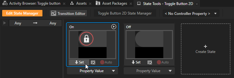
In the Preview, use the Node tool
to position the toggle button indicator on the right-hand side of the toggle button.Tip
Hold down the Shift key when you drag a node with the Node tool to move the node in a true horizontal or vertical line.
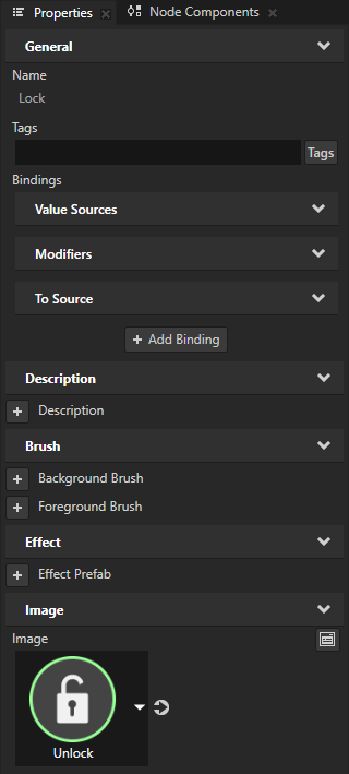
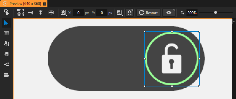
In the Node Tree, select the Lock node. In the Properties, set the Image property to the Unlock image.
This way you set the appearance of the toggle button indicator when the toggle button is in the Unlock state.
In the State Tools, in the Off state click
to save the current position of the toggle button indicator to that state.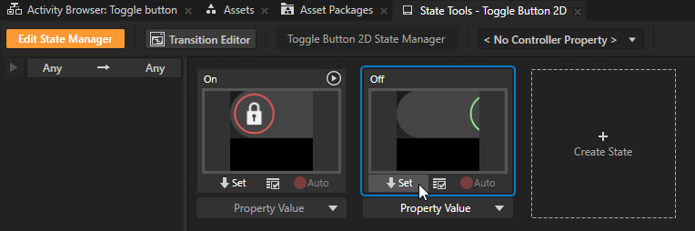
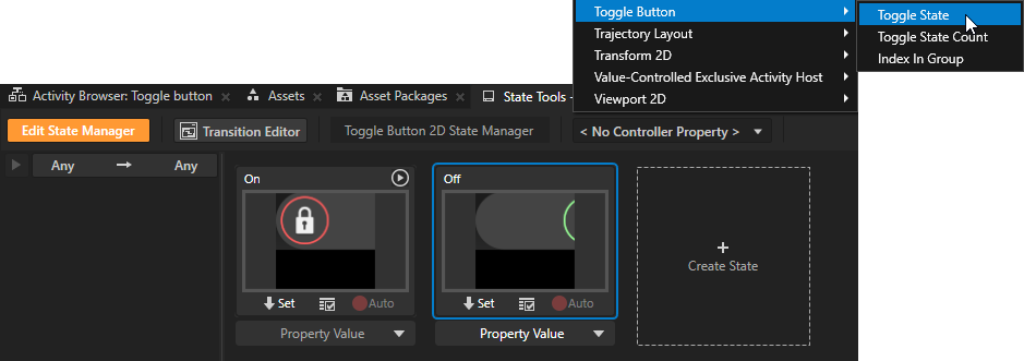
In the State Tools, click the <No Controller Property> dropdown menu and select the Toggle Button > Toggle State property.
In a state manager, the value of the property that you select as the Controller Property defines the conditions when each state in a state group is active.
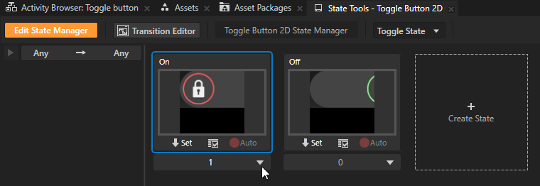
In the State Tools, set the value of the controller property for each state.
For the On state set the value to 1.
For the Off state leave the value set to 0.
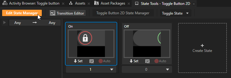
In the State Tools, click Edit State Manager to deactivate the State Tools.
In the Preview, click
 to enter the Interact mode.
In the Preview, when you click the toggle button, you toggle between the On and Off states that you defined in the state manager in the Toggle Button 2D node.
Fine-tune the toggle button
In this section, you fine-tune the toggle button to:
Add a label that indicates the state of the toggle button
Adjust the transition between the toggle button states
To fine-tune the toggle button:
Add a label that indicates the state of the toggle button:
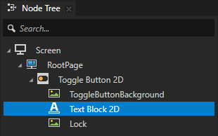
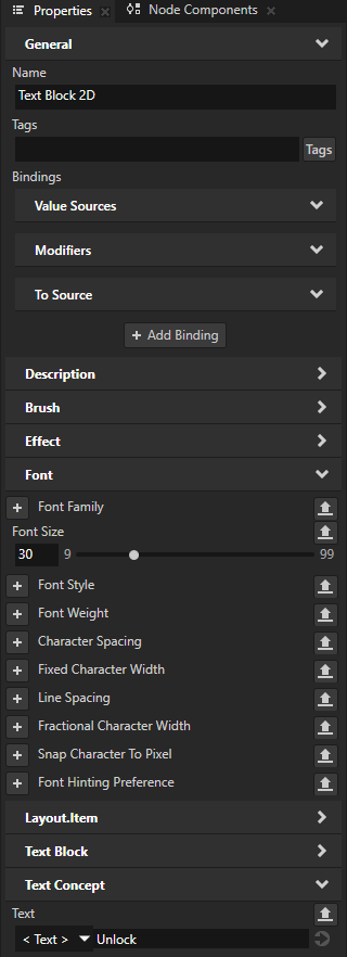
In the Node Tree, press Alt and right-click the Toggle Button 2D node, and select Text Block 2D. Drag the Text Block 2D node above the Lock node.
In the Properties, add and set:
Font Size to 30
Text to Unlock
In the Node Tree, select the Toggle Button 2D node. In the State Tools, click Edit State Manager.
In the State Tools, click the On state and position the toggle button label:
In the Preview, select the Node tool
, right-click the Text Block 2D node, and select Select > Text Block 2D.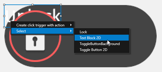
Use the Node tool
to place the Text Block 2D node to the right-hand side of the toggle button.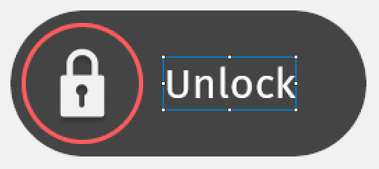
In the State Tools, in the On state, click
.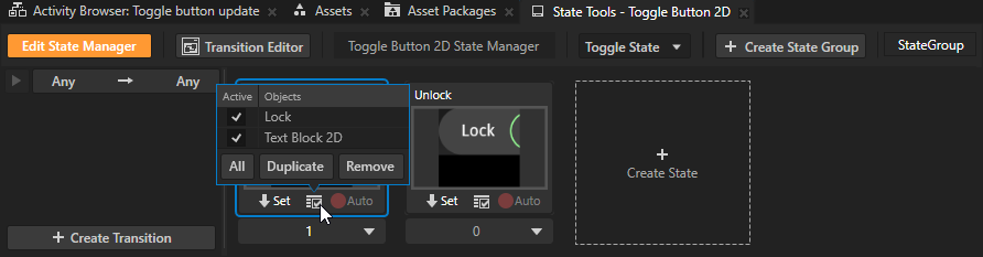
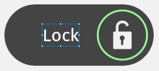
In the State Tools, click the Off state and adjust the toggle button label:
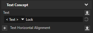
In the Properties, set the Text property to Lock.
In the Preview, place the Text Block 2D to the left-hand side of the toggle button.
In the State Tools, in the Off state, click
.
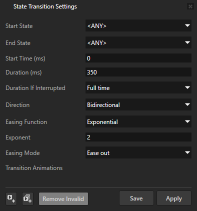
In the State Tools, click the Any -> Any transition and in the State Transition Settings set:
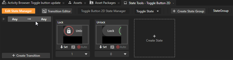
Duration to 350
Direction to Bidirectional
This way you apply a transition when transitioning from either of the states.
Easing Function to Exponential
Easing Mode to Easing out
Click Save.
This way you modify the amount of time the toggle button takes to transition between its states and the appearance of the transition.
In the State Tools, click Edit State Manager to deactivate the State Tools.
In the Preview, click
to enter the Interact mode.
In the Preview, when you click the toggle button, you toggle between the On and Off states that now include a label and a modified transition.
What’s next?
In this tutorial you learned how to create a toggle button. Now you can:
Learn how to create a button that changes its appearance based on user actions. See Tutorial: Creating a button.
Learn more about different types of button nodes and how to use them. See Buttons.
Learn how to create a slider. See Tutorial: Creating a slider.
Learn the state manager transitions. See State manager.
Complete other tutorials. See Tutorials.
See also
To learn more about the Kanzi state manager, see State manager.
To learn more about different types of button nodes and how to use them, see Buttons.
To learn more about creating Kanzi applications, see Tutorials.