Step 1 - Navigate the application screens
In this step, you learn how to create navigation for application screens. You enable the user to navigate the application screens using both touch and key input.
Assets for the tutorial
The starting point of this tutorial is the <KanziWorkspace>/Tutorials/UI navigation/Start/UI navigation.kzproj Kanzi Studio project.
You can find the completed Kanzi Studio project of this tutorial in the <KanziWorkspace>/Tutorials/UI navigation/Completed directory.
The starting point project contains the content that you need to complete this tutorial:
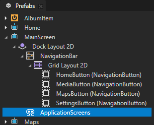
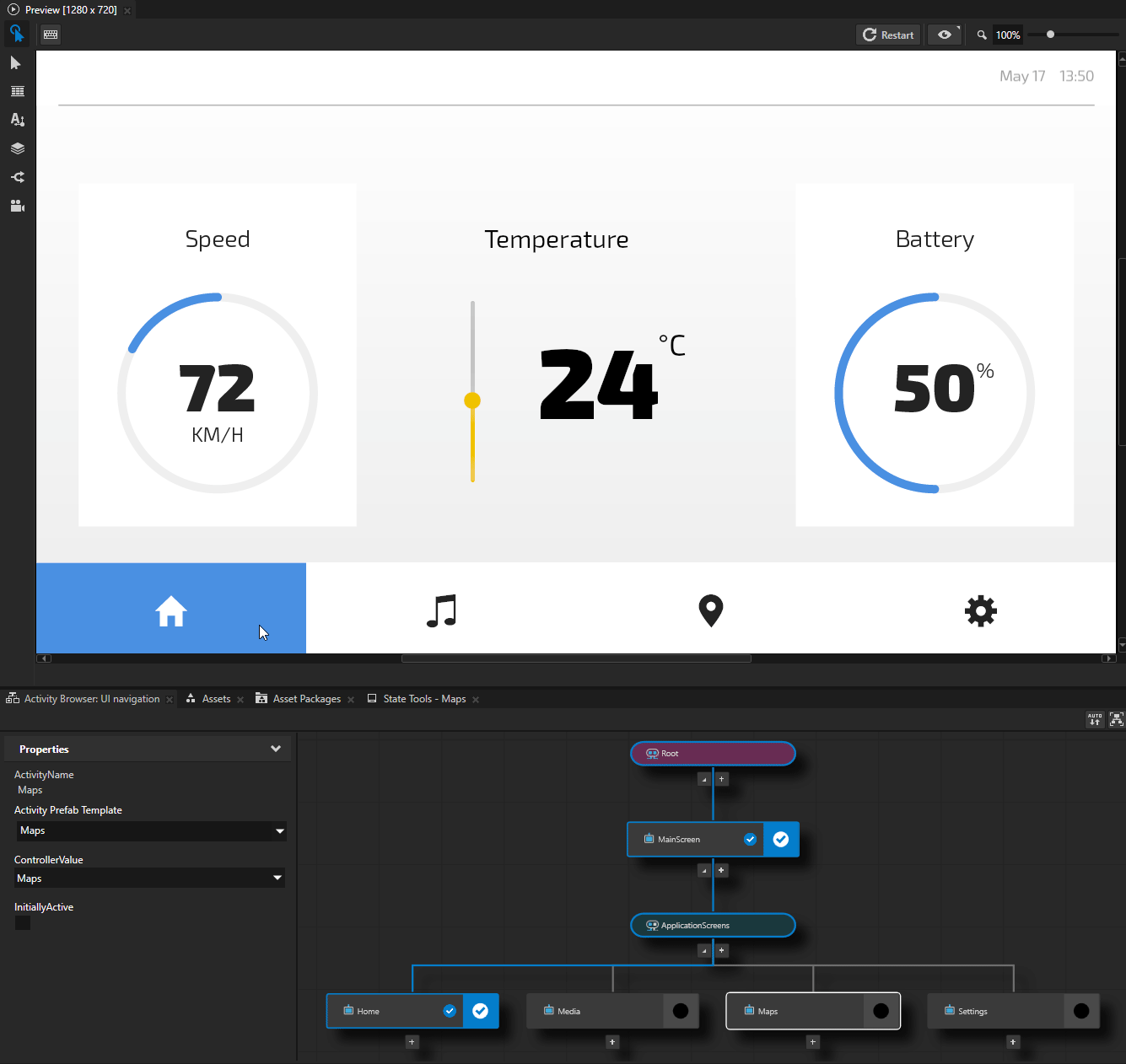
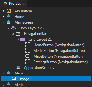
The MainScreen Activity prefab contains:
The NavigationBar toggle button group that shows the navigation button menu.
In the NavigationBar, the toggle buttons are instances of the NavigationButton prefab. The NavigationButton prefab uses a state manager that sets the appearance of the toggle button based on its toggle state.
In this tutorial, you use these toggle buttons to activate the application screens.

ApplicationScreens Exclusive Activity Host contains Activities that each represent an application screen:
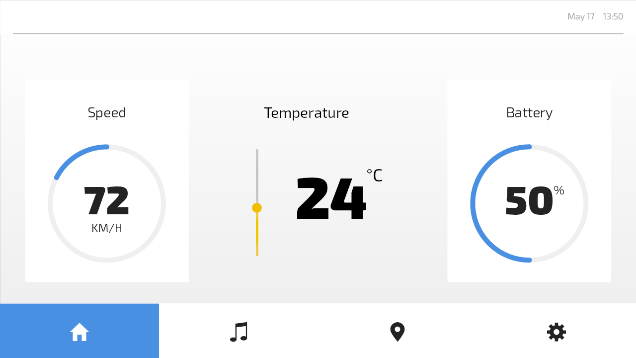
Home contains a temperature slider.
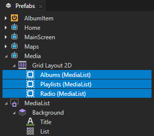
Media contains lists of albums, playlists, and radio stations.
Maps contains a static image.
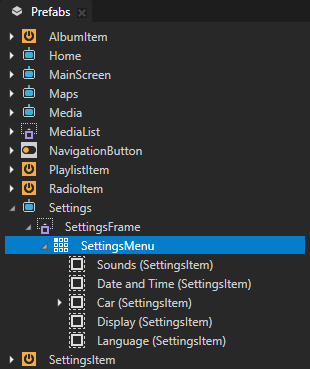
Settings contains a settings menu.
In this tutorial, you learn how enable the user to move between these screens and interact with UI elements in each screen using both touch and key input.

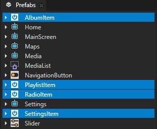
The AlbumItem, PlaylistItem, RadioItem, and SettingsItem prefabs are the templates for the items in different types of lists.
In the Media Activity prefab, the Albums, Playlists, and Radio are instances of the MediaList prefab. The MediaList contains a customizable title and a Grid List Box node that shows a list with a customizable item template and items source. The Media Activity gets the list items from a data source.
In the Settings Activity prefab, the list items in the SettingsMenu are instances of the SettingsItem prefab.
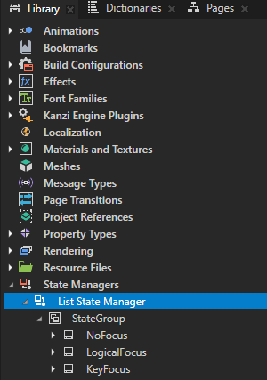
Library > State Managers > List State Manager sets the background brush of a node based on the focus state.
You use this state manager in Step 2 of this tutorial.
Navigate the application screens with touch input
In this section, you create touch navigation for the application screens. You enable the user to navigate between the application screens by clicking the buttons in the navigation bar.
To navigate the application screens with touch input:
Create a property type that controls which Activity is active:
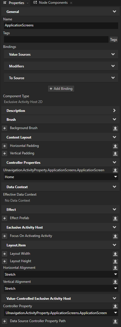
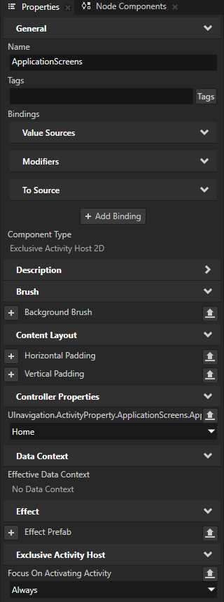
In the Activity Browser, right-click the ApplicationScreens Exclusive Activity Host and select Create Controller Property > Enum.
An Exclusive Activity Host uses the Controller Property to set and control which Activity is active in that Exclusive Activity Host.
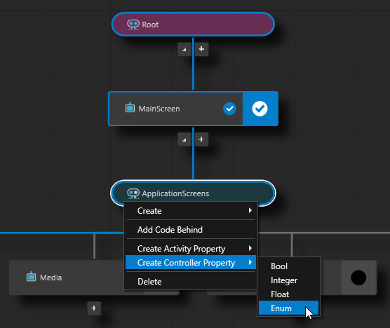
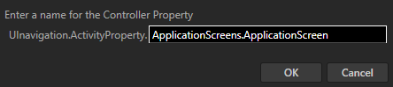
Name the property ApplicationScreens.ApplicationScreen and click OK.
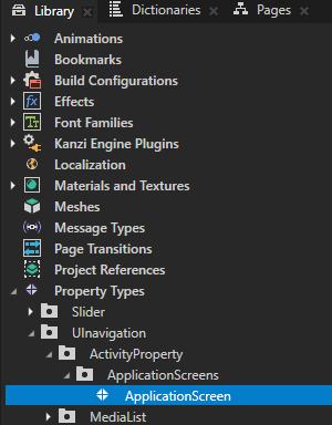
Kanzi Studio:
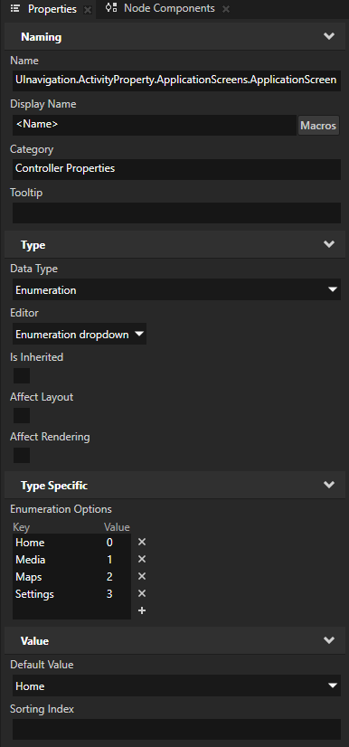
Creates in the Library > Property Types the UInavigation.ActivityProperty.ApplicationScreens.ApplicationScreen property type with enumeration keys that match the names of the Activities in the ApplicationScreens Exclusive Activity Host.
In the ApplicationScreens Exclusive Activity Host, adds the UInavigation.ActivityProperty.ApplicationScreens.ApplicationScreen property and sets the Controller Property property to that property.
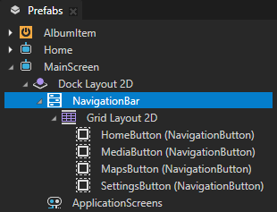
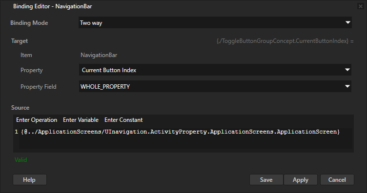
In the Prefabs, select the MainScreen > Dock Layout 2D > NavigationBar toggle button group. In the Properties, click + Add Binding and in the Binding Editor, set:
Binding Mode to Two way
Property to Toggle Button Group > Current Button Index
You use the Current Button Index property to access the index of the toggle button that is toggled on in the NavigationBar toggle button group.
In the Prefabs, select the MainScreen > Dock Layout 2D > ApplicationScreens node. From the Properties, drag the UInavigation.ActivityProperty.ApplicationScreens.ApplicationScreen property to the Binding Editor, and drop it on the Source field.
This way, you set the Source to
{@../ApplicationScreens/UInavigation.ActivityProperty.ApplicationScreens.ApplicationScreen}
Click Save.
This binding creates a two-way connection between the toggled on menu button and the active Activity in the ApplicationScreens Activity Host.
Now when you:
In the Preview click a navigation menu button, Kanzi activates the Activity of that application screen.
In the Activity Browser activate an Activity of an application screen, Kanzi selects the corresponding navigation menu button.
Set the focus at application startup
In this section, you set the node that receives the key focus when application starts.
To receive key input, a node must be focusable. A focusable node has the Focusable property enabled. Interactivity control nodes, such as the Slider and Button nodes, have the Focusable property enabled by default.
In this tutorial project, the application screens are Activities. Activity nodes are focus scopes and handle the key focus and key input by default. A focus scope helps handle the key navigation. When the key focus moves to a focus scope node, that focus scope forwards the focus to its first focusable child node.
To set the key focus at application startup:
In the Prefabs, select the MainScreen > Dock Layout 2D > ApplicationScreens Exclusive Activity Host.
In the Properties, add the Focus On Activating Activity property and set it to Always.
This way, you set the key focus to the Home Activity that the application activates when the application starts.
When the Home Activity activates, Kanzi moves the focus to that Activity. The Home Activity forwards the focus to its only focusable node, the Slider node. The Slider node becomes the key focus node, which receives key input.
Now, when you select the Preview window, you can use these keys to adjust the temperature using the slider on the home screen:
↑ (Up) and ↓ (Down) to move the knob
Home to move the slider knob to the bottom of the rail
End to move the slider knob to the top of the rail
Slider nodes handle the input from these keys by default.
Navigate the application screens with key input
In this section, you create key navigation for the application screens. You enable the user to navigate between the application screens using the L and R keys.
To navigate the application screens with key input:
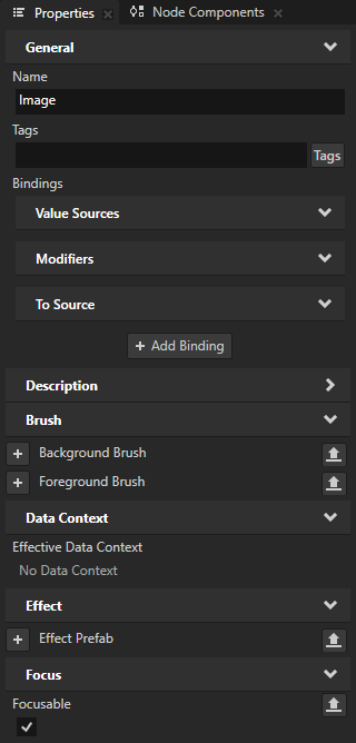
In the Prefabs, select the Maps > Image node. In the Properties, add the Focus > Focusable property.
The Maps Activity contains a mockup map image. To enable key navigation for that Activity, you make the image focusable.
The Media and Settings screens contain Button nodes that are focusable by default. This means that key navigation is now enabled for all application screens.
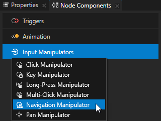
In the Prefabs, select the MainScreen > Dock Layout 2D > ApplicationScreens Exclusive Activity Host. In the Node Components, press Alt and right-click Input Manipulators and select Navigation Manipulator.
Use the Navigation Manipulator to set the keys that the user can use to navigate to different directions in your application.
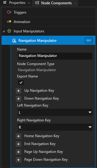
In the Navigation Manipulator, add and set:
Left Navigation Key to L
Right Navigation Key to R
This way, you set the Navigation Manipulator to respond to the L and R key presses.
Enable navigating to the left:
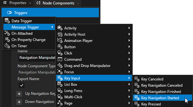
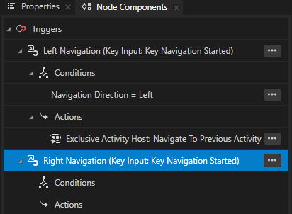
In the Node Components, press Alt and right-click Triggers, select Message Trigger > Key Input > Key Navigation Started, and name it Left Navigation.
The Key Navigation Started trigger is set off when the user presses any of the navigation keys that you set in the Navigation Manipulator.
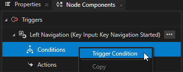
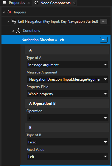
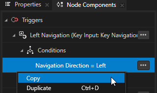
In the Left Navigation trigger, right-click Conditions, select Trigger Condition, and in the condition set:
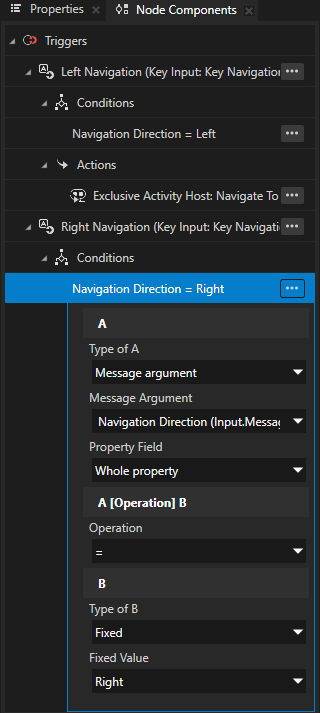
A
Type of A to Message argument
Message Argument to Navigation Direction
Operation to =
B
Type of B to Fixed
Fixed Value to Left
With this condition, you set the Left Navigation trigger to set off only when the user presses the L key, which you set in the Navigation Manipulator as the Left Navigation Key.
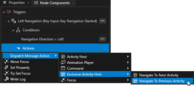
In the Left Navigation trigger, press Alt and right-click Actions and select Dispatch Message Action > Exclusive Activity Host > Navigate To Previous Activity.
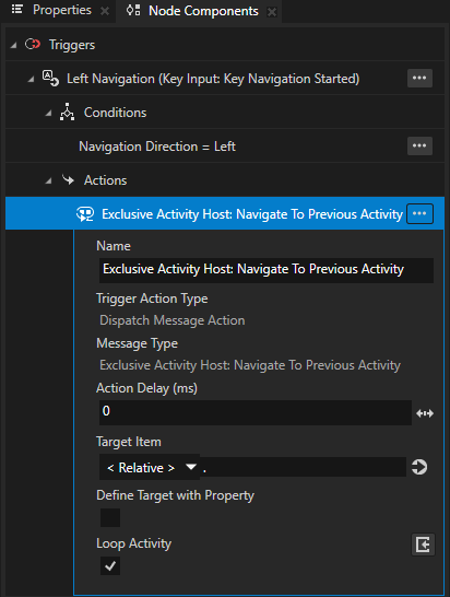
With this action, you set the ApplicationScreens Activity Host to activate the previous activity in the ApplicationScreens Activity Host.
In the Navigate To Previous Activity action, set the Loop Activity property to enabled.
This way, you set the ApplicationScreens Activity Host to activate its last Activity when the Left Navigation trigger sets off while the first Activity is active.
Enable navigating to the right:
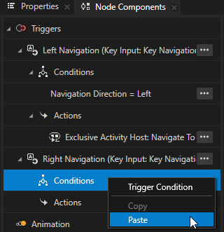
In the Node Components > Triggers, create a Key Input > Key Navigation Started trigger and name it Right Navigation.
From the Left Navigation trigger, copy the trigger condition to the Right Navigation trigger. In the condition, set the Fixed Value to Right.
With this condition, you set the Right Navigation trigger to set off when the user presses the R key, which you set in the Navigation Manipulator as the Right Navigation Key.
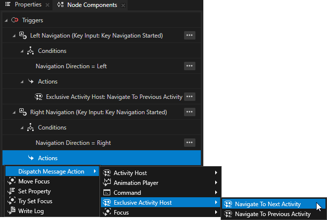
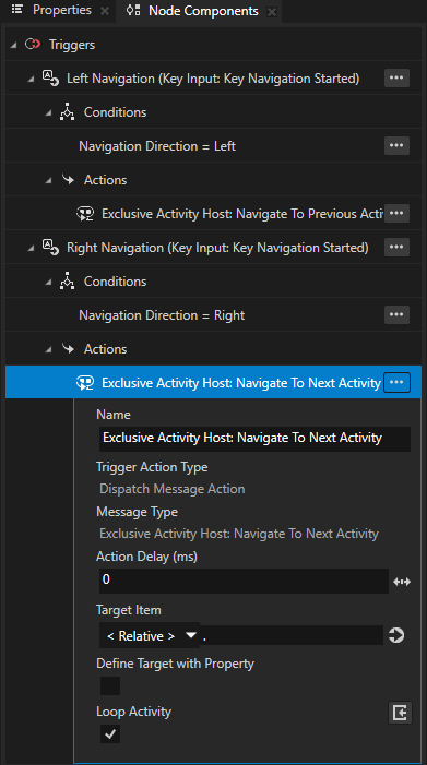
In the Right Navigation trigger, press Alt and right-click Actions and select Dispatch Message Action > Exclusive Activity Host > Navigate To Next Activity. In the action, set the Loop Activity property to enabled.
With this action, you set the ApplicationScreens Activity Host to activate the next Activity in the ApplicationScreens Activity Host. By enabling the Loop Activity property, you set the ApplicationScreens Activity Host to activate its first Activity when the Right Navigation trigger sets off while the last Activity is active.
Now, when you select the Preview window and press:
The L key, you navigate left through the application screens.
The R key, you navigate right through the application screens.

See also
To learn more about how to use the Activity Browser, see Using the Activity Browser.
To learn more about the Activity system, see Activities.
To learn more about using bindings, see Using bindings and Bindings expressions reference.
To learn more about using sliders, see Using the Slider nodes.
To learn more about focus, see Focus and Using focus.
To learn more about handling user input in Kanzi, see Handling user input.
To learn more about triggers and actions, see Triggers.
To learn more about using the List Box nodes, see List Box nodes.