Handling user input
You can set how and which elements in your application react to user input. In Kanzi, to handle user input you can:
Enable gesture and key recognition for nodes. See Using input manipulators.
Control how nodes react to input. See Controlling how a node reacts to input.
Define which nodes receive input. See Defining which node receives input.
Set the size of the input area of 3D nodes. See Setting the size of the input area of 3D nodes.
For these Kanzi nodes you do not have to create input manipulators manually, because they handle input by default:
Button nodes. See Using the Button nodes.
Toggle Button nodes. See Using the Toggle Button nodes.
List Box nodes. See List Box nodes.
List Box Item Container prefabs. See Using the List Box Item Container prefabs.
Scroll View nodes. See Using the Scroll View nodes.
Slider nodes. See Using the Slider nodes.
Text Box nodes. See Using the Text Box nodes.
Use triggers and actions to create interactions based on user input.
See Using triggers.
Using input manipulators
Kanzi provides low and high-level access to input:
The high-level system provides input in terms of gestures, such as click, pan, pinch, and so on. It is recommended to use the high-level system to bind gestures to the UI components or application functionality.
The low-level input system reports raw touch events as they happen in nodes.
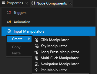
Kanzi provides input manipulators to enable gesture recognition for nodes in your Kanzi application. You can create and configure the manipulators:
In Kanzi Studio using the Input Manipulators node components and input manipulator triggers
Through the Kanzi Engine API
Kanzi provides these input manipulators:
Use the Click Manipulator to enable users to click nodes in your Kanzi application.
Use the Long-Press Manipulator to enable users to long-press nodes in your Kanzi application.
Use the Multi-Click Manipulator to enable users to multi-click nodes in your Kanzi application.
Use the Key Manipulator to set the keys that the user can use to navigate your application. For example, you can override the default focus navigation keys and use a specific key to set focus to a node, set a key to open or close a popup-type window, or move focus in the focus chain.
Use the Navigation Manipulator to set the keys that the user can use to navigate to different directions in your application.
Use the Drag-And-Drop Manipulator to enable users to drag and drop nodes in your Kanzi application.
Use the Pan Manipulator to enable users to move nodes in your Kanzi application.
Use the Pinch Manipulator to enable users to zoom and rotate nodes in your Kanzi application.
In Kanzi Studio when you select a node and in the Node Components > Input Manipulators create an input manipulator node component, Kanzi installs to that node the corresponding input manipulator. Kanzi Studio provides these input manipulator components for enabling gesture recognition:
Click Manipulator
Key Manipulator
Long-Press Manipulator
Multi-Click Manipulator
Navigation Manipulator
Pan Manipulator
In the Kanzi Engine API InputManipulator is the base class for input manipulators, and functions, such as ClickManipulator::create and PanManipulator::create create input manipulators responsible for the corresponding gesture recognition.
When you create an input manipulator, to recognize a gesture, attach it to the node with Node::addInputManipulator. This function attaches all the children of that node, too.
The attached input manipulator generates messages in response to user actions. Each manipulator uses messages to report different events during gesture recognition, such as PanManipulator::StartedMessage, PanManipulator::MovedMessage, PanManipulator::FinishedMessage for the pan manipulator, and so on.
Controlling how a node reacts to input
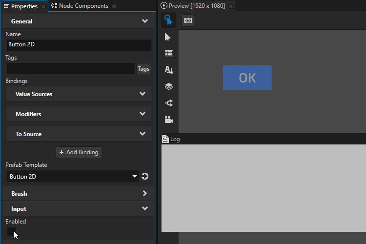
Use the Input > Enabled property to control how a node reacts to input.
Tip
The Button, List Box, Scroll View, Slider, and Text Box nodes handle input by default and do not react to input when they are disabled.
When you disable the Enabled property of a node, you effectively disable that node and its descendant nodes in the same overlay focus scope.
This means that when you disable the Enabled property of a node that contains an overlay focus scope node, the nodes in that overlay stay effectively enabled.
Kanzi delivers input also to effectively disabled nodes. This enables you to control the behavior of a disabled node.
When you effectively disable a node:
When the node is focused, it receives key input until the focus moves to another node.
When the node is not focused, it is not part of the focus chain and does not receive key input.
To observe whether a node is effectively enabled, use the Input > Effectively Enabled property in a state manager or a binding. For example, to visually indicate to the user whether a node is in use, create a state manager and use the Effectively Enabled property as its controller property.
To learn more about focus, see Focus and Using focus.
To learn more about the Kanzi state manager, see State manager.
To control how a node reacts to input:
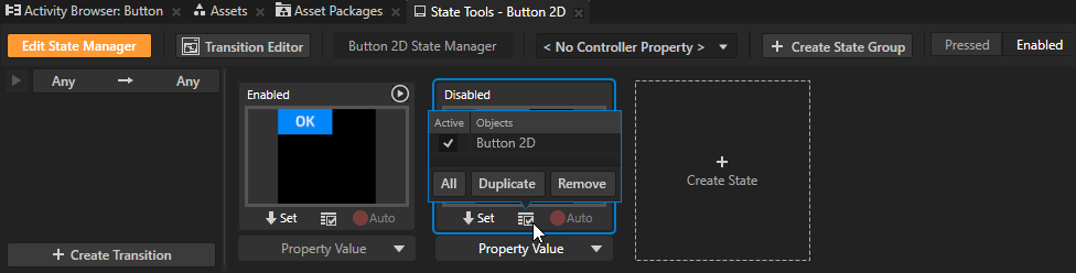
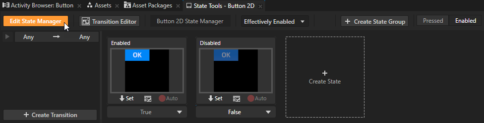
In the Node Tree or Prefabs select the node, in the State Tools create a state group, and name it.
For example, name the state group Enabled.
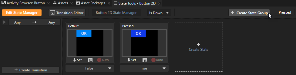
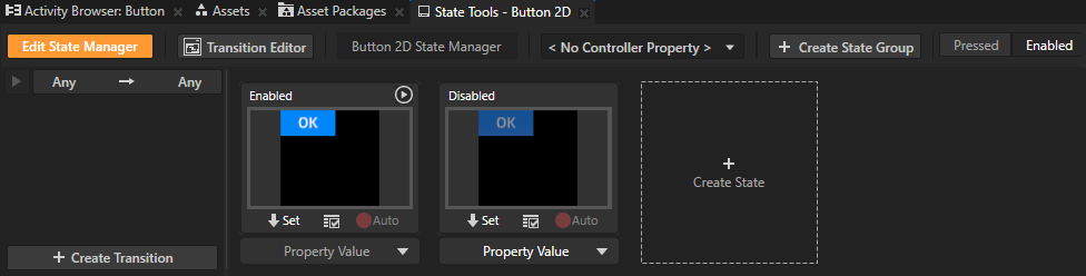
In the State Tools create two states, one that defines the appearance and behavior of the node when it is in use, and another that defines the node when it is not in use.
For example, name the states Enabled and Disabled.
For each state, define the appearance and behavior of the node in that state.
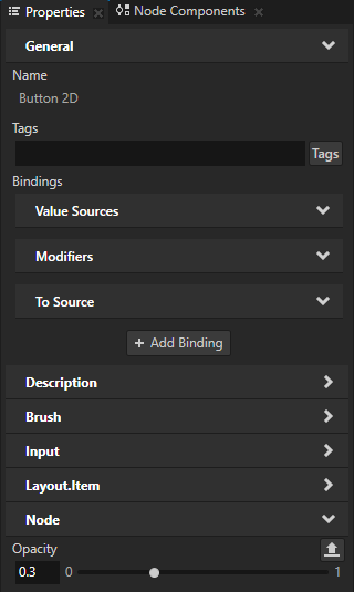
For example, to set how the node looks when it is not in use, in the Disabled state set the Opacity property to 0.3.
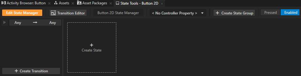
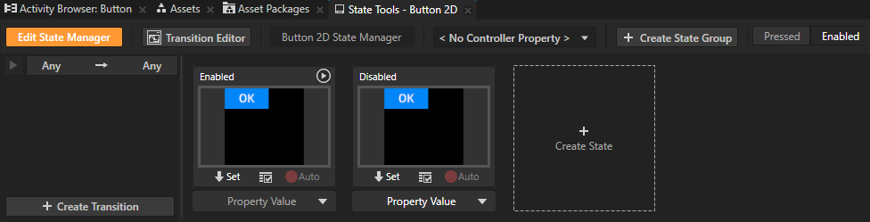
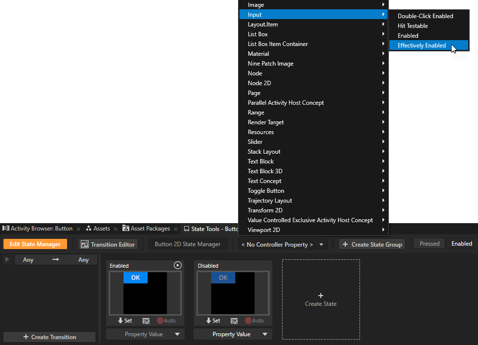
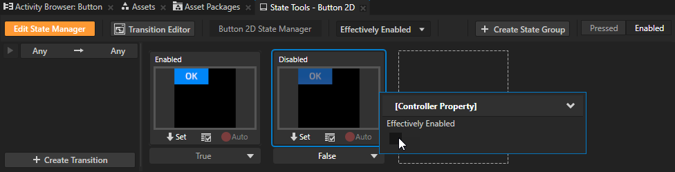
In the State Tools set the Controller Property to Input > Effectively Enabled.
The Effectively Enabled property indicates whether a node and its ancestor nodes are enabled.
In the State Tools set the value of the Effectively Enabled controller property in the Disabled state to False.
This way you set your application to use:
The Disabled state when the node is not in use and does not react to input.
The Enabled state when the node is in use and reacts to input.
In the State Tools, click Edit State Manager to deactivate the State Tools.
When you change the value of the Input > Enabled property, the appearance of the node changes. When you disable the Enabled property and try to interact with the node in the Preview, the node does not react.
Defining which node receives input
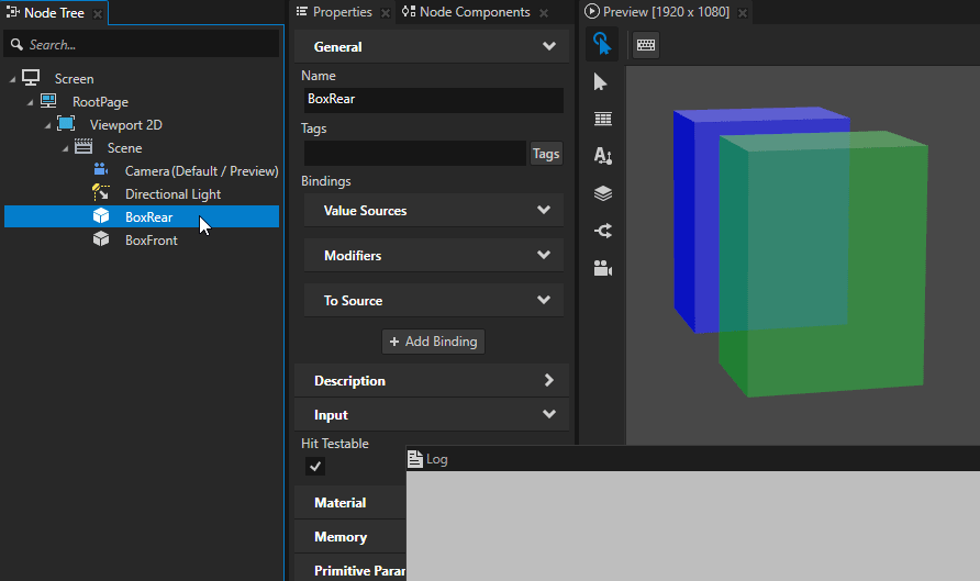
When creating a user interface, pay attention to how your application handles input, because only one node can receive input at a time. For example, define whether a click is handled by the node in the front or by the one behind it.
Kanzi uses hit testing to determine the nodes that receive input. In practice, hit testing projects a ray from the camera towards the 3D scene based on the screen coordinates of the input event.
By default hit testing is enabled for the Button, Toggle Button, List Box Item Container, Scroll View, Slider, and Text Box nodes.
To enable hit testing for a node of any other node type, add and enable the Input > Hit Testable property to that node. A 3D node has hit testing enabled when that node or its ancestor has the Hit Testable property enabled.
The first 3D node from the Camera node whose bounding box is intersected and has hit testing enabled, receives the input, consumes the event, and generates set actions, such as sending a click message.
For example, if you place two Box nodes so that the BoxFront node is in front of the BoxRear node and occludes it:
The BoxFront node receives the input when the Hit Testable property of the BoxFront node is enabled.
The BoxRear node receives the input even though it is occluded by the BoxFront node when:
Hit Testable property of the BoxFront node is disabled
Hit Testable property of the BoxRear node is enabled
Setting the size of the input area of 3D nodes
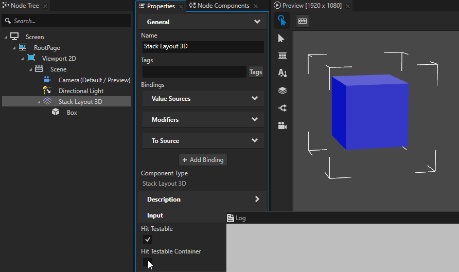
In Kanzi, hit testing for a 3D node is by default based on the bounding box of that node.
When you want to change the area within which your 3D content receives input, use the Input > Hit Testable Container property.
When you enable the Hit Testable Container property, Kanzi includes in the input area the actual layout size of the 3D node that has the property and the actual layout size of any of its child nodes. The actual layout size of a 3D node is determined by the values of the Actual Layout Width, Actual Layout Height, and Actual Layout Depth properties.
For these nodes, the Hit Testable Container property is enabled by default:
Button 3D
List Box Item Container 3D
Scroll View 3D
Slider 3D
To set the size of the input area for a 3D node of some other type, add and enable these properties:
Hit Testable Container
Hit Testable
Keep in mind that if a node is not a layout control node or the child of a layout control node, the actual layout size of that node is zero. For example, the actual layout size of an Empty Node 3D or a Model node whose parent node is not a layout control node, is zero. When you want to use such a node to set the size of the input area, place that node in a layout control node. See Layout control nodes.
For example, a Stack Layout 3D node which contains a Box node receives click input:
When the Hit Testable Container property of the Stack Layout 3D node is disabled, from the area defined by the Width, Height, and Depth properties of the Box node
When the Hit Testable Container property of the Stack Layout 3D node is enabled, from the area defined by the Layout Width, Layout Height, and Layout Depth properties of either the Stack Layout 3D or the Box node
Disabling input handling in your application
A Kanzi application handles input by default. To optimize performance, you can disable input handling in an application that does not need it. When you disable input, Kanzi does not spend CPU resources on the input events that it receives from the platform. Keep in mind that when you disable input handling, the application cannot manage the key focus, either.
To disable input handling and key focus management, override the Application::setScreenOverride function:
// To disable input handling and key focus management, leave the implementation empty.
void setScreenOverride() override
{
}
See also
Using the Long-Press Manipulator
Using the Multi-Click Manipulator
Using the Navigation Manipulator
Using the Drag-And-Drop Manipulator
Using the List Box Item Container prefabs