Using bindings
Use bindings to set the value of a property or property field with the value from another property, property field, or a data source.
Bindings allow nodes, render passes, 2D effects, states, state objects, and styles to automatically update the values of their properties in response to the changing property values, or the occurrence of some external event.
The simplest of bindings bind a property of a node to one of its own properties. You can also bind properties and property fields of one node to those of several different nodes. See Creating simple bindings, Binding to the properties of other nodes, and Modifying the value of the property that you bind.
To change the value of the target property when the value of the source property changes, and the other way around, use a two-way binding.
See Creating a two-way binding.
A complex binding expression uses several variables and bindings functions. See Creating a more complex binding.
Material types have their own special types of bindings for uniforms and temporary variables. See Material type bindings.
Blue type marks the properties that are controlled by a binding.
When you create a binding for a property, the value that comes from that binding overrides the value that you set for that property in the Properties.
When creating bindings, keep in mind that:
Only bindings to similar data types are valid. For example, you can bind only color to color, vector2 to vector2, and so on. See Type casting.
Binding takes the value of the last expression, whether it is an assignment, unary or binary operation, or just a constant value or variable itself.
In bindings you can cast strings between the four fundamental types: integer, float, boolean, and string.
Casts between integer, float, and boolean are implicit and depend on the type of the property that uses the value. Casts to and from string are explicit.
See Bindings expressions reference.
For a list of error messages and their explanations in the Binding Editor, see Troubleshooting bindings.
Learn how to use bindings by completing one of these tutorials:
Bind the rotation property field of a node to a property to create a gauge needle which you can control with property. See Tutorial: Create gauges.
Bind the position or size of one node to the position or size of another node. See Tutorial: Making applications with dynamic layout.
Bind the rotation property field of a node to the Scroll Position property of a Scroll View node to rotate the node using swiping gestures. See Tutorial: Rotate a 3D model.
Creating simple bindings
The simplest of bindings bind a property of a node to one of its own properties. You can also use bindings operators and functions to modify the result, and add several bindings to the same node.
To create simple bindings:
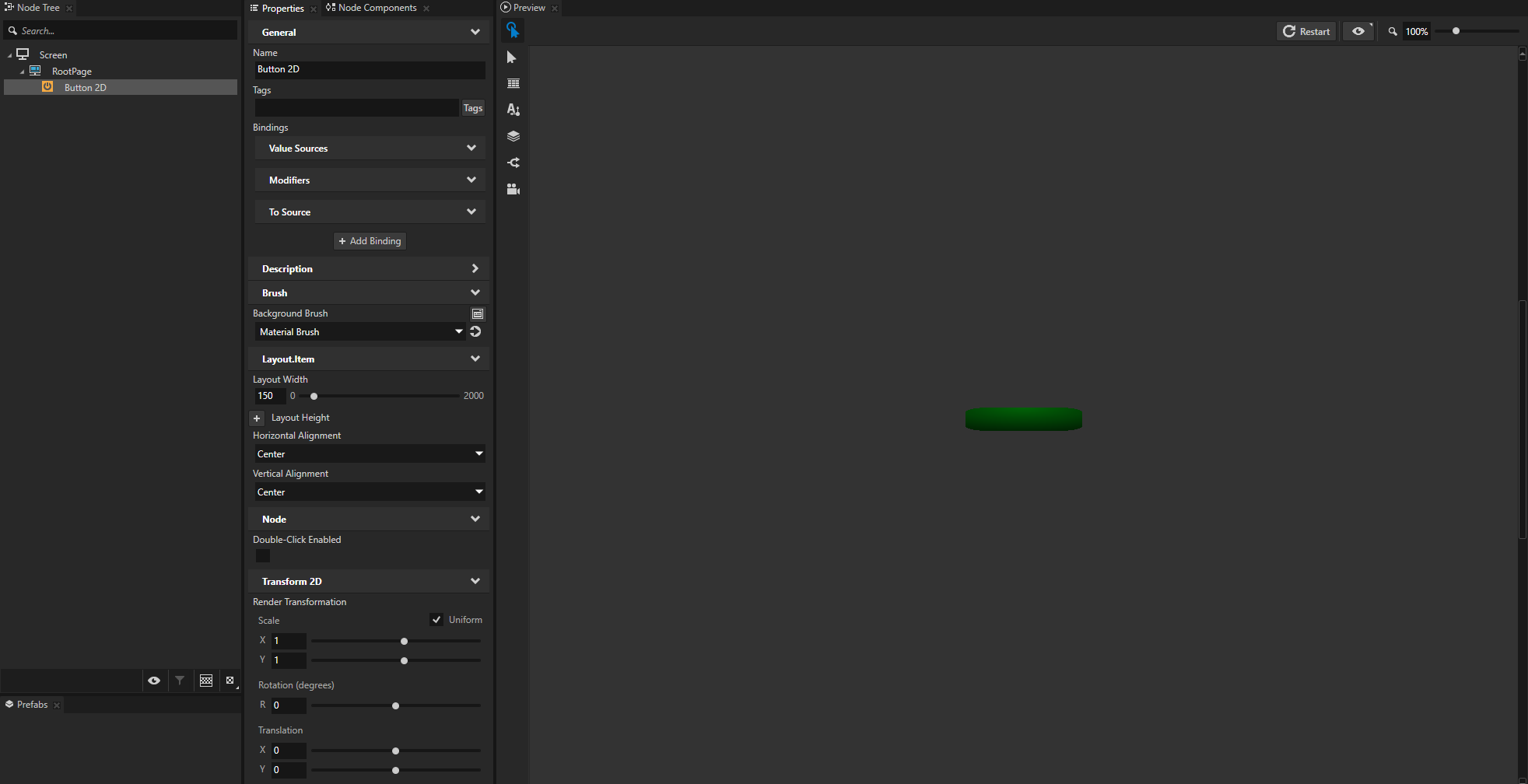
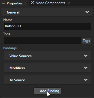
In the Node Tree create or select the node the properties of which you want to bind.
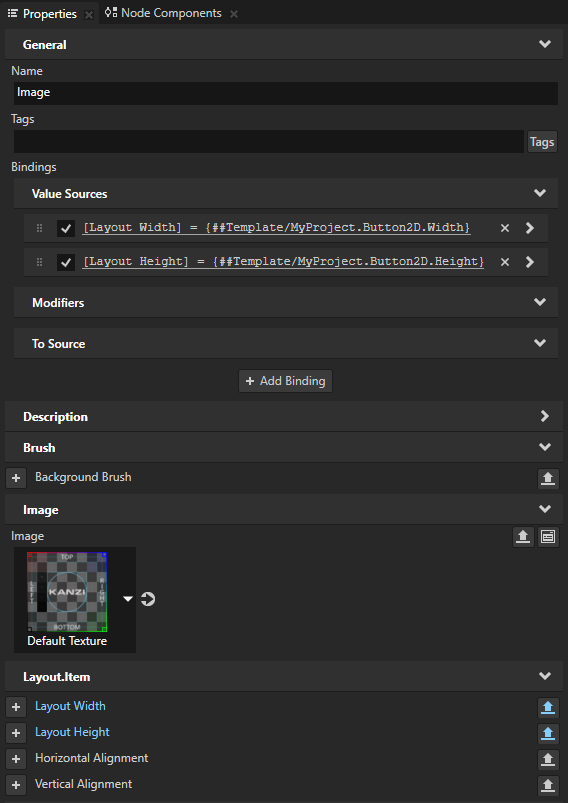
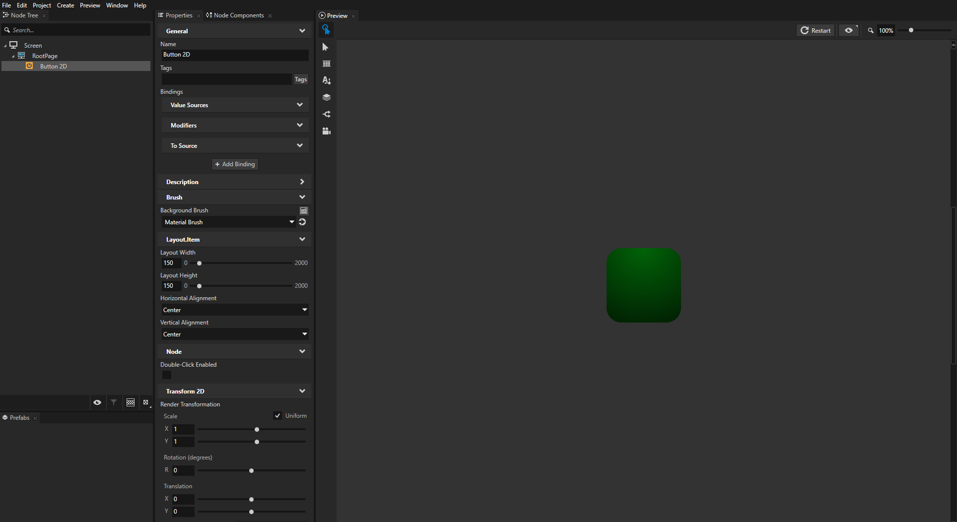
For example, create a Button 2D node and in the Properties add and set:
Background Brush to a Color Brush, Texture Brush, or Material Brush that you use to fill the Button 2D node. See Adjusting the appearance of 2D nodes.
Horizontal Alignment and Vertical Alignment to Center
Layout Width to set the width of the button
Render Transformation
You use this property later in this procedure to set the position of the button.
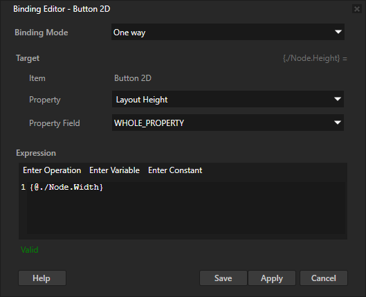
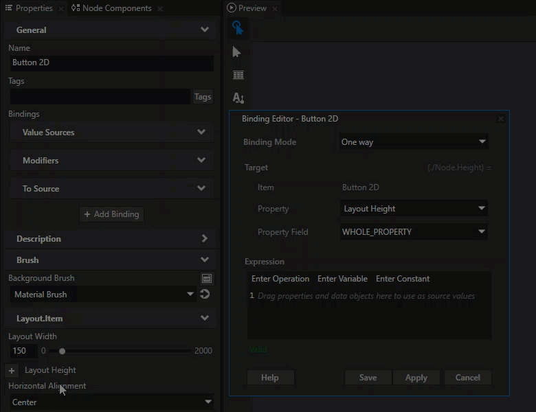
In the Properties click + Add Binding and in the Binding Editor set:
Property to the property you want to bind
For example, to bind the height, select Layout Height.
(Optional) Property Field to the property field you want to bind
To bind to the whole property, leave Property Field set to Whole property.
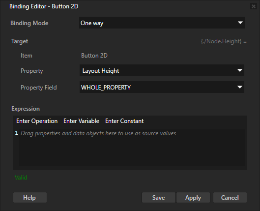
In the Expression editor enter the binding expression.
For example, to bind the height to the width of this same node, enter:
{@./Node.Width}Click Save to apply the binding and close the Binding Editor.
When you change the width of the node by changing the value of the Layout Width property, the height of the node changes the same amount and the button is always square-shaped.
Tip
When you write expressions for bindings in the Binding Editor, the fastest and most accurate way to add nodes and their properties to an expression is to drag them from the Properties to the Expression editor in the Binding Editor.
Tip
You can apply a binding in these ways:
To apply a binding without closing the Binding Editor, click Apply.
When you edit only the binding expression, you can apply a binding by pressing the Shift Enter keys on the keyboard.
To apply a binding and close the Binding Editor, click Save.
Add another binding to the same node.
For example:
In the Properties click + Add Binding and in the Binding Editor set:
Property to Layout Width
Expression to
abs({@./Node2D.RenderTransformation}.translationX * 0.5)
Click Save.
You bind the width of the node to half of the absolute value of the Render Transformation property Translation X property field.
You use the
absfunction to calculate the absolute value. See abs (absolute value) in the Bindings expressions reference.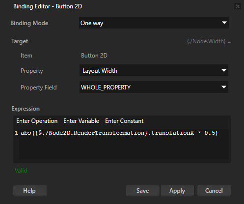
Tip
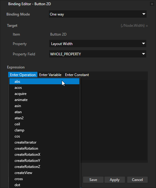
To quickly add a function call to a binding expression, in the Binding Editor click Enter Operation and select the function that you want to call.
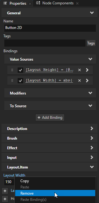
(Optional) In the Properties right-click the Layout Width property, and select Remove.
You can remove the Layout Width property because a binding controls that property.
When you create a binding for a property, the value that comes from that binding overrides the value that you set for that property in the Properties.
When you move the button on the x axis, the size of the button changes.
Binding to the properties of other nodes
You can bind properties and property fields of one node to those of other nodes.
To bind to the properties of other nodes:
In the Node Tree create or select the node to the properties of which you want to bind.
For example, create a Button 2D node and in the Properties add and set:
Background Brush to a Color Brush, Texture Brush, or Material Brush that you use to fill the Button 2D node. See Adjusting the appearance of 2D nodes.
Horizontal Alignment and Vertical Alignment to Center
Layout Width and Layout Height to set the size of the button
Render Transformation
You use this property later in this procedure to set the position of the button.
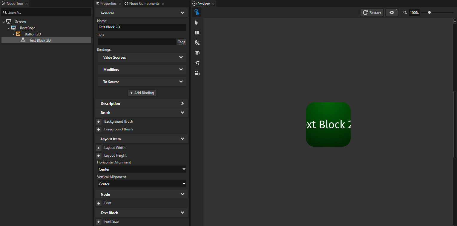
Create another node and bind one of its properties to a property of the node that you created in the previous step.
For example:
In the Node Tree press Alt and right-click the node that you created, select Text Block 2D, and in the Properties add and set the Horizontal Alignment and Vertical Alignment properties to Center.
In the Properties click + Add Binding and in the Binding Editor set:
Property to Text
Expression to
int({@../Node2D.RenderTransformation}.translationX)Tip
When you use the @ sign in a binding expression before the path to a node, Kanzi Studio:
Checks whether the path is valid and shows an error message in the Binding Editor if the path is not valid.
Updates the path in the binding expression whenever the location between the source and the target nodes in the node tree changes.
With the @ sign you can create bindings only within the same prefab, not between prefabs.
Click Save.
You bind the Text property of the node to the Render Transformation property Translation X property field of its parent node, and convert the value to an integer. See Type casting in the Bindings expressions reference.
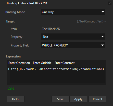
When you change the value of the Render Transformation property Translation X property field of the node that you created in the first step of the procedure, the text in the Text Block 2D node changes to show the current position of the node on the x axis.
Modifying the value of the property that you bind
You can get the current value of the property that you want to bind and modify that value.
To modify the value of the property that you want to bind:
In the Node Tree create or select the node to the properties of which you want to bind.
For example, create a Button 2D node and in the Properties add and set:
Background Brush to a Color Brush, Texture Brush, or Material Brush that you use to fill the Button 2D node. See Adjusting the appearance of 2D nodes.
Horizontal Alignment and Vertical Alignment to Center
Layout Width and Layout Height to set the size of the button
Render Transformation
You use this property later in this procedure to set the position of the button.
In the Properties click + Add Binding and in the Binding Editor set:
Property to the property that you want to bind
For example, to bind one of the Render Transformation property fields, select Render Transformation.
Property Field to the property field that you want to bind
For example, to bind the Translation property field on the y axis, select Translation Y.
Expression to
getCurrentValue().translationX
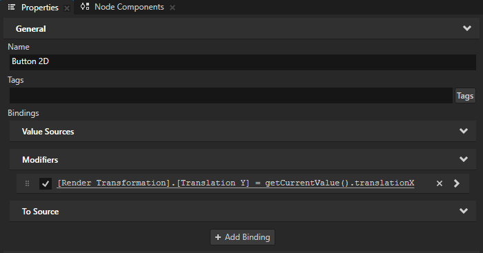
You use the getCurrentValue bindings function to get the value of the Render Transformation property which you modify with this binding. Kanzi Studio creates the binding in the Bindings > Modifiers.
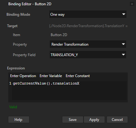
When you move the node on the x axis by changing the value of the Render Transformation property Translation X property field, the node moves the same distance on the y axis.
Creating a to-source binding
Use a to-source binding to set:
A property value in another project item that you set as the push target of the binding.
A property value that is affected also by some other input source, such as user input.
For example, to create a to-source binding that updates the toggle state of a Toggle Button:
Create a Toggle Button node whose toggle state you want to update with a binding.
For example:
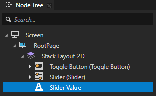
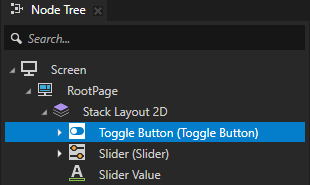
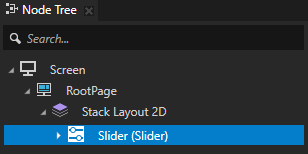
In the Node Tree, create a Stack Layout 2D node.
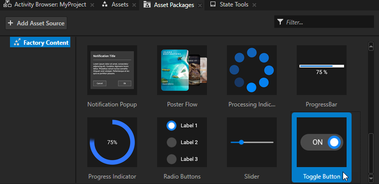
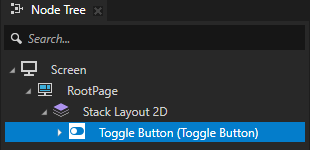
From the Asset Packages > Factory Content, drag the Toggle Button to the Node Tree and drop it on the Stack Layout 2D node. See Factory Content assets.
Create a control to which you want to bind the toggle state of the Toggle Button node.
For example:
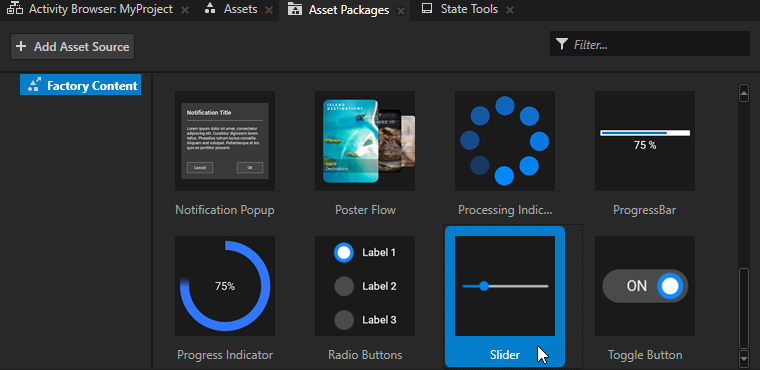
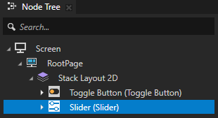
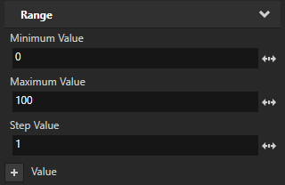
From the Asset Packages > Factory Content, drag the Slider to the Node Tree and drop it on the Stack Layout 2D node. In the Properties, add and set the lowest and highest value of the slider. See Using the slider from the Factory Content.
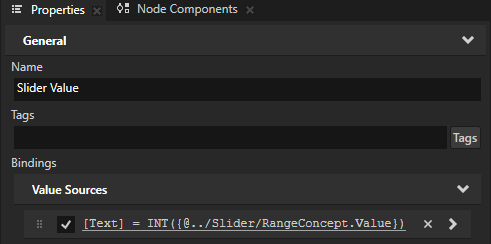
(Optional) In the Stack Layout 2D node, create a Text Block 2D node that shows the slider value.
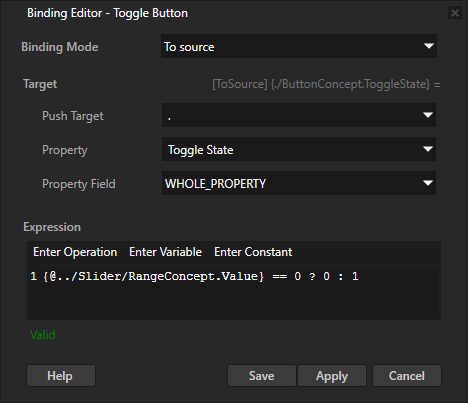
Select the Toggle Button node. In the Properties, click + Add Binding and in the Binding Editor, set:
Binding Mode to To source
Push Target to .
Property to Toggle Button > Toggle State
Expression to the expression that returns the value to which you want to set the toggle state.
For example, set it to
{@../Slider/RangeConcept.Value} == 0 ? 0 : 1This binding uses the conditional operator to toggle the Toggle Button:
Off when the value of the Slider is zero.
On when the value of the Slider is not zero.
See ? (conditional).
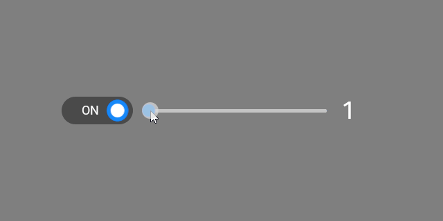
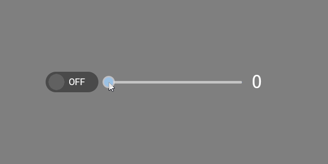
Now, when in the Preview you:
Adjust the slider to a value larger than zero, Kanzi toggles on the toggle button.
Adjust the slider to zero, Kanzi toggles off the toggle button.
Toggle the toggle button, the slider keeps its value.
This enables the user to both adjust the value of a setting and quickly enable and disable the setting. For example, you can create a volume control.
Creating a two-way binding
To change the value of the target property when the value of the source property changes, and the other way around, use a two-way binding.
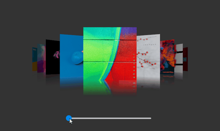
For example, use a two-way binding to enable the user to select an item in a list box either by clicking the item in the List Box node, or by using a slider.
To create a two-way binding between properties of two nodes:
Create the first of the two nodes between which you want to bind properties.
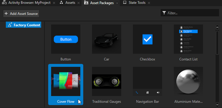
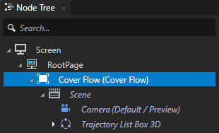
For example, from the Asset Packages > Factory Content drag the Cover Flow to the Preview. See Factory Content assets.
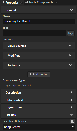
In the Cover Flow > Scene > Trajectory List Box 3D node the Selection Behavior property is set to Bring Center. This way when the user clicks an item in that list box, the list box brings that item to the center of the list box.
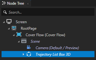
Create the second of the two nodes between which you want to bind properties.
For example:
From the Asset Packages > Factory Content drag the Slider to the Preview. See Using the slider from the Factory Content.

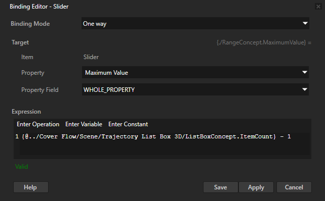
In the Node Tree select the Slider node, in the Properties click + Add Binding, and in the Binding Editor set:
Property to Maximum Value
Expression to
{@../Cover Flow/Scene/Trajectory List Box 3D/ListBoxConcept.ItemCount} - 1
You bind the highest value of the Slider node to the index of the last item in the Trajectory List Box 3D node. The lowest value of the Slider node is by default 0. This way you set the range of values in the Slider node to match the number of items in the Trajectory List Box 3D node.
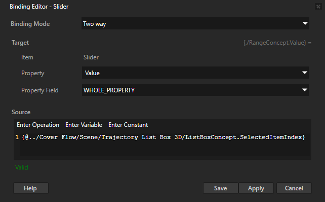
To create a two-way binding between the properties of the nodes that you created, in the Node Tree select the Slider node, in the Properties click + Add Binding, and in the Binding Editor set:
Binding Mode to Two way
Property to the property that you want to bind
For example, set it to Value.
Source to the property to which you want to bind the target property
For example, set it to the Selected Item Index property of the List Box node:
{@../Cover Flow/Scene/Trajectory List Box 3D/ListBoxConcept.SelectedItemIndex}
You bind the Value property of the Slider node to the Selected Item Index property of the Trajectory List Box 3D node. This way you create a two-way connection between the position of the slider knob and the selected item in the list box.
In the Preview when you move the slider knob, the selected item in the list box changes, and when you click items in the list box, the slider knob moves.
Creating a more complex binding
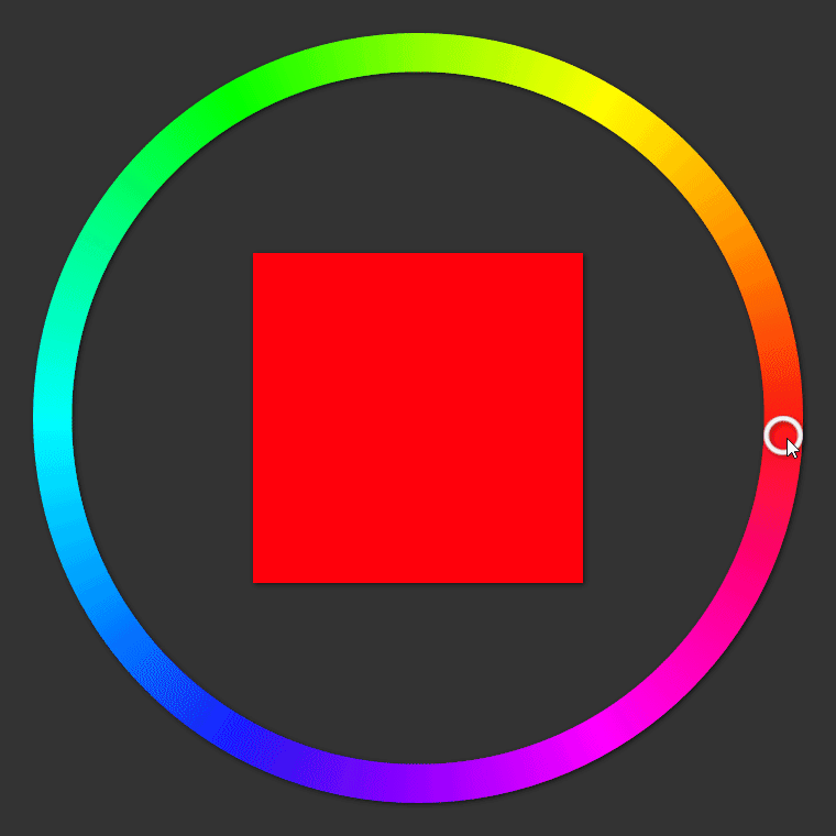
A more complex binding involves binding properties of one node to properties of other nodes and using several variables and binding functions. In this example, you create a color picker with a slider.
To create a more complex binding:
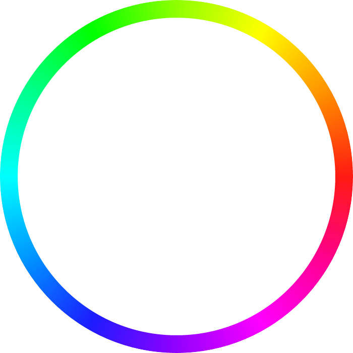
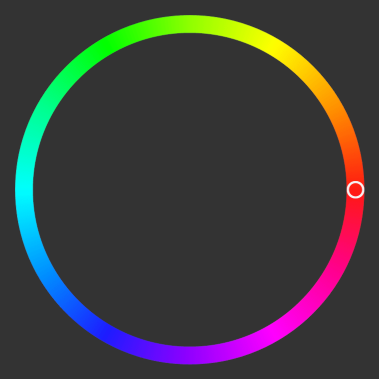
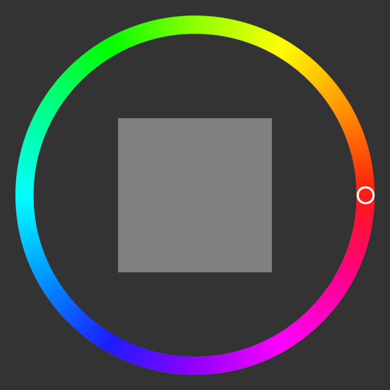
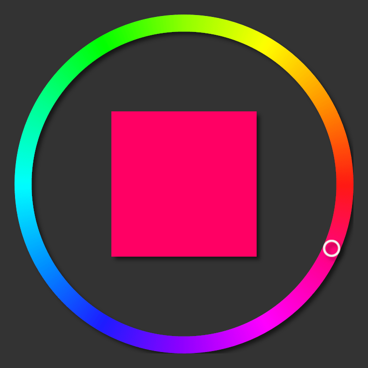
Create a slider whose ring-shaped knob moves along a color wheel:
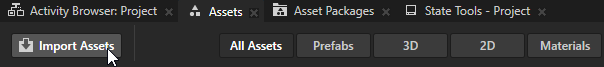
In the Assets, click Import Assets and import images that show a color wheel and a ring-shaped slider knob.
For example, save and import these images.

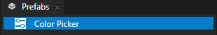
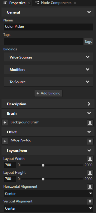
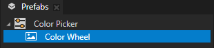
In the Prefabs, create a Slider 2D prefab and name it Color Picker. In the Properties, add and set:
Layout Width and Layout Height to match the dimensions of the image that shows the color wheel.
For example, set them to 700.
Horizontal Alignment and Vertical Alignment to Center
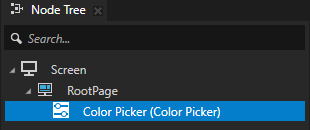
Drag the Color Picker prefab to the Node Tree and drop it on the RootPage node.
This way you instantiate the prefab in the node tree so that you can follow the creation of the slider in the Preview.
In the Prefabs > Color Picker prefab:
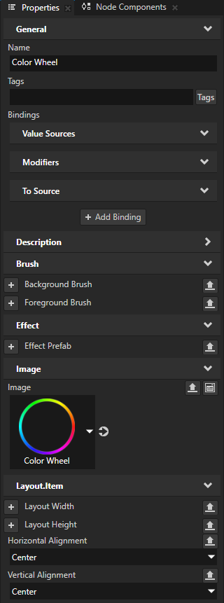
Create an Image node that shows the color wheel and visually represents the rail along which the slider knob moves. In the Properties, add and set the Horizontal Alignment and Vertical Alignment properties to Center.
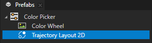
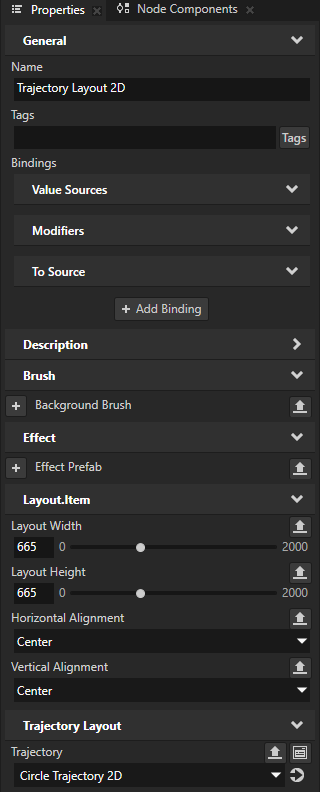
Create a Trajectory Layout 2D node that acts as the rail along which you move the slider knob. In the Properties, add and set:
Layout Width and Layout Height to the difference between the dimensions of the images that show the color wheel and the slider knob.
For example, set them to 665.
Horizontal Alignment and Vertical Alignment to Center
This way you position the trajectory layout over the color wheel.
Tip
To see the trajectory, in the Preview click
 to enter the Analyze mode, right-click
  , and select Debug objects.
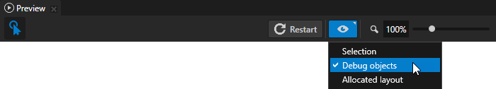
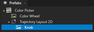
In the Trajectory Layout 2D node, create an Image node that you use as the visual representation of the slider knob.
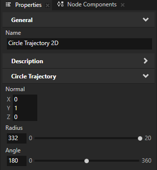
In the Prefabs, select the Trajectory Layout 2D node. In the Properties next to the Trajectory property, click
 to go to that resource and set:
Radius to half of the width of the Trajectory Layout 2D node
For example, set it to 332.
Angle to 180
You set the starting point of the trajectory to the color red, whose hue is 0.
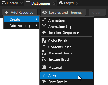
Create an alias that Kanzi uses to tell the slider which trajectory to use as the rail of the slider:
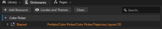
In the Prefabs, select the Color Picker prefab. In the Dictionaries, click + Add Resource, select Create > Alias, and name the alias $layout.
Set the $layout alias to point to the Trajectory Layout 2D node in the Color Picker prefab.
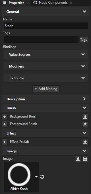
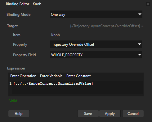
In the Prefabs, select the Knob node. In the Properties, click + Add Binding and in the Binding Editor, set:
Property to Trajectory Override Offset
Expression to
{@../../RangeConcept.NormalizedValue}
Click Save.
This binding makes the slider knob move on the trajectory that defines the slider rail.
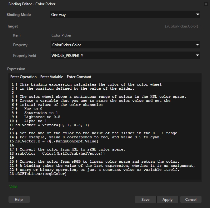
Store the color that the user selects on the color wheel:
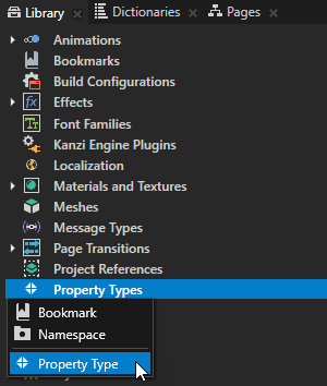
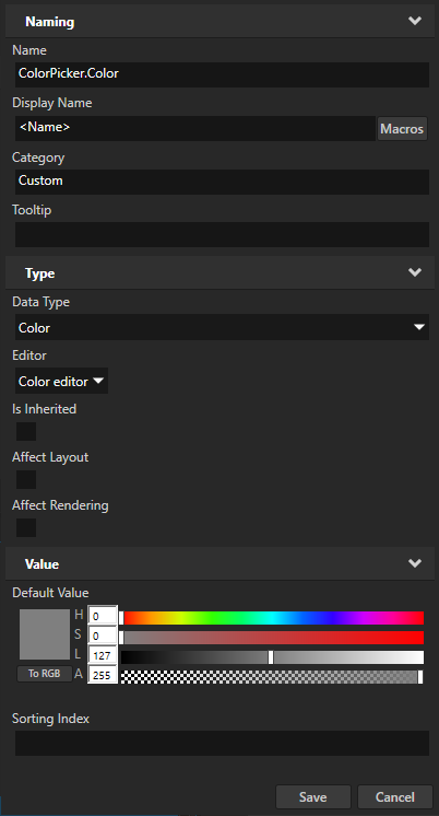
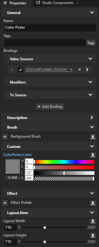
In the Library > Property Types, create a property type and set:
Name to ColorPicker.Color
Data Type to Color
In the Prefabs, select the Color Picker prefab. In the Properties, click + Add Binding and in the Binding Editor, set:
Property to ColorPicker.Color
Expression to
# This binding expression calculates the color of the color wheel
# in the position defined by the value of the slider.

# The color wheel shows a continuous range of colors in the HSL color space.
# Create a variable that you use to store the color value and set the
# initial values of the color channels:
# - Hue to 0
# - Saturation to 1
# - Lightness to 0.5
# - Alpha to 1
hslVector = Vector4(0, 1, 0.5, 1)

# Set the hue of the color to the value of the slider in the 0...1 range.
# For example, value 0 corresponds to red, and value 0.5 to cyan.
hslVector.x = {@./RangeConcept.Value}

# Convert the color from HSL to sRGB color space.
srgbColor = Color4(hslToSrgb(hslVector))

# Convert the color from sRGB to linear color space and return the color.
# A binding takes the value of the last expression, whether it is an assignment,
# unary or binary operation, or just a constant value or variable itself.
sRGBToLinear(srgbColor)
Click Save.
You bind the ColorPicker.Color property to a color value that you calculate based on the Value property of the slider. To convert between color spaces, you use the hslToSrgb and sRGBToLinear binding functions.
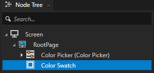
Create a swatch that shows the currently selected color:
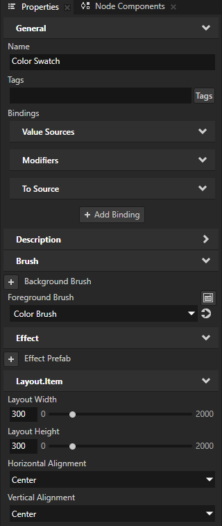
In the Node Tree, create an Empty Node 2D node and name it Color Swatch. In the Properties, add and set:
Foreground Brush and select + Color Brush
Layout Width and Layout Height to 300
Horizontal Alignment and Vertical Alignment to Center
You use this node to show the color that the user selects in the color wheel with the slider.
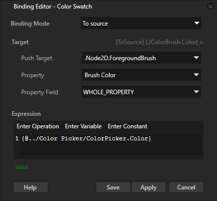
In the Node Tree, select the Color Swatch node. In the Properties, click + Add Binding, and in the Binding Editor set:
Binding Mode to To source
Push Target to .Node2D.ForegroundBrush
Property to Brush Color
Expression to
{@../Color Picker/ColorPicker.Color}
Click Save.
This way you set the value of the Brush Color property for the brush that is used by the Foreground Brush of the Color Swatch node. You bind the value of the Brush Color property to the value of the ColorPicker.Color property in the Color Picker node.
In the Preview, when you drag the knob along the color wheel, the color swatch shows the color under the knob.

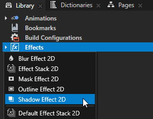
(Optional) Apply a shadow to the color wheel, slider knob, and color swatch:
In the Library, press Alt and right-click Effects and select Shadow Effect 2D.
The Shadow Effect 2D effect applies a shadow to the visual shape of the content in a 2D node. See Using the Shadow Effect 2D effect.
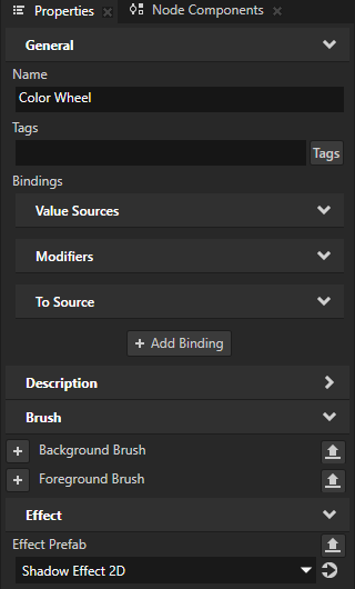
From the Library > Effects > 2D Effects, drag the Shadow Effect 2D effect to the Prefabs and drop it on the node that shows the color wheel.
This way you set in that node the Effect Prefab property to the Shadow Effect 2D effect.
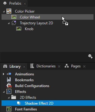
Repeat the previous step for the nodes that show the slider knob and color swatch.
Adjust the appearance of the shadow effect.
For example, in the Library > Effects > 2D Effects, select the Shadow Effect 2D effect. In the Properties, add and set:
Shadow Blur Radius to 5
Shadow Distance to 2
Shadow Color to fully opaque black
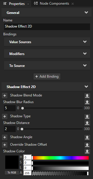
In the Prefabs, select the Color Picker prefab. In the Properties, set the Layout Width and Layout Height properties to values that leave enough space for the shadow in the layout.
For example, set the Layout Width and Layout Height to 710.
Using a binding to load resources
You can use the Acquire binding function to load resources using their resource IDs, which you define in a string property.
For example, you can create a binding that gets the resource ID of a text resource from a data source, loads the text resource, and sets a Text Block node to show the content of that text resource. If you localize that text resource, the Text Block automatically shows the value of the resource for the current locale of the application. If you change the data in your data source, the binding function gets the resource, to which the resource ID points, and updates the text.
See acquire.
To use a binding to load resources:
In Kanzi Studio create the resources that you want to show in your application.
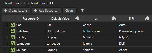
For example, in a localization table create text resources for labels in a list menu. See Localizing applications.
Create a data source where string data objects set the resource IDs of the resources that you want to show in your application. See Defining a data source and Using a data source.
For example, from the
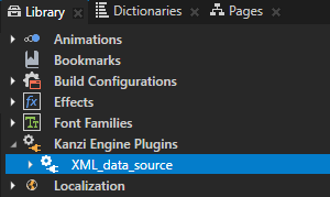
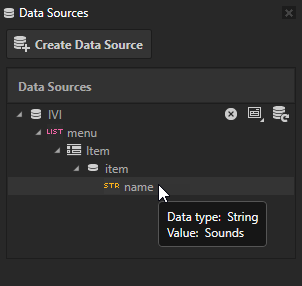
<KanziWorkspace>/Tutorials/Data sources/Completed/Application/lib/Win64directory import the XML_data_source Kanzi Engine plugin and create a data source. You use that data source to provide data for items in a List Box node. See Tutorial: Get application data from a data source.<menu type="list"> <items> <item> <name type="string">Sounds</name> </item> <item> <name type="string">DateTime</name> </item> <item> <name type="string">Car</name> </item> <item> <name type="string">Display</name> </item> <item> <name type="string">Language</name> </item> </items> </menu>
Load the resources:
Use the
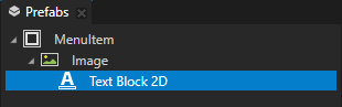
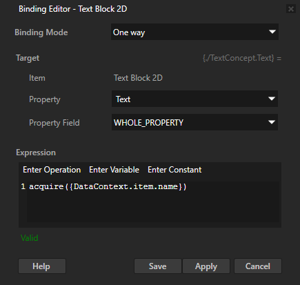
acquirebinding function to load a resource based on its resource ID.For example, select the Text Block node where you want to show the content to which a resource ID points, in the Properties click + Add Binding, and in the Binding Editor set:
Property to Text
Expression to
acquire({DataContext.item.name})
You bind the Text property to the content of the text resource whose resource ID you define in the data source in the menu list item in the name string data object.
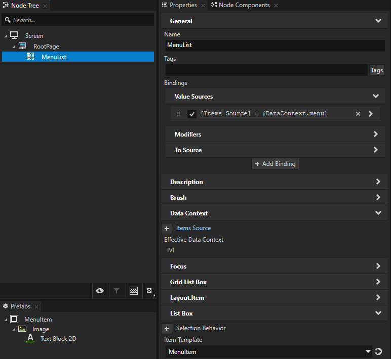
Create the nodes that show the content to which resource IDs from a data source point.
For example, populate a List Box node with data from a data source, and as the item template use the prefab that contains the node to which you added the binding that loads a resource. See Using list data objects.
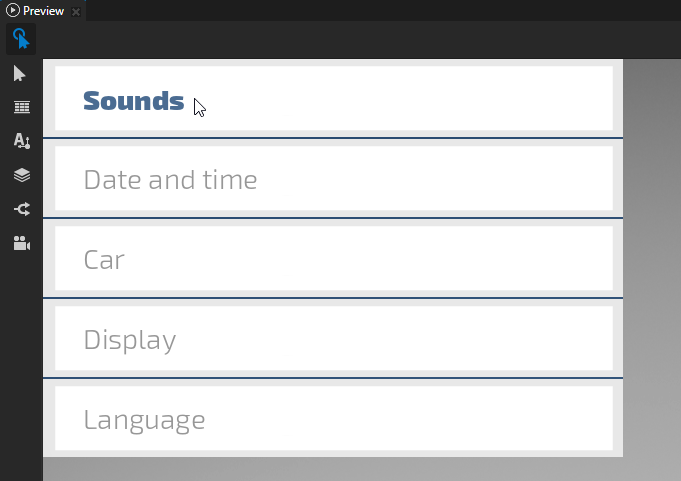
When you switch the locale of your application or change the data in your data source, the acquire binding function gets the resources, to which the resource IDs point, and updates the content in the List Box node.
Using piecewise functions in bindings
You can use the animate bindings function to set how a value of a property changes using a piecewise function.
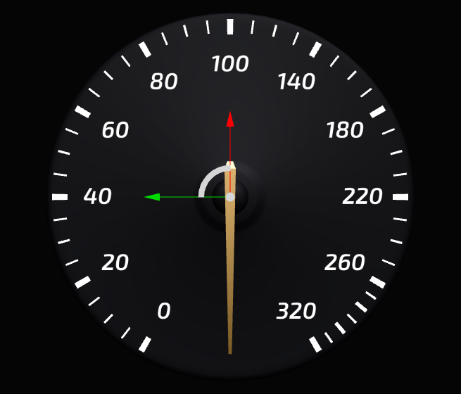
For example, you can use the Animate function to set the needle in a gauge to move faster between values 0 and 100 than it does for values larger than 100.
See animate.
To use a piecewise function in a binding:
Create an Animation Data item. See Animations.
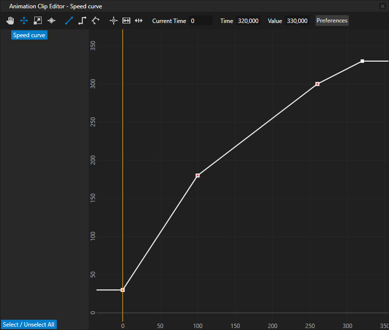
For example, create an Animation Data item named Speed curve that contains four keyframe points which define three different segments. Create keyframes at:
Time 0 with Value 30
Time 100 with Value 180
Time 260 with Value 300
Time 320 with Value 330
You use these keyframes to set the rotation of a speed needle at different speeds. For example, when the speed is 100, you set the rotation of the needle to be 180 degrees.
In the Node Tree select or create a node for the properties of which you want to use the piecewise function you created in the Animation Data item in the previous step.
For example, to create a speed needle create an Empty Node 3D node, name it Speed Needle, add to it a Model node which shows a speed needle, and position the Model so that you can use the Empty Node 3D to rotate the Model around a desired point along the needle. See Editing the origin of nodes.
In the Library > Property Types create the property type you use to control the position of the needle.
For example, create a property type named Speed and set the Upper Bound property to 320. When you create a property type, Kanzi Studio by default creates a custom float property type with a slider editor.
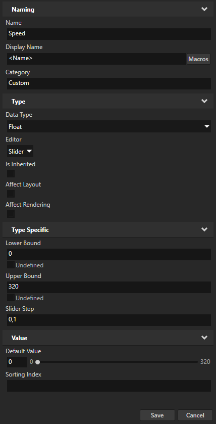
In the Node Tree select the Empty Node 3D node which represents the speed needle and in the Properties add the property type that you created in the previous step.
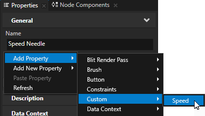
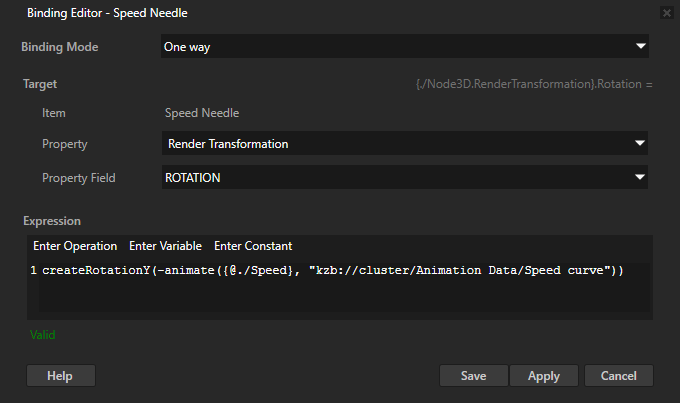
In the Properties click + Add Binding and in the Binding Editor set:
Property and Property Field to the property and property field you want to use to position the speed needle with the expression in the binding.
For example, set:
Property to Render Transformation
Property Field to Rotation
Create a binding for each property field that you want to animate.
Expression to the expression that animates the change in the position of the speed needle using a piecewise function.
Use the
animatefunction to bind the property type that you use to control the position of the needle to the piecewise function you define in the Animation Data item you created in the first step. See animate.To point to the Animation Data item use either:
Resource ID. See Adding a resource to a resource dictionary.
Kzb URL. To get the kzb URL of a resource, in the Library right-click the resource and select Copy .kzb URL.
For example:
createRotationY(-animate({@./Speed}, "kzb://cluster/Animation Data/Speed curve"))
Click Save.
When you change the value of the Speed property in the Speed Needle node the needle moves. The piecewise function you define in the Animation Data item Speed curve sets the rotation of the needle. The needle moves in:
Largest increments when the value of the Speed property is between 0 and 100
Smaller increments when the value of the Speed property is between 100 and 260
Smallest increments when the value of the Speed property is between 260 and 320
Creating dynamic kzb URLs with bindings
You can create the kzb URL of a resource in your project dynamically in a binding expression. For example, you can create a binding which:
Creates the kzb URL of a texture based on data from a data source.
Sets an image in your application to use that texture.
For example, to create a binding which dynamically creates the kzb URL of a texture:
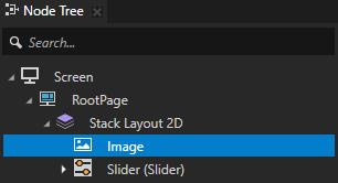
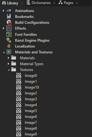
In the Node Tree create or select a node whose property type you want to use as input for creating the kzb URL of a resource in your project. You can also use a custom property type or a data source. See Creating property types and Using a data source.
For example, use the Slider from the Asset Packages > Factory Content to dynamically create the kzb URL of a texture in your project based on the value of that slider. See Using the slider from the Factory Content.
If your project contains textures called Image0 to Image10, you set the Image property of an Image node to one of those textures based on the value of the slider. For example, when the value of the slider is 5.0, you set the Image property to the Image5 texture.
In the Node Tree create or select a node whose property you want to bind to the dynamically created kzb URL and in the Properties click + Add Binding.
For example, create an Image node and add a binding to that node.
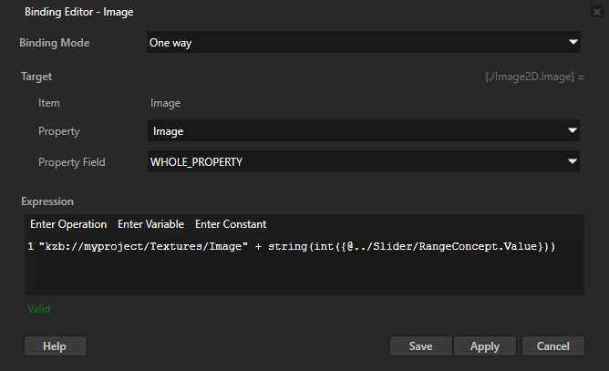
In the Binding Editor set:
Property to the property that you want to bind to a dynamic kzb URL.
For example, set it to Image.
Expression to the binding expression where you create the kzb URL to a resource in your project.
For example, if you set the Property to Image, use an expression which creates the kzb URL of a texture based on the value of the slider that you created in the first step.
"kzb://<projectname>/Textures/Image" + string(int({@../Slider/RangeConcept.Value}))
Click Save.
You bind the value of the Image property to the static part of the kzb URL, which points to the textures in your project, and the dynamic part, which comes from the slider. Before you can concatenate the two parts, you must cast the float value that comes from the slider to an integer and then convert it to a string. When you change the value of the slider, the value of the Image property changes too.
Tip
To get the kzb URL of a resource, in the Library right-click the resource and select Copy .kzb URL.
In the Preview when you move the slider knob, the texture that the Image node shows changes based on the value of the slider.
Using bindings to split text into parts
You can use bindings to split text into parts and access each part of the text. For example, split runtime data that you get from a data source. See Using a data source.
You can either:
Show the parts of text in multiple nodes in the order of those nodes in the Node Tree.
You store the collection of text parts in a property and in each node, where you want to show a part of the text, use a binding to advance the iteration of that collection and show the first element from the iterator.
Because the bindings iterate over the collection of text parts in the order in which Kanzi executes those bindings, the order of the nodes in the Node Tree determines which part of the text each node shows.
When you show the parts of text in this way, if you in Kanzi Studio change any property value in a node that shows a part of the text, the Kanzi Studio Preview re-instantiates the bindings in that node and advances the iteration beyond the end of the text that you split. When this happens, you must restart the Preview to see the correct text.
See Showing the text parts in multiple nodes in the node tree order.
Show the parts of text in multiple nodes in any order.
You store the locations of the text parts in separate properties and in each node, where you want to show a part of the text, use a binding to show the text part from a location stored in a specific property.
Showing the text parts in multiple nodes in the node tree order
When you split text into parts, you can show those parts in multiple nodes in the order determined by the order of those nodes in the Node Tree.
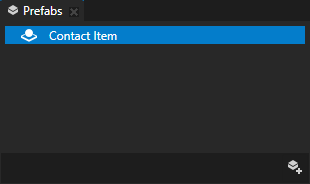
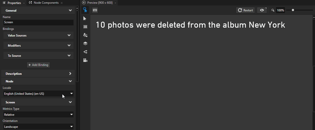
In this example you split text that contains contact information and show the first name, last name, and phone number in different Text Block nodes. The example uses a custom text property that you create in Kanzi Studio, but you can use text from any other source. To learn how to create a contacts list that receives data from a data source, see Tutorial: Create a contacts list with a Grid List Box.
To split text into parts and show those parts in multiple nodes in the order determined by the order of those nodes in the Node Tree:
Create the text that you want to split.
For example:
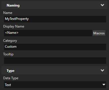
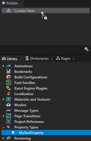
In the Library press Alt and right-click Property Types, select Property Type, and in the New Property Type window set Data Type to Text.
In the Prefabs create a Dock Layout 2D node that you use to define the layout of a contact entry and from the Library drag the text property type that you created, to the Dock Layout 2D node.
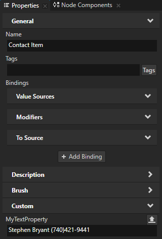
In the Prefabs select the Dock Layout 2D node and in the Properties set the custom text property to the text that you want to split. In the text use specific characters to separate the parts of text.
This example uses space as the separator.
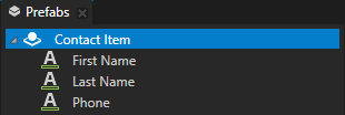
Create the nodes where you want to show the parts of text, and set the layout and appearance of those nodes.
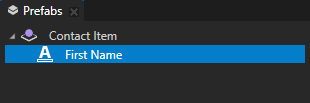
For example, in the Prefabs in the Dock Layout 2D node create and arrange as many Text Block 2D nodes as you need to show all parts of the text that you want to split and set the appearance of each Text Block 2D node. See Using the Dock Layout nodes and Using the Text Block nodes.
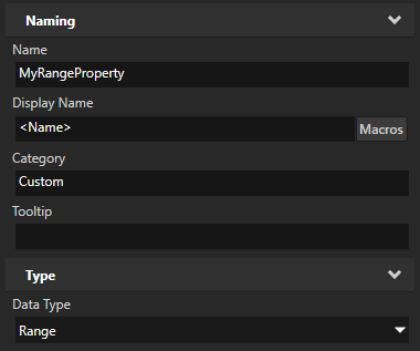
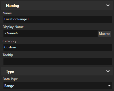
In the Library > Property Types create a property type and set Data Type to Range.
A range property stores a collection of values.
Create a binding that splits a text into parts and stores those parts in a range.
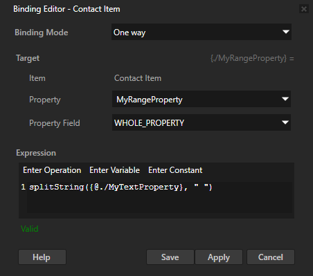
For example, in the Prefabs select the Dock Layout 2D node, in the Properties click + Add Binding, and in the Binding Editor set:
Property to MyRangeProperty
Expression to
splitString({@./MyTextProperty}, " ")The splitString function splits a text string into a collection of substrings and returns that collection as a range iterator.
Click Save.
With this binding you split the text in the MyTextProperty property using space as the separator, and store that text in the MyRangeProperty range property as a collection of parts of text.
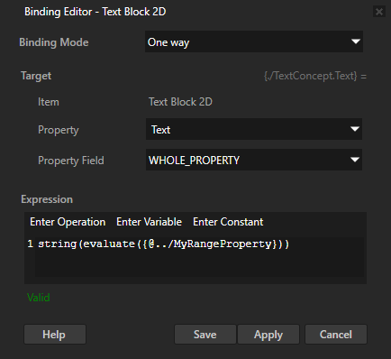
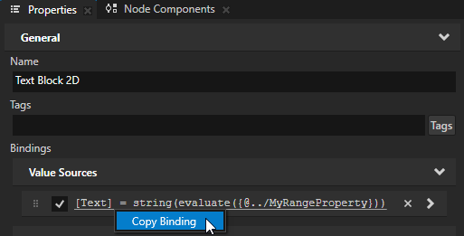
In the Prefabs select the first Text Block 2D node, in the Properties click + Add Binding, and in the Binding Editor set:
Property to Text
Expression to
string(evaluate({@../MyRangeProperty}))The evaluate function advances the iteration of a range. By converting the evaluation to a string you read the first element from the range.
Click Save.
With this binding you get the first part of text in the MyRangeProperty.
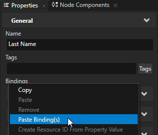
In the Properties right-click the binding that you added in the previous step and select Copy Binding.
Paste the binding to the other Text Block 2D nodes that you created.
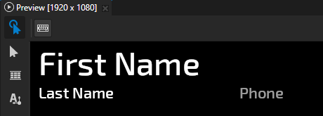
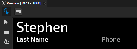
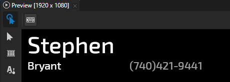
In each Text Block 2D node you use the same binding to advance the iteration of the range. This way you step through the parts of text in the range and in each Text Block 2D node show one part.
The bindings in the Text Block 2D nodes iterate over the range in the order in which Kanzi executes those bindings.
Note that if you now in Kanzi Studio change any property value in any of the Text Block 2D nodes, Kanzi re-instantiates the bindings in that node and advances the range iteration beyond the end of the text that you split. To see the correct text, restart the Preview.
Showing the text parts in multiple nodes in any order
When you split text into parts, you can show those parts in multiple nodes in any order.
In this example you split text that contains contact information and show the first name, last name, and phone number in different Text Block nodes. The example uses a custom text property that you create in Kanzi Studio, but you can use text from any other source. To learn how to create a contacts list that receives data from a data source, see Tutorial: Create a contacts list with a Grid List Box.
To split text into parts and set the order in which to show those parts in multiple nodes:
Create the text that you want to split.
For example:
In the Library press Alt and right-click Property Types, select Property Type, and in the New Property Type window set Data Type to Text.
In the Prefabs create a Dock Layout 2D node that you use to define the layout of a contact entry and from the Library drag the text property type that you created, to the Dock Layout 2D node.
In the Prefabs select the Dock Layout 2D node and in the Properties set the custom text property to the text that you want to split. In the text use specific characters to separate the parts of text.
This example uses space as the separator.
Create the nodes where you want to show the parts of text, and set the layout and appearance of those nodes.
For example, in the Prefabs in the Dock Layout 2D node create and arrange as many Text Block 2D nodes as you need to show all parts of the text that you want to split and set the appearance of each Text Block 2D node. See Using the Dock Layout nodes and Using the Text Block nodes.
In the Library > Property Types create a property type and set Data Type to Range.
A range property stores a collection of values.
In the Library > Property Types duplicate the range property type as many times as you need to create a property type for each part of the text that you want to split.
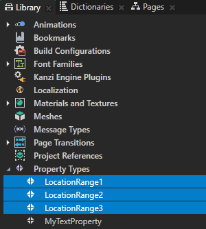
Create bindings that split a text into parts and store each part in a range property.
For example:
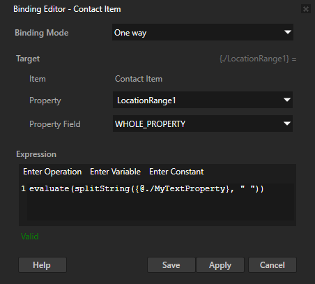
In the Prefabs select the Dock Layout 2D node, in the Properties click + Add Binding, and in the Binding Editor set:
Property to the first range property that you created
For example, set it to LocationRange1.
Expression to
evaluate(splitString({@./MyTextProperty}, " "))You use the splitString function to split the text in the MyTextProperty property into a collection of substrings and return that collection as a range. You then use the evaluate function to advance the iteration of that range.
Click Save.
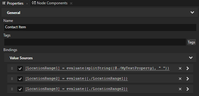
With this binding you store in the LocationRange1 property a range iterator that contains all parts of the text that you split and points to the first element in that iterator.
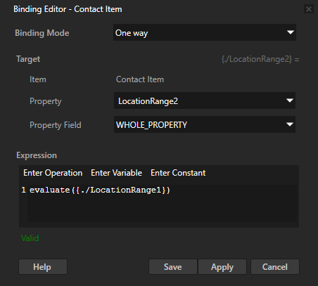
Add another binding and in the Binding Editor set:
Property to the second range property that you created
For example, set it to LocationRange2.
Expression to return the next location in the range iterator that you stored in the first range property
For example, set it to
evaluate({./LocationRange1})
Click Save.
With this binding you store in the LocationRange2 range property a range iterator that contains all except the first part of the text that you split and points to the first element in that iterator.
Add a binding for each range property type that you created and set the binding expression to advance the iteration of the range iterator that you stored in the preceding range property.
For example, bind the LocationRange3 to the expression that advances the iteration of the range iterator that you stored in the LocationRange2 property, and so on.

In each node where you want to show a part of the text, add a binding that shows the first element from a specific range location.
For example:
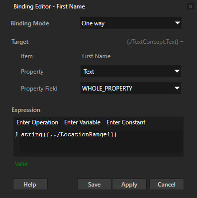
In the Prefabs select the first Text Block 2D node, in the Properties click + Add Binding, and in the Binding Editor set:
Property to Text
Expression to
string({../LocationRange1})By converting the evaluation of a range to a string you read the first element from the range.
Click Save.
With this binding you get the first part of text in the LocationRange1 property.
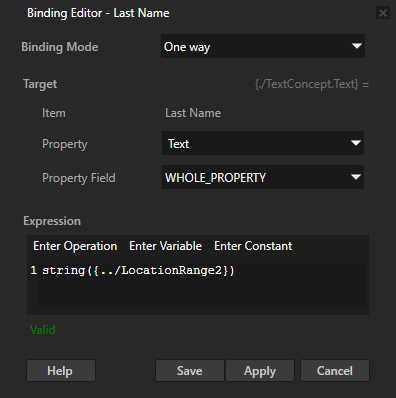
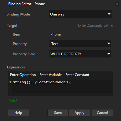
Repeat the previous step for each Text Block 2D node but in the binding expression change the range property that you read.
Formatting display of property values
Use the format binding function to set how a Text Block node displays a property value. See format.
With format, you can:
Insert values from a node property or data source to a text string.
Set the order in which the values that you pass to the function appear in the formatted text. See Setting text order in a localized string.
Truncate a floating point value to a specific number of decimal places.
Set a minimum width for the formatted text inside a string.
When the content takes less space than the minimum width, pad the leftover space with spaces or zeroes. See Formatting display of property values.
Align the formatted text to the left or to the right within the available space.
To format the display of a property value:
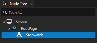
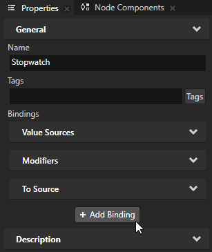
In the Node Tree, create Text Block node whose text you want to format.
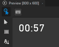
For example, create a Text Block 2D node and name it Stopwatch.
In this example, you use the
formatbinding function to create a stopwatch that displays minutes and seconds with leading zeroes.See Using the Text Block nodes.
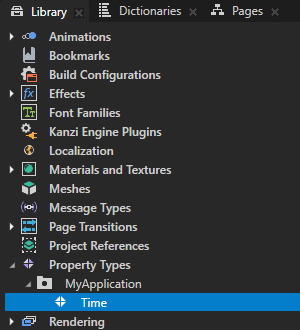
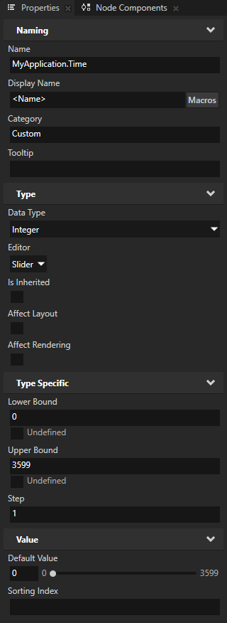
In the Library > Property Types, create a property type whose Data Type is Integer. Add the property type to the node that you created in the previous step.
For example, create a property type called Time and add it to the Stopwatch node.
You use this property type to keep the stopwatch time.
To increment the stopwatch time:
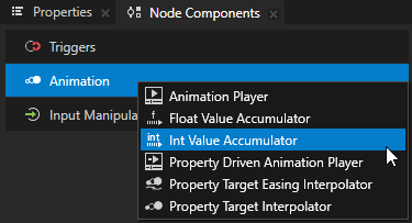
In the Node Tree, select the node that shows the stopwatch time. In the Node Components, press Alt and right-click Animation and select Int Value Accumulator.
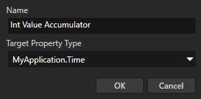
In the Create Int Value Accumulator dialog, set Target Property Type to the intermediate property type that you created earlier in this procedure and added to this node.
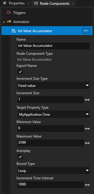
In the Node Components in the Value Accumulator settings, set:
Increment Size to 1
Minimum Value to 0
Maximum Value to 3599
Autoplay to enabled
Bound Type to Loop
Increment Time Interval to 1000
With these settings, you configure the Value Accumulator for a stopwatch that starts counting from 0, counts up to 59 minutes and 59 seconds, and automatically restarts after it reaches that time.
To learn how to increment a value of a property type over time, see Incrementing the value of a property type.
In the Node Tree, select the node that shows the stopwatch time. In the Properties, click + Add Binding, and in the Binding Editor set:
Property to Text
Expression to
# Store the intermediate property value that tracks the elapsed seconds.
seconds = {@./MyApplication.Time}

# To get the number of minutes, divide seconds by 60.
minutes = seconds / 60

# Use the format function to pad empty space with zeroes and set the width
# to two characters.
# Use the modulo function to show seconds as a value between 0 and 59.
format("{:02}:{:02}", minutes, mod(seconds,60))
Click Save.
To learn about the available formatting rules for placeholders, see Log message argument format specification. For information on using the modulo function, see mod (modulo).
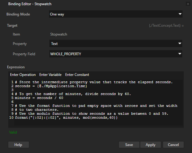
In the Preview, the stopwatch begins counting automatically. When either the minutes or seconds is a single-digit value, the format function formats the value to show a leading zero.
To add controls for starting, pausing, resuming, and stopping the stopwatch, see Creating a stopwatch.
Using bindings as an alternative to property inheritance
You can use bindings as an alternative to property inheritance. You can use property inheritance for defining a property in a parent so that it is inherited by a child node, but it works only when a property is inheritable and it is acceptable to have the property inherited by all child nodes. See Property system.
To use bindings as an alternative to property inheritance:
Create a custom property and add it to the node to which you want to create a binding.
In the Node Tree select the node to which you want to add a binding and in the Properties click + Add Binding.
In the Binding Editor set:
Property and Property Field to the property and attribute you want to bind.
In the Expression editor enter the expression to include the custom property you created in the beginning of this procedure.
Click Save.
Using bindings in the API
For details, see the Binding class.
See also
Customizing instances of prefabs