Tutorial: Creating a button
In this tutorial you learn how to create a button. Kanzi allows you to create buttons using only triggers and actions. However, to create a robust button use the Kanzi state manager and control the state of the button using the Is Down property.
The difference between the two approaches is that when you use the state manager you always know in which state the button is. For example, when a user clicks a button created with triggers and actions, the action sends the message, but your application is not aware of the state of the button. When you use the state manager, you can always check which state the button is in and even revert the state when needed.
This video shows the result of the tutorial.
This tutorial assumes that you understand the basics of working with Kanzi Studio. The best entry points for getting familiar with Kanzi Studio are:
Assets for the tutorial
The starting point of this tutorial is the <KanziWorkspace>/Tutorials/Button/Start/Button.kzproj Kanzi Studio project.
You can find the completed tutorial in the <KanziWorkspace>/Tutorials/Button/Completed directory.
Create a button
To create a button:
In Kanzi Studio open the project stored in the
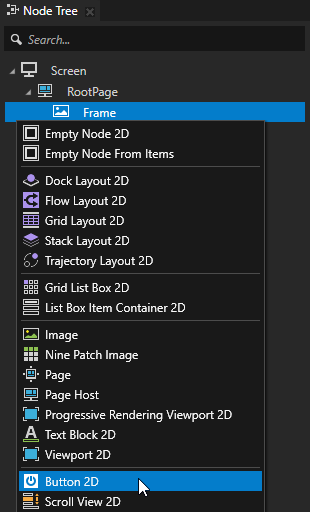
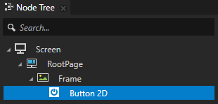
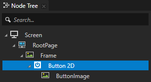
<KanziWorkspace>/Tutorials/Button/Startdirectory.In the Node Tree press Alt and right-click the Frame node and select Button 2D.
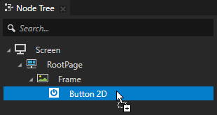
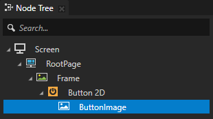
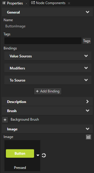
From the Assets window drag the Released image to the Node Tree, drop it on the Button 2D node, press the F2 key, and rename the node to ButtonImage.
You use the ButtonImage node to set the appearance of the button.
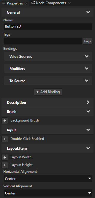
In the Node Tree select the Button 2D node and in the Properties add and set:
Horizontal Alignment to Center
Vertical Alignment to Center
Create the button states
In this section you use the state manager to define what the button looks like when the user presses and releases it.
To create the button states:
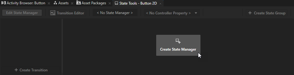
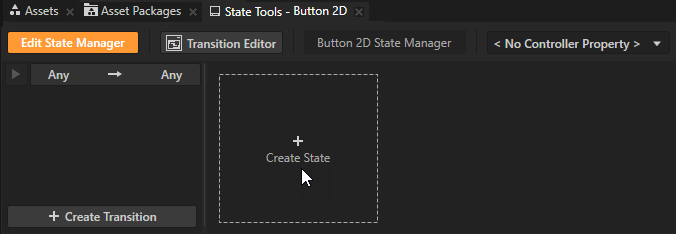
In the Node Tree select the Button 2D node and in the State Tools click Create State Manager.
You can find the State Tools window below the Preview window.
Kanzi Studio creates a state manager and assigns it to the Button 2D node.
Create a state for the button:
In the State Tools click Create State to create a state.
Double-click the name of the state and enter a new name for the state.
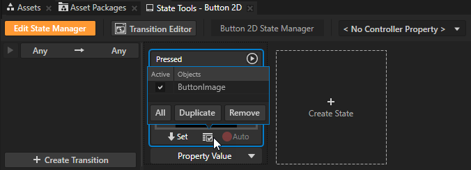
For example, name the state Pressed.
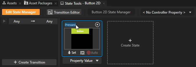
In the Node Tree select the ButtonImage node and in the Properties set the Image property to Pressed.
In the State Tools click
 to save the current values to that state.
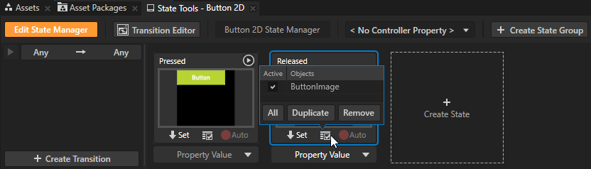
You save the current value of the Image property to the Pressed state to display that image when the user presses the button. To see which nodes have properties saved to a state, hover over
 on that state.
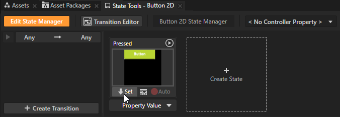
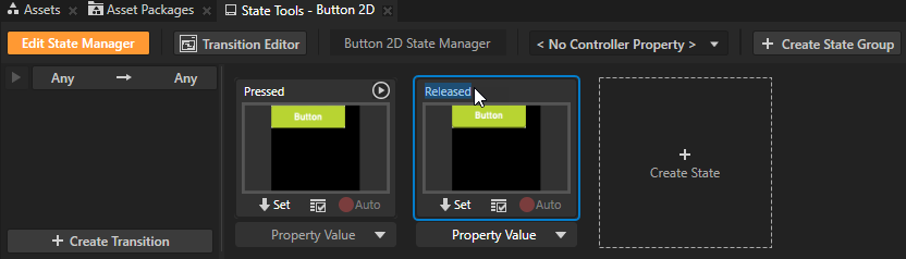
Repeat the previous step to create the state that defines the button when it is not pressed.
For example, name the state Released and set the ButtonImage node Image property to Released.
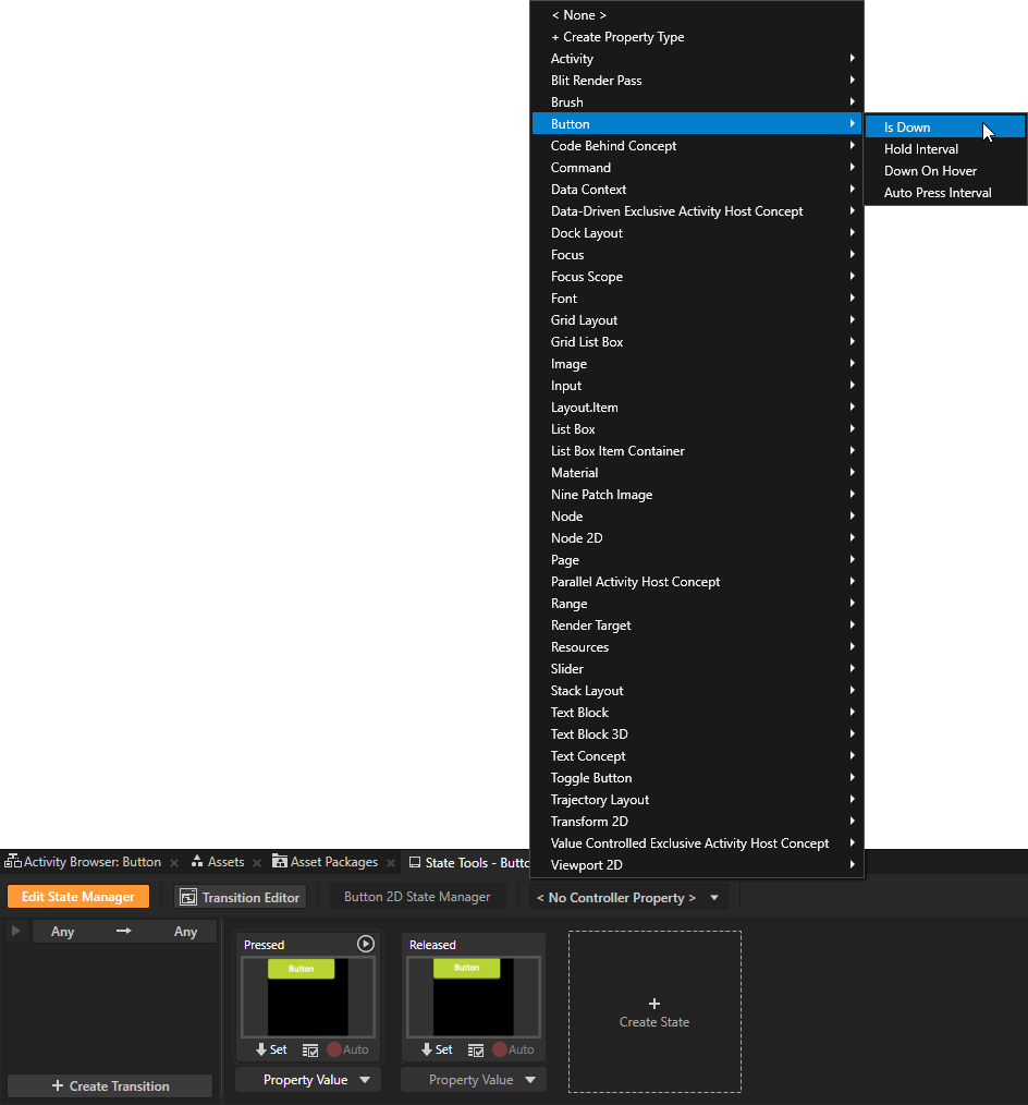
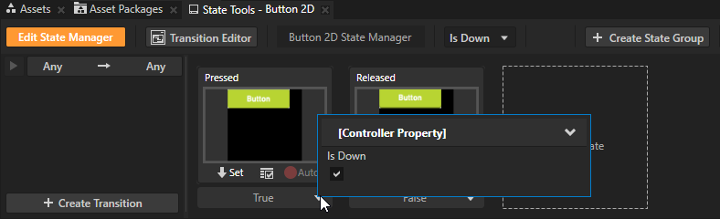
In the State Tools click <No Controller Property> and select Button > Is Down.
In a state manager the value of the property that you select as the Controller Property defines the conditions when each state in a state group is active.
Here you use the Is Down property to transition to a state based on the value of that property.
The Is Down property controls whether a Button node is in a pressed or non-pressed state.
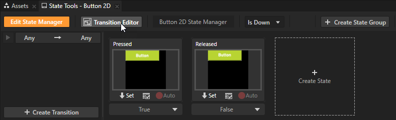
In the State Tools set the value of the Controller Property in the Pressed state to True. By doing so your Kanzi application uses the Pressed state when the button is pressed and the Released state when the button is not pressed.
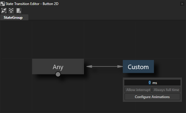
In the State Tools click Transition Editor to open the State Transition Editor.
The State Transition Editor shows the transition that is used between all states in that state group. Move your mouse pointer over
 and set Duration to 0 ms.
You set the duration of the transition to 0 ms so that the button changes appearance instantly when the user presses and releases it.
Close the State Transition Editor.
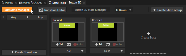
In the State Tools click Edit State Manager to deactivate the State Tools.
When you want to try out in the Preview how the state manager works in your application you need to exit the editing mode in State Tools.
In the Preview when you click the button and hold down the mouse button you enter the Pressed state. When you release the mouse button you enter the Released state.
What's next?
In this tutorial you learned how to create a button that changes its appearance based on user actions. Now you can:
Learn how to create a toggle button. See Tutorial: Creating a toggle button.
Learn more about different types of button nodes and how to use them. See Buttons.
Learn how to create a slider. See Tutorial: Creating a slider.
Complete other tutorials. See Tutorials.
See also
To learn more about the Kanzi state manager, see State manager.
To learn more about different types of button nodes and how to use them, see Buttons.
To learn more about creating Kanzi applications, see Tutorials.