Step 3 - Define the appearance for the selected item
In this step you define the appearance for the currently selected list item. First you change the color of the arrow in the currently selected contact, then you show a vertical bar next to the photo of the currently selected contact.
Define the appearance for the selected item in the List Box Item Container 2D
In this section you define the appearance for the currently selected list item. In the List Box Item Container 2D prefab you define the color of the selection arrow.
To define the appearance for the selected item in the List Box Item Container 2D:
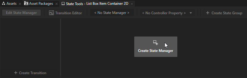
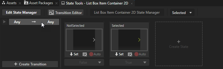
In the Prefabs select the List Box Item Container 2D prefab and in the State Tools click Create State Manager.
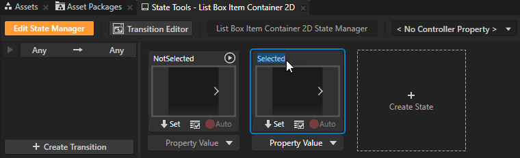
In the State Tools click Create State twice to create two states, double-click the name of each state, and rename the states to NotSelected and Selected.
The Selected state defines the state of your application when the user selects an item in the list box, the NotSelected state when that item is not selected.
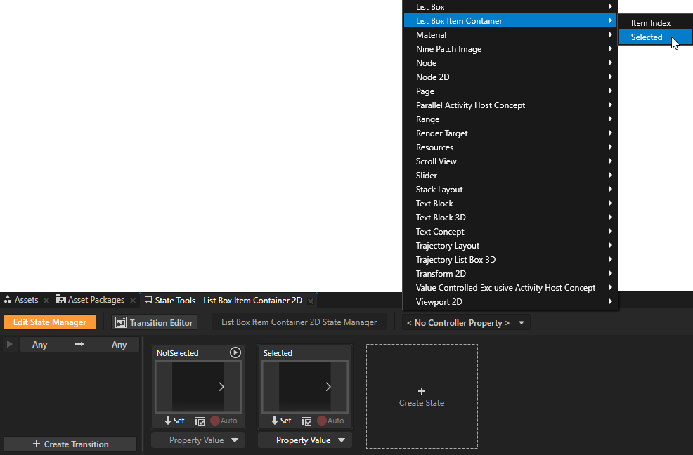
In the State Tools click the <No Controller Property> dropdown menu and select the List Box Item Container > Selected property.
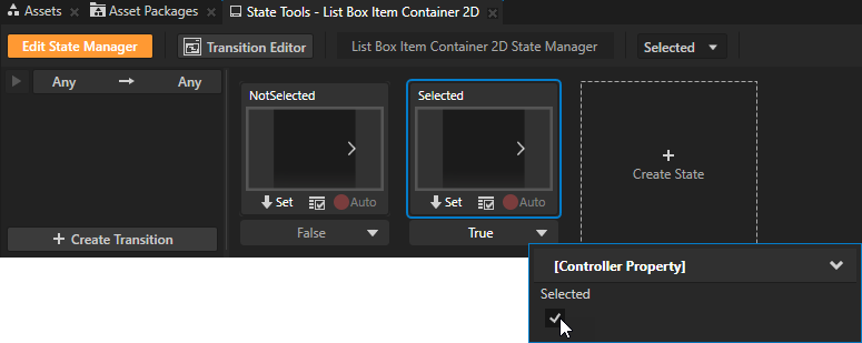
In a state manager the value of the property that you select as the Controller Property defines the conditions when each state in a state group is active.
The List Box Item Container > Selected property indicates whether a list box item is selected.
In the State Tools set the value of the controller property for each state:
For the NotSelected state leave the value set to False.
For the Selected state set the value to True.
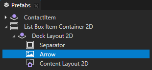
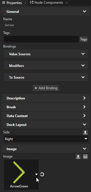
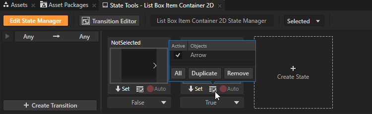
In the Prefabs in the List Box Item Container 2D prefab select the Arrow node, in the Properties set the Image property to the ArrowGreen image, and in the State Tools click
 below the Selected state to save the current image to that state.
You set the state manager to show a green arrow in a selected item in the Grid List Box 2D node.
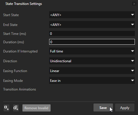
In the State Tools click Edit State Manager to deactivate the State Tools.
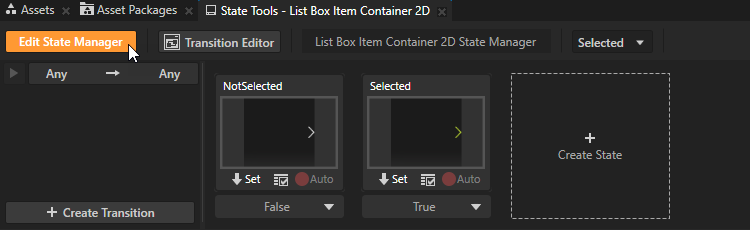
In the State Tools click the Any -> Any transition, in the State Transition Settings set the Duration property to 0, and click Save.
When you set the duration of a state transition to 0, Kanzi transitions instantly between the selected states.
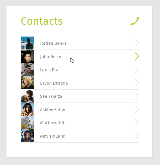
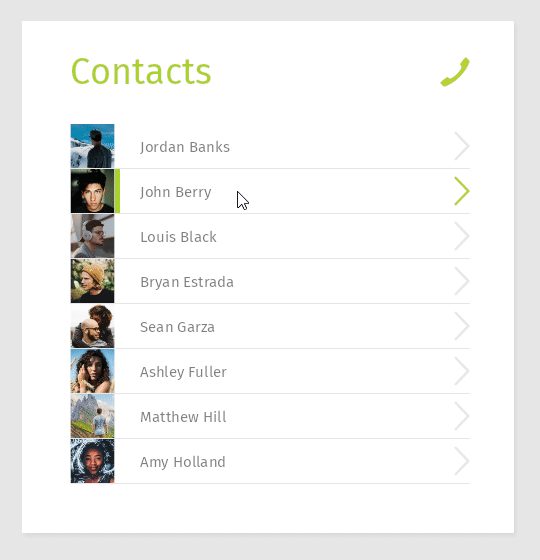
In the Preview when you select a list item, the arrow for that item turns green.
Define the appearance for the selected item by modifying the item template
In this section you define the appearance for the currently selected list item. You modify the ContactItem prefab to show a vertical bar next to the photo of the currently selected contact.
To define the appearance for the selected item by modifying the item template:
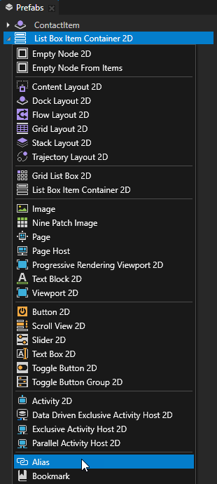
In the Prefabs in the ContactItem prefab create an Empty Node 2D node, name it SelectionBar, and drag it between the ContactPhoto and ContactName nodes.
You use this node to show for the selected contact a vertical bar on the right side of the contact photo.
You create the SelectionBar node in the ContactItem prefab instead of the List Box Item Container 2D prefab, because you want to place the SelectionBar node between the ContactPhoto and ContactName nodes.
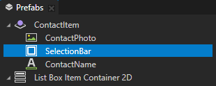
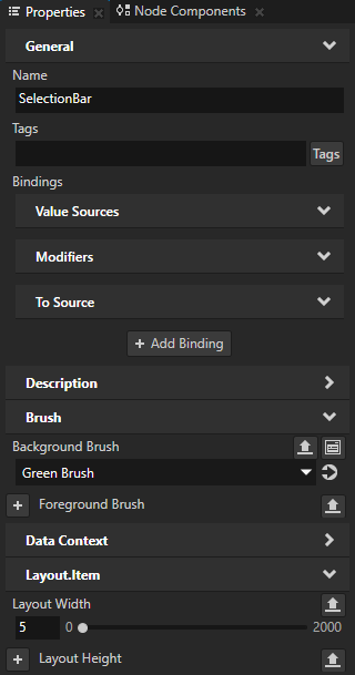
In the Prefabs select the SelectionBar node and in the Properties add and set:
Background Brush to Green Brush
Layout Width to 5
In the Prefabs press Alt and right-click the List Box Item Container 2D prefab and select Alias.
Use an Alias to get consistent access to a Kanzi node. You can use aliases to access nodes both in Kanzi Studio and using the Kanzi Engine API.
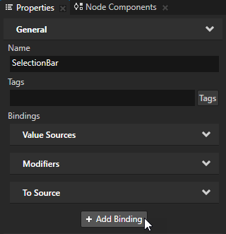
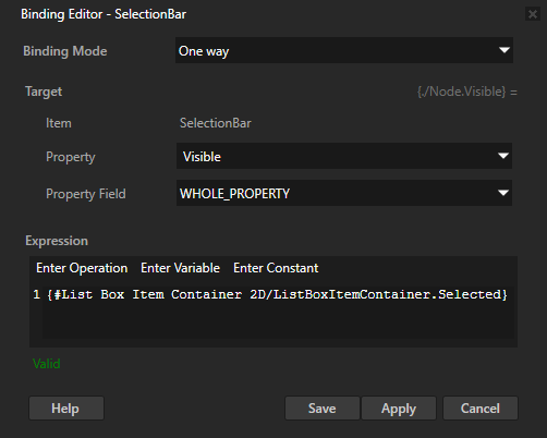
In the Prefabs select the SelectionBar node, in the Properties click + Add Binding, and in the Binding Editor set:
Property to Visible
Expression to
{#List Box Item Container 2D/ListBoxItemContainer.Selected}You access the List Box Item Container 2D prefab using the alias that you created in the previous step.
Click Save.
By binding the Visible property of the SelectionBar node to the Selected property of the List Box Item Container 2D prefab you make the SelectionBar node visible only in the selected item.
In the Preview when you select a list item, the green selection bar appears in that item.
What's next?
In this tutorial you learned how to use a Grid List Box node to create a scrollable list of contacts which receives data from a data source. You also learned how to use a List Box Item Container to set the appearance of the list items and to change the appearance of the item that the user selects in the list. Now you can:
Learn how to define a data source. See Tutorial: Get application data from a data source.
Learn how to load the resources for list items asynchronously. See Tutorial: Load and deploy resources asynchronously.
Complete other tutorials. See Tutorials.
See also
To learn more about using state managers, see Using state managers.
To learn more about using bindings, see Using bindings and Bindings expressions reference.