Using focus
Key focus forwards hardware key messages to the correct user interface element in your application. For example, the user can press the arrow keys on the keyboard to move a slider or press the Enter key to click a button.
You can set which user interface elements in your application can receive focus and use the default keys that Kanzi uses to navigate focus, or set a specific key.
Kanzi includes in the focus chain all focus scope nodes and the nodes for which you enable the Focusable property. The Button, Toggle Button, Slider, and Text Box nodes have the Focusable property enabled by default. When you create a List Box or a Scroll View node in Kanzi Studio, Kanzi Studio automatically adds and enables in that node the Focusable property.
To handle focus in your Kanzi application, you can:
Set focus to a specific user interface element. See Setting focus.
Set the order in which user interface elements receive focus. See Moving focus in the focus chain.
Move the focus within a user interface element. See Moving the focus within a group of nodes.
Set how an overlay reacts to user input. See Creating an overlay.
Change the appearance of a user interface element when that element has focus. See Showing when a user interface element has focus.
Define keyboard navigation for your application. See Setting a specific key to move focus.
Learn how to use focus by completing a tutorial. See Tutorial: Move focus in an application.
Setting focus
Set focus to a node when you want to enable the user to use keys to interact with the user interface element that that node represents.
Setting focus with a Try Set Focus action
To set focus with a Try Set Focus action:
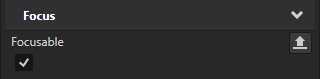
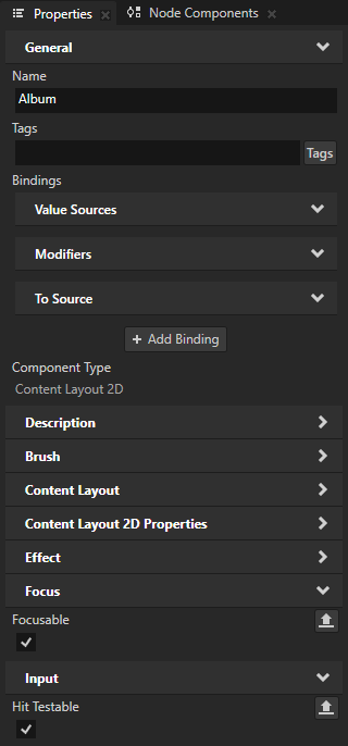
Select the node to which you want to set focus and in the Properties add and enable the Focus > Focusable property.
Tip
These nodes have the Focusable property enabled and can receive focus by default:
Button, Toggle Button, Slider, and Text Box nodes that you create using the Kanzi Engine API or Kanzi Studio.
List Box and Scroll View nodes that you create using Kanzi Studio.
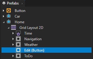
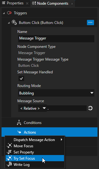
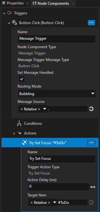
Select the node that you want to use to set the focus and in the Node Components create a trigger that you use to set off the action that sets the focus.
For example, in a Button node use the Button: Click trigger.
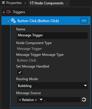
In the trigger create a Try Set Focus action.
For example, by creating a Try Set Focus action in a Button: Click trigger you set the application to set focus to a node when the user clicks the Button node.
In the Try Set Focus action set the Target Item to the node to which you want to set the focus.
Tip
Aliases provide a convenient way to set the node to which you want to set the focus. See Using aliases.
Setting focus to a node that the user presses
To set focus to a node that the user presses:
Make sure that the node, to which you want to set the focus, can receive the focus and the press.
Select the node and in the Properties add and enable:
Focus > Focusable
Tip
These nodes have the Focusable property enabled and can receive focus by default:
Button, Toggle Button, Slider, and Text Box nodes that you create using the Kanzi Engine API or Kanzi Studio.
List Box and Scroll View nodes that you create using Kanzi Studio.
Input > Hit Testable
By enabling hit testing for the node, you enable the node to receive the press.
Tip
By default hit testing is enabled for the Button, Toggle Button, List Box Item Container, Scroll View, Slider, and Text Box nodes.
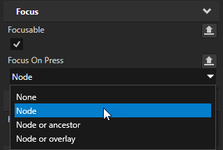
In the Properties add the Focus On Press property and set it to:
Node to try to set the focus to the node and if that fails, do nothing.
Node or ancestor to try to set the focus to the node and if that fails, set focus to the nearest focusable ancestor of the node.
Node or overlay to try to set the focus to the node and if that fails, set focus to the overlay scope that contains the node. The overlay scope node then forwards the focus according to its settings.
Every Kanzi application contains at least one overlay scope, the Screen node.
Tip
A node inherits the value of the Focus On Press property from its parent. For example, to set all interactive nodes in an application screen to receive focus at press, it is enough to set the Focus On Press property in the root node of that application screen.
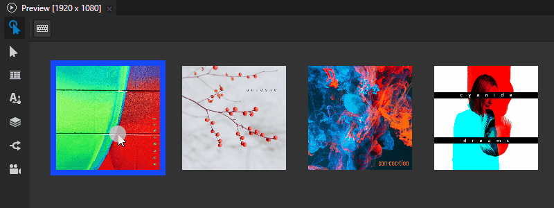
In the Preview click the node in which you set the Focus On Press property. For example, if you set the property in a prefab, instantiate that prefab multiple times and click the instances.
Tip
Use a state manager or a binding to change the appearance of a user interface element when that element has focus. See Showing when a user interface element has focus.
Moving focus in the focus chain
Focus chain is a sequence of nodes that defines the order in which Kanzi sets focus to those nodes. Kanzi includes in the focus chain all nodes in your project that have the Focusable property enabled.
Tip
These nodes have the Focusable property enabled and can receive focus by default:
Button, Toggle Button, Slider, and Text Box nodes that you create using the Kanzi Engine API or Kanzi Studio.
List Box and Scroll View nodes that you create using Kanzi Studio.
By default the focus chain moves the focus from each node based on the order of the nodes in the node tree:
To the next focusable node in the focus scope when the user navigates in the forward direction by pressing the Tab key.
To the previous focusable node in the focus scope when the user navigates in the backward direction by pressing the BackTab key or the Shift Tab keys.
To control how the focus chain moves the focus, you can set for each focusable node the position of the node in the focus chain.
Setting the order of nodes in the focus chain
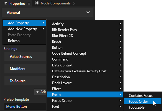
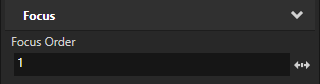
To manually set the order of nodes in the focus chain, in the Node Tree select each node whose position in the focus chain you want to set and in the Properties add and set the Focus Order property.
You set the focus to move between the nodes based on their Focus Order property value:
In the ascending order when the user navigates in the forward direction.
For example, when the node whose Focus Order property is set to 1 has focus and the user presses the Tab key, the focus moves to the node whose Focus Order property is set to 2.
In the descending order when the user navigates in the backward direction.
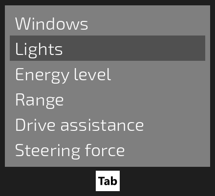
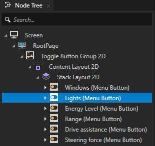
Moving the focus within a group of nodes
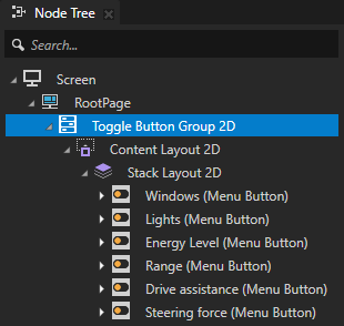
Use a focus group to handle navigation between nodes that form a user interface element.
You can set a node to be a focus group to forward the focus from that node to a child node. When you set focus to a focus group, Kanzi forwards the focus to the focusable child node of that group which has the smallest Focus Order property value or is positioned first in the node tree. When you move the focus from a focus group node, that focus group remembers its last-focused node. This way, when that focus group receives focus again, Kanzi sets focus to the node that was last focused.
To set a focus group:
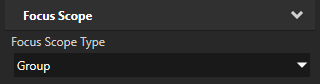
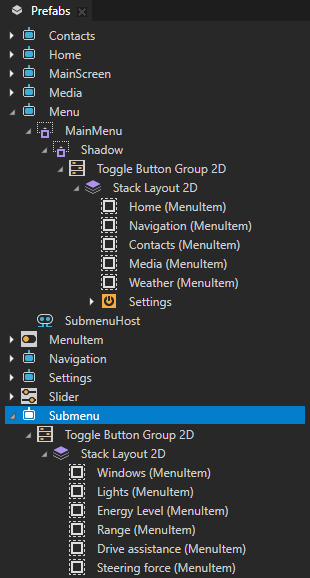
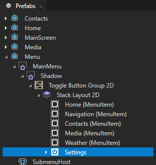
In the Node Tree select the node that you want to set as a focus group, in the Properties add the Focus Scope > Focus Scope Type property, and set it to Group.
When you set focus to the focus group node, that focus group forwards the focus to the first focusable child node. For example, if you set a Toggle Button Group node as a focus group, by default the first Toggle Button node in that Toggle Button Group receives focus. You can use the Tab and BackTab or Shift Tab keyboard keys to move the focus between the Toggle Button nodes.
Tip
These nodes have the Focusable property enabled and can receive focus by default:
Button, Toggle Button, Slider, and Text Box nodes that you create using the Kanzi Engine API or Kanzi Studio.
List Box and Scroll View nodes that you create using Kanzi Studio.
Tip
Use a state manager or a binding to change the appearance of a user interface element when that element has focus. See Showing when a user interface element has focus.
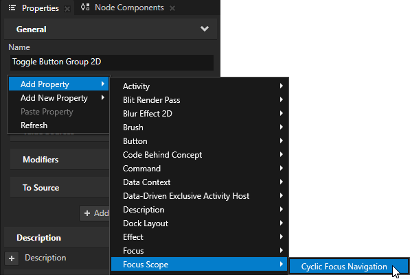
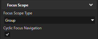
(Optional) To make the focus move in the focus group cyclically, in the Properties add and enable the Focus Scope > Cyclic Focus Navigation property.
When you enable the Cyclic Focus Navigation property:
When the user navigates forward by pressing the Tab key, and the focus reaches the last focusable node of the focus group, the focus moves back to the first focusable node.
When the user navigates backward by pressing the BackTab or Shift Tab keys, and the focus reaches the first focusable node of the focus group, the focus moves back to the last focusable node.
(Optional) To manually set which node in the focus group first gets the focus, in the Node Tree select the child node of the focus scope node to which you want to set focus, in the Properties add the Focus > Focus Order property, and set it to 1.
When focus moves to the focus group node for the first time, the child node with the smallest Focus Order property value receives focus. If the focus group node has several child nodes with the same smallest Focus Order property value, Kanzi sets focus to the first child node in the node tree of the focus scope.
When the focus moves away from the focus group, the focus group remembers its last-focused node. When that focus group receives focus again, Kanzi sets focus to the node that was last focused - not to the node with the smallest Focus Order property value.
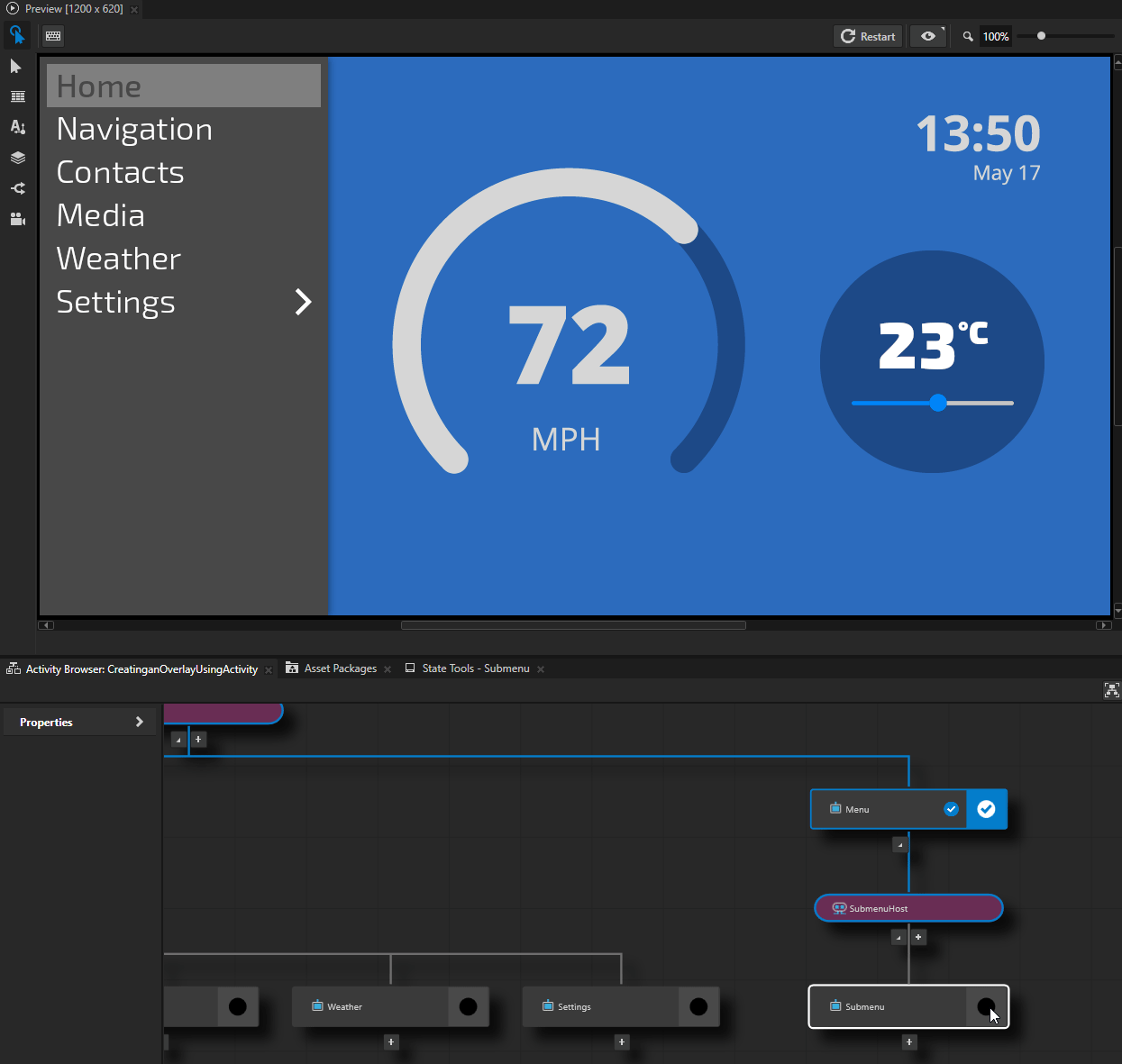
Creating an overlay
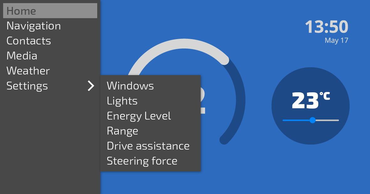
You can create an overlay that opens on top of other parts of your application. For example, you can create dialog boxes, notifications, and menus that are overlays.
Creating an overlay using an Activity
The most convenient way to create an overlay in Kanzi is using an Activity. Kanzi handles the key and touch input for the overlay automatically based on the activity status of the Activity:
When you activate the Activity, the overlay opens and gets the focus.
When you deactivate the Activity, the overlay closes and loses the focus.
See Activities.
To create an overlay using an Activity:
In a Parallel Activity Host create the Activity that you want to show as an overlay.
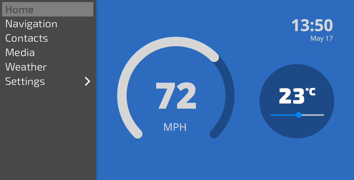
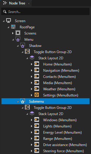
For example, create an Activity that shows a submenu of settings items.
Tip
Use a state manager or a binding to change the appearance of a user interface element when that element has focus. See Showing when a user interface element has focus.
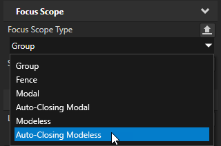
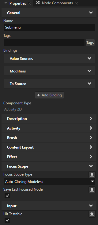
In the Prefabs select the Activity prefab that you want to show as an overlay, in the Properties add the Focus Scope > Focus Scope Type property, and set it to:
Modal to create an overlay that blocks the input that comes from outside of the overlay.
For example, use this overlay type to create a dialog that the user must interact with before returning to the main application screen.
Modeless to create an overlay that propagates the input that comes from outside of the overlay.
For example, use this overlay type to create a popup that allows the user to interact with other parts of the application while the popup is visible.
Auto-Closing Modal to create an overlay that closes with touch input outside of the overlay.
For example, use this overlay type to create a notification that closes when the user taps the application screen outside that notification.
Auto-Closing Modeless to create overlay that closes with touch input outside of the overlay and propagates the input.
For example, use this overlay type to create a menu that closes when the user taps outside it. If the user closes the menu by touching an interactive element, that element receives the touch.
To open the overlay, activate the Activity. See Activating Activities.
When you activate an Activity that you set as an overlay, Kanzi sets the focus to that Activity.
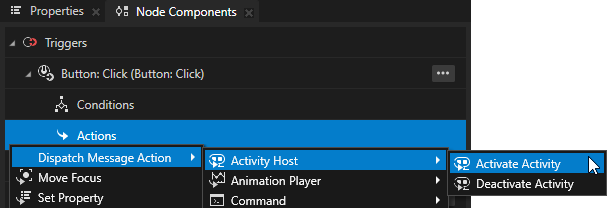
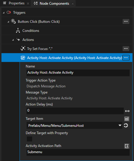
For example, to open the overlay when the user presses a button, in the Prefabs select a Button node, in the Button: Click trigger create an Activity Host: Activate Activity action, and in that action set:
Target Item to the Activity Host that contains the Activity that you want to activate.
Activation Path to the path from the Activity Host to the Activity that you want to activate.
If you nest Activity nodes in other types of nodes, include in the path only the ancestor Activity nodes.
To close the overlay, deactivate the Activity.
When you deactivate an Activity that you set as an overlay, Kanzi removes the focus from that Activity and restores the focus to the overlay focus scope below the overlay that you deactivated.
If you set the Focus Scope Type property to Auto-Closing Modal or Auto-Closing Modeless, the user can close the overlay also by clicking outside the overlay.
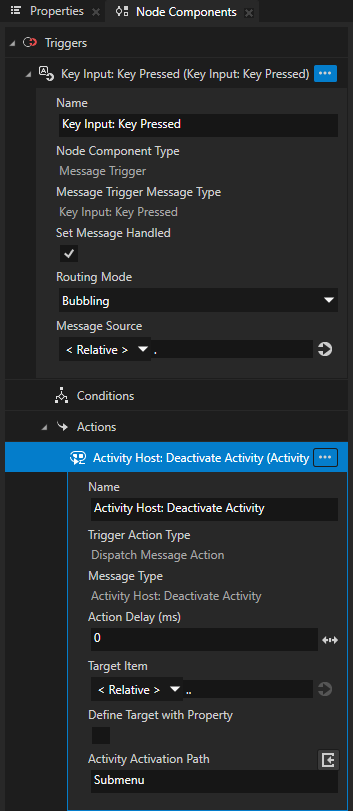
For example, to close the overlay when the user presses a specific key:
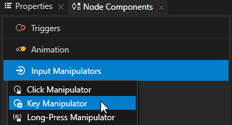
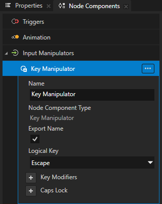
In the Prefabs select the Activity that you set as the overlay, in the Node Components > Input Manipulators create a Key Manipulator, and set the Logical Key property to the keyboard key that you want to use to close the overlay.
For example, to close the overlay when the user presses the Escape key, set the Logical Key property to Escape.
Tip
To set the keys that the user can use to navigate to different directions in your application, use the Navigation Manipulator. See Using the Navigation Manipulator.
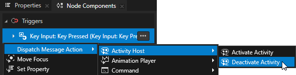
In the Node Components > Triggers create a Key Input: Key Pressed trigger with an Activity Host: Deactivate Activity action, and in that action set:
Target Item to the Activity Host that contains the Activity that you want to deactivate.
Activation Path to the path from the Activity Host to the Activity that you want to deactivate.
(Optional) If you set the Focus Scope Type property of the Activity to Auto-Closing Modal or Auto-Closing Modeless, make sure that hit testing is enabled for the Activity or its content. This way you enable Kanzi to detect whether touch input comes from the overlay Activity area or from outside the overlay, and close the overlay when input comes from outside the overlay.
To enable hit testing for the overlay, in the Prefabs select the Activity that you set as the overlay and in the Properties add and enable the Input > Hit Testable property.
(Optional) To set the focus to the first focusable node in the overlay when that overlay opens again, in the Prefabs select the Activity that you set as an overlay, and in the Properties disable the Activity > Save Last Focused Node property.
By default Kanzi remembers the last-focused node in an Activity and sets the focus to that node when you activate that Activity again.
In the Preview you can now:
Open the overlay when the button that you set as the control to open that overlay is focused and you press the Enter key on your keyboard.
Close the overlay by pressing the Escape key on your keyboard.
If you set the Focus Scope Type property to Auto-Closing Modal or Auto-Closing Modeless, you can close the overlay also by clicking anywhere outside the overlay. When you close an auto-closing modeless overlay by clicking an interactive user interface element outside that overlay, Kanzi propagates that click to the element that you click.
Creating an overlay using any node
The most convenient way to create an overlay in Kanzi is using an Activity. See Creating an overlay using an Activity.
This section shows how you can create an overlay using a node that is not an Activity, which requires you to create triggers and actions to show and hide the overlay.
To create an overlay using any node:
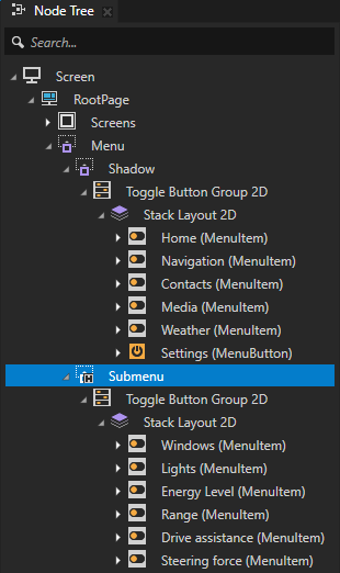
In the Node Tree create the node that you want to show as an overlay and add content to it.
For example, create a node that shows a submenu of settings items.
Tip
Use a state manager or a binding to change the appearance of a user interface element when that element has focus. See Showing when a user interface element has focus.
In the Node Tree select the node that you want to show as an overlay, in the Properties add the Focus Scope > Focus Scope Type property, and set it to:
Modal to create an overlay that blocks the input that comes from outside of the overlay.
For example, use this overlay type to create a dialog that the user must interact with before returning to the main application screen.
Modeless to create an overlay that propagates the input that comes from outside of the overlay.
For example, use this overlay type to create a popup that allows the user to interact with other parts of the application while the popup is visible.
Auto-Closing Modal to create an overlay that closes with touch input outside of the overlay.
For example, use this overlay type to create a notification that closes when the user taps the application screen outside that notification.
Auto-Closing Modeless to create overlay that closes with touch input outside of the overlay and propagates the input.
For example, use this overlay type to create a menu that closes when the user taps outside it. If the user closes the menu by touching an interactive element, that element receives the touch.
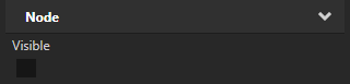
In the Properties add and disable the Node > Visible property.
This way you hide the overlay when the application starts.
When you set a node to be an overlay focus scope and that node is not visible, the focus and input handling ignores that node.
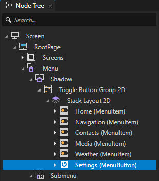
Create a control to open the overlay.
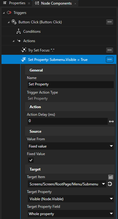
In the Node Tree select the node that you want to use as the control to open the overlay and in the Node Components use a trigger with a Set Property action that makes the overlay visible.
When you make an overlay visible, Kanzi sets off the Overlay Brought To Front trigger and sets the focus to that overlay.
For example, select a Button node, in the Button: Click trigger create a Set Property action, and in that action set:
Target Item to the overlay node
Target Property to Visible (Node.Visible)
Value From to Fixed value
Fixed Value to enabled
Create a control to close the overlay.
In the Node Tree select the node that you want to use as the control to close the overlay and in the Node Components use a trigger with a Set Property action that makes the overlay invisible.
When you hide an overlay, Kanzi sets off the Overlay Sent To Back trigger and sets the focus to the node that had the focus before you made the overlay visible.
For example:
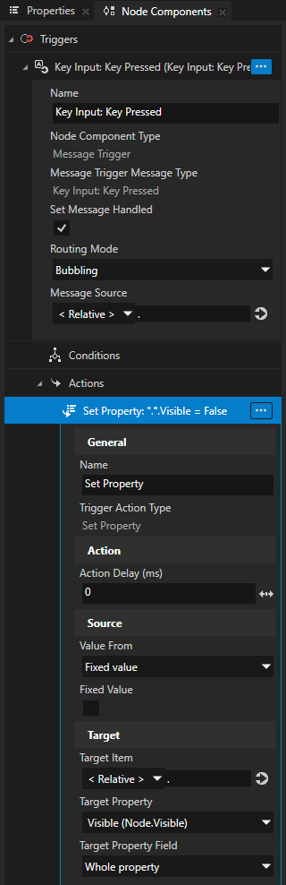
Select the overlay node, in the Node Components > Input Manipulators create a Key Manipulator, and set the Logical Key property to the keyboard key that you want to use to close the overlay.
For example, to close the overlay when the user presses the Escape key, set the Logical Key property to Escape.
In the Node Components > Triggers create a Key Input: Key Pressed trigger with a Set Property action, and in that action set:
Target Item to the overlay node
Target Property to Visible (Node.Visible)
Value From to Fixed value
Fixed Value to disabled
(Optional) Set the focus to a specific node in the overlay when that overlay opens.
By default Kanzi remembers the last-focused node in an overlay and sets the focus to that node when the overlay opens again.
To always set the focus to a specific node in an overlay:
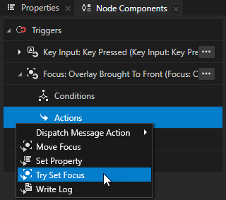
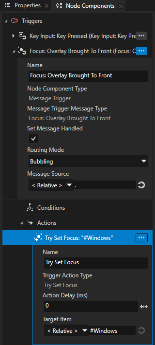
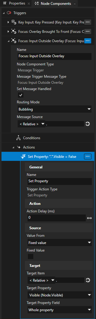
In the Node Tree select the overlay node and in the Node Components create a Focus: Overlay Brought To Front trigger.
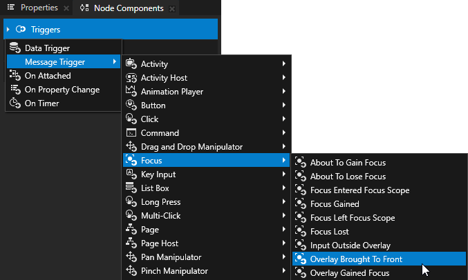
In the Focus: Overlay Brought To Front trigger create a Try Set Focus action and set the Target Item to the node in the overlay to which you want to set the focus when the overlay opens.
For example, set the Target Item to the first focusable node in the overlay.
(Optional) If you set the Focus Scope Type property of the overlay node to Auto-Closing Modal or Auto-Closing Modeless, set the overlay to close with touch input outside of the overlay:
In the Node Tree select the overlay node and in the Properties add and enable the Input > Hit Testable property.
This way you enable Kanzi to detect whether touch input comes from the overlay node area or from outside the overlay.
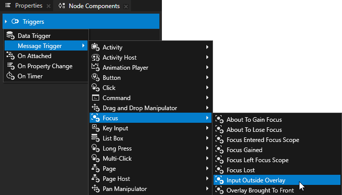
In the Node Components > Triggers create a Focus: Input Outside Overlay trigger.
Kanzi sets off the Focus: Input Outside Overlay trigger when the user taps the application area outside the overlay node.
In the Focus: Input Outside Overlay trigger create a Set Property action and set:
Target Property to Visible (Node.Visible)
Value From to Fixed value
Fixed Value to disabled
This way you hide the overlay node when the user taps outside it.
In the Preview you can now:
Open the overlay when the button that you set as the control to open that overlay is focused and you press the Enter key on your keyboard.
Close the overlay by pressing the Escape key on your keyboard.
If you set the Focus Scope Type property to Auto-Closing Modal or Auto-Closing Modeless, you can close the overlay also by clicking anywhere outside the overlay. When you close an auto-closing modeless overlay by clicking an interactive user interface element outside that overlay, Kanzi propagates that click to the element that you click.
Showing when a user interface element has focus
You can set a user interface element to change appearance when that element or any of its child elements has focus. For example, you can change the colors of a slider control when that slider has focus or highlight a group of UI controls when one of those controls has focus.
You can use these Focus properties to observe whether a user interface element has focus:
The Focused Boolean property reports whether a node is the key focus node and receives key input.
The Focus State enumeration property reports the focus state of a node or nodes in a focus scope and can have these values:
Enumeration value
Enumeration key
Meaning for a focusable node
Meaning for a focus scope
No Focus
0
The node does not have focus.
None of the nodes in the focus scope have focus.
Logical Focus
1
The node is the logical focus node of an overlay-type focus scope. The logical focus node was the key focus node before the overlay lost the focus. When the overlay regains the focus, the logical focus node becomes the key focus node.
A node in the focus scope is the logical focus node of the overlay to which the scope belongs.
Key Focus
2
The node is the key focus node.
A node in the focus scope is the key focus node.
To visually indicate to the user whether a user interface element has focus, either:
Create a state manager and use the Focused or Focus State property as its controller property. See Using a state manager to show when a user interface element has focus.
Create a binding where you set a property based on the value of the Focused or Focus State property. See Using a binding to show when a user interface element has focus.
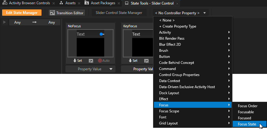
Using a state manager to show when a user interface element has focus
Using a state manager to show when a user interface element has focus is convenient when you want to change the values of multiple properties to visually indicate the focus. With a state manager you can also animate the change in the appearance.
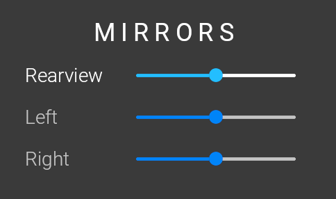
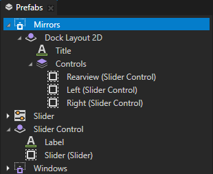
In this example, you use the Focus > Focus State property as the controller property in a state manager to change the appearance of a slider and its label when that slider has the key focus.
To use a state manager to show when a user interface element has focus:
Select the user interface element for which you want to create focus visualization.
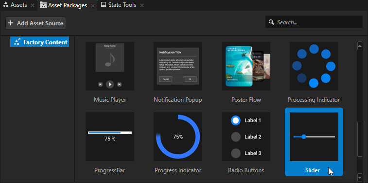
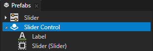
For example, create a prefab that contains a Slider and a Text Block node that shows the slider label.
Tip
The Kanzi Factory Content contains a 2D slider that you can use. See Using the slider from the Factory Content.
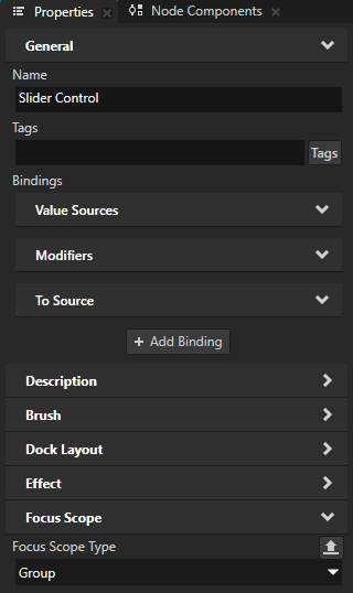
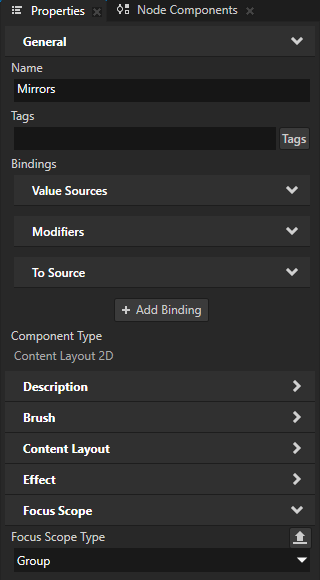
In the Properties, add the Focus Scope > Focus Scope Type property and set it to Group.
This way you make the node a focus scope. You can use the Focus State property to check the focus state of the nodes in a focus scope.
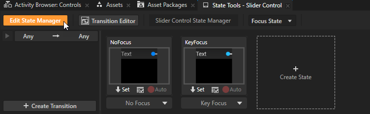
In the State Tools, create a state manager with two states, one that defines the appearance of the user interface element when none of its nodes have focus, and another that defines the user interface element when one of its nodes is the key focus node.
For example, name the states NoFocus and KeyFocus.
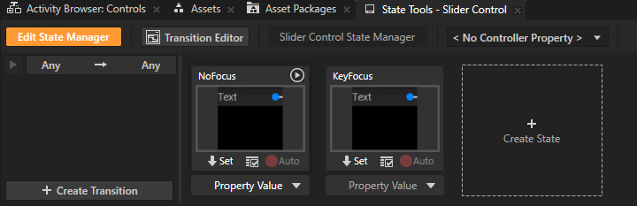
In the user interface element for which you create focus visualization, select each node whose appearance you want to change and set the values of the properties that you want to change when a node in the user interface element has the key focus.
For example, change the colors of the slider label and slider when the slider has focus.
In the State Tools, click
 below the state which defines how the user interface element looks when a node in that user interface element has the key focus. This way you save the current property values to that state.
For example, click
below the KeyFocus state.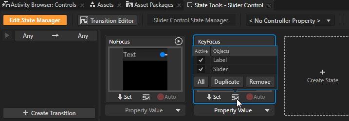
In the State Tools, set the Controller Property to Focus > Focus State.
The Focus State property reports the focus state of a focus scope. The property has the value Key Focus when a node in the focus scope has the key focus.
In the State Tools, set the value of the controller property in the KeyFocus state to Key Focus. Leave the value of the controller property in the NoFocus state set to No Focus.
This way you set your application to use:
The NoFocus state when none of the nodes in the user interface element have focus.
The KeyFocus state when a node in the user interface element has the key focus.
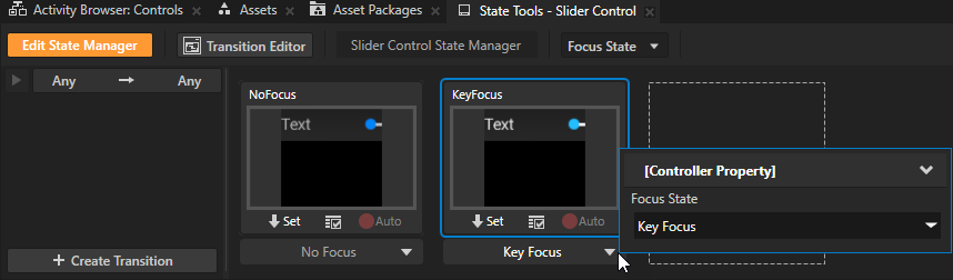
In the State Tools, click Edit State Manager to deactivate the State Tools.
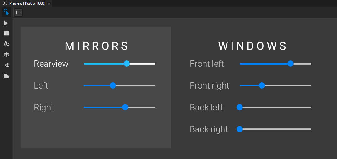
When you set focus to the slider in the slider control prefab that you created, the appearances of the slider and slider label change.
Using a binding to show when a user interface element has focus
Using a binding to show that a user interface element has focus is convenient when you want to change the value of only one property to visually indicate the focus.
When you use a binding to show that a user interface element has focus, the change happens immediately without a transition animation.
To use a binding to show when a user interface element has focus:
Select the node for which you want to create focus visualization.
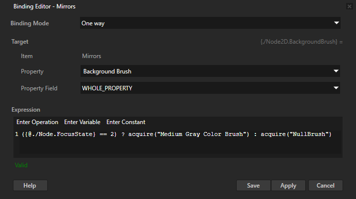
For example, select a node which is a focus scope and whose background color you want to change when a node in that focus scope has the key focus.
In the Properties, click + Add Binding, and in the Binding Editor, set:
Property to the property whose value you want to change when the node or its descendant node has focus.
For example, set it to Background Brush.
Expression to set the Property to different values depending on the focus status.
You can use:
The Focused (
Node.Focused) Boolean property to find out whether a node has the key focus.The Focus State (
Node.FocusState) enumeration property to find out the focus state of a node or the nodes in a focus scope.The Focus State property can have these values:
Enumeration value
Enumeration key
Meaning for a focusable node
Meaning for a focus scope
No Focus
0
The node does not have focus.
None of the nodes in the focus scope have focus.
Logical Focus
1
The node is the logical focus node of an overlay-type focus scope. The logical focus node was the key focus node before the overlay lost the focus. When the overlay regains the focus, the logical focus node becomes the key focus node.
A node in the focus scope is the logical focus node of the overlay to which the scope belongs.
Key Focus
2
The node is the key focus node.
A node in the focus scope is the key focus node.
For example, to set a brush in a focus scope node when a node in that focus scope has the key focus:
({@./Node.FocusState} == 2) ? acquire("Medium Gray Color Brush") : acquire("NullBrush")See ? (conditional) and acquire.
Click Save.
For example, when you add the binding to a focus group node that contains UI controls, the background brush of that node changes when any of those UI controls has the key focus.
Controlling whether to set focus to an activating Activity
You can control whether to set key focus to an Activity when that Activity activates.
By default Kanzi tries to set the focus to an activating Activity only if the Activity Host of that Activity has the focus. This means that when there is no application focus, Kanzi by default does not set focus to an activating Activity.
Use these properties to control whether to set focus to an activating Activity:
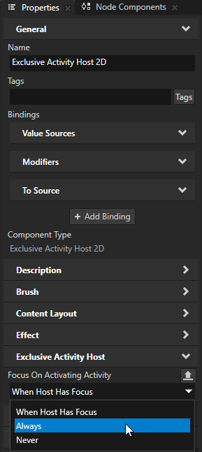
In an Exclusive Activity Host the Focus On Activating Activity property.
The value of this property applies to all Activities in the Exclusive Activity Host in which you set this property.
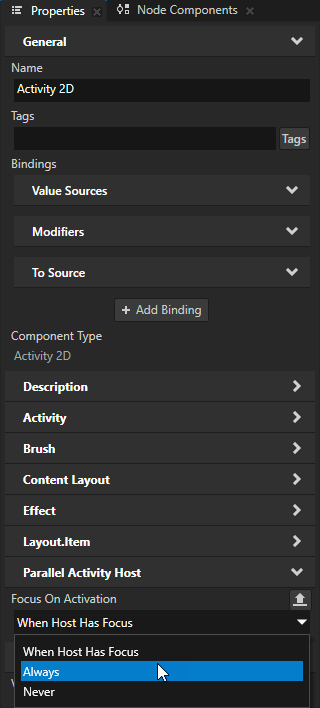
In an Activity in a Parallel Activity Host the Focus On Activation property.
The value of this property applies to the Activity in which you set this property.
The available options are:
When Host Has Focus tries to set the key focus to the activating Activity if the Activity Host has the focus.
This is the default value.
Always tries to set the key focus to the activating Activity.
For example, use this option to make sure that Kanzi sets focus to an Activity at application startup.
This option does not guarantee that the focus moves to the activating Activity. For example, if there is a modal overlay in front of the activating Activity, Kanzi cannot set focus to that Activity. A modal overlay blocks the key input that originates from outside its boundaries. See Creating an overlay using an Activity.
Never does not try to set the key focus to the activating Activity.
For example, use this for a non-urgent notification, which does not require user interaction, to make sure that the notification does not interrupt the user during their interaction with other elements in the application.
Setting a specific key to move focus
When creating key navigation for your application, you can use:
Key Manipulator to set which keys the user can use to navigate the application. You can override the default focus navigation keys and use a specific key to set focus to a node, open or close an overlay, or move focus in the focus chain. See Using the Key Manipulator.
Navigation Manipulator to set the keys that the user can use to navigate to different directions in your application. See Using the Navigation Manipulator.
Using focus in the API
For details, see the FocusManager class in the Kanzi Engine API reference.