Using the Content Layout nodes
Use the Content Layout nodes to present content in a UI control as a single item.
For example, use a Content Layout node to create the layout for a list item or a button with a border, a background, an icon, and a label.

By default the size of a Content Layout node is determined by the size of its child nodes. A Content Layout node that does not have child nodes by default stretches to take all the available space.
A Content Layout node does not arrange its child nodes. To arrange nodes in a Content Layout node, use another layout control node. See Layout control nodes.
Content Layout allows you to create layouts where:
Content of a Content Layout node determines the size of the Content Layout node. See Creating a Content Layout node that adapts to the size of its content.
Content of a Content Layout node adapts to the size that you set. See Creating a Content Layout where content adapts to a fixed size.
Creating a Content Layout node
To create a Content Layout node:
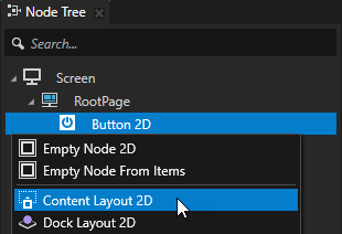
In the Node Tree press Alt and right-click the node where you want to create a Content Layout node and select either Content Layout 3D, or Content Layout 2D.
You can create a 3D node only in a 3D node, such as the Scene node, and a 2D node only in a 2D node.
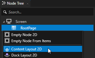
In the Node Tree add content to the Content Layout node.
For example, if you created a Content Layout 2D node, create a Text Block 2D node.
Content Layout node does not arrange its child nodes. To arrange nodes in a Content Layout node, use another layout control node. See Layout control nodes.
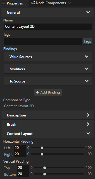
To add space around the content of the Content Layout node, in the Node Tree select the Content Layout node, and in the Properties add and set the padding properties:
Depth Padding to add space in the back and front of the content in a Content Layout 3D node
Horizontal Padding to add space on the left and the right sides of the content
Vertical Padding to add space on the bottom and the top of the content
Creating a Content Layout node that adapts to the size of its content
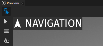
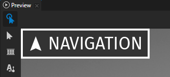
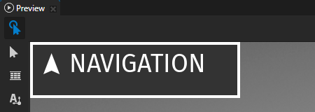
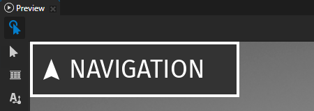
You can use a Content Layout node to create a layout that adapts to the size of its content. In this example, you create the layout of a 2D button with a border, a background, an icon, and a label.
To create a Content Layout node that adapts to the size of its content:
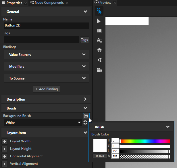
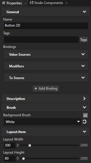
In the Node Tree create a Button 2D node, in the Properties add the Background Brush property, and set it to a brush that you want to use to fill the Button 2D node. See Adjusting the appearance of 2D nodes.
You fill the Button 2D node with a brush to show the border of the button.
For example, select + Color Brush, name the brush, click
 next to the Background Brush property, and set the color of the color brush.
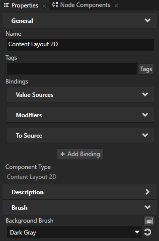
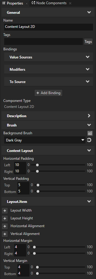
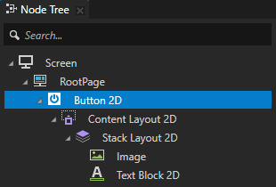
In the Button 2D node create a Content Layout 2D node, in the Properties add the Background Brush property, and set it to a brush that you want to use to fill the Content Layout 2D node.
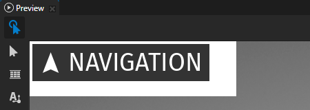
The Content Layout 2D node stretches the button to take all the available space.
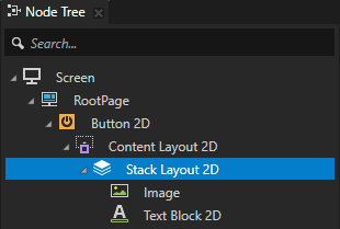
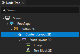
Add content to the Content Layout node.
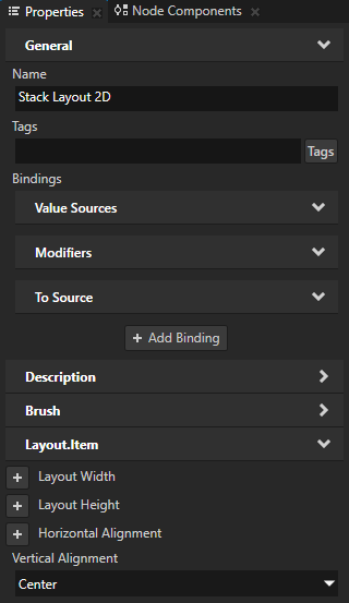
For example, create a Stack Layout 2D node, and in the Stack Layout 2D node create:
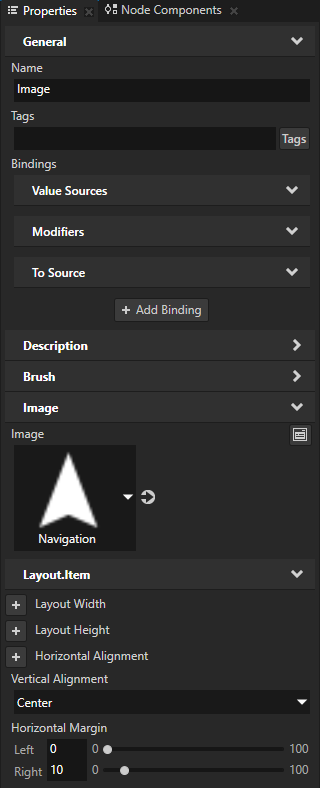
Image node and in the Properties add and set:
Image to a texture that shows the button icon
Vertical Alignment to Center
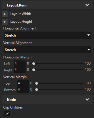
Horizontal Margin property Right property field to add space on the right side of the Image node
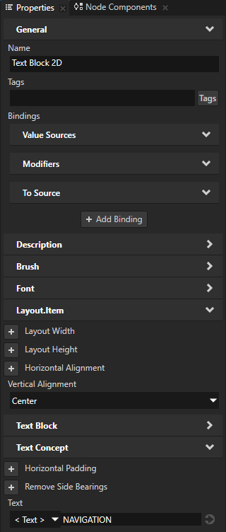
Text Block 2D node and in the Properties add and set:
Text to set the button label
Vertical Alignment to Center
The Content Layout 2D node takes the space needed by the content that you add to it.
In the Node Tree select the Content Layout 2D node and in the Properties add and set:
Horizontal Padding and Vertical Padding to set the amount of space between the Content Layout 2D node and its parent node.
This way you set the amount of space between the button borders and content.
Horizontal Margin and Vertical Margin to set the thickness of the button border.
Creating a Content Layout where content adapts to a fixed size
You can use a Content Layout node to create a layout where the content adapts to the size that you set. In this example, you create the layout of a fixed-sized 2D button with a border, a background, an icon, and a label.
To create a Content Layout where content adapts to a fixed size:
Create a 2D layout that adapts to the size of its content. See Creating a Content Layout node that adapts to the size of its content.
Set the size of the node that contains a Content Layout 2D node.
For example, in the Node Tree select the Button 2D node, and in the Properties add and set the Layout Width and Layout Height properties.
In the Node Tree select the Content Layout 2D node and in the Properties add and set:
Horizontal Alignment and Vertical Alignment to Stretch
This way you set the Content Layout 2D node to take as much space on the x and y axis as it can.
Clip Children to enabled
This way you clip the content of the child nodes of the Content Layout 2D node to fit into the size of the Content Layout 2D node.
Align the content of the Content Layout node.
For example, in the Node Tree select the Stack Layout 2D node, in the Properties add the Vertical Alignment property, and set it to Center.
Setting the appearance of a Content Layout 2D node
To set the appearance of 2D nodes:
You can fill 2D nodes with a solid color, a texture, or a material. See Adjusting the appearance of 2D nodes.


You can apply a post-processing effect to a 2D node. See Effects for 2D nodes.


You can rotate a 2D node around all three axes to create a 3D perspective effect. See Creating a 3D perspective effect for 2D nodes.

You can apply custom rendering to 2D nodes to create post-processing effects. See Applying custom rendering to 2D nodes.
You can render a 2D node as pixel-perfect. See Rendering pixel-perfect 2D nodes.
Using the Content Layout 3D node in the API
For details, see the ContentLayout3D class in the Kanzi Engine API reference.
Using the Content Layout 2D node in the API
For details, see the ContentLayout2D class in the Kanzi Engine API reference.
Content Layout property types and messages
For lists of the available property types and messages for the Content Layout nodes, see Content Layout 2D and Content Layout 3D.