Tutorial: Creating a slider
In this tutorial you learn how to create a slider in Kanzi Studio.
Complete this tutorial if you want to understand the structure of Kanzi sliders and create your own slider. If you want to use and modify a ready-made slider, use the slider in the Kanzi Studio factory content. See Slider.
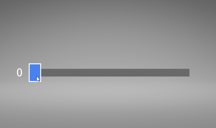
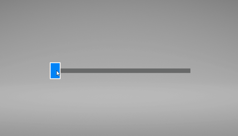
This video shows the result of the tutorial.
This tutorial assumes that you understand the basics of working with Kanzi Studio. The best entry points for getting familiar with Kanzi Studio are:
Assets for the tutorial
You can find the completed tutorial in the <KanziWorkspace>/Tutorials/Slider/Completed directory.
Create a slider
In this section you learn how to create a slider.
To create a slider:
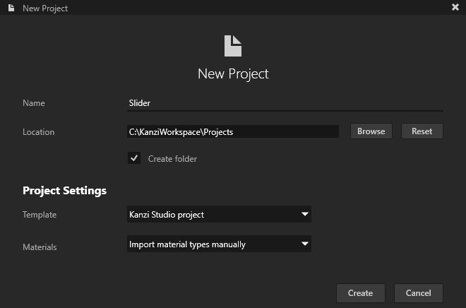
In Kanzi Studio create a project and in the New Project window set:
Name to Slider
Template to Kanzi Studio project
Use this template to create a Kanzi application without using the Kanzi Engine API.
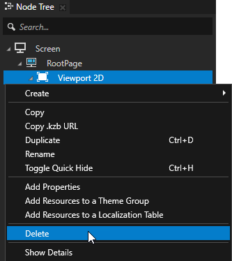
In the Node Tree delete the Viewport 2D node.
You can delete the Viewport 2D node because you do not create any 3D content in this tutorial.
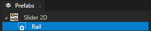
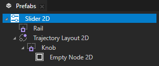
In the Prefabs click
 and create a Slider 2D node.
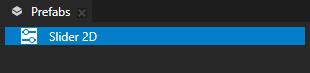
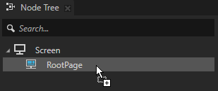
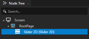
Drag the Slider 2D prefab to the Node Tree and drop it on the RootPage node.
This way you instantiate the prefab in the node tree so that you can follow the creation of the slider in the Preview.
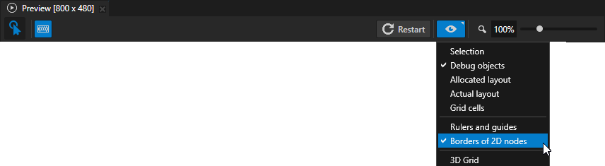
In the Preview click
 to enter the Analyze mode, right-click
  , and select:
Debug objects shows visualization nodes, such as light, camera, and layout nodes.
Borders of 2D nodes outlines the borders of 2D nodes with striped lines.
This way you can see in the Preview how the properties and their values affect the nodes as you create the slider.
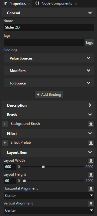
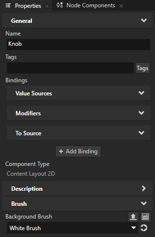
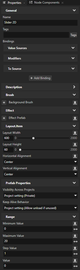
In the Prefabs select the Slider 2D node, and in the Properties add and set:
Layout Width to 600
Layout Height to 60
Horizontal Alignment to Center
Vertical Alignment to Center
This way you set the size and alignment of the slider, including the rail, the knob, and the position of the knob on both extremes of the slider.
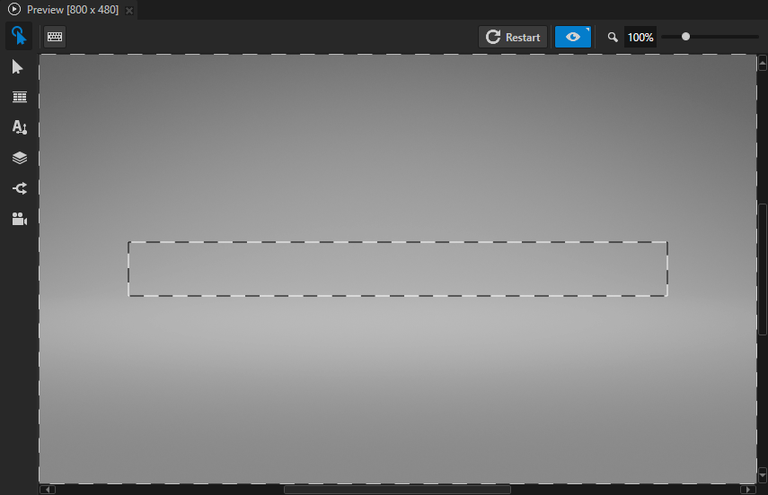
Create the visual representation of the rail along which the slider knob moves:
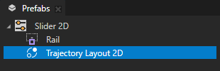
In the Prefabs in the Slider 2D prefab create a Content Layout 2D node, and name it Rail.
The Rail node visually represents the rail along which the slider knob moves. For example, to create a visual representation of a rail, you can use a Content Layout 2D node, an Image node, or several Image or Empty Node 2D nodes in a layout.
In the Prefabs select the Rail node, and in the Properties add and set:
Layout Width to 500
Layout Height to 25
Horizontal Alignment to Center
Vertical Alignment to Center
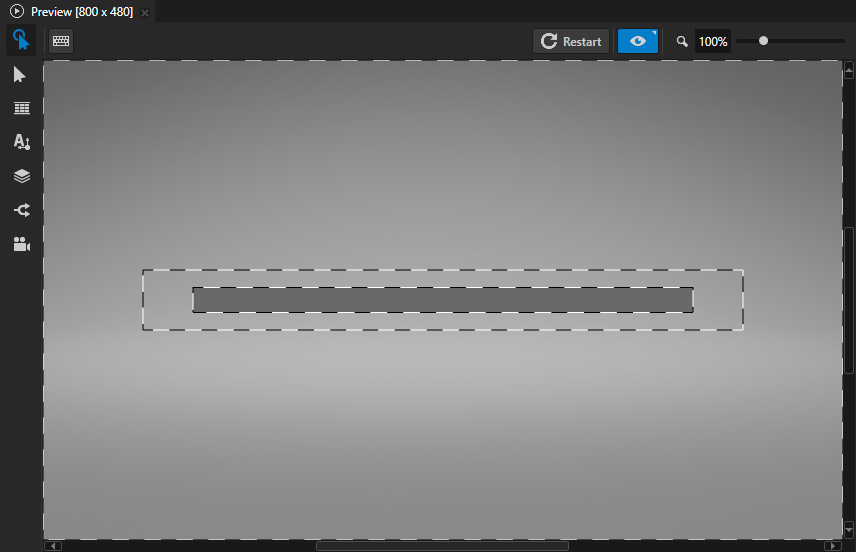
This way you set the size and alignment of the slider rail. It is narrower and shorter than its parent Slider 2D node so that the center of the slider knob can move to the edge of the rail on both sides.
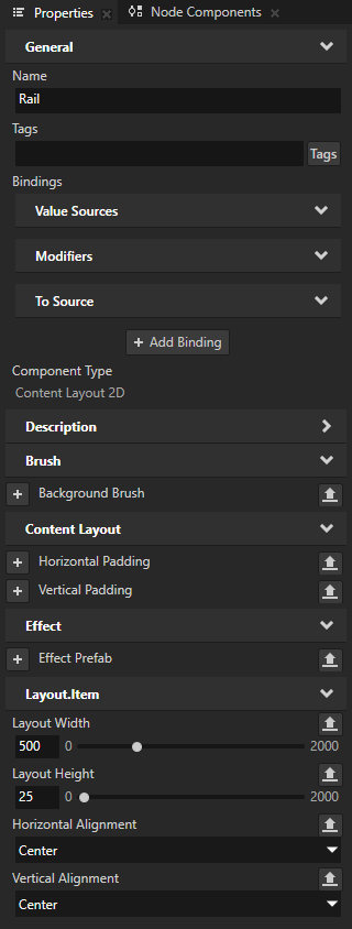
In the Prefabs select the Rail node, in the Properties add the Background Brush property, select + Color Brush, and name the brush Gray Brush.
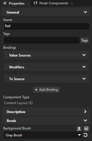
Next to the Background Brush property click
 and set the Lightness (L) property field to 105.
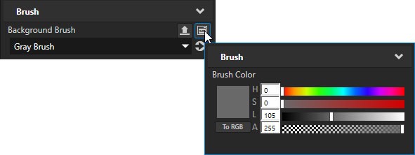
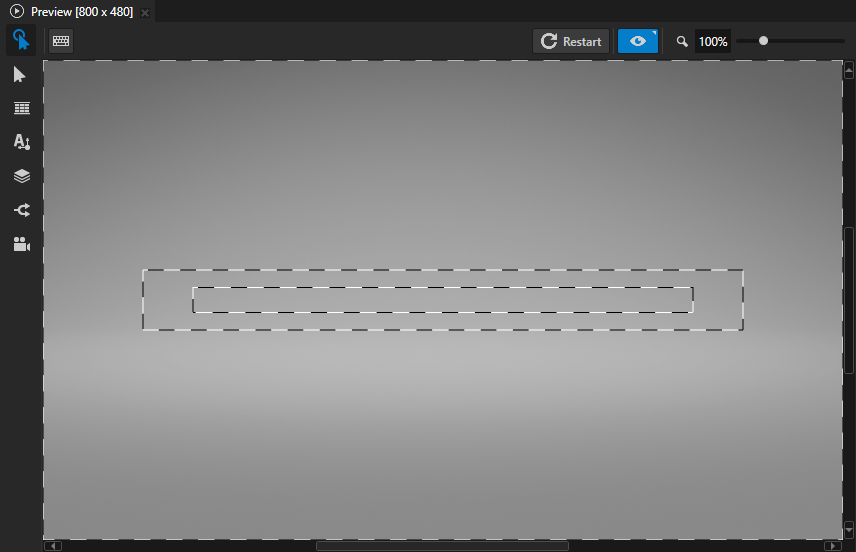
Create a trajectory that Kanzi uses to move the slider knob along the visual representation of the rail:
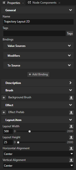
In the Prefabs in the Slider 2D prefab, create a Trajectory Layout 2D node, and in the Properties add and set:
Layout Width to 500
Layout Height to 25
Horizontal Alignment to Center
Vertical Alignment to Center
The values of these properties must match those of the visual representation of the slider rail.
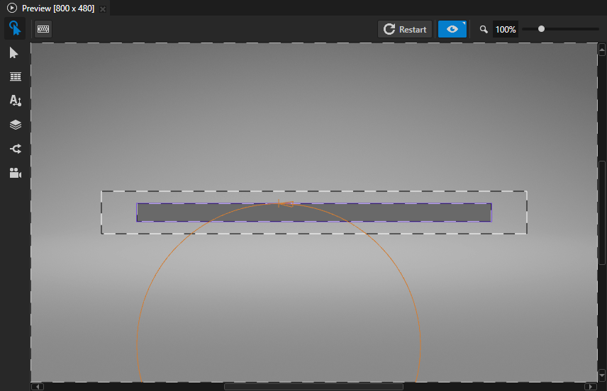
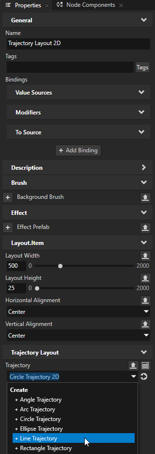
In the Prefabs select the Trajectory Layout 2D node and in the Trajectory property select + Line Trajectory.
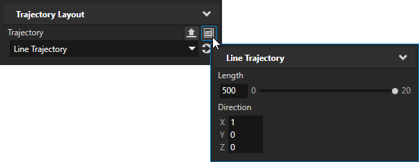
Next to the Trajectory property click
and set:Length to 500
Set the Length property to the same value as the Layout Width property of the visual representation of the rail.
Direction X property field to 1, all the other property fields to 0
This way you set the trajectory of the slider to be the x axis so that the slider knob moves horizontally on the rail.

Create an alias that Kanzi uses to tell the slider which trajectory to use as the rail of the slider:
In the Prefabs select the Slider 2D prefab, in the Dictionaries window click + Add Resource, and select Create > Alias.
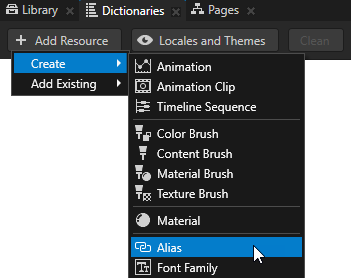
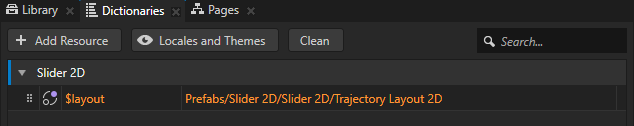
Name the alias $layout and set it to point to the Trajectory Layout 2D node in the Slider 2D prefab.
Kanzi uses this alias to tell the slider along which trajectory to move the slider knob.
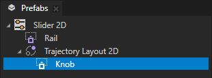
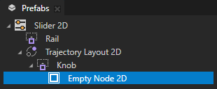
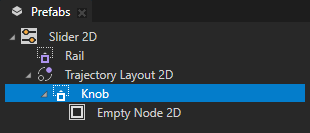
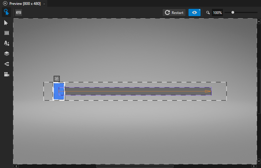
Create the slider knob:
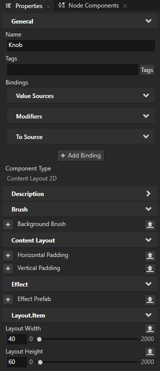
In the Prefabs in the Trajectory Layout 2D create a Content Layout 2D node, name it Knob, and in the Properties add and set:
Layout Width to 40
Layout Height to 60
You use this node as the visual representation of the slider knob.

In the Knob node add the Background Brush property, set it to + Color Brush, and name the brush White Brush.
Next to the Background Brush property click
and set the Lightness (L) property field to 255.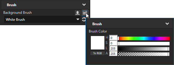
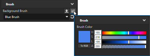
In the Prefabs in the Knob node create an Empty Node 2D, add the Background Brush property, set it to + Color Brush, and name the brush Blue Brush.
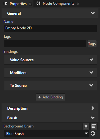
Next to the Background Brush property click
and set these property fields:Hue (H) to 155
Saturation (S) to 216
Lightness (L) to 156
In the Prefabs select the Knob node, and in the Properties add and set:
Horizontal Padding Left to 3
Horizontal Padding Right to 3
Vertical Padding Top to 3
Vertical Padding Bottom to 3
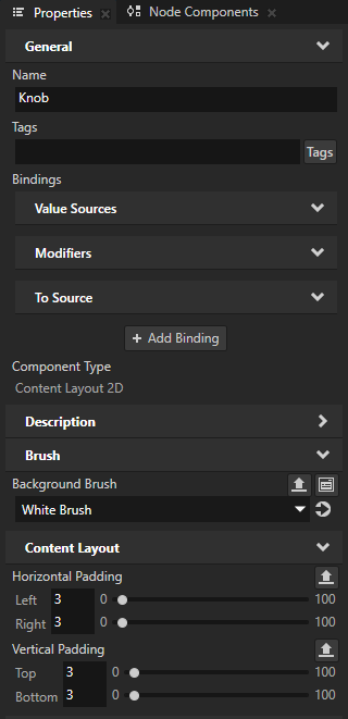
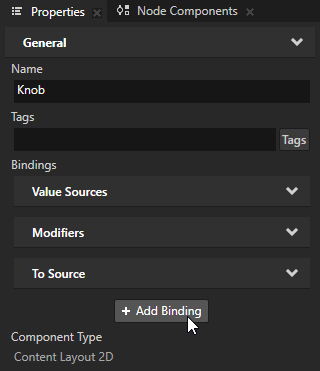
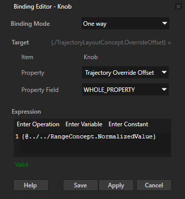
In the Prefabs select the Knob node, in the Properties click + Add Binding, and in the Binding Editor set:
Property to Trajectory Override Offset
Expression to
{@../../RangeConcept.NormalizedValue}
Click Save.
This binding makes the slider knob move on the trajectory that defines the slider rail.
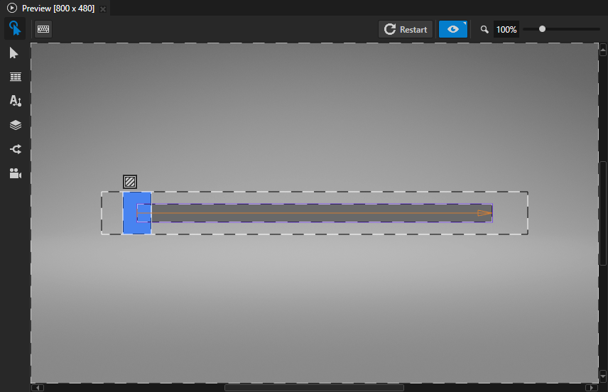
In the Preview click:
- to exit the Analyze mode
 to enter the Interact mode
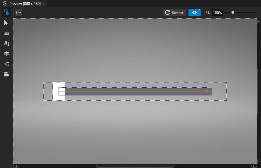
In the Preview you can now drag the slider knob along the rail.
Display the slider value
In this section you learn how to set the minimum, maximum, step, and starting values for a slider, and display the value of a slider.
To display the slider value:
In the Prefabs select the Slider 2D prefab, in the Properties from the Range category add and set:
Minimum Value to 0
This way you set the lowest value for a slider.
Maximum Value to 20
This way you set the highest value for a slider.
Step Value to 1
This way you set the increment by which the slider knob moves.
Value to 0
This way you set the initial position of the slider knob. If you do not set the Minimum Value and the Maximum Value properties, the range is between 0 and 1.
In the Prefabs in the Slider 2D prefab create a Text Block 2D node, name it Slider Value, and in the Properties add the Vertical Alignment property and set it to Center.
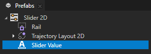
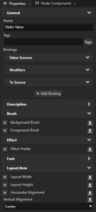
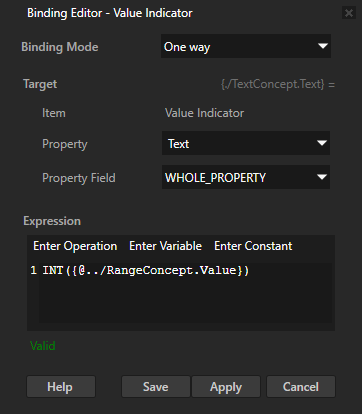
In the Prefabs select the Slider Value node, in the Properties, click + Add Binding, and in the Binding Editor set:
Property to Text
Expression to
INT({@../RangeConcept.Value})
Click Save.
This way you set the Slider Value node to display the current value of a slider.
In the Preview when you drag the slider knob, the Slider Value node shows the current value of the slider.

What's next?
In this tutorial you learned how to create a slider. Now you can:
Learn how to create a button that changes its appearance based on user actions. See Tutorial: Creating a button.
Learn how to create a toggle button. See Tutorial: Creating a toggle button.
Complete other tutorials. See Tutorials.
See also
To learn more about using sliders, see Using the Slider nodes.
To learn more about trajectories, see Trajectories.
To learn more about using bindings, see Using bindings and Bindings expressions reference.
To learn more about creating Kanzi applications, see Tutorials.