Tutorial: Generate UI from a data source
In this tutorial you learn how to generate an application UI from data that comes from a data source.
You can use a list data source and a Data-Driven Exclusive Activity Host to create parts of UI with Activities from content of data objects. For example, you can define the content of menus in a data source and use a Data-Driven Exclusive Activity Host to create the menus in your application.
In this tutorial you use a Data-Driven Exclusive Activity Host and a list data source to create a settings panel that shows setting items and each item has its own UI control.
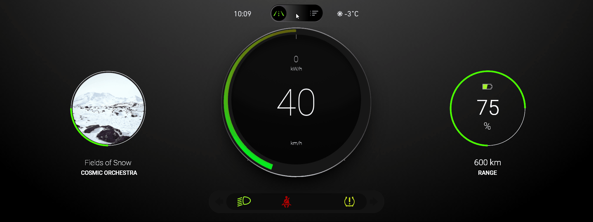
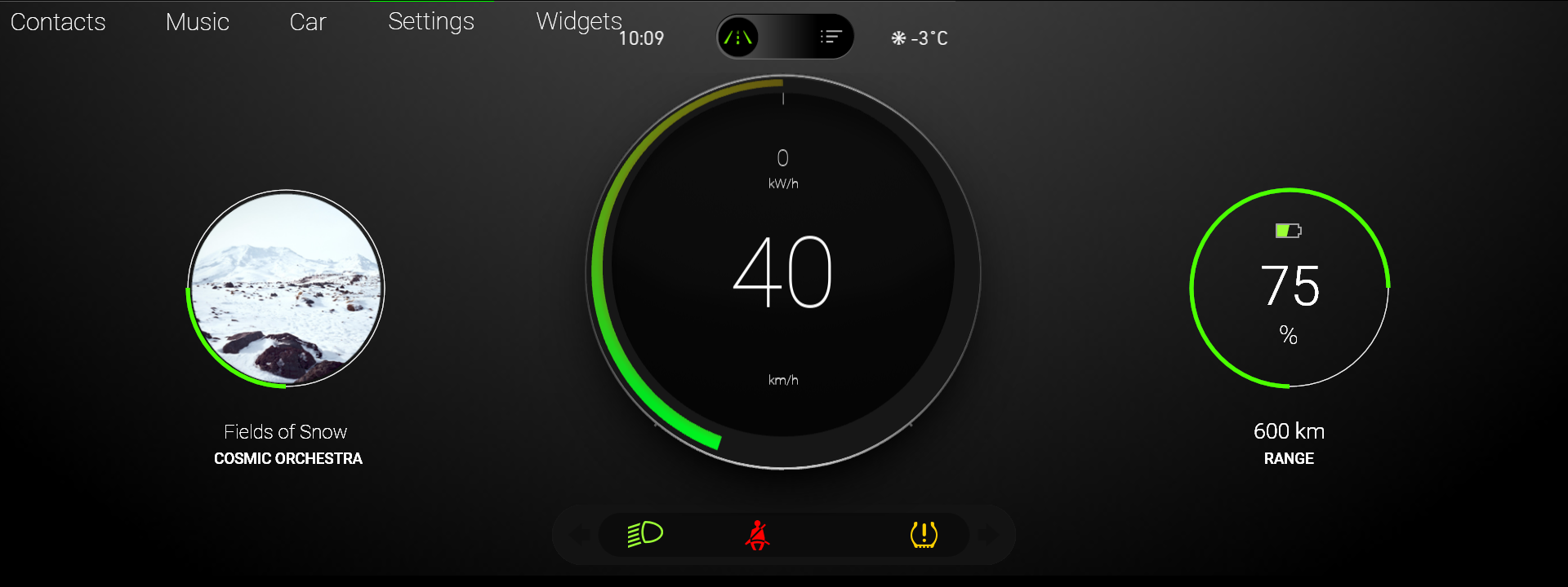
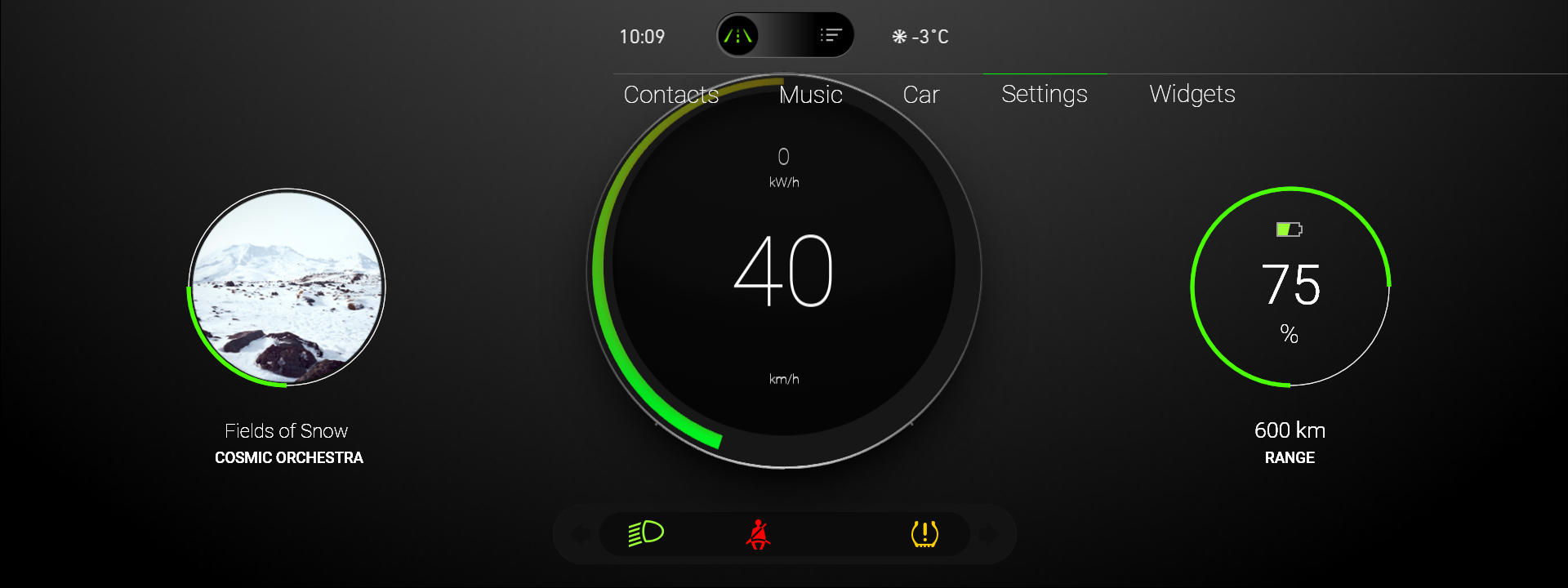
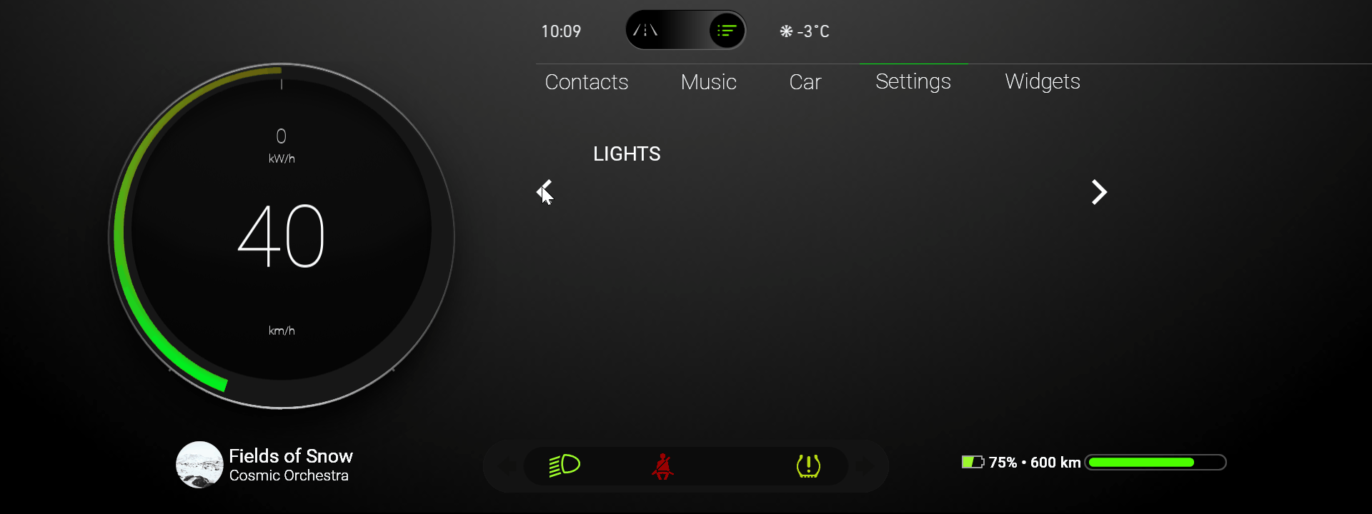
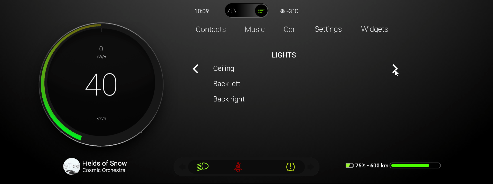
This video shows the result of the tutorial.
This tutorial assumes that you understand the basics of working with the Kanzi Activity system. The best entry points for that are tutorials:
Assets for the tutorial
The starting point of this tutorial is the <KanziWorkspace>/Tutorials/Data-Driven Activities/Start/Tool_project/Data-Driven Activities.kzproj Kanzi Studio project. To learn about the content of this project and how to create such a project, see Tutorial: Control application UI.
You can find the completed tutorial in the <KanziWorkspace>/Tutorials/Data-Driven Activities/Completed directory.
The starting point project contains the assets that you need to complete this tutorial:
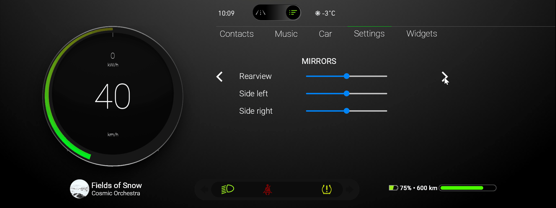
The SettingsMenuBar image and prefab. You use this image as the interface mockup for the content that a Data-Driven Exclusive Activity Host generates.

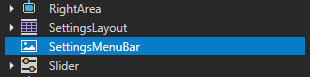
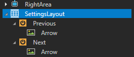
The SettingsLayout prefab. You use this prefab to lay out the content in the Settings menu in the application, and the UI controls to navigate between the Activities that a Data-Driven Exclusive Activity Host generates.

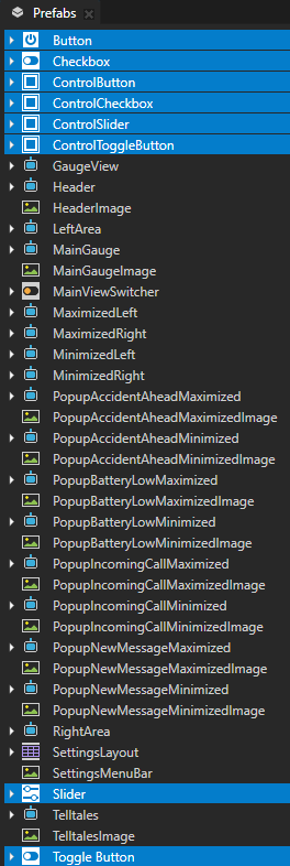
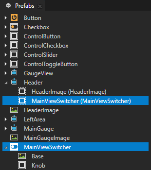
These UI controls from the Kanzi Studio Factory Content:
Button instantiated in the ControlButton prefab
Checkbox instantiated in the ControlCheckbox prefab
Slider instantiated in the ControlSlider prefab
Toggle Button instantiated in the ControlToggleButton prefab
You use these UI controls in the Activities that a Data-Driven Exclusive Activity Host generates.
The fonts that you use in the tutorial.
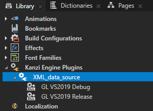
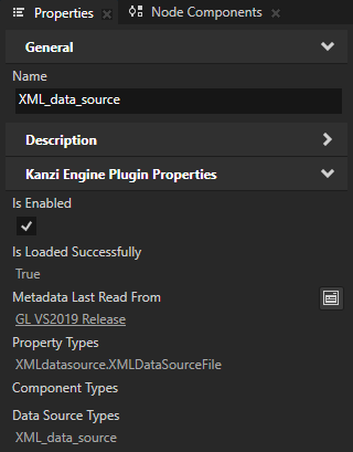
The XML_data_source is a Kanzi Engine plugin that provides limited support for using XML as a source of data for your Kanzi application.
You use this Kanzi Engine data source plugin to get data from an XML data source and use that data with a Data-Driven Exclusive Activity Host to generate Activities.
To learn more about this plugin and how to define your own data source, see Tutorial: Get application data from a data source.
The
Application/bin/Settings.xmlcontains the data that describes the content that a Data-Driven Exclusive Activity Host uses to generate Activities.<SettingsPanels type="list"> <items> <SettingsPanelItem> <PanelName type="string">WINDOWS</PanelName> <SettingsItems type="list"> <items> <SettingItem> <SettingName type="string">Front left</SettingName> <SettingType type="string">slider</SettingType> <SettingValue type="int">0</SettingValue> <SettingRange type="int">10</SettingRange> </SettingItem> <SettingItem> <SettingName type="string">Front right</SettingName> <SettingType type="string">slider</SettingType> <SettingValue type="int">0</SettingValue> <SettingRange type="int">10</SettingRange> </SettingItem> <SettingItem> <SettingName type="string">Back left</SettingName> <SettingType type="string">slider</SettingType> <SettingValue type="int">0</SettingValue> <SettingRange type="int">10</SettingRange> </SettingItem> <SettingItem> <SettingName type="string">Back right</SettingName> <SettingType type="string">slider</SettingType> <SettingValue type="int">0</SettingValue> <SettingRange type="int">10</SettingRange> </SettingItem> </items> </SettingsItems> </SettingsPanelItem> ... </items> </SettingsPanels>
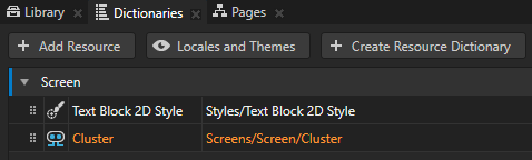
The resource dictionary of the Screen node contains the alias that points to the Cluster Parallel Activity Host. You use this alias to access that Activity Host.
The Header Activity contains a Toggle Button node that enables you to switch between the Drive and Browse application modes.
Generate Activities from a data source
In this section you create a template Activity that you then use in a Data-Driven Exclusive Activity Host to generate Activities from an XML data source.
To generate Activities from a data source:
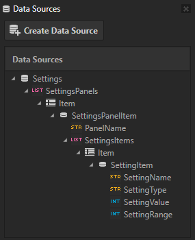
Create a data source with list data objects:
In Kanzi Studio open the
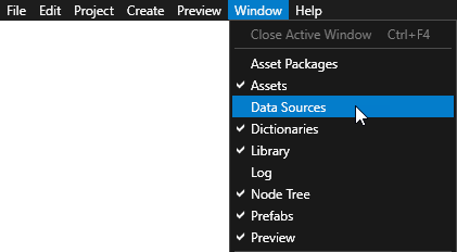
<KanziWorkspace>/Tutorials/Data-Driven Activities/Start/Tool_project/Data-Driven Activities.kzprojproject.In the Window main menu select Data Sources.
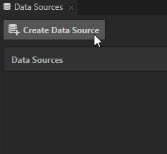
Use the Data Sources window to create, set, and delete the data sources in your project, and to connect data objects from a data source to nodes and resources in your project.
In the Data Sources window click Create Data Source and create a data source with these settings:
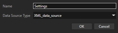
Name to Settings
Data Source Type to XML_data_source
In the Data Sources next to the data source that you just created click
 and set the XML Data Source File property to use the
 Application/bin/Settings.xmlXML file as a data source.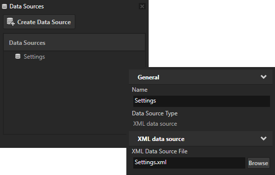
In the Data Sources next to the Settings data source click
 .
.This way you load the data from the
Application/bin/Settings.xmlfile and create data objects. A Data-Driven Exclusive Activity Host uses these data objects to generate Activities.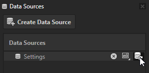
Create the template for Activities that a Data-Driven Exclusive Activity Host uses to generate its Activities:
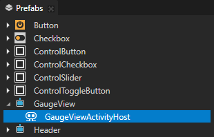
In the Prefabs click
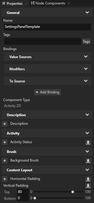
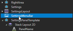
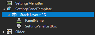
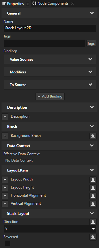
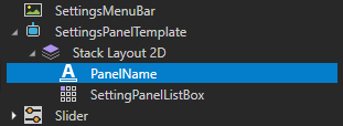
 , select Activity 2D, name it SettingsPanelTemplate, and in that Activity prefab create a Stack Layout 2D node with a Text Block 2D node named PanelName.
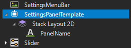
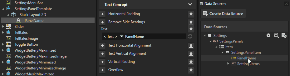
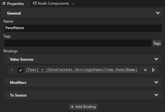
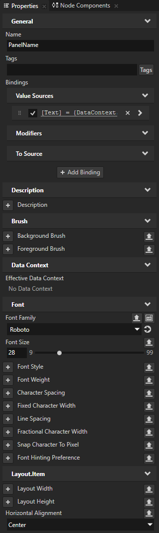
In the Prefabs select SettingsPanelTemplate > Stack Layout 2D > PanelName, and from the Data Sources drag the Settings > SettingsPanels > Item > SettingsPanelItem > PanelName data object to the Properties and drop it on the Text property.
This way you set the PanelName node to show the name of a settings menu that is set in the PanelName data object. When you drop a data object on a property, Kanzi Studio binds the value of that property type to the value of the data object.
The PanelName data object gets the value from the
Settings.xmlfile<PanelName>element.<SettingsPanels type="list"> <items> <SettingsPanelItem> <PanelName type="string">WINDOWS</PanelName> ... </SettingsPanelItem> <SettingsPanelItem> <PanelName type="string">MIRRORS</PanelName> ... </SettingsPanelItem> <SettingsPanelItem> <PanelName type="string">LIGHTS</PanelName> ... </SettingsPanelItem> <SettingsPanelItem> <PanelName type="string">SEATS</PanelName> ... </SettingsPanelItem> </items> </SettingsPanels>
In the Prefabs select SettingsPanelTemplate and in the Properties add and set the Vertical Padding property field Top to 80.
This way you add padding between the top of the Settings panel and the rest of the application interface.
Create the structure and content for the SettingsPanel:
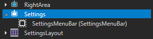
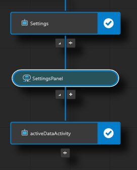
In the Activity Browser below the GaugeViewActivityHost click
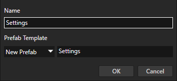
 , select Create Activity, and name the Activity and its prefab Settings.
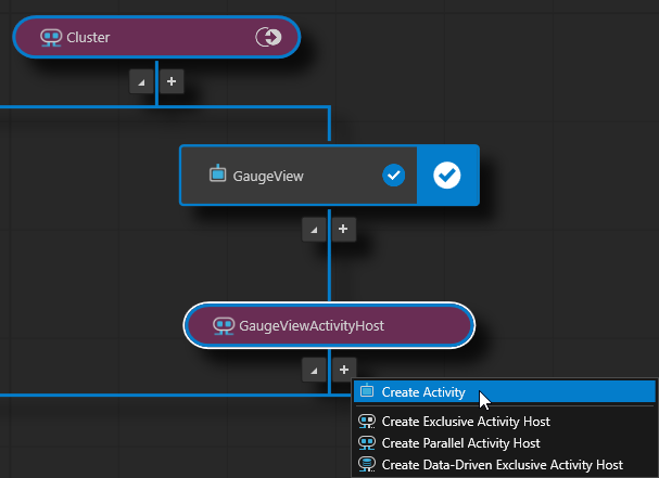
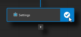
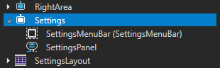
In the Prefabs drag the SettingsMenuBar node to the Settings Activity.
In the Activity Browser in the Settings Activity click
 .
.This way you simulate the activation of the Activity so that you can see it the Preview.
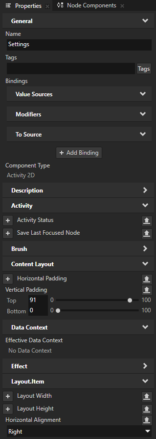
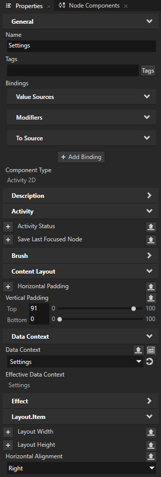
In the Prefabs select the Settings prefab and in the Properties add and set:
Vertical Padding Top to 91
Horizontal Alignment to Right
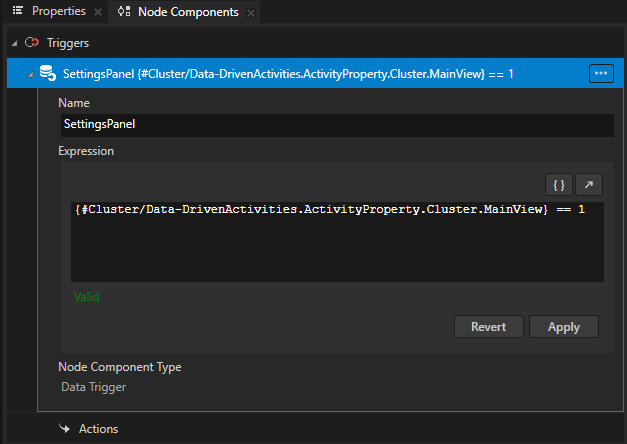
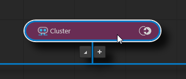
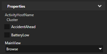
Create a Data Trigger that activates the Settings Activity when the Cluster Activity Host is in the Browse mode:
In the Prefabs select the GaugeView > GaugeViewActivityHost.
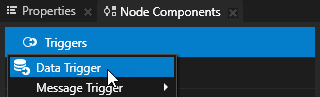
In the Node Components press Alt and right-click Triggers, select Data Trigger, and name it SettingsPanel.
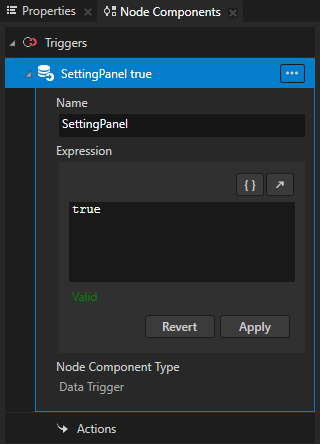
In the Expression use the expression:
{#Cluster/Data-DrivenActivities.ActivityProperty.Cluster.MainView} == 1A condition expression in a Data Trigger must evaluate to either
TrueorFalse.Click Apply.
This way you set the Data Trigger to keep an Apply Action in that Data Trigger applied for as long as the Data-DrivenActivities.ActivityProperty.Cluster.MainView property is set to Browse (enumeration value 1). You add an Apply Activation Action in the next step. With this binding, the value for the Data-DrivenActivities.ActivityProperty.Cluster.MainView comes from the Cluster Activity Host. You use the Cluster alias that is included in the starting point project and that points to the Cluster Parallel Activity Host.
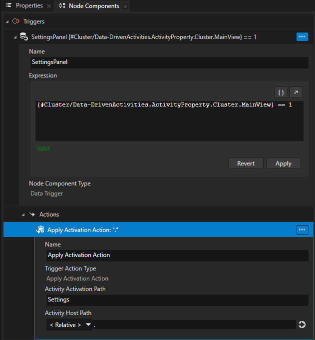
In the SettingsPanel trigger press Alt and right-click Actions, select Apply Activation Action, and set Activity Activation Path to Settings.
The path to the Activity that you set in the Activity Activation Path property is relative to the Activity Host node that you set in the Activity Host Path property.
The Data Trigger and Apply Activation Action keep this Activity active for as long as the condition in the Data Trigger is met.
The Activity Browser indicates that an Activity Host has a Data Trigger with the
 icon.
icon.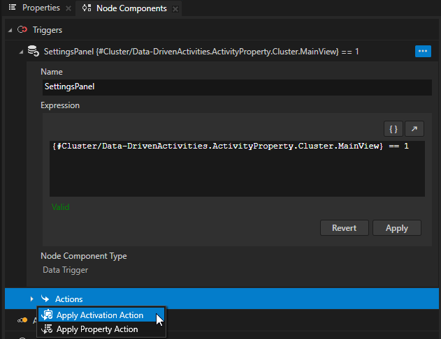
Create and set up a Data-Driven Exclusive Activity Host to generate Activities from data that comes from a data source:
In the Activity Browser below the Settings Activity click
, select Create Data-Driven Exclusive Activity Host, and name the Data-Driven Exclusive Activity Host SettingsPanel.
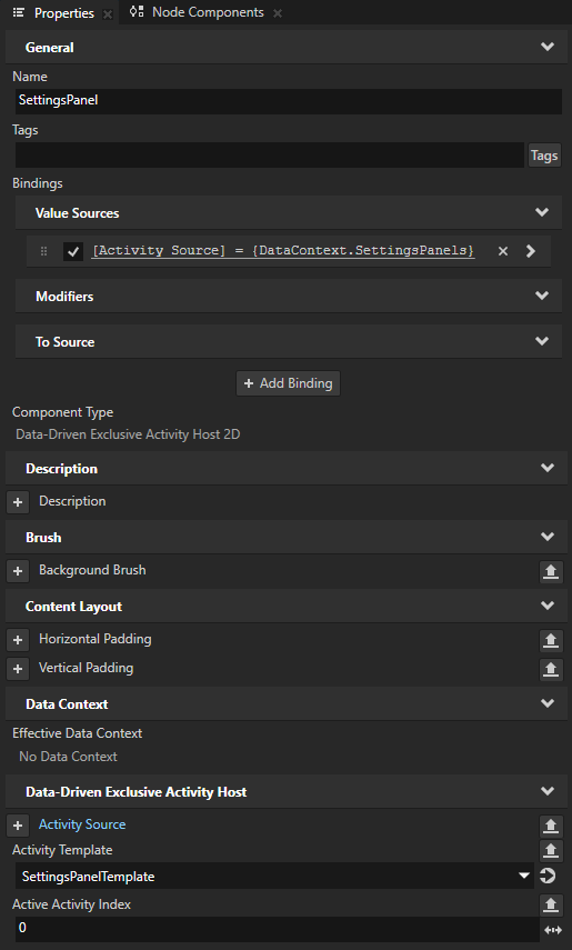
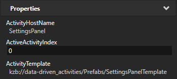
In the Prefabs select the Settings prefab, in the Properties add the Data Context > Data Context property and set it to the Settings data source that you created earlier.
This way you set which data source the SettingsPanel Data-Driven Exclusive Activity Host uses to generate Activities.
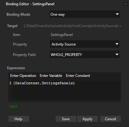
In the Prefabs select the Settings > SettingsPanel, in the Properties click + Add Binding, and in the Binding Editor set:
Property to Activity Source
Binding Expression to
{DataContext.SettingsPanels}
Click Save.
When you bind the Activity Source property to a data object, you tell a Data-Driven Exclusive Activity Host to use the data from that data object to generate Activities.
In the Prefabs select the Settings > SettingsPanel, in the Properties add and set:
Activity Template to the SettingsPanelTemplate prefab
Data-Driven Exclusive Activity Host uses this prefab to create Activities.
Active Activity Index to the item in the list data object that you want the Data-Driven Exclusive Activity Host to use to create an Activity when the application activates this Data-Driven Exclusive Activity Host.
The value of the Active Activity Index property is zero-based and indicates the position in the list data object in a data source that a Data-Driven Exclusive Activity Host uses to create Activities. Value -1 indicates that no Activities in that Data-Driven Exclusive Activity Host are active.
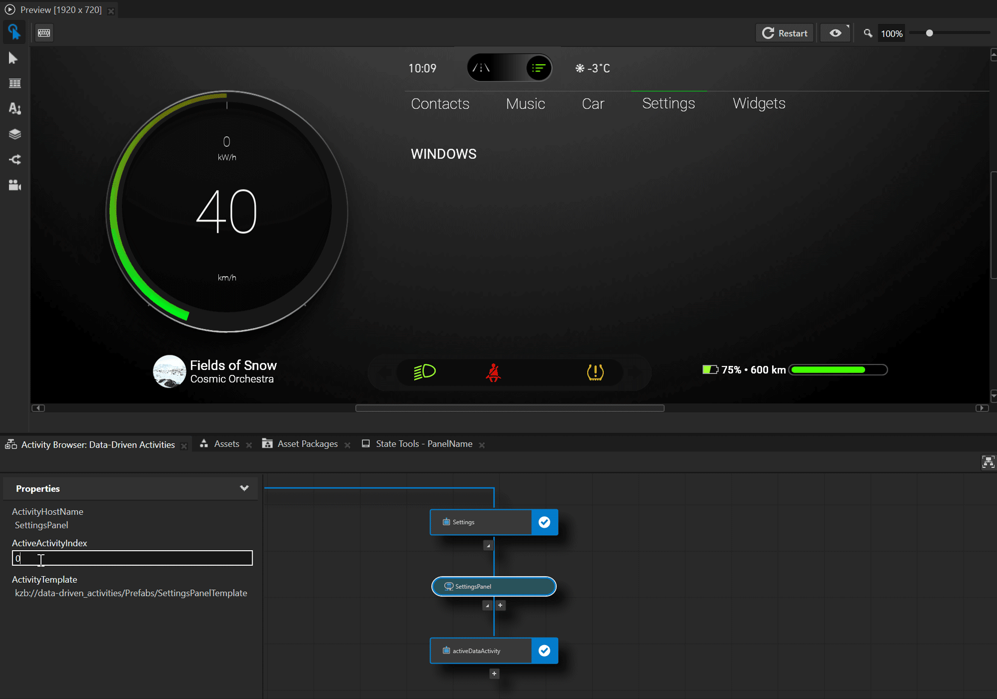
In the Activity Browser you can now browse through the Activities generated by the SettingsPanel Data-Driven Exclusive Activity Host:
In the Activity Browser select Cluster and in the side panel set the MainView property to Browse.
In the Activity Browser select the SettingsPanel Data-Driven Exclusive Activity Host and in the side panel set the value of the Active Activity Index property.
Use the Active Activity Index property to tell a Data-Driven Exclusive Activity Host Node which item in a list data object you want to create. When you set the value of the Active Activity Index property in the Activity Browser, you change the runtime value of this property. When you restart the Preview or your application, the Data-Driven Exclusive Activity Host reads the value of the Active Activity Index property that you set in the Properties.
Create the controls to navigate between Activities
In this section you create the controls to navigate between Activities in the SettingsPanel Data-Driven Exclusive Activity Host.
To create the controls to navigate between Activities:
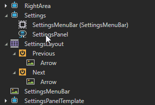
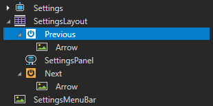
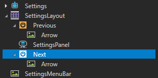
In the Prefabs drag the Settings > SettingsPanel to the SettingsLayout prefab between the Previous and Next nodes, then drag the SettingsLayout to the Settings Activity.
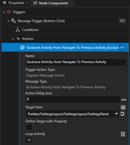
In Prefabs select the SettingsLayout > Previous Button node, in the Node Components press Alt and right-click Button: Click, and select Dispatch Message Action > Exclusive Activity Host > Navigate to Previous Activity.
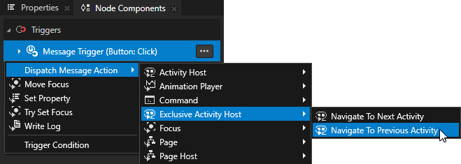
In Node Components in the Navigate to Previous Activity Action set:
Target Item to Prefabs/SettingsLayout/SettingsLayout/SettingsPanel
This way you set in a Navigate to Previous Activity Action in which Data-Driven Exclusive Activity Host you want to go to the previous Activity.
Loop Activity to enabled
This way you set a Navigate to Previous Activity Action to go to the last Activity in a Data-Driven Exclusive Activity Host after it reaches the first Activity in that Activity Host.
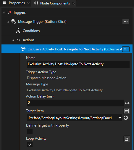
Repeat the procedure for the SettingsLayout > Next Button node but create a Navigate to Next Activity Action instead.
In the Activity Browser when you select the Cluster Activity Host and in the side panel set the MainView to Browse, in the Preview you can now use the buttons to navigate between the Activities in the SettingsPanel Data-Driven Exclusive Activity Host.
Show settings in the SettingsPanel
In this section you show in the SettingsPanel the settings that are defined for each panel in the Settings data source.
To show settings in the SettingsPanel:
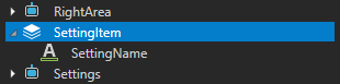
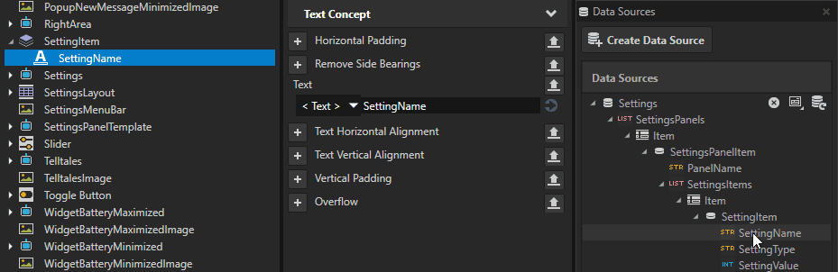
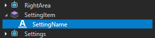
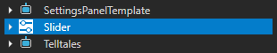
In the Prefabs create a Stack Layout 2D prefab named SettingItem and inside it create a Text Block 2D named SettingName.
You use this prefab to show each SettingItem from the Settings data source.
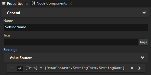
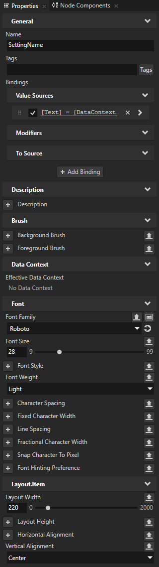
In the Prefabs select SettingItem > SettingName, from the Data Sources drag the Settings > SettingsPanels > Item > SettingsPanelItem > SettingsItems > Item > SettingItem > SettingName to the Properties and drop it on the Text property.
This way you bind the Text property of the SettingName to the SettingName data object in the Settings data source.
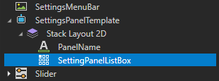
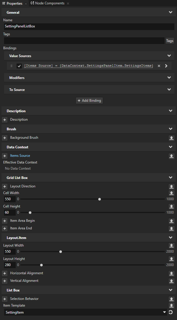
In the Prefabs > SettingsPanelTemplate > Stack Layout 2D create a Grid List Box 2D and name it SettingPanelListBox.
You use this list box to show the settings from the Settings data source using the SettingItem.
In the Prefabs select the SettingPanelListBox and set it so that it shows items from the Settings data source:
From the Data Sources drag the Settings > SettingsPanels > Item > SettingsPanelItem > SettingsItems data object to the Properties and drop it on the Items Source property.
In the Properties add and set:
Item Template to SettingItem
With the Item Template property you set which prefab template you want a Grid List Box node to use for the items in its list.
Layout Width to 550
Layout Height to 280
Cell Width to 550
Cell Height to 60
Adjust the presentation of the content in the SettingsPanel Data-Driven Exclusive Activity Host:
In the SettingsPanelTemplate > Stack Layout 2D set Direction to Y.
In the SettingsPanelTemplate > Stack Layout 2D > PanelName add and set:
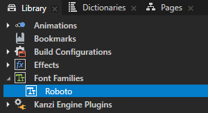
Font Family to Roboto
Font Size to 28
Horizontal Alignment to Center
In the SettingItem > SettingName add and set:
Font Family to Roboto
Font Size to 28
Font Weight to Light
Layout Width to 220
Vertical Alignment to Center
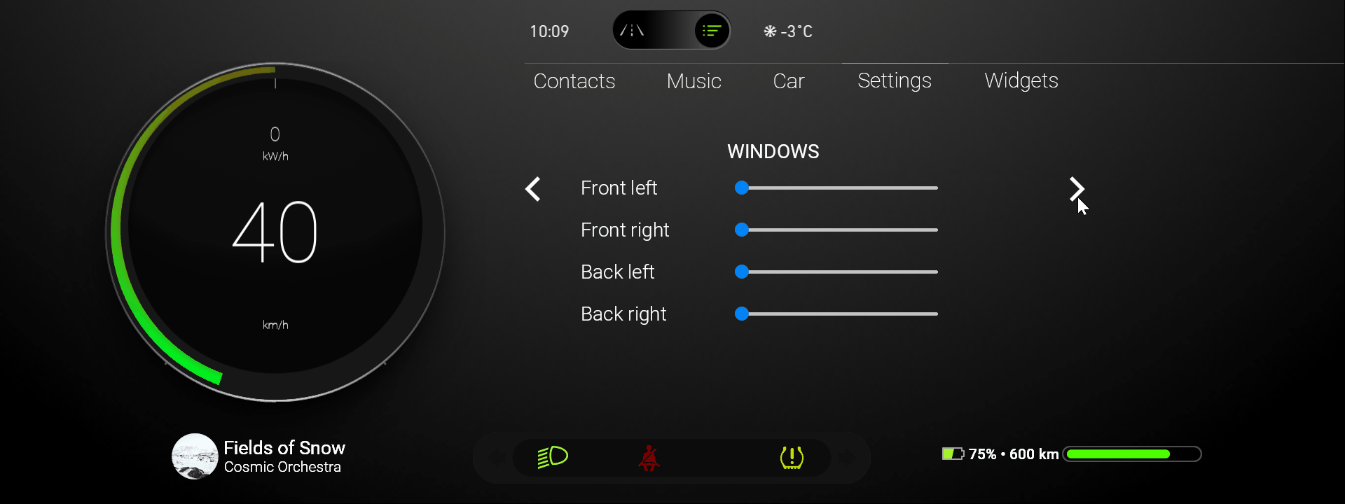
In the Activity Browser when you select the Cluster Activity Host and in the side panel set the MainView to Browse, in the Preview you can now see in the SettingsPanel Data-Driven Exclusive Activity Host the settings that are defined for each panel in the Settings data source.
Show a UI control for a setting item
In this section you learn how to show in the SettingsPanel for each setting item a control that is specified for that setting item in the Settings data source.
To show a UI control for a setting item:
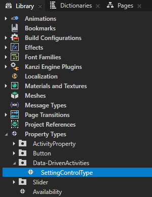
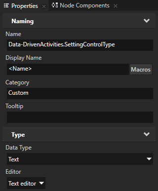
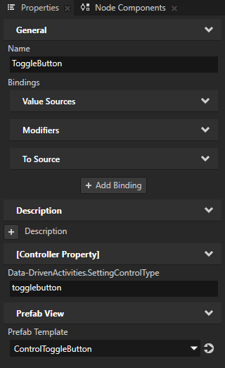
In the Library > Property Types create a property type named SettingControlType and set the Data Type to Text.
You use this property type to set the type of UI control that you want to use for each setting in the SettingsPanel.
Create a state manager that selects the UI control for each setting item in the SettingsPanel:
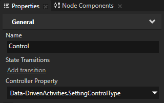
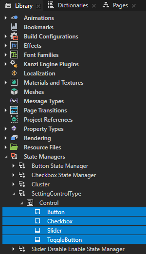
In the Library > State Managers create a state manager named SettingControlType, rename the State Group to Control, and in the Properties set the Controller Property property to SettingControlType.
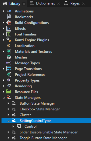
In the Library > State Managers > SettingControlType > Control create for each control type a state that sets these properties:
State
SettingControlType
Prefab View > Prefab Template
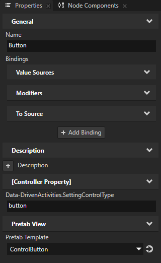
Button
button
ControlButton
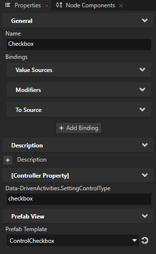
Checkbox
checkbox
ControlCheckbox
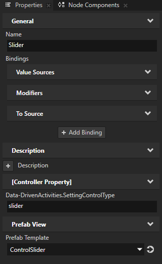
Slider
slider
ControlSlider
Toggle Button
togglebutton
ControlToggleButton
You use these states to set the UI control that you want to use for each setting. For the SettingControlType property values you use the same values that the Settings data source uses for each UI control type.
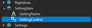
In the Prefabs > SettingItem create a Prefab View 2D, name it SettingControl, and in the Properties:
Add and set:
Resources > State Manager to SettingControlType
Layout Width to 300
Layout Height to 70
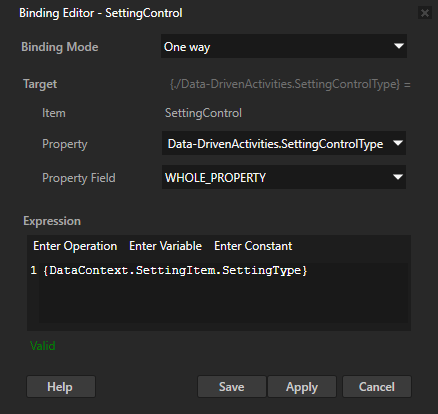
Click + Add Binding and in the Binding Editor set:
Property to Data-DrivenActivities.SettingControlType
Expression to
{DataContext.SettingItem.SettingType}
Click Save.
This way the value of the SettingControlType property comes from the SettingType data object. Since the controller property of the SettingControlType state manager is the SettingControlType property, you use this approach to instantiate the prefab of the UI control that the Settings data source contains.
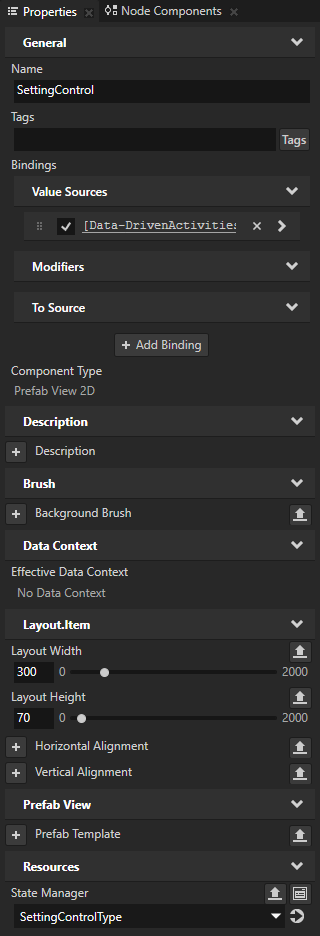
In the Activity Browser when you select the Cluster Activity Host and in the side panel set the MainView to Browse, in the Preview you can now see in the SettingsPanel Data-Driven Exclusive Activity Host each setting item with a UI control that is defined in the Settings data source.
Set the UI controls with data source
In this section you set the Checkbox, Slider, and Toggle Button UI controls to get and store their values from the Settings data source. This way the values of UI controls persist when the user navigates to other Activities. The XML_data_source data source that you use in this tutorial stores these values only in the memory.
To set the UI controls with data source:
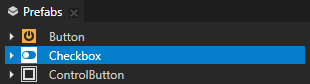
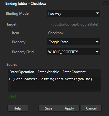
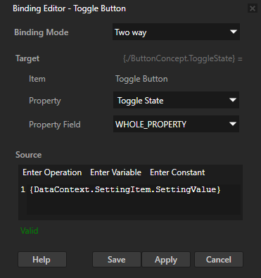
In the Prefabs select the Checkbox prefab, in the Properties click + Add Binding, and in the Binding Editor set:
Binding Mode to Two way
Property to Toggle State
Expression to
{DataContext.SettingItem.SettingValue}
Click Save.
This way the Checkbox gets its state from the SettingValue data object and stores the user-set value to the SettingValue data object of that setting item.
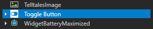
Repeat the previous step for the Toggle Button prefab.
Tip
To copy a binding:
In the Properties right-click the binding that you want to copy and select Copy Binding.
Select the node where you want to use the binding, in the Properties right-click the Bindings property, and select Paste Binding(s).
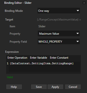
To set the Slider with data source:
In the Prefabs select the Slider prefab, in the Properties click + Add Binding, and in the Binding Editor set:
Property to Maximum Value
Expression to
{DataContext.SettingItem.SettingRange}
Click Save.
This way the Slider gets its maximum value from the SettingRange data object.
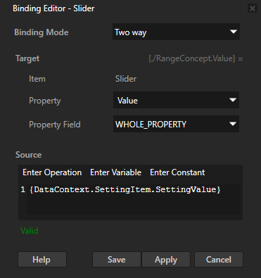
In the Properties click + Add Binding and in the Binding Editor set:
Binding Mode to Two way
Property to Value
Expression to
{DataContext.SettingItem.SettingValue}
Click Save.
This way the Slider gets its value from the SettingValue data object and stores the user-set value to the SettingValue data object of that setting item.
In the Preview when you change the value of a UI control in a setting item and navigate away from that Activity, when you return to that Activity the value for that UI control remains the same.
What's next?
In this tutorial you learned how to use a Data-Driven Exclusive Activity Host to generate Activities from data that comes from a data source. Now you can:
Learn how to program Activities with the Code Behind worklow. See Tutorial: Program Activities with C++ Code Behind.
Learn how to define a data source. See Tutorial: Get application data from a data source.
Learn how to use a List Box. See Tutorial: Create a contacts list with a Grid List Box.
See also
To learn more about how to use the Activity Browser, see Using the Activity Browser.
To learn more about the Activity system, see Activities.
To learn more about the Data Sources, see Data sources.
To learn more about the Kanzi state manager, see State manager.
To learn more about using bindings, see Using bindings and Bindings expressions reference.