Using the Slider nodes
Use the Slider nodes when you want to allow users to change numerical values using a visual indicator between a minimum and a maximum value.
As you move the knob along the trajectory the slider generates messages: drag started, drag finished, and value changed.
To learn how to create a slider by completing a tutorial, see Tutorial: Creating a slider.
The Slider nodes have the Focusable property enabled and can receive focus by default. When a Slider node has focus, to move the knob of that slider, you can use these default keyboard keys:
Home to move the slider knob to the beginning of the rail
End to move the slider knob to the end of the rail
← and → to move the knob of a horizontal slider
↑ and ↓ to move the knob of a vertical slider
To move a slider knob with the arrow keyboard keys, in that Slider node set the amount that the knob moves for each key press with the Step Value property.
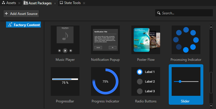
Using the slider from the Factory Content
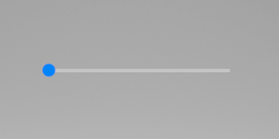
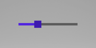
The Kanzi Factory Content asset package contains a 2D slider that you can customize to suit your needs.
To use the slider from the Factory Content:
From the Asset Packages > Factory Content drag the Slider and drop it on the Preview or on a 2D node in the Node Tree.
Kanzi Studio imports the Slider asset to your project, creates from the slider a prefab, and instantiates that prefab in your project.
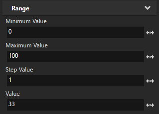
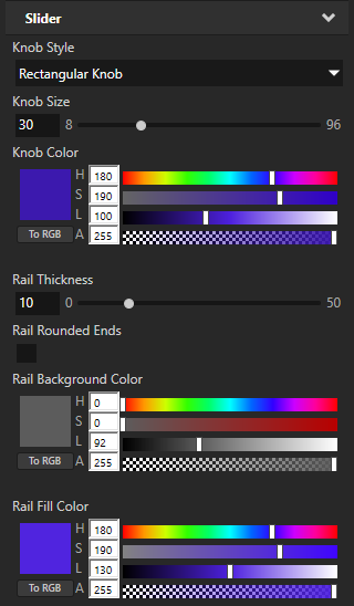
(Optional) To set the look and behavior of the slider, in the Node Tree or Prefabs select the Slider and in the Properties add and set:
Maximum Value to set the highest value of the slider. The default value is 100.
Minimum Value to set the lowest value of the slider. The default value is 0.
Step Value to set the increment by which the knob moves on the rail. The default value is 1.
Value to set the initial position of the knob on the rail. You can use bindings to control another property with the position of the slider. See Using bindings.
Knob Style to set the shape of the knob to square or circle, or to not show the knob.
Knob Size to set the size of the knob.
Knob Color to set the color of the knob.
Rail Thickness to set the thickness of the rail.
Rail Rounded Ends to set whether to round the ends of the rail.
Rail Background Color to set the color of the rail from the knob until the end of the rail.
Rail Fill Color to set the color of the rail from the start of the rail until the knob.
Creating your own slider
When the slider that comes with Kanzi does not meet your requirements, you can create your own slider.
To create your own slider:
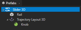
In the Prefabs click
 and select either Slider 3D or Slider 2D.
Right-click the slider prefab you created and create:
For a 3D slider:
A node that visually represents the rail along which the slider knob moves.
For example, if you want to visualize the trajectory along which the slider moves, use a mesh.
Trajectory Layout 3D that acts as the rail along which you want to move the slider knob.
Kanzi Studio creates and uses a circle trajectory by default. You can use an angle, arc, circle, ellipse, line, rectangle, spiral, spline, or a trapezoid trajectory. See Trajectories.
Inside the Trajectory Layout 3D create a node that you want to use as the slider knob.
For example, create a Sphere.
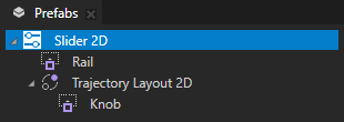
For a 2D slider:
A node that visually represents the rail along which the slider knob moves. For example, to create a visual representation of a rail, you can use a Content Layout 2D node, an Image node, or several Image or Empty Node 2D nodes in a layout.
For example, create a Content Layout 2D node and name it Rail.
A Trajectory Layout 2D node that acts as the rail along which you want to move the slider knob.
Kanzi Studio creates and uses a circle trajectory by default. You can use an angle, arc, circle, ellipse, line, rectangle, spiral, spline, or a trapezoid trajectory. See Trajectories.
Inside the Trajectory Layout 2D node create a node that you want to use as the visual representation of the slider knob.
For example, create a Content Layout 2D node and name it Knob.
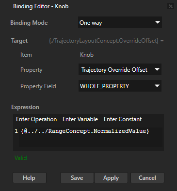
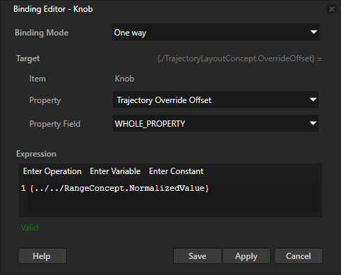
Select the node you want to use as the knob, in the Properties click + Add Binding, and in the Binding Editor set:
Property to Trajectory Override Offset
Expression to
{@../../RangeConcept.NormalizedValue}
Click Save. See Using bindings.
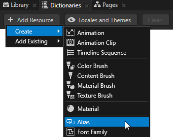
Create an alias that Kanzi uses to tell the slider which trajectory to use as the rail of the slider:
In the Prefabs select the Slider 2D prefab, in the Dictionaries window click + Add Resource, and select Create > Alias.
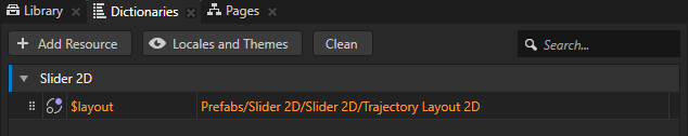
Name the alias $layout and set it to point to the Trajectory Layout 2D node in the Slider 2D prefab.
Kanzi uses this alias to tell the slider along which trajectory to move the slider knob.
Set the size of the rail along which the knob of the slider moves:
For a 3D slider: in the Library > Trajectories select the trajectory that the Trajectory Layout 3D node in the slider uses and set either the Length property of a Line Trajectory or the Radius property of a Circle Trajectory.
For a 2D slider: in the Prefabs select the Trajectory Layout 2D and in the Properties set the Layout Width property.
(Optional) Select the slider and in the Properties you can set slider parameters by adding and setting:
Maximum Value defines the highest value of the slider.
Minimum Value defines the lowest value of the slider.
Step Value defines the increment by which the knob moves on the rail.
Value property sets the initial position of the knob on the rail. If you do not set the Minimum Value and Maximum Value properties, the range is between 0 and 1.
Drag the slider you created from the Prefabs to the Node Tree and drop it on the node where you want to use the slider.
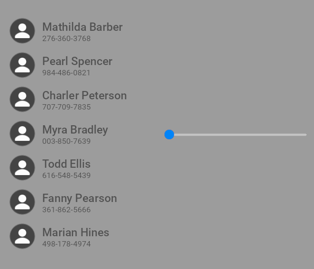
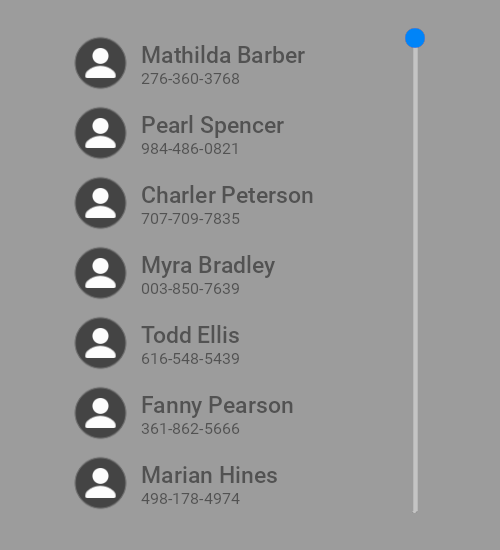
Using a slider to scroll a Grid List Box node
You can use a Slider node to scroll a Grid List Box node. In this example you use a slider to scroll a vertical contacts list.
To use a slider to scroll a Grid List Box node:
Create the Grid List Box node that you want to scroll.
For example:
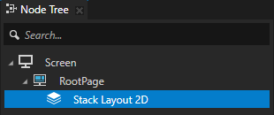
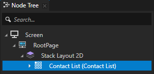
In the Node Tree create a Stack Layout 2D node.
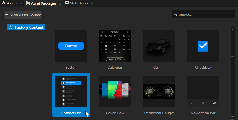
From the Asset Packages > Factory Content drag the Contact List to the Node Tree and drop it on the Stack Layout 2D node. See Factory Content assets.
Create the Slider node that you use to scroll the Grid List Box node, and set the size and orientation of the Slider node to match those of the Grid List Box node.
For example:
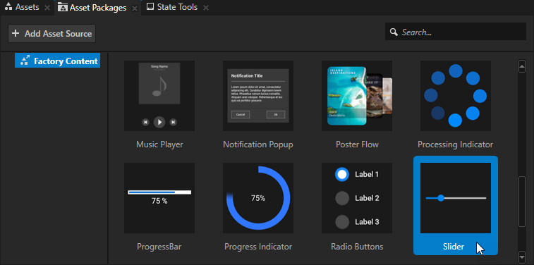
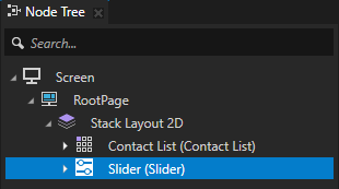
From the Asset Packages > Factory Content drag the Slider to the Node Tree and drop it on the Stack Layout 2D node.
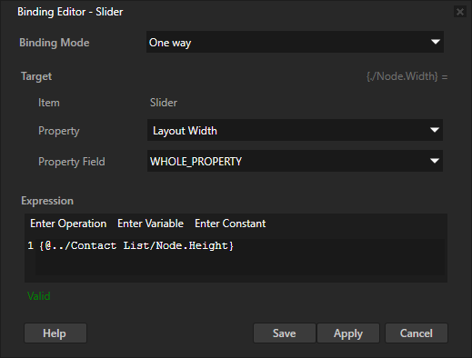
In the Node Tree select the Slider node, in the Properties click + Add Binding, and in the Binding Editor set:
Property to Layout Width
Expression to
{@../Contact List/Node.Height}
This way you make the length of the slider rail match the height of the Contact List node.
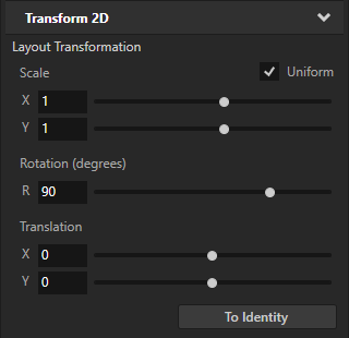
In the Properties add the Transform 2D > Layout Transformation property and set the Rotation property field to 90.
This way you make the slider vertical.
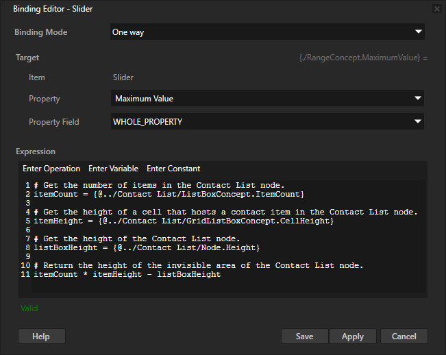
In the Properties click + Add Binding and in the Binding Editor set:
Property to Maximum Value
Expression to
# Get the number of items in the Contact List node.
itemCount = {@../Contact List/ListBoxConcept.ItemCount}

# Get the height of a cell that hosts a contact item in the Contact List node.
itemHeight = {@../Contact List/GridListBoxConcept.CellHeight}

# Get the height of the Contact List node.
listBoxHeight = {@../Contact List/Node.Height}

# Return the height of the invisible area of the Contact List node.
itemCount * itemHeight - listBoxHeight
You bind the highest value of the Slider node to the height of the invisible area of the Contact List node. The lowest value of the Slider node is by default 0. This way you set the range of values in the slider to match the length of the contacts list.
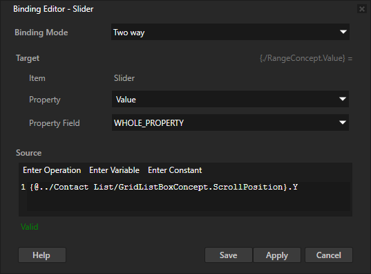
In the Node Tree select the Slider node, in the Properties click + Add Binding, and in the Binding Editor set:
Binding Mode to Two way
Property to Value
Source to the Scroll Position property X or Y property field of the Grid List Box node that you want to scroll.
For example, set it to:
{@../Contact List/GridListBoxConcept.ScrollPosition}.Y
You bind the Value property of the Slider node to the Scroll Position property Y property field of the Contact List node. This way you create a two-way connection between the position of the slider knob and the vertical scroll position of the list box.
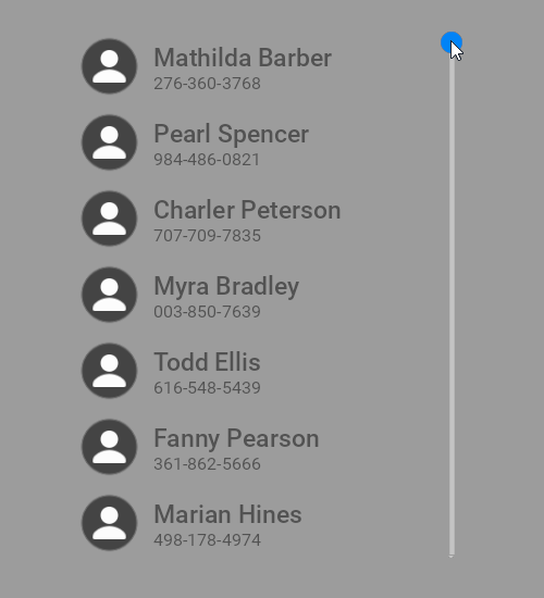
In the Preview when you move the slider knob, the contacts list scrolls, and when you scroll the contacts list, the slider knob moves.
Creating a color picker with a slider
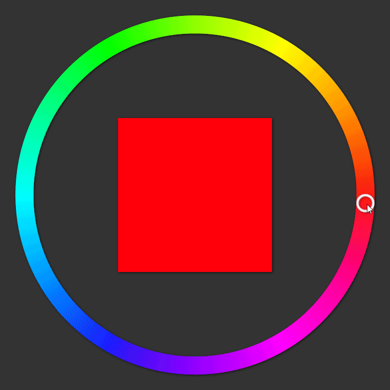
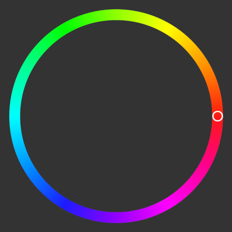
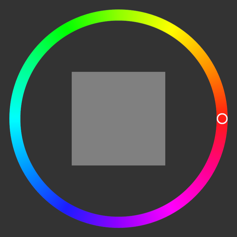
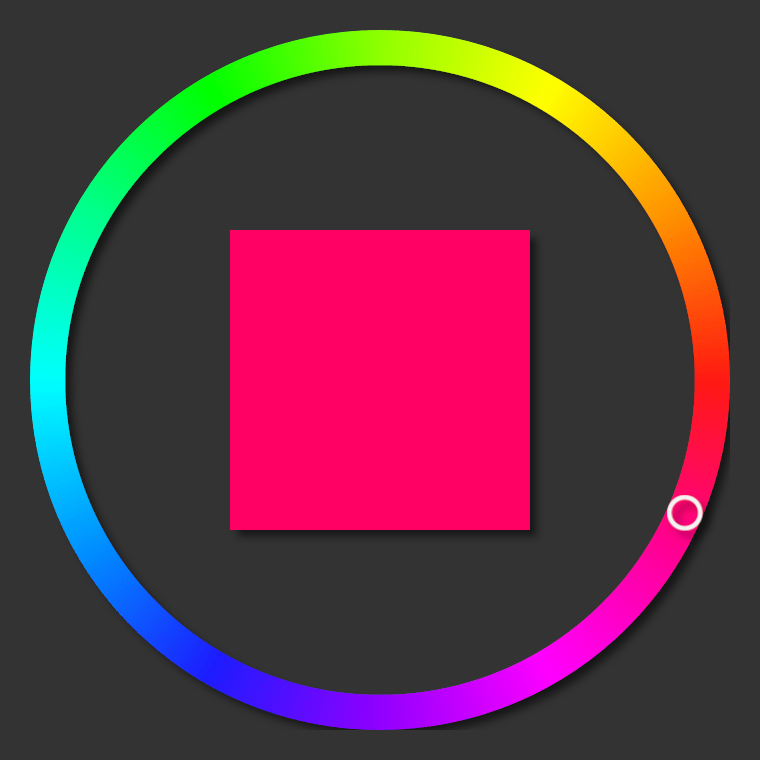
You can use a Slider node to create a color picker where the slider value sets the color of a color swatch.
To create a color picker with a slider:
Create a slider whose ring-shaped knob moves along a color wheel:
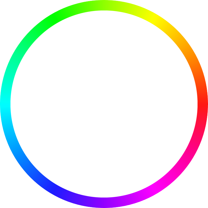
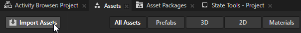
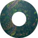
In the Assets, click Import Assets and import images that show a color wheel and a ring-shaped slider knob.
For example, save and import these images.

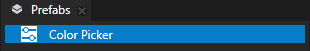
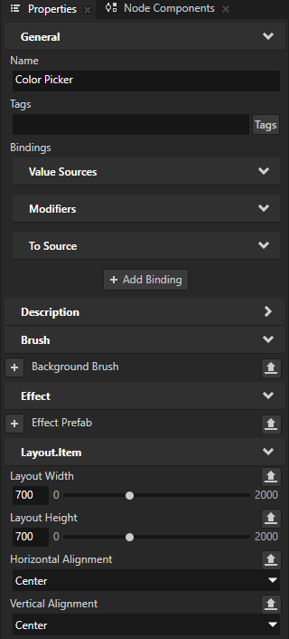
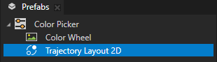
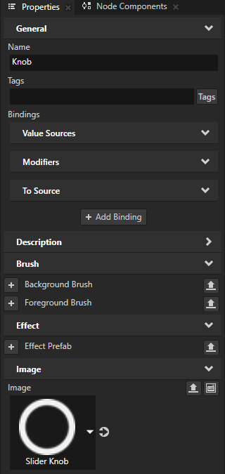
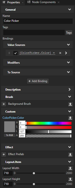
In the Prefabs, create a Slider 2D prefab and name it Color Picker. In the Properties, add and set:
Layout Width and Layout Height to match the dimensions of the image that shows the color wheel.
For example, set them to 700.
Horizontal Alignment and Vertical Alignment to Center
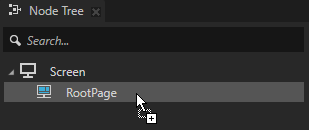
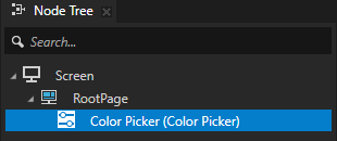
Drag the Color Picker prefab to the Node Tree and drop it on the RootPage node.
This way you instantiate the prefab in the node tree so that you can follow the creation of the slider in the Preview.
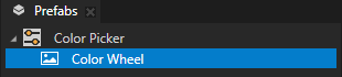
In the Prefabs > Color Picker prefab:
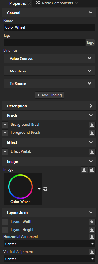
Create an Image node that shows the color wheel and visually represents the rail along which the slider knob moves. In the Properties, add and set the Horizontal Alignment and Vertical Alignment properties to Center.
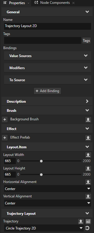
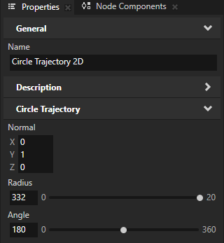
Create a Trajectory Layout 2D node that acts as the rail along which you move the slider knob. In the Properties, add and set:
Layout Width and Layout Height to the difference between the dimensions of the images that show the color wheel and the slider knob.
For example, set them to 665.
Horizontal Alignment and Vertical Alignment to Center
This way you position the trajectory layout over the color wheel.
Tip
To see the trajectory, in the Preview click
 to enter the Analyze mode, right-click
  , and select Debug objects.
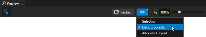
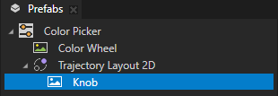
In the Trajectory Layout 2D node, create an Image node that you use as the visual representation of the slider knob.
In the Prefabs, select the Trajectory Layout 2D node. In the Properties next to the Trajectory property, click
 to go to that resource and set:
Radius to half of the width of the Trajectory Layout 2D node
For example, set it to 332.
Angle to 180
You set the starting point of the trajectory to the color red, whose hue is 0.
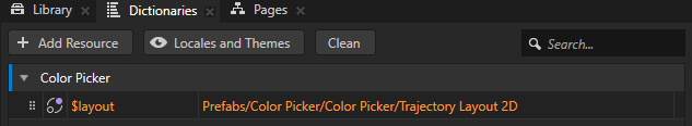
Create an alias that Kanzi uses to tell the slider which trajectory to use as the rail of the slider:
In the Prefabs, select the Color Picker prefab. In the Dictionaries, click + Add Resource, select Create > Alias, and name the alias $layout.
Set the $layout alias to point to the Trajectory Layout 2D node in the Color Picker prefab.
In the Prefabs, select the Knob node. In the Properties, click + Add Binding and in the Binding Editor, set:
Property to Trajectory Override Offset
Expression to
{@../../RangeConcept.NormalizedValue}
Click Save.
This binding makes the slider knob move on the trajectory that defines the slider rail.
Store the color that the user selects on the color wheel:
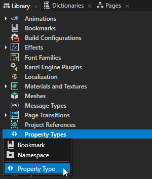
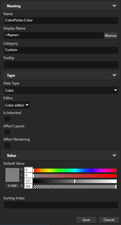
In the Library > Property Types, create a property type and set:
Name to ColorPicker.Color
Data Type to Color
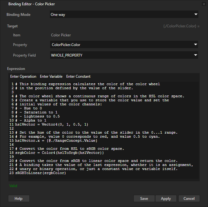
In the Prefabs, select the Color Picker prefab. In the Properties, click + Add Binding and in the Binding Editor, set:
Property to ColorPicker.Color
Expression to
# This binding expression calculates the color of the color wheel
# in the position defined by the value of the slider.

# The color wheel shows a continuous range of colors in the HSL color space.
# Create a variable that you use to store the color value and set the
# initial values of the color channels:
# - Hue to 0
# - Saturation to 1
# - Lightness to 0.5
# - Alpha to 1
hslVector = Vector4(0, 1, 0.5, 1)

# Set the hue of the color to the value of the slider in the 0...1 range.
# For example, value 0 corresponds to red, and value 0.5 to cyan.
hslVector.x = {@./RangeConcept.Value}

# Convert the color from HSL to sRGB color space.
srgbColor = Color4(hslToSrgb(hslVector))

# Convert the color from sRGB to linear color space and return the color.
# A binding takes the value of the last expression, whether it is an assignment,
# unary or binary operation, or just a constant value or variable itself.
sRGBToLinear(srgbColor)
Click Save.
You bind the ColorPicker.Color property to a color value that you calculate based on the Value property of the slider. To convert between color spaces, you use the hslToSrgb and sRGBToLinear binding functions.
Create a swatch that shows the currently selected color:
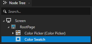
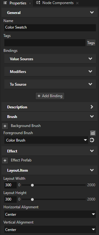
In the Node Tree, create an Empty Node 2D node and name it Color Swatch. In the Properties, add and set:
Foreground Brush and select + Color Brush
Layout Width and Layout Height to 300
Horizontal Alignment and Vertical Alignment to Center
You use this node to show the color that the user selects in the color wheel with the slider.
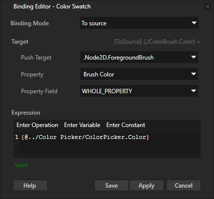
In the Node Tree, select the Color Swatch node. In the Properties, click + Add Binding, and in the Binding Editor set:
Binding Mode to To source
Push Target to .Node2D.ForegroundBrush
Property to Brush Color
Expression to
{@../Color Picker/ColorPicker.Color}
Click Save.
This way you set the value of the Brush Color property for the brush that is used by the Foreground Brush of the Color Swatch node. You bind the value of the Brush Color property to the value of the ColorPicker.Color property in the Color Picker node.
In the Preview, when you drag the knob along the color wheel, the color swatch shows the color under the knob.

(Optional) Apply a shadow to the color wheel, slider knob, and color swatch:
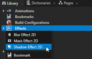
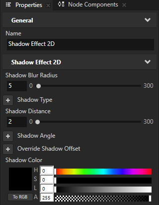
In the Library, press Alt and right-click Effects and select Shadow Effect 2D.
The Shadow Effect 2D effect applies a shadow to the visual shape of the content in a 2D node. See Using the Shadow Effect 2D effect.
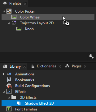
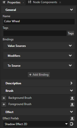
From the Library > Effects > 2D Effects, drag the Shadow Effect 2D effect to the Prefabs and drop it on the node that shows the color wheel.
This way you set in that node the Effect Prefab property to the Shadow Effect 2D effect.
Repeat the previous step for the nodes that show the slider knob and color swatch.
Adjust the appearance of the shadow effect.
For example, in the Library > Effects > 2D Effects, select the Shadow Effect 2D effect. In the Properties, add and set:
Shadow Blur Radius to 5
Shadow Distance to 2
Shadow Color to fully opaque black
In the Prefabs, select the Color Picker prefab. In the Properties, set the Layout Width and Layout Height properties to values that leave enough space for the shadow in the layout.
For example, set the the Layout Width and Layout Height to 710.
Controlling whether a Slider node is in use
To control whether a Slider node is in use, use the Input > Enabled property. A disabled Slider node does not react to user input. When you disable a Slider node, Kanzi stops ongoing gestures and preserves the slider value.
When you disable the Enabled property of a node, you effectively disable that node and its descendant nodes in the same overlay focus scope.
To observe whether a node is effectively enabled, use the Input > Effectively Enabled property in a state manager or a binding. For example, to visually indicate to the user whether a node is in use, create a state manager and use the Effectively Enabled property as its controller property.
Setting the appearance of a Slider 2D node
To set the appearance of 2D nodes:
You can fill 2D nodes with a solid color, a texture, or a material. See Adjusting the appearance of 2D nodes.


You can apply a post-processing effect to a 2D node. See Effects for 2D nodes.


You can rotate a 2D node around all three axes to create a 3D perspective effect. See Creating a 3D perspective effect for 2D nodes.
You can apply custom rendering to 2D nodes to create post-processing effects. See Applying custom rendering to 2D nodes.
You can render a 2D node as pixel-perfect. See Rendering pixel-perfect 2D nodes.
Using the Slider 3D node in the API
To create a Slider 3D node with a custom appearance:
// Create a Slider 3D node named Custom 3D slider.
Slider3DSharedPtr slider3d = Slider3D::create(domain, "Custom 3D slider");
// Add the Slider 3D node to the Scene node.
scene->addChild(slider3d);

// Set the size of the Slider 3D node to be 4 device independent units wide,
// 2 device independent units high, and 1 device independent unit deep.
slider3d->setWidth(4.0f);
slider3d->setHeight(2.0f);
slider3d->setDepth(1.0f);

// Use the Trajectory Layout 3D node to define the rail along which the knob of the slider moves.
// Create a Trajectory Layout 3D node named Slider rail.
TrajectoryLayout3DSharedPtr trajectoryLayout = TrajectoryLayout3D::create(domain, "Slider rail");

// Use the Sphere node to define the look of the knob that moves on the slider rail.
// Create a blue Sphere node named Slider knob whose radius is 1 device independent unit.
Model3DSharedPtr sliderKnob = Model3D::createSphere(domain, "Slider knob", 1.0f, 20, 20, ThemeBlue);
// Set the Sphere node to be the child of the trajectoryLayout Trajectory Layout 3D node.
trajectoryLayout->addChild(sliderKnob);

// Add the layout as a child node of the Slider 3D node.
// You can place the Trajectory Layout 3D node that defines the rail anywhere
// in the node tree and it does not have to be the direct child of the Slider 3D node.
slider3d->addChild(trajectoryLayout);

// The knob movement on the rail is based on modifying the TrajectoryLayout3D::StaticTrajectoryOffsetProperty
// which is set based on the Slider3D::ValueProperty.
// "../.." is the path from the knob (Sphere node) to the Slider 3D node.
AbstractBindingSharedPtr binding = Binding::create("../..", Slider3D::ValueProperty, PropertyFieldWhole);
// Add to the knob the binding that enables the knob to move on the rail.
sliderKnob->setBinding(binding, TrajectoryLayout3D::OverrideOffsetProperty, PropertyFieldWhole);

// Create an alias pointing to the Trajectory Layout 3D node that defines the slider rail.
ResourceID alias("$layout");
string path("obj:///" + trajectoryLayout->getName());
// Add the alias to the resource dictionary of the Slider 3D node.
slider3d->addResource(alias, path);

// Create the trajectory of the Trajectory Layout 3D node that is used as the rail of the Slider 3D node.
// Create a line trajectory on the x axis, that is 5 device independent units long, and name it Line trajectory.
TrajectorySharedPtr trajectory = Trajectory::createLine(Vector3(), Vector3(1.0f, 0.0f, 0.0f), 5.0f, domain, "Line trajectory");
// Set the Trajectory Layout 3D node to use the line trajectory.
trajectoryLayout->setTrajectory(trajectory);

// Set the Trajectory Layout 3D node so that it sets its size
// based on the size of its parent node (in this case the Slider 3D node).
trajectoryLayout->setHorizontalAlignment(Node::HorizontalAlignmentStretch);
trajectoryLayout->setVerticalAlignment(Node::VerticalAlignmentStretch);
trajectoryLayout->setDepthAlignment(Node::DepthAlignmentStretch);
For details, see the Slider3D class in the Kanzi Engine API reference.
Using the Slider 2D node in the API
To create a Slider 2D node with a custom appearance:
// Create a Slider 2D node named Custom 2D slider.
Slider2DSharedPtr slider = Slider2D::create(domain, "Custom 2D slider");
// Set the size of the Slider 2D node to be 400 pixels wide and 200 pixels high.
slider->setSize(400.0f, 200.0f);

// Use the Trajectory Layout 2D node to define the rail along which the knob of the slider moves.
// Create a Trajectory Layout 2D node named Slider rail.
TrajectoryLayout2DSharedPtr trajectoryLayout = TrajectoryLayout2D::create(domain, "Slider rail");

// Use the Image node to define the look of the knob that moves on the slider rail.
// Create an Image node named Slider knob.
Image2DSharedPtr knob = Image2D::create(domain, "Slider knob");
// Set the Image node to be the child of the trajectoryLayout Trajectory Layout 2D node.
trajectoryLayout->addChild(knob);

// Create an alias pointing to the Trajectory Layout 2D node that defines the slider rail.
ResourceID alias("$layout");
string path("obj:///" + trajectoryLayout->getName());
// Add the alias to the resource dictionary of the Slider 2D node.
slider->addResource(alias, path);

// Add the layout as a child node of the Slider 2D node.
// You can place the Trajectory Layout 2D node that defines the rail anywhere
// in the node tree and it does not have to be the direct child of the Slider 2D node.
slider->addChild(trajectoryLayout);

// Create the trajectory of the Trajectory Layout 2D node that is used as the rail of the Slider 2D node.
// Create a line trajectory on the x axis, that is 350 pixels long, and name it Line trajectory.
TrajectorySharedPtr trajectory = Trajectory::createLine(Vector3(), Vector3(1.0f, 0.0f, 0.0f), 350.0f, domain, "Line trajectory");
// Set the Trajectory Layout 2D node to use the line trajectory.
trajectoryLayout->setTrajectory(trajectory);

// Set the Trajectory Layout 2D node so that it sets its size
// based on the size of its parent node (in this case the Slider 2D node).
trajectoryLayout->setHorizontalAlignment(Node::HorizontalAlignmentStretch);
trajectoryLayout->setVerticalAlignment(Node::VerticalAlignmentStretch);

// The knob movement on the rail is based on modifying the TrajectoryLayout2D::StaticTrajectoryOffsetProperty
// which is set based on the Slider2D::ValueProperty.
// "../.." is the path from the knob (Image node) to the Slider 2D node.
AbstractBindingSharedPtr binding = Binding::create("../..", Slider2D::ValueProperty, PropertyFieldWhole);

// Add the Slider 2D node to the Viewport 2D node.
viewportNode->addChild(slider);

// Get the knob instance from the instance of the prefab template.
Node2DSharedPtr knobInstance = slider->getPresenter()->getLayout()->getChild(0);
// Set to the knob the binding that enables the knob to move on the rail.
knobInstance->setBinding(binding, TrajectoryLayout2D::OverrideOffsetProperty, PropertyFieldWhole);
For details, see the Slider2D class in the Kanzi Engine API reference.