Using the List Box Item Container prefabs
Use the List Box Item Container prefabs to set the appearance and behavior of items in List Box nodes. For example, use a List Box Item Container prefab to add decorative elements to List Box items or change the appearance of the currently selected item.
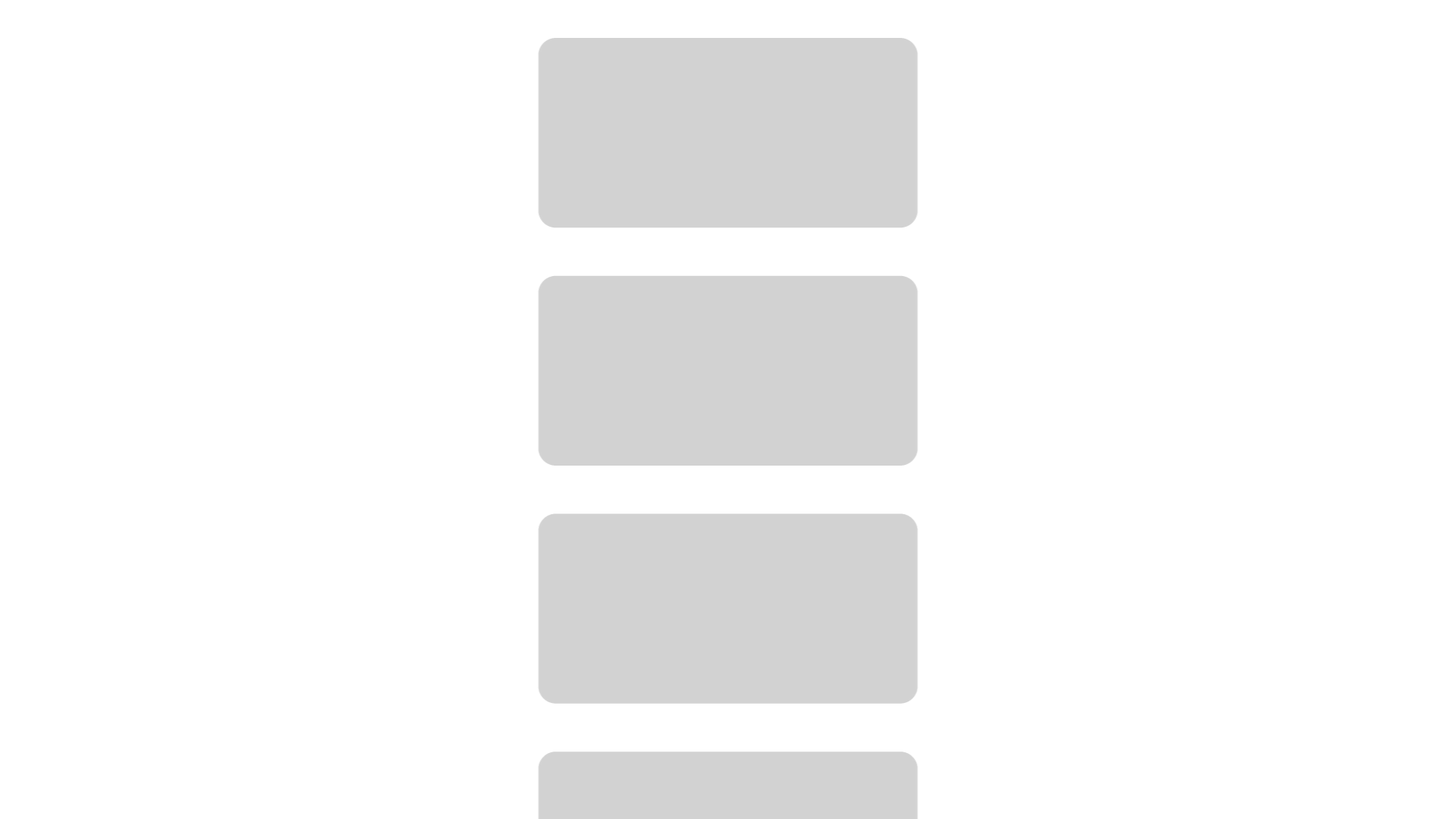
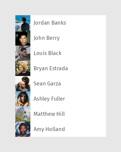
Learn how to use a List Box Item Container 2D prefab to set the appearance of the selected item in a Grid List Box 2D node by completing a tutorial. See Tutorial: Create a contacts list with a Grid List Box.
For an example of how to use a List Box Item Container 3D prefab to set the appearance of the selected item in a Trajectory List Box 3D node, see the Trajectory list box example.
Creating a List Box Item Container prefab
To create a List Box Item Container prefab:
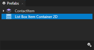
In the Prefabs click
 and select List Box Item Container 2D or List Box Item Container 3D. List Box Item Container must always be a prefab. See Using node prefabs.
Use List Box Item Container 2D with Grid List Box 2D nodes and List Box Item Container 3D with Grid List Box 3D and Trajectory List Box 3D nodes. See Using the Grid List Box nodes and Using the Trajectory List Box 3D node.
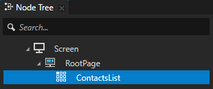
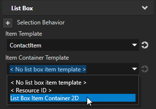
In the Node Tree select the List Box node with which you want to use the List Box Item Container, in the Properties add the List Box > Item Container Template property, and set it to the List Box Item Container prefab that you created.
The Item Container Template property allows you to share functionality between the items in a List Box node. When you set the Item Container Template property, each item in the List Box node inherits the functionality from the List Box Item Container prefab. Kanzi by default places the list box item as a child node of the List Box Item Container prefab.
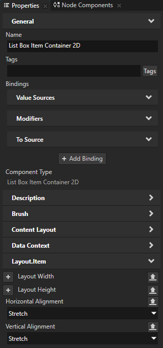
To make a List Box Item Container 2D prefab stretch to the cell size of a Grid List Box 2D node, in the Prefabs select the List Box Item Container 2D prefab, in the Properties add the Horizontal Alignment and Vertical Alignment properties, and set them to Stretch.
In the List Box Item Container prefab set the functionality and decoration that is common to all List Box items. For example, you can:
Set the placement of the list box item in the node tree of the List Box Item Container prefab. See Setting the placement of List Box items in a List Box Item Container.
Set the appearance of the selected list box item. See Using a List Box Item Container to set the appearance of the selected item in a List Box.
Setting the placement of List Box items in a List Box Item Container
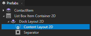
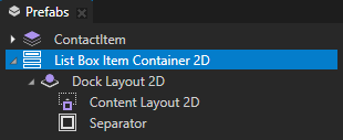
When you set a List Box Item Container prefab as the Item Container Template of a List Box node, Kanzi by default places the list box item as a child node of the List Box Item Container prefab. You can set a Content Layout node in the List Box Item Container prefab as the root node of the list box item.
To set the placement of List Box items in a List Box Item Container:
Create a List Box Item Container prefab. See Creating a List Box Item Container prefab.
In the List Box Item Container prefab create the nodes that you want to use to define the appearance of the list box item, and a Content Layout node that you use as the root node of the list box item.
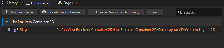
Create an alias that Kanzi uses to tell the List Box Item Container prefab which Content Layout node to use as the root node of the list box item:
In the Prefabs select the List Box Item Container prefab, in the Dictionaries window click + Add Resource, and select Create > Alias.
This way you create an alias in the resource dictionary of the List Box Item Container 2D.
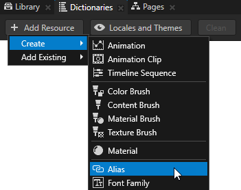
Name the alias $layout and set it to point to the Content Layout node that you want to use as the root node of the list box item.
This way you set Kanzi to place the list box item in the Content Layout node. If you do not specify the $layout alias, Kanzi places the list box item as the last child node of the List Box Item Container prefab.
Using a List Box Item Container to set the appearance of the selected item in a List Box
You can use the List Box Item Container prefabs to change the appearance of the currently selected item in a List Box node. For example, to highlight the selected item you can make it slightly larger than the other items or change its background color.
To use a List Box Item Container to set the appearance of the selected item in a List Box:
Create a List Box Item Container prefab and set it as the Item Container Template of a List Box node. See Creating a List Box Item Container prefab.
For example:
Create a List Box Item Container 2D prefab and set it as the Item Container Template of a Grid List Box 2D node that presents address book contacts.
In the Prefabs select the List Box Item Container 2D prefab, in the Properties add the Horizontal Alignment and Vertical Alignment properties, and set them to Stretch.
This way you make the List Box Item Container 2D prefab stretch to the cell size of the Grid List Box 2D node.
In the Prefabs select the List Box Item Container prefab and in the State Tools create a State Manager with two states. See Using state managers.
For example, name one state NotSelected and the other Selected.
The Selected state defines the state of your application when an item in the list box is selected, the NotSelected state when the item is not selected.
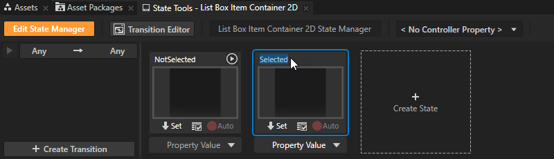
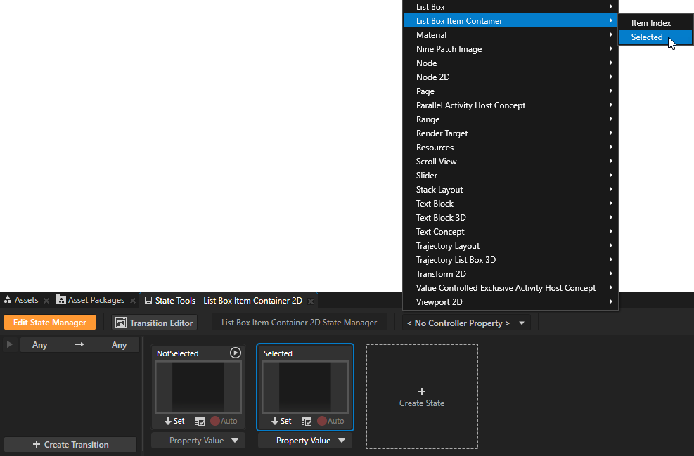
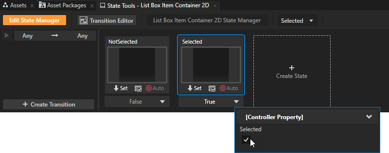
In the State Tools click <No Controller Property>, select the List Box Item Container > Selected property, and set the value of the controller property for the Selected state to True.
In a state manager the value of the property that you select as the Controller Property defines the conditions when each state in a state group is active.
In the Prefabs select the List Box Item Container prefab and in the Properties add and set the properties the values of which you want to change when a list box item is selected. Save different values of the properties to each state. You can also add nodes to the List Box Item Container prefab and make them visible only for the selected item.
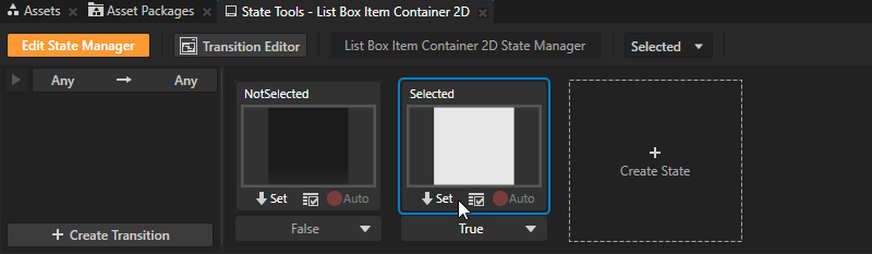
For example, to change the background color of the selected list box item add the Background Brush property, and set it to a color brush that you want to use to fill the background of the selected list box item. In the State Tools click
 below the Selected state to save the property value to that state.
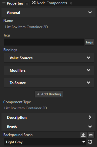
In the State Tools click Edit State Manager to deactivate the State Tools.
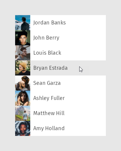
In the Preview when you click an item in the List Box node to select it, its appearance changes.
Enabling the double-click gesture for List Box items
When you add to a List Box node items that support the double-click gesture, you must enable the double-click gesture for those items in the List Box Item Container prefab.
To learn how to enable the double-click gesture for a node, see Enabling the multi-click gesture for a node.
To enable the double-click gesture for List Box items:
Create a List Box Item Container prefab and set it as the Item Container Template of the List Box node. See Creating a List Box Item Container prefab.
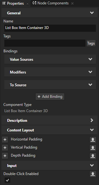
In the Prefabs select the List Box Item Container prefab and in the Properties add and enable the Input > Double-Click Enabled property.
When you enable the Double-Click Enabled property, Kanzi installs in the List Box Item Container prefab a multi-click manipulator that generates double-click messages.
Using the List Box Item Container 3D prefab in the API
For details, see the ListBoxItemContainer3D class in the Kanzi Engine API reference.
Using the List Box Item Container 2D prefab in the API
For details, see the ListBoxItemContainer2D class in the Kanzi Engine API reference.
List Box Item Container property types
For lists of the available property types for the List Box Item Container prefabs, see List Box Item Container 2D and List Box Item Container 3D.