Step 1 - Create a theme for a cluster
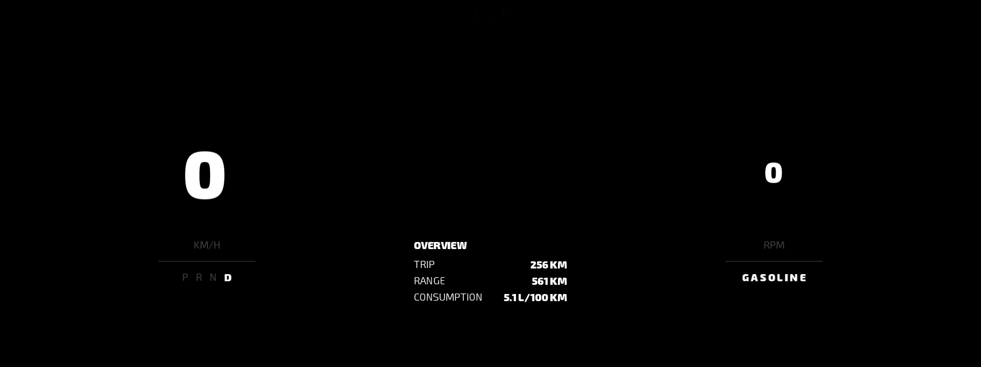
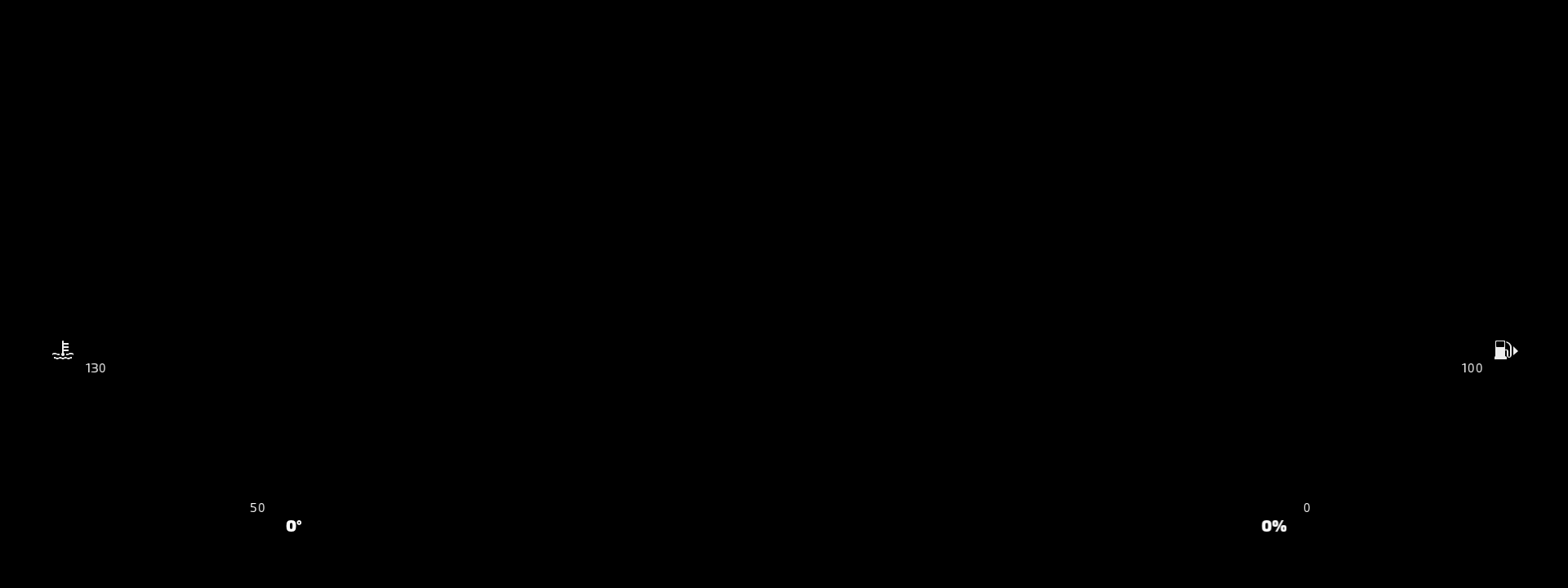
In this step of the tutorial you learn how to create a theme for a cluster. You start with a project which contains a cluster with round primary gauges (speed and RPM) and bar secondary gauges (engine temperature and fuel), and create a modern theme for that cluster.
Assets for the tutorial
The starting point of this tutorial is stored in the <KanziWorkspace>/Tutorials/Theming/Start directory:
Tool_projectdirectory contains the Kanzi Studio project with a user interface for which you create themes.Applicationdirectory contains an empty application which you use in step 3 of this tutorial to enable the user to change the non-baked themes in the application.
You can find the completed tutorial in the <KanziWorkspace>/Tutorials/Theming/Completed directory.
The starting point project contains the content that you need to complete this tutorial:
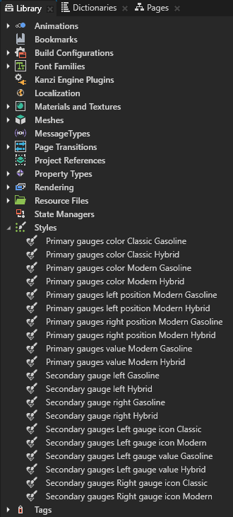
The Library > Styles contains the styles you use to create the themes in this tutorial. You learn about each style as you use it in the tutorial.
To learn more about the different types of styles and how to create them, see Using styles.
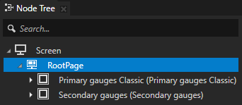
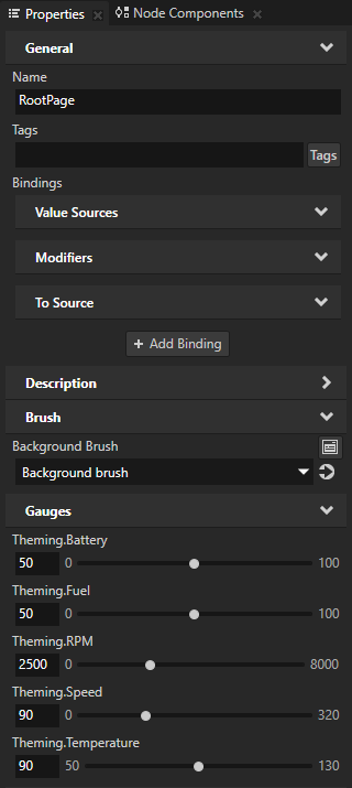
The RootPage node contains the control properties for the gauges. The gauges in the project bind to these properties in the RootPage node. This allows you to control the gauges from a single node in the project.
Layouts. In the Prefabs you can find the layouts you need to create the themes in this tutorial.
The Primary gauges Classic prefab sets the layout for the cluster speed and RPM gauges for the Classic theme.
This prefab contains:
The Background node contains the cluster background.

The Gauges node contains the speed and RPM gauges.

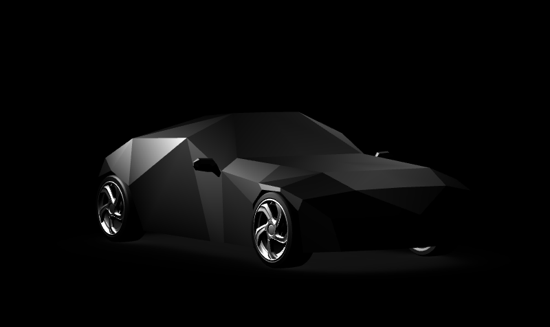
The Car node points to the prefab which contains the model of the car for that theme.

The Primary gauges grid Classic node contains and positions the content shown with the primary gauges: the speed and RPM values, and additional information shown with the primary gauges.
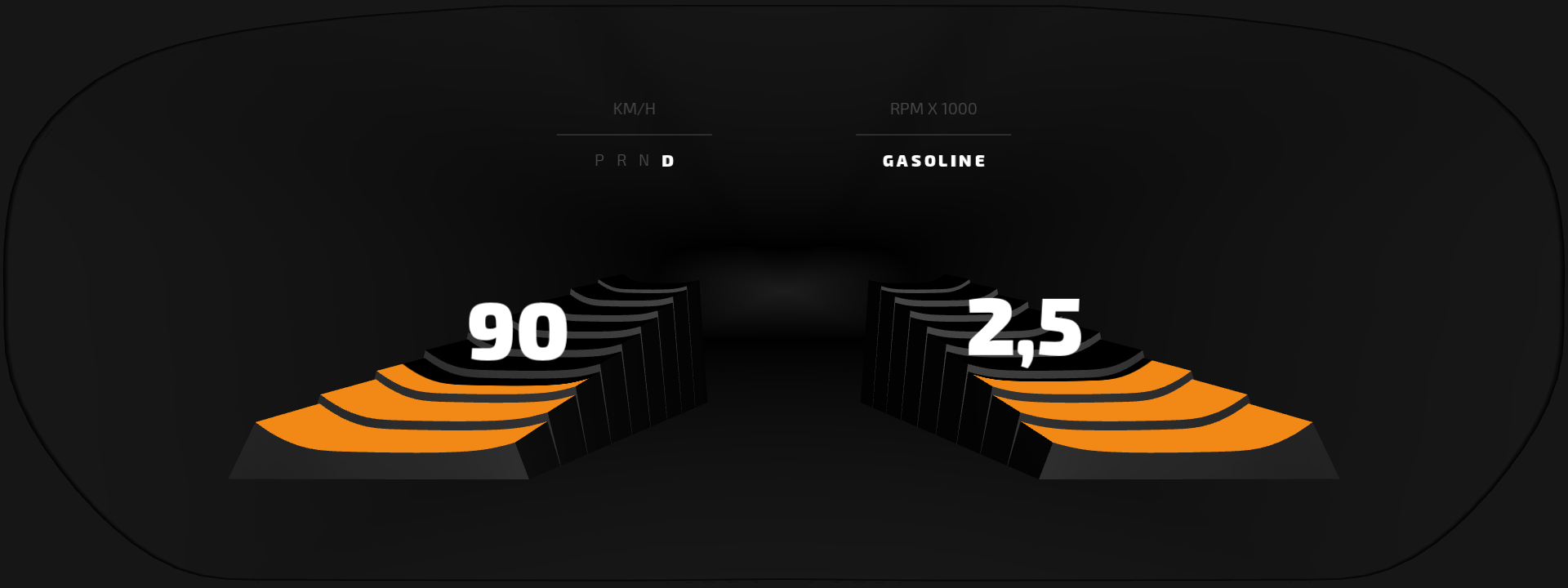
The Primary gauges Modern prefab sets the layout for the cluster speed and RPM gauges for the Modern theme.
This prefab contains:
The Gauges node contains the speed and RPM gauges and the cluster background.
A Grid Layout node which positions the content shown with the primary gauges in this theme (Primary gauges grid Modern) and two Trajectory Layout nodes which position the speed and RPM values above the gauges.

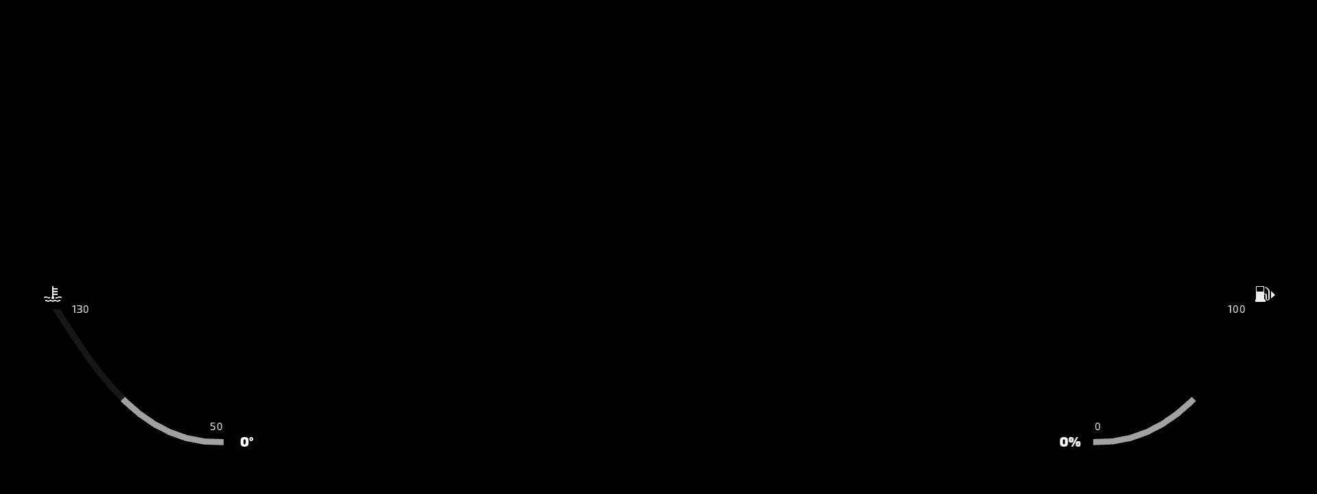
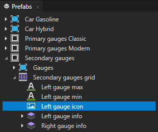
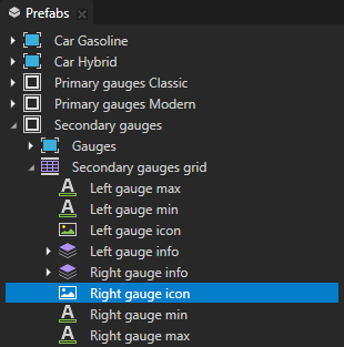
The Secondary gauges prefab sets the layout for the cluster secondary gauges for both Classic and Modern themes. The secondary gauges are positioned at the bottom of the cluster. In the Hybrid car variant themes the secondary gauges show the battery and fuel gauges, while in the Gasoline car variant themes they show the engine temperature and fuel gauges.
This prefab contains:
The Gauges node contains both secondary gauges.

The Secondary gauges grid Grid Layout node sets the layout of the secondary gauges in the cluster.
User interface elements. In the Prefabs you can find the user interface elements you need to create the themes in this tutorial.
The Car Gasoline prefab contains the car model shown between the speed and RPM gauges in the Gasoline car variant of the Classic theme.
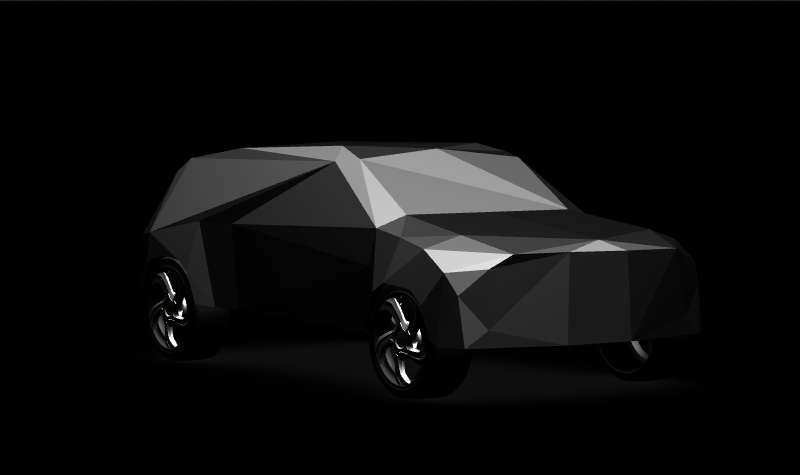
The Car Hybrid prefab contains the car model shown between the speed and RPM gauges in the Hybrid car variant of the Classic theme.
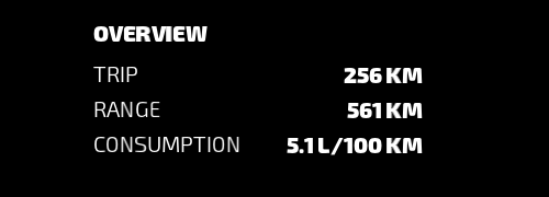
The Table Overview prefab contains the content shown in the Classic theme between the speed and RPM gauges.
The Table RPM prefab contains the content for the panel shown in the RPM gauge.

The Table Speed prefab contains the content for the panel shown in the speed gauge.

The Theme selector prefab contains the control you can use to change non-baked themes in this application. You learn about different options for exporting themes and how to change the application theme using the Kanzi Engine API in the last step of this tutorial.

Create cluster themes
In this section you create the Classic and Modern themes for the cluster and theme the primary gauges. You use a separate prefab for each theme, because the change in the cluster appearance and layout of the primary gauges between the two themes is big. The starting point project of this tutorial already contains prefabs for both themes, but you learn about the Theme Group and Theming resources. You also learn how to set which theme the Preview shows.
To create cluster themes:
In Kanzi Studio open the project stored in the
<KanziWorkspace>/Tutorials/Theming/Start/Tool_projectdirectory.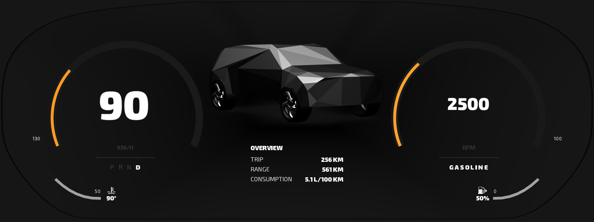
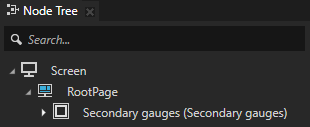
In the Node Tree select the RootPage > Primary gauges Classic Prefab Placeholder node and delete it.
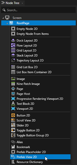
You replace this Prefab Placeholder node with a Prefab View node. You must use a Prefab View node so that you can dynamically change the prefab. See Using node prefabs.
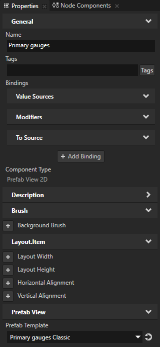
In the Node Tree press Alt and right-click the RootPage, select Prefab View 2D node, name it Primary gauges, and move it so that it is the first child of the RootPage node.
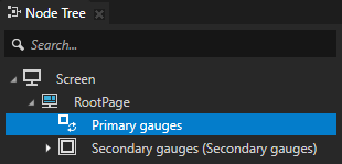
In the Node Tree select the Primary gauges Prefab View 2D node and in the Properties add and set the Prefab Template property to the Primary gauges Classic prefab.
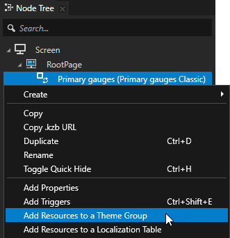
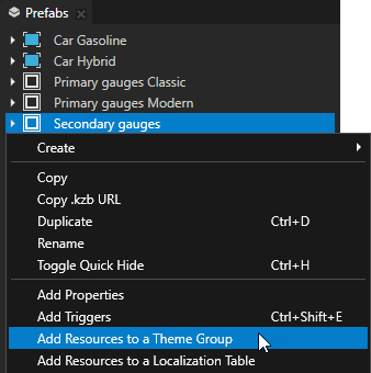
In the Node Tree right-click the Primary gauges node and select Add Resources to a Theme Group.
When you use the Add Resources to a Theme Group command, Kanzi Studio enables you to add all resources from a selected node and its tree to a theme group and create a theme.
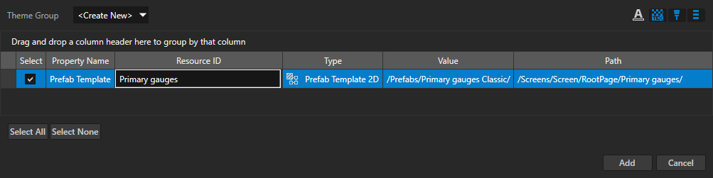
In the Add Resources to a Theme Group window set:
Theme Group to the theme group to which you want to add the resources. If you do not have a theme group yet, select <Create New>.
A theme group contains the information about which theme uses which resources.
Rename the Primary gauges.PrefabViewConcept.Prefab resource ID to Primary gauges.
Click Add.
When you use the Add Resources to a Theme Group window to add resources to a theme group, Kanzi Studio:
Creates a Theme Group in the Library > Themes, if the project does not already contain a Theme Group.
Adds to that theme group the resource IDs which point to the resources or nodes shown in the Value column.
In this example, the Primary gauges resource ID points to the Primary gauges Classic prefab.
In the node from which you add the resources to a Theme Group, replaces the direct pointer to a resource or node with the resource ID.
In this example, Kanzi Studio sets the value of the Prefab Template property in the Primary gauges Prefab View 2D node to the Primary gauges resource ID.
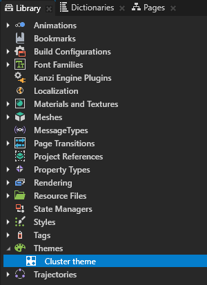
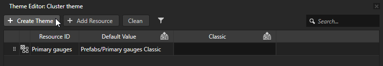
In the Library > Themes select the Theme Group, press F2, and rename it to Cluster theme.
You use the Cluster theme theme group to store the resource IDs and values to which they point for the cluster theme.
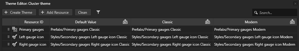
In the Library > Themes double-click the Cluster theme theme group to open the theme group in the Theme Editor, in the Theme Editor click Create Theme, and name it Classic.
You use this theme to define the look of the cluster with two round primary gauges.
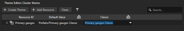
In the Theme Editor in the column of the Classic theme you created in the previous step, select the Primary gauges Classic prefab.
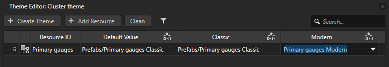
In the Theme Editor create a theme called Modern and for the Primary gauges resource ID set the value to the Primary gauges Modern prefab.
You use this theme to define the look of the cluster with two modern primary gauges.
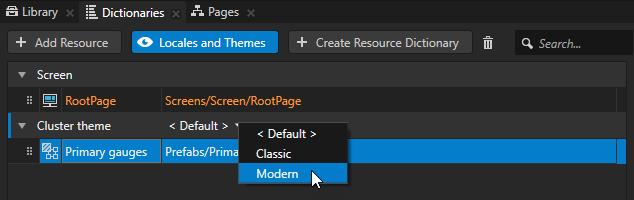
In the Dictionaries click Locales and Themes to enable the viewing of theme groups, in the Cluster theme theme group click < Default >, and select the theme you want to see in the Preview.
Theme the secondary gauges
In this section you apply different styles to the themes you created in the previous section. You use these styles to change the position of the secondary gauge icons.
In the previous section the change in the cluster appearance and layout of the primary gauges between the two themes was big. This is why for each theme you used a separate prefab with a different layout. However, when a change between themes is small, you can use the same prefab and change the appearance and functionality by applying styles.
To theme the secondary gauges:
Use a style to set the position of the Left gauge icon, instead of using properties:
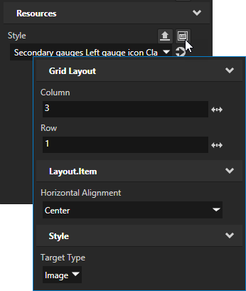
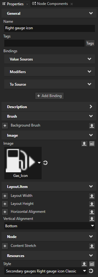
In the Prefabs select the Secondary gauges > Secondary gauges grid > Left gauge icon, in the Properties add the Style property, and set it to the Secondary gauges Left gauge icon Classic style.
The Secondary gauges Left gauge icon Classic style targets only the Image nodes and sets the position and alignment of the Left gauge icon in the Secondary gauges grid Grid Layout node.
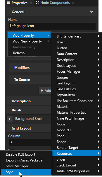
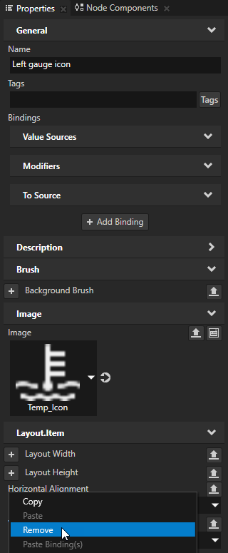
In the Properties remove the Column, Row, and Horizontal Alignment properties from the Left gauge icon node.
You remove these properties because you use the Secondary gauges Left gauge icon Classic style to set the values of these properties.
Repeat the previous two steps for the Secondary gauges > Secondary gauges grid > Right gauge icon, but use the Secondary gauges Right gauge icon Classic style.
Add the two styles you used in the previous steps to the Cluster theme theme group and set which style you want to use for which theme:
In the Prefabs right-click the Secondary gauges prefab and select Add Resources to a Theme Group.
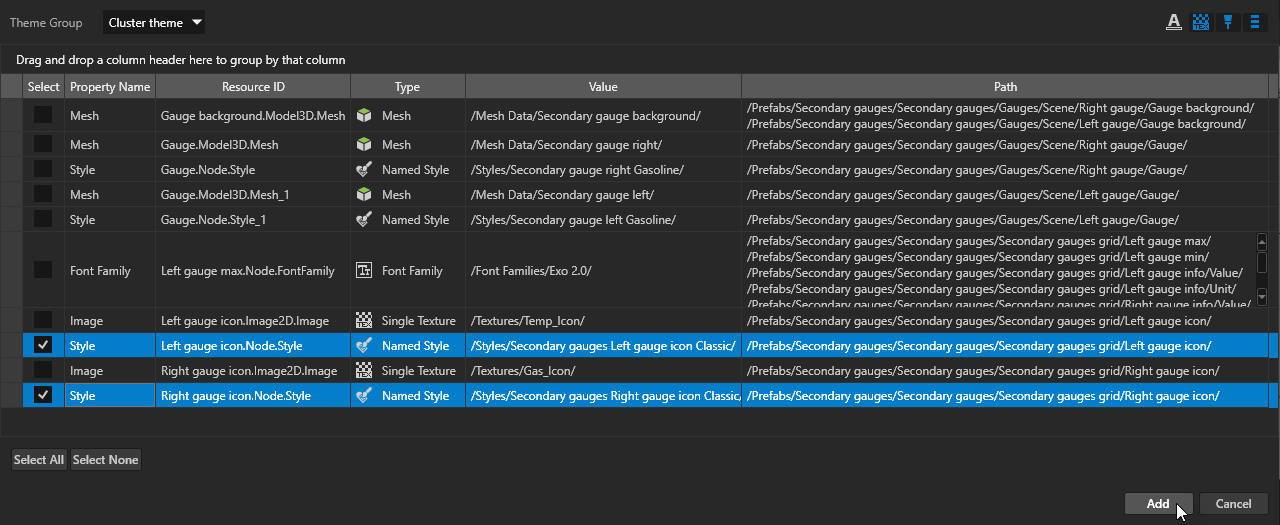
In the Add Resources to a Theme Group window select and rename only these resource IDs:
Left gauge icon.Node.Style to Left gauge icon
Right gauge icon.Node.Style to Right gauge icon
Click Add.
Open the Cluster theme theme group in the Theme Editor and set the resource IDs:
For the Classic theme set:
Left gauge icon to the Secondary gauges Left gauge icon Classic style
Right gauge icon to the Secondary gauges Right gauge icon Classic style
For the Modern theme set:
Left gauge icon to the Secondary gauges Left gauge icon Modern style
Right gauge icon to the Secondary gauges Right gauge icon Modern style
Now when you select in the Dictionaries a theme in the Cluster theme theme group, the Preview shows the resources you defined for the selected theme.