Using the Text Box nodes
Use the Text Box nodes to add single-line text input to your application.
Use Text Box 3D to add text input in 3D space and Text Box 2D to add text input in 2D space.
The Text Box nodes have the Focusable property enabled and can receive focus by default. By default when a Text Box node has focus, that Text Box node is in the editing state.
When a Text Box node is in the editing state, to move the cursor in that text box, you can use these default keyboard keys:
← to move the cursor one character backward.
→ to move the cursor one character forward.
Ctrl ← to move the cursor to the word boundary that precedes the cursor.
Ctrl → to move the cursor to the word boundary that follows the cursor.
Home to move the cursor to the beginning of the text content.
End to move the cursor to the end of the text content.
When a Text Box node is in the editing state, to modify the text selection in that text box, you can use these default keyboard keys:
Shift ← to move the active cursor in the text selection one character backward.
Shift Ctrl to move the active cursor in the text selection to the word boundary that precedes the current position.
Shift Home to move the active cursor in the text selection to the beginning of the text content.
Shift → to move the active cursor in the text selection one character forward.
Shift Ctrl → to move the active cursor in the text selection to the word boundary that follows the current position.
Shift End to move the active cursor in the text selection to the end of the text content.
Ctrl A to select all text.
Editing the text in a Text Box node
A Text Box node by default:
Enters the editing state when focus moves to that Text Box node. This happens when the application user taps the node or sets focus to the node using the focus chain navigation. See Focus.
Exits the editing state when focus moves from that Text Box node to another node.
See Controlling manually when a Text Box node is in the editing state.
To edit the text in a Text Box node:
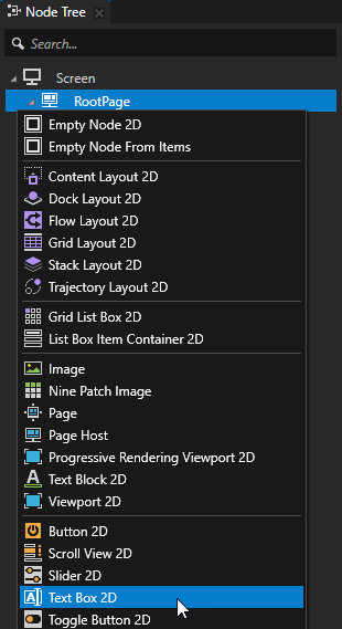
In the Node Tree press Alt and right-click the node where you want to add single-line text input to your application and select either Text Box 2D, or Text Box 3D.
You can create a 3D node only in a 3D node, such as the Scene node, and a 2D node only in a 2D node.
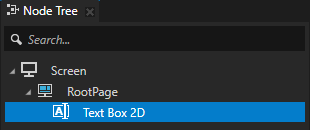
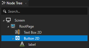
In the Node Tree create a node that you use to add, edit, and remove text in a Text Box node.
For example, create a Button 2D node and add content to it.
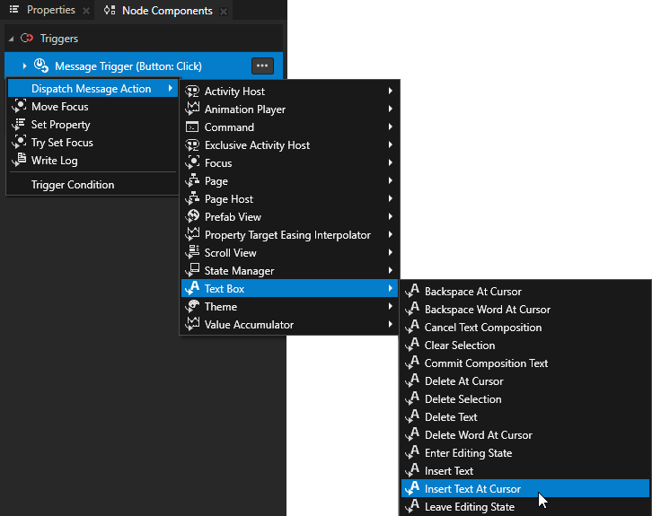
In the Node Tree select the node that you created in the previous step and in the Node Components > Triggers section press Alt and right-click the trigger that you want to use to add, edit, or remove text, and select one of the Text Box actions. See Text Box actions.
For example:
Insert Text At Cursor
Inserts text at the cursor position.
In the Insert Text At Cursor action set the value of the Text property to the text that you want to insert.
Delete At Cursor
Deletes a character using delete.
Backspace At Cursor
Deletes a character using backspace.
Move Cursor Backward
Moves the cursor one character backward.
Move Cursor Forward
Moves the cursor one character forward.
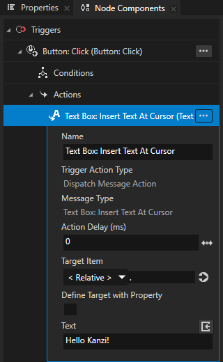
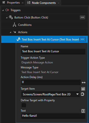
In the action that you created in the previous step, set the Target Item to the Text Box node where you want to edit the text.
When the trigger, to which you added the action, is set off, Kanzi executes the action that edits the text in the Text Box node.
Controlling manually when a Text Box node is in the editing state
The application user can edit the text in a Text Box node when that node is in the editing state. Only one Text Box node can be in the editing state at a time. A Text Box node always leaves the editing state when:
Another Text Box node enters the editing state.
That Text Box node is disabled. See Controlling whether a Text Box node is in use.
A Text Box node by default:
Enters the editing state when focus moves to that Text Box node. This happens when the application user taps the node or sets focus to the node using the focus chain navigation. See Focus.
Exits the editing state when focus moves from that Text Box node to another node.
To manually control when a Text Box node is in the editing state:
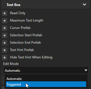
In the Node Tree select a Text Box node, in the Properties add the Edit Mode property, and set it to Triggered.
This way you set a Text Box node to:
Enter the editing state when a trigger executes the Text Box: Enter Editing State action.
Exit the editing state when either:
A trigger executes the Text Box: Leave Editing State action.
Another Text Box node enters the editing state.
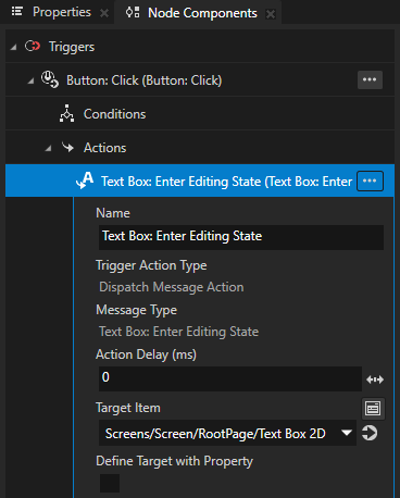
Create a trigger that sets the Text Box node to the editing state.
For example, to set the Text Box node to the editing state when the application user clicks a button, in the Node Tree create a Button node, in the Node Components in the Button: Click trigger create a Text Box: Enter Editing State action, and set Target Item to the Text Box node that you want to edit.
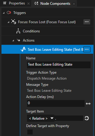
Create a trigger that sets the Text Box node to exit the editing state.
For example, to set the Text Box node to exit the editing state when it loses focus, in that Text Box node create a Focus: Focus Lost trigger that executes a Text Box: Leave Editing State action.
Limiting the length of text in a Text Box node
In the Text Box nodes you can set:
The length of the text that the Text Box node can show. See Setting the length of text that a Text Box node can show.
The length of the text that the user can enter in the Text Box node. See Setting the length of text that the user can enter in a Text Box node.
Setting the length of text that a Text Box node can show
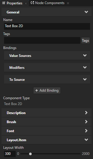
To set the length of text that a Text Box node can show at a time, in the Node Tree select that node and in the Properties set the value of the Layout Width property.
When the text in a Text Box node is longer than the width of that node, in the editing state the user can scroll the text by moving the cursor in that Text Box node.
To let the length of the text in a Text Box node determine the width of that Text Box node, remove the Layout Width property.
Setting the length of text that the user can enter in a Text Box node
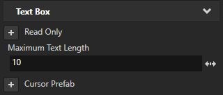
To set the length of text that the user can enter in a Text Box node, in the Node Tree select the Text Box node, in the Properties add the Maximum Text Length property, and set it to the number of UTF-8 characters to which you want to limit the text that the user can enter in that Text Box node.
Setting the color of text in a Text Box 2D node
To set the color of text in a Text Block 2D or Text Box 2D node:
In the Node Tree create or select a Text Block 2D or Text Box 2D node.
In the Properties add the Foreground Brush property.
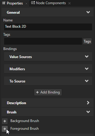
Set the Foreground Brush property to an existing Color Brush or select + Color Brush, name the brush, click
 next to the property, and set the color of the Color Brush you created.
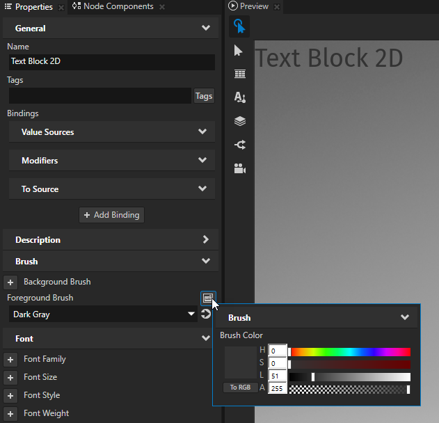
Tip
To quickly edit a brush, in the Properties next to the Background Brush or Foreground Brush property click
and edit the brush.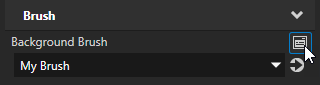
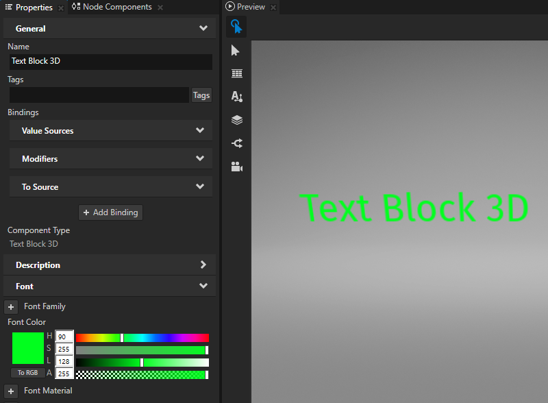
Setting the color of text in a Text Box 3D node
To set the color of text in a 3D text node:
In the Node Tree create or select a Text Block 3D or Text Box 3D node.
In the Properties add and set the Font Color property.
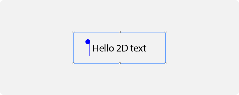
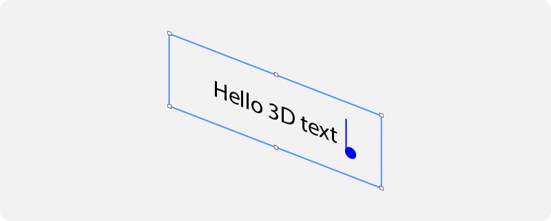
Setting the appearance of the cursor
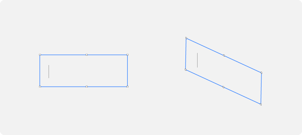
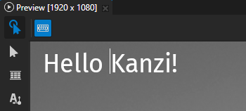
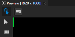
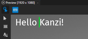
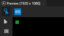
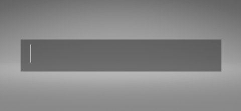
You can set the appearance of a Text Box cursor. To see the cursor of a Text Box node in the Kanzi Studio Preview click that Text Box node.
To set the appearance of the cursor:
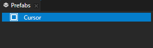
In the Prefabs create a prefab that you want to use as the cursor.
For example, for a Text Box 2D node create an Empty Node 2D node and set its Background Brush, Layout Width, and Layout Height properties.
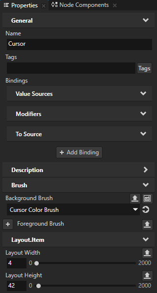
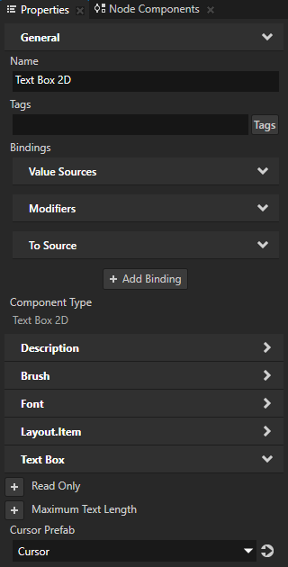
In the Node Tree select a Text Box node and in the Properties add and set the Cursor Prefab property to the prefab that you want to use as the cursor.
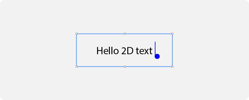
The Text Box node aligns the top of the cursor with the top of the Text Box node.
If the cursor does not fit in a Text Box 2D node, in the Text Box 2D node set the Horizontal Padding and Vertical Padding properties to adjust the offset of the cursor position.
Setting the appearance of the text selection in a Text Box 2D node
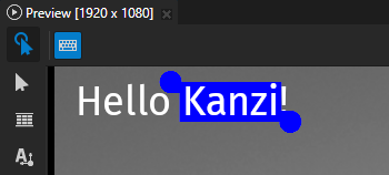
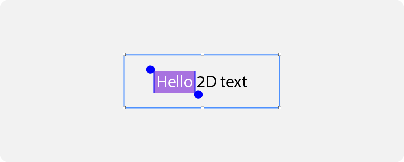
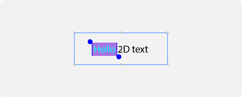
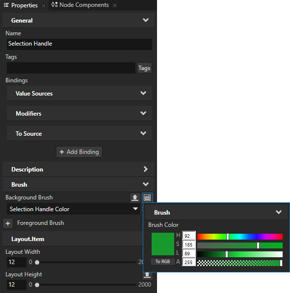
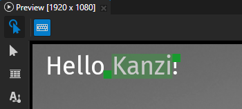
In a Text Box node you can set the color of the selected text, its background, and the handles to change the selected text.
To select a word in a Text Box node, double-click that word. To modify the selection, drag the handles in the top-left and bottom-right corners of the selected text.
To set the appearance of text selection, in the Node Tree select a Text Box 2D node and in the Properties add and set:
Selection Background Brush to the brush that you want to use to fill the background of the selected text. |
|
Selection Foreground Brush to the brush that you want to use to fill the selected text. |
|
Selection Start Prefab to the prefab that you want to use for the selection handle at the beginning of the selection. |
|
Selection End Prefab to the prefab that you want to use for the selection handle at the end of the selection. |
|
Tip
If a prefab that you use as a selection handle does not fit in a Text Box 2D node, in the Text Box 2D node set the Horizontal Padding and Vertical Padding properties to at least half of the width and height of the selection handle prefab.
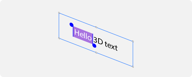
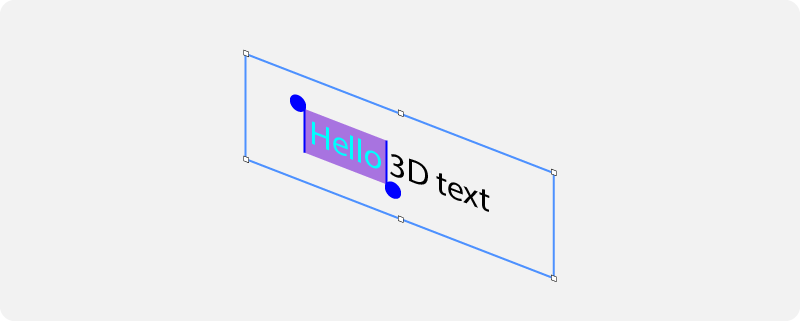
Setting the appearance of the text selection in a Text Box 3D node
In a Text Box node you can set the color of the selected text, its background, and the handles to change the selected text.
To select a word in a Text Box node, double-click that word. To modify the selection, drag the handles in the top-left and bottom-right corners of the selected text.
To set the appearance of text selection, in the Node Tree select a Text Box 3D node and in the Properties add and set:
Selection Start Prefab to the prefab that you want to use for the selection handle at the beginning of the selection. |
|
Selection End Prefab to the prefab that you want to use for the selection handle at the end of the selection. |
|
Selection Background Color to the color that you want to use to fill the background of the selected text. |
|
Selection Font Color to the color that you want to use to fill the selected text. |
|
Setting the appearance of the composition text in a Text Box 2D node
Composition text is an instance of text that the application user produces using an input method editor (IME). An input method editor is an application that enables the user to use their input devices to type characters and symbols that are not natively available on those input devices.
In a Text Box node you can set the color of the composition text and its background.
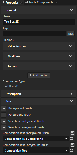
To set the appearance of the composition text, in the Node Tree select a Text Box 2D node and in the Properties add and set:
Composition Text Background Brush to the brush that you want to use to fill the background of the composition text.
Composition Text Foreground Brush to the brush that you want to use to fill the composition text.
Setting the appearance of the composition text in a Text Box 3D node
Composition text is an instance of text that the application user produces using an input method editor (IME). An input method editor is an application that enables the user to use their input devices to type characters and symbols that are not natively available on those input devices.
In a Text Box node you can set the color of the composition text and its background.
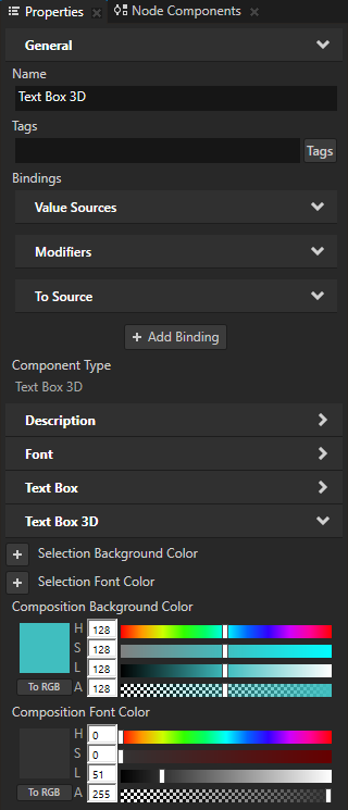
To set the appearance of the composition text, in the Node Tree select a Text Box 3D node and in the Properties add and set:
Composition Background Color to the color that you want to use to fill the background of the composition text.
Composition Font Color to the color that you want to use to fill the composition text.
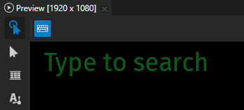
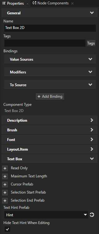
Showing placeholder content
You can set a Text Box node to show placeholder content when the Text Box is empty. For example, you can use this placeholder content to show text that tells the user what they can enter in a Text Box node.
To show placeholder content:
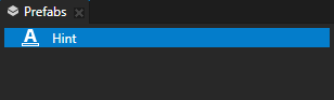
In the Prefabs create a prefab that you want to use as the placeholder content.
For example, create a Text Block node and set its Text property.
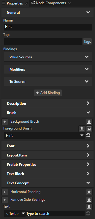
In the Node Tree select a Text Box node and in the Properties add and set:
Text Hint Prefab to the prefab that you want to use as the placeholder content
(Optional) Hide Text Hint When Editing to enabled to hide the placeholder content whenever that Text Box node is in the editing state. By default Kanzi keeps the placeholder content visible until the user enters some text in the Text Box.
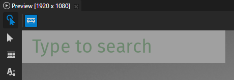
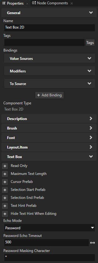
Masking passwords
You can set how to mask the password characters that the user enters in a Text Box node.
To set how Kanzi masks passwords in a Text Box node, in the Node Tree select that node, and in the Properties add and set:
Echo Mode to Password This way you set Kanzi to show each character for a certain amount of time, and then hide it with a masking character.
Password Echo Timeout to the time in milliseconds that you want to show each character before hiding it. By default Kanzi shows each character for one second.
Password Masking Character to the UTF-8 character with which you want to hide each password character. By default Kanzi masks each character with a bullet symbol (•).
Setting truncation in a Text Box
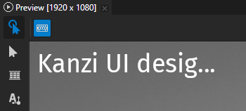
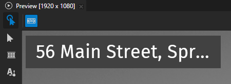
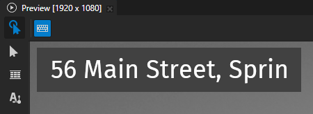
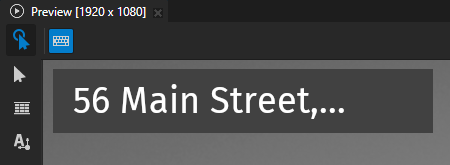
When a Text Box node is not in the editing state, if the text in the node is longer than the width of that node, Kanzi by default truncates the end part of the text with ellipsis. When a Text Box node is in the editing state, Kanzi does not truncate the text. Instead, the user can scroll the text by moving the cursor.
You can set:
Which part of the text to truncate. See Setting the part to truncate.
The type of truncation boundary. See Setting the truncation boundary.
How to indicate truncated text. See Setting the characters that indicate truncation.
Setting the part to truncate
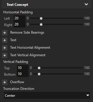
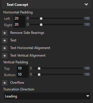
To set which part of the text to truncate, add the Text Concept > Truncation Direction property and set it to:
Trailing to truncate the end part of the text. Default value.
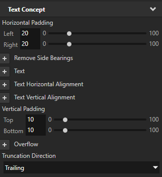
Center to truncate the middle part of the text.
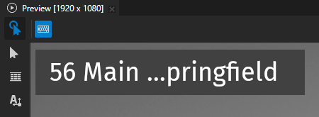
Leading to truncate the beginning part of the text.
Setting the truncation boundary
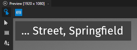
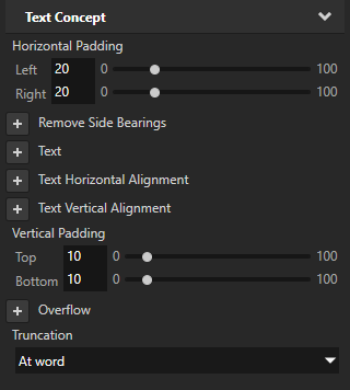
To set the truncation boundary type, add the Text Concept > Truncation property and set it to:
None to disable text truncation. Kanzi clips the text at the node boundary.
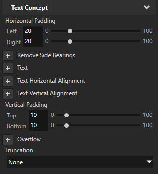
At character to truncate text character by character. Default value.
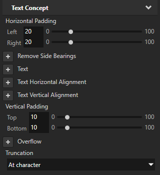
At word to truncate text by entire words.
Setting the characters that indicate truncation
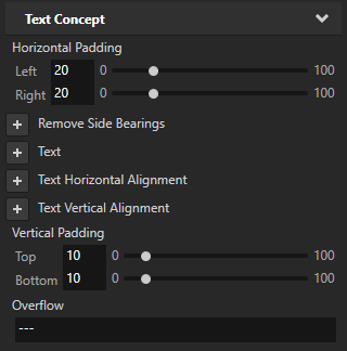
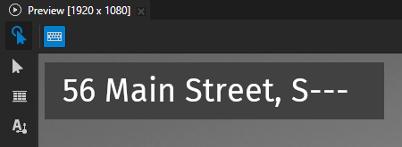
To set the characters that indicate truncation, add and set the Overflow property.
Controlling whether a Text Box node is in use
To control whether a Text Box node is in use, use the Input > Enabled property. A disabled Text Box node does not react to user input. When you disable a Text Box node, that Text Box node leaves the editing state and stays in that state while it is disabled.
When you disable the Enabled property of a node, you effectively disable that node and its descendant nodes in the same overlay focus scope.
To observe whether a node is effectively enabled, use the Input > Effectively Enabled property in a state manager or a binding. For example, to visually indicate to the user whether a node is in use, create a state manager and use the Effectively Enabled property as its controller property.
Setting the appearance of a Text Box 2D node
To set the appearance of 2D nodes:
You can fill 2D nodes with a solid color, a texture, or a material. See Adjusting the appearance of 2D nodes.


You can apply a post-processing effect to a 2D node. See Effects for 2D nodes.


You can rotate a 2D node around all three axes to create a 3D perspective effect. See Creating a 3D perspective effect for 2D nodes.

You can apply custom rendering to 2D nodes to create post-processing effects. See Applying custom rendering to 2D nodes.
You can render a 2D node as pixel-perfect. See Rendering pixel-perfect 2D nodes.
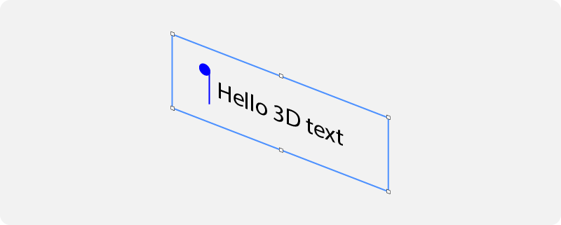
Using the Text Box 3D node in the API
To create a Text Box 3D node:
// Create a Text Box 3D node named Text Box.
TextBox3DSharedPtr textBoxNode = TextBox3D::create(this->getDomain(), "Text Box");
To set the initial text content in a Text Box 3D node:
// Set the initial text content in the Text Box node.
textBoxNode->setText("Initial text that the Text Box contains before editing.");
To set the appearance of the text in a Text Box 3D node:
// Set the style of the text in the Text Box node:
// Set the font family of the text.
textBoxNode->setFontFamily(fontFamily);
// Set line spacing to 1.5f.
textBoxNode->setLineSpacing(1.5f);
// Set font size to 36.0f.
textBoxNode->setFontSize(36.0f);
// Set the color of the text to blue.
textBoxNode->setFontColor(ThemeBlue);
// Align the text to the right.
textBoxNode->setTextHorizontalAlignment(TextFormat::TextHorizontalAlignmentRight);
// Set font hinting: Render the text in the Text Box node using the hinter of the font engine rasterizer.
textBoxNode->setHintingPreference(FontHintingPreference::AutoHinting);
To show placeholder content in a Text Box 3D node:
// Set the prefab that shows the placeholder content in the Text Box node.
textBoxNode->setTextHintPrefab(textHintPrefab);
To set the position of the cursor in a Text Box 3D node:
// Set the cursor position in the beginning of the text field.
textBoxNode->setCursorPosition(0u);
To set the appearance of the cursor in a Text Box 3D node:
// Set the prefab that visualizes the cursor.
textBoxNode->setCursorPrefab(cursorPrefab);
To set the appearance of the text selection in a Text Box 3D node:
// Set the color of the selected text to orange.
textBoxNode->setSelectionFontColor(ThemeOrange);
// Set the background color of the selected text to gray.
textBoxNode->setSelectionBackgroundColor(ThemeGray);
// Set the prefab that visualizes the selection handle at the beginning of the selection.
textBoxNode->setCursorPrefab(selectionStartPrefab);
// Set the prefab that visualizes the selection handle at the end of the selection.
textBoxNode->setCursorPrefab(selectionEndPrefab);
To set the appearance of the composition text in a Text Box 3D node:
// Set the color of the composition text to red.
textBoxNode->setSelectionFontColor(ThemeRed);
// Set the background color of the composition text to gray.
textBoxNode->setSelectionBackgroundColor(ThemeGray);
To make a Text Box 3D node behave as a password field:
// Set Kanzi to show each character for a certain amount of time, and then hide it with a masking character.
textBoxNode->setEchoMode(EchoMode::Password);
// Set the UTF-8 character with which you want to hide each password character.
textBoxNode->setPasswordMaskingCharacter("*");
// Set the time in milliseconds that you want to show each character before hiding it.
textBoxNode->setPasswordEchoTimeout(500);
For details, see the TextBox3D class in the Kanzi Engine API reference.
Using the Text Box 2D node in the API
To create a Text Box 2D node:
// Create a Text Box 2D node named Text Box.
TextBox2DSharedPtr textBoxNode = TextBox2D::create(this->getDomain(), "Text Box");
To set the initial text content in a Text Box 2D node:
// Set the initial text content in the Text Box node.
textBoxNode->setText("Initial text that the Text Box contains before editing.");
To set the appearance of the text in a Text Box 2D node:
// Set the style of the text in the Text Box node:
// Set the font family of the text.
textBoxNode->setFontFamily(fontFamily);
// Set line spacing to 1.5f.
textBoxNode->setLineSpacing(1.5f);
// Set font size to 36.0f.
textBoxNode->setFontSize(36.0f);
// Set the color of the text.
textBoxNode->setForegroundBrush(textColorBrush);
// Align the text to the right.
textBoxNode->setTextHorizontalAlignment(TextFormat::TextHorizontalAlignmentRight);
// Set font hinting: Render the text in the Text Box node using the hinter of the font engine rasterizer.
textBoxNode->setHintingPreference(FontHintingPreference::AutoHinting);
To show placeholder content in a Text Box 2D node:
// Set the prefab that shows the placeholder content in the Text Box node.
textBoxNode->setTextHintPrefab(textHintPrefab);
To set the position of the cursor in a Text Box 2D node:
// Move the cursor to the beginning of the text field.
textBoxNode->setCursorPosition(0u);
To set the appearance of the cursor in a Text Box 2D node:
// Set the prefab that visualizes the cursor.
textBoxNode->setCursorPrefab(cursorPrefab);
To set the appearance of the text selection in a Text Box 2D node:
// Set the brush that fills the background of the selected text.
textBoxNode->setSelectionBackgroundBrush(selectedTextBackgroundBrush);
// Set the brush that fills the selected text.
textBoxNode->setSelectionForegroundBrush(selectedTextColorBrush);
// Set the prefab that visualizes the selection handle at the beginning of the selection.
textBoxNode->setCursorPrefab(selectionStartPrefab);
// Set the prefab that visualizes the selection handle at the end of the selection.
textBoxNode->setCursorPrefab(selectionEndPrefab);
To set the appearance of the composition text in a Text Box 2D node:
// Set the brush that fills the background of the composition text.
textBoxNode->setCompositionBackgroundBrush(compositionTextBackgroundBrush);
// // Set the brush that fills the composition text.
textBoxNode->setCompositionForegroundBrush(compositionTextColorBrush);
To make a Text Box 2D node behave as a password field:
// Set Kanzi to show each character for a certain amount of time, and then hide it with a masking character.
textBoxNode->setEchoMode(EchoMode::Password);
// Set the UTF-8 character with which you want to hide each password character.
textBoxNode->setPasswordMaskingCharacter("*");
// Set the time in milliseconds that you want to show each character before hiding it.
textBoxNode->setPasswordEchoTimeout(500);
For details, see the TextBox2D class in the Kanzi Engine API reference.
Text Box property types and messages
For lists of the available property types and messages for the Text Box nodes, see Text Box 2D and Text Box 3D.