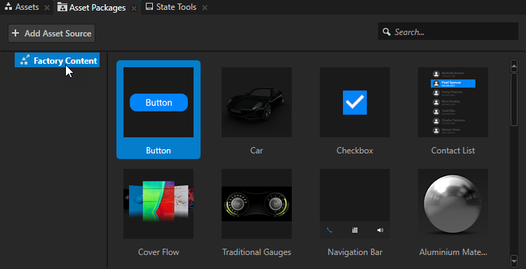
Factory Content assets
The Factory Content asset packages contain ready-made components and materials that you can use to create prototype projects faster.
Here you can find all the Factory Content assets:
2D interactivity control components that you can use to make your application interactive. See Interactivity control components.
Progress components that you can use to indicate that a task is in progress. See Progress components.
List components that you can use to present collections of items arranged in scrollable lists. See List components.
Complete user interface components that you can use to add functionality to your application. See Complete user interface components.
Materials that you can apply to 3D content in your project. See Materials.
To use the Factory Content assets in your Kanzi Studio project, from the Asset Packages drag an asset to a node in the Node Tree, to the Prefabs, to the Preview, or to a Page node in the Pages window. See Using the Factory Content assets.
Interactivity control components
Use 2D interactivity control components to make your application interactive.
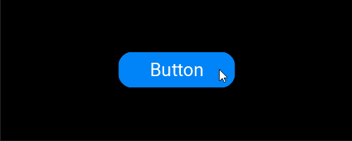
Button
Use the Button to create a button that receives user input.
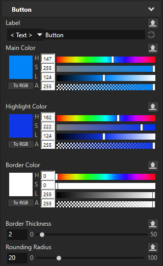
To adjust the appearance and behavior of the Button, after you add the Button to your project, in the Properties set:
Label to set the text in the button.
Main Color to set the color of the button background.
Highlight Color to set the color of the button background when the user presses the button.
Border Color to set the color of the button border that is visible when the user presses the button.
Border Thickness to set the width of the button border that is visible when the user presses the button.
Rounding Radius to set the roundness of the button corners.
For example, to make the button corners right-angle, set Rounding Radius to 0.
In the Node Components use triggers and actions to set how the button reacts to user input. See Using the Button nodes and Using triggers.
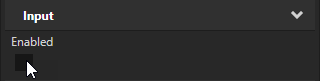
The Button uses a state manager that sets the appearance and behavior of the Button when:
The user presses the button.
The value of the Enabled property changes.
When you disable the Enabled property in the Button node, the button does not react to user input.
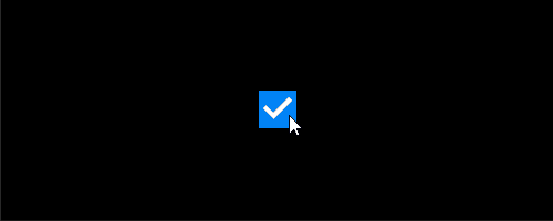
Checkbox
Use the Checkbox to create a checkbox that receives user input.
The Checkbox uses a state manager that sets the appearance and behavior of the Checkbox when:
The user toggles the checkbox.
The value of the Enabled property changes.
When you disable the Enabled property in the Checkbox node, the checkbox does not react to user input.
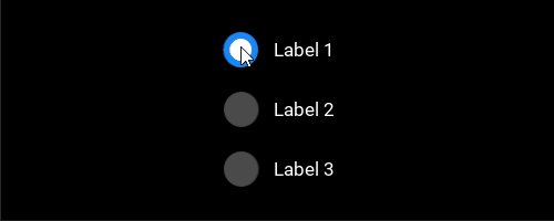
Radio Buttons
Use the Radio Buttons to create radio buttons that receive user input.
In the Node Components use triggers and actions to set how radio buttons react to user input. See Using the Button nodes and Using triggers.
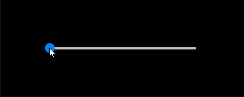
Slider
Use the Slider to create a slider that receives user input.
To adjust the appearance and behavior of the Slider, after you add the Slider to your project, in the Properties set:
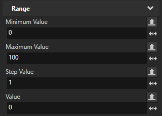
Maximum Value to set the highest value of the slider. The default value is 100.
Minimum Value to set the lowest value of the slider. The default value is 0.
Step Value to set the increment by which the knob moves on the rail. The default value is 1.
Value to set the initial position of the knob on the rail. You can use bindings to control another property with the position of the slider. See Using bindings.
Knob Style to set the shape of the knob to square or circle, or to not show the knob.
Knob Size to set the size of the knob.
Knob Color to set the color of the knob.
Rail Thickness to set the thickness of the rail.
Rail Rounded Ends to set whether to round the ends of the rail.
Rail Background Color to set the color of the rail from the knob until the end of the rail.
Rail Fill Color to set the color of the rail from the start of the rail until the knob.
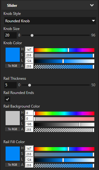
The Slider uses a state manager that sets the appearance and behavior of the slider when the value of the Enabled property changes. When you disable the Enabled property in the Slider node, the slider does not react to user input.
Toggle Button
Use the Toggle Button to create a toggle button that receives user input.
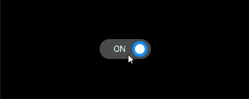
The Toggle Button uses a state manager that sets the appearance of the Toggle Button when the user toggles it.
In the Node Components use triggers and actions to set how the toggle button reacts to user input. See Using the Toggle Button nodes and Using triggers.
Progress components
Use the progress components to show that a task is in progress.
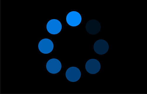
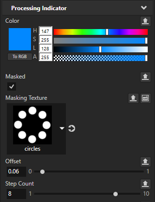
Processing Indicator
Use the Processing Indicator to show that the application is processing a task.
To adjust the appearance of the Processing Indicator, after you add the Processing Indicator to your project, in the Properties set:
Color to set the color of the processing indicator.
Masked to set whether to mask the processing indicator with the texture that you set using the Masking Texture property.
Masking Texture to a texture to use to mask the processing indicator.
In the masking texture:
Black pixels form the mask that hides areas of the processing indicator.
White pixels form the gaps in the mask that show areas of the processing indicator.
By default the Processing Indicator is masked by a texture that shows a ring of circles.
Offset to set the rotation angle of the processing indicator.
Step Count to set the number of segments in the processing indicator.
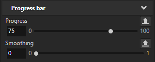
Progress Bar
Use the Progress Bar to show that a task is in progress, expressed both visually and as a percentage.
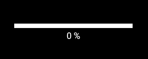
To set the value of the Progress Bar, in the Properties set the value of the Progress property. You can use bindings to control the Progress property. See Using bindings.
To set the length of the gradient in the end of the progress bar, in the Properties set the value of the Smoothing property.
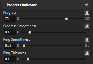
Progress Indicator
Use the Progress Indicator to show that a task is in progress, expressed both visually and as a percentage.
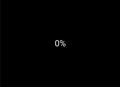
To set the value of the Progress Indicator, in the Properties set the value of the Progress property. You can use bindings to control the Progress property. See Using bindings.
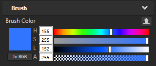
To adjust the appearance of the Progress Indicator, after you add the Progress Indicator to your project, in the Properties set:
Brush Color to set the color of the progress indicator ring.
Progress Smoothness to set the length of the gradient in the end of the progress indicator.
Ring Smoothness to set the edge smoothness of the progress indicator ring.
Ring Thickness to set the width of the progress indicator ring.
List components
Use the list components to present collections of items arranged in scrollable lists.
Each list component uses a List Box node to arrange its items. See List Box nodes.
Use a data source to display your own data in a list component. See Using a data source, and Tutorial: Get application data from a data source.
Contact List
Use the Contact List to create a contact list that shows the name, profile picture, and phone number for each contact.
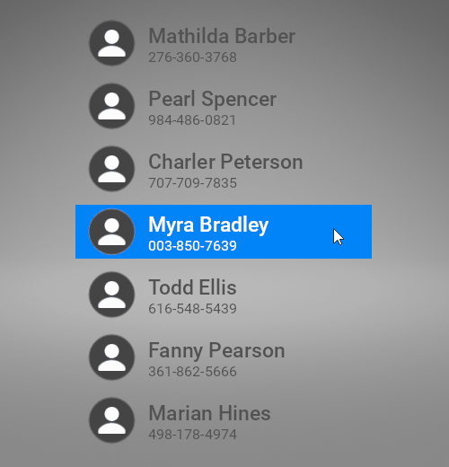
To set the content and behavior of the Contact List, in the Properties add and set:
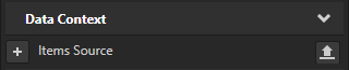
Items Source to provide a data source for the list items.
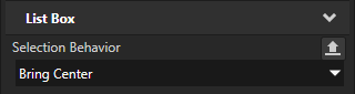
Selection Behavior to set whether the list box brings an item to the center of the list box area when the user selects that item.
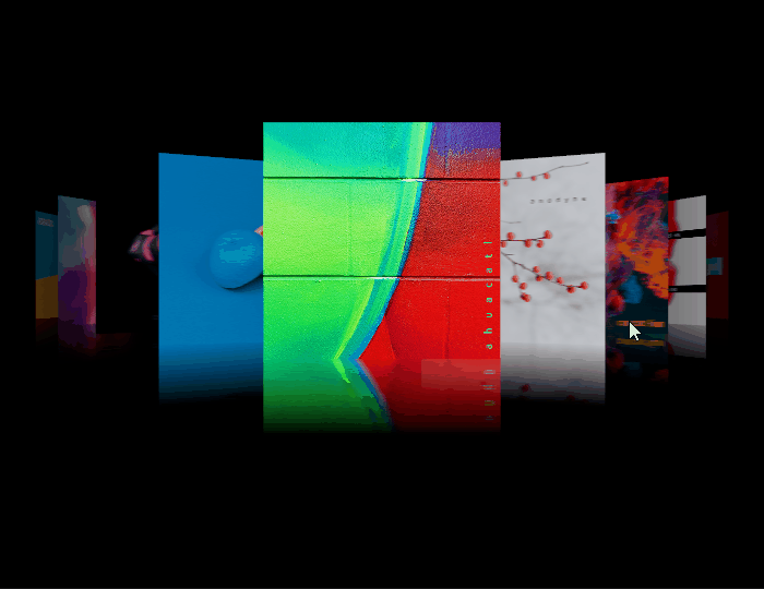
Cover Flow
Use the Cover Flow to present album covers.
To set the content and behavior of the Cover Flow, in the Node Tree or Prefabs select the Cover Flow > Scene> Trajectory List Box 3D node and in the Properties add and set:
Items Source to provide a data source for the list items.
Selection Behavior to set whether the list box brings an item to the center of the list box area when the user selects that item.
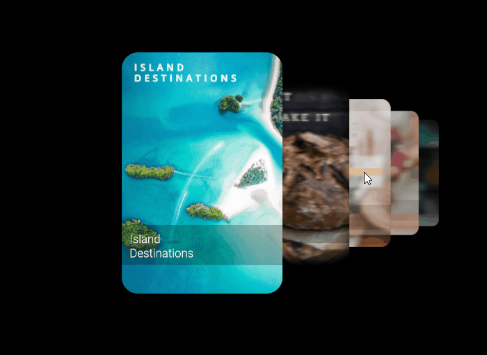
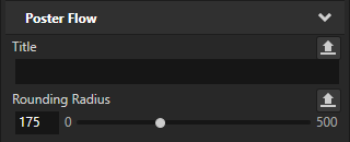
Poster Flow
Use the Poster Flow to present media posters.
To adjust the roundness of poster corners, in the Prefabs select the Poster prefab and in the Properties set the Rounding Radius property.
To set the content and behavior of the Poster Flow, in the Node Tree or Prefabs select the Poster Flow > Scene> Trajectory List Box 3D node and in the Properties add and set:
Items Source to provide a data source for the list items.
Selection Behavior to set whether the list box brings an item to the center of the list box area when the user selects that item.
Complete user interface components
Factory Content includes complete user interface components that you can use to add functionality to your application.
Car
Use the Car to add a car model.
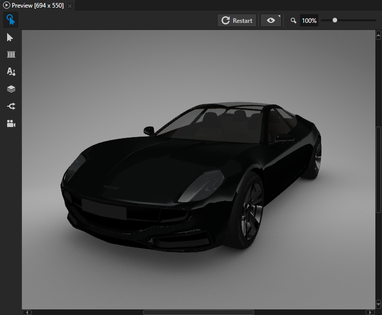
To position the car, in the Preview use either the Node tool or the Camera tool. See Editing your application in the Preview and Using the Camera node.
To set the material for the different parts of the car, you can drag materials from the Assets window to the Car in the Preview window. See Using the Factory Content assets.
Music Player
Use the Music Player to create a music player with buttons that receive user input.
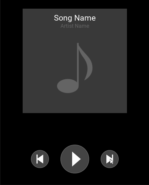
In the Node Components use triggers and actions to set how the Music Player buttons react to user input. See Using triggers.
Navigation Bar
Use the Navigation Bar to create a navigation bar with toggle buttons that receive user input.
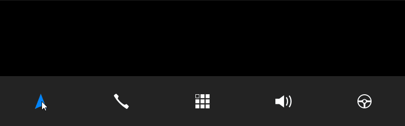
In the Node Components use triggers and actions to set how the Navigation Bar buttons react to user input. See Using triggers
Notification Popup
Use the Notification Popup to create a notification dialog with buttons that receive user input.
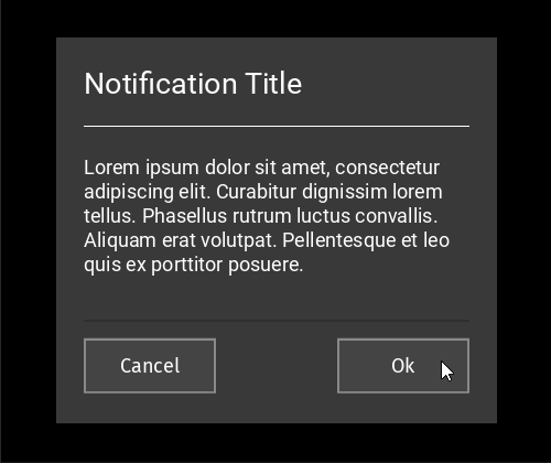
In the Node Components use triggers and actions to set how the Notification Popup buttons react to user input. See Using triggers.
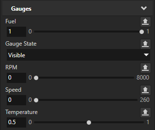
Traditional Gauges
Use the Traditional Gauges to create a car cluster with speed, RPM, fuel, and temperature gauges.
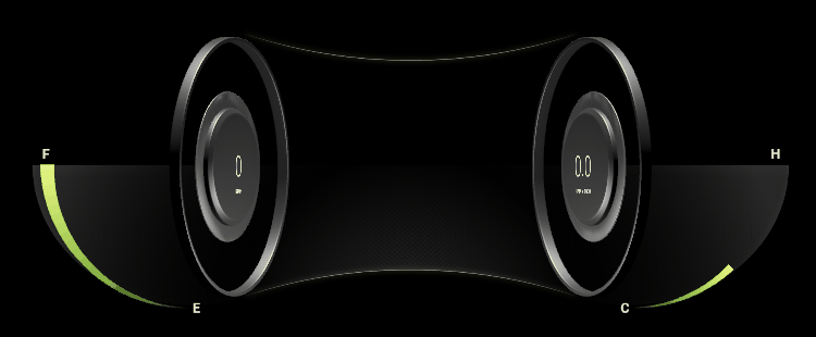
To control the visibility of the speed and RPM gauges, in the Properties add and set the Gauge State property.
To move the indicators, in the Properties add and set:
Fuel to move the fuel indicator.
RPM to move the RPM indicator.
Speed to move the speed indicator.
Temperature to move the temperature indicator.
Materials
Factory Content includes materials that you can apply to 3D content in your project.

Aluminium Material
Uses normal map textures.

Car Paint Material

Carbon Fiber Material
Uses normal map textures.

Chrome Material

Glass Material

Leather Material
Uses normal map textures.

Mask Texture Material

Rubber Material
Uses normal map textures.
To learn about using Factory Content materials in your Kanzi application, see Using Factory Content materials in your project.