Using the Button nodes
Use the Button nodes to create interactions through clicking, tapping, or pressing a key on the keyboard.
Use Button 3D to create a 3D button and Button 2D to create a 2D button.
Kanzi allows you to create buttons using:
State managers
Triggers and actions
The difference between the two approaches is that when you use the state manager you always know in which state the button is. For example, when a user clicks a button created with triggers and actions, the action sends the message, but your application is not aware of the state of the button. When you use the state manager, you can always check which state the button is in and even revert the state when needed. See Using state managers.
When you use triggers and actions to create a button, and the user clicks the visual representation of a button, the action generates a message that travels to the button node where you can define the behavior for that message.
When you create a Button node, Kanzi Studio by default adds a Button: Click trigger to that node.
The Button nodes have the Focusable property enabled and can receive focus by default. When a Button node has focus, to press that button, you can use the default keyboard keys Space, Enter, and Enter on the numeric pad.
See Using focus.
You can add other triggers to a Button node as well. For example, you can add messages that are triggered when a user presses down a mouse button or cancels a click. See Using triggers.
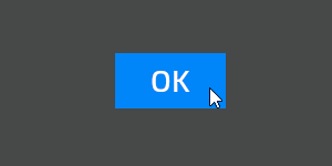
When you create a button it does not have a visual shape. To make a button visible, add to the button a node with content. You can make a Button 2D node visible also by filling its background with a brush. See Adjusting the appearance of 2D nodes.
The Kanzi Factory Content asset package contains a 2D button that you can customize. See Button.
To learn how to create a button, complete Tutorial: Creating a button.
Creating a button
To create a button:
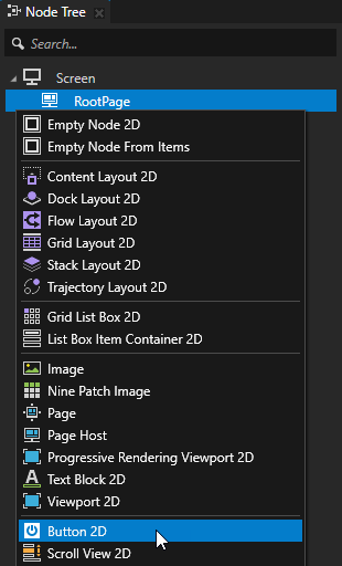
In the Prefabs or Node Tree press Alt and right-click the node where you want to create a button and select either Button 3D, or Button 2D.
You can create a 3D node only in a 3D node, such as the Scene node, and a 2D node only in a 2D node.
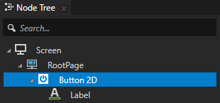
Define the content and appearance of the button.
For example, if you created a Button 2D node, add to it a Text Block 2D node that shows the button label, and in the Button 2D node set the Layout Width, Layout Height, and Background Brush properties. See Adjusting the appearance of 2D nodes.
Tip
Use a Content Layout node to create the layout for a button that contains multiple content nodes. See Using the Content Layout nodes.
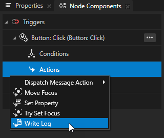
In the Prefabs or Node Tree select the Button node, in the Node Components > Triggers section in the Button: Click message trigger press Alt and right-click Actions, and select an action that you want to set off when the user presses the button.
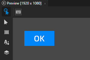
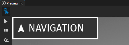
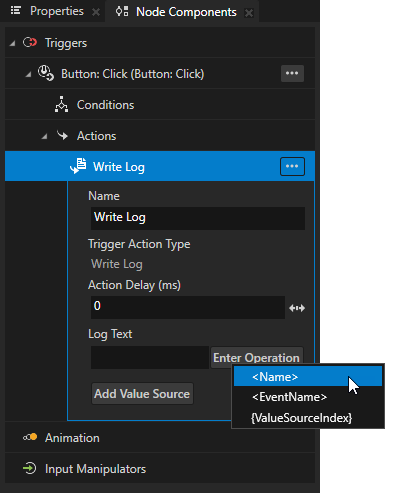
For example, select the Write Log action and set its Log Text property to <Name>. In the Preview when you click the visual representation of the button, the Write Log action writes the name of that node to the Log window.
To learn more about the Write Log action, see Using Write Log action.
(Optional) Use the Button triggers that come with Kanzi to define the behavior of Button nodes. See Using triggers and Button node triggers.
Controlling the behavior of a Button node
In Kanzi, to control the behavior of a Button node you can:
Use a state manager to define how a Button node reacts to user input. See Using a state manager to set button states and Controlling whether a Button node is in use.
Use the Button triggers that come with Kanzi to define the behavior of Button nodes. See Using the Button triggers.
Enable users to double-click or double-tap Button nodes. See Enabling the double-click gesture for a Button node.
Using a state manager to set button states
Use a state manager to define how a Button node reacts to user input. For example, you can set how a button looks when the user presses or releases that button. You can see how to use state managers in Using state managers. To learn more about creating buttons using a state manager, see Tutorial: Creating a button.
To use a state manager to set button states:
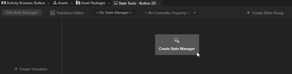
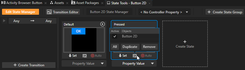
In the Node Tree select the Button node for which you want to create states and in the State Tools create a state manager for that node.
Create two states, one that defines the button in its default state, and another that defines the button when it is pressed.
For example, name the states Default and Pressed.
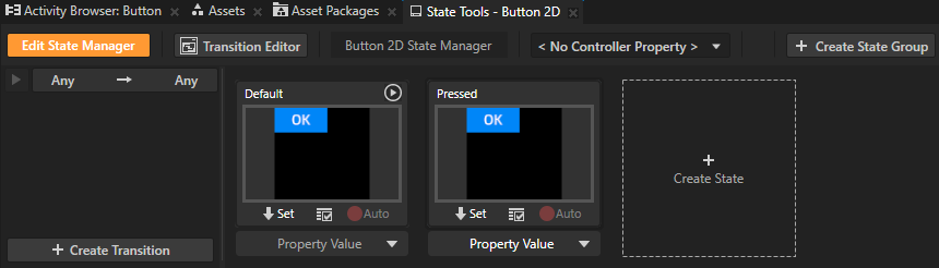
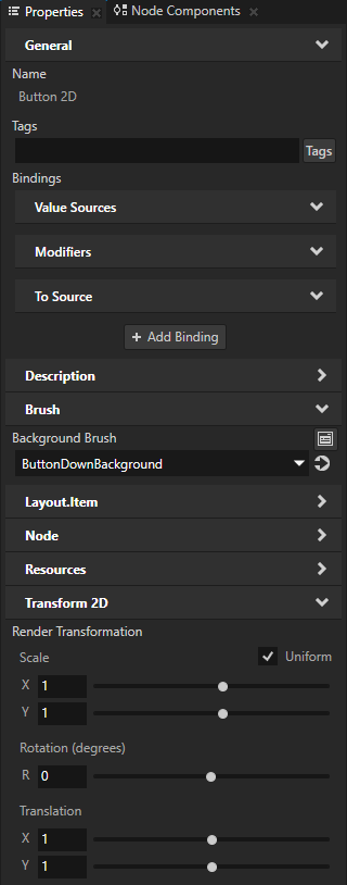
For each state, set the values of the properties that set the appearance of the Button node.
For example, to set how a Button 2D node looks when the user presses it, for the Pressed state in that Button 2D node set:
Background Brush to the brush that you want to use when the button is pressed
Transform 2D > Render Transformation property Translation property fields to slightly larger values than in the default state
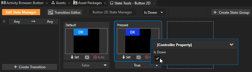
In the State Tools for the state manager which controls the Button states set the Controller Property to Is Down.
In a state manager the value of the property that you select as the Controller Property defines the conditions when each state in a state group is active.
Here you use the Is Down property to transition to a state based on the value of that property.
The Is Down property controls whether a Button node is in a pressed or non-pressed state.
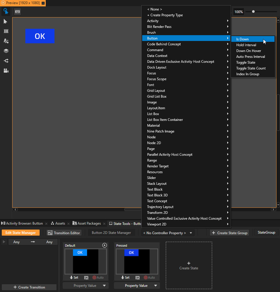
In the State Tools set the value of the Controller Property in the Pressed state to True.
This way you set your application to use the Pressed state when the button is pressed and the Default state when the button is not pressed.
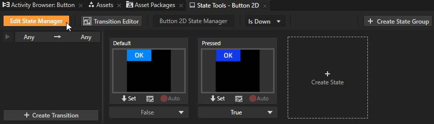
In the State Tools click Edit State Manager to deactivate the State Tools.
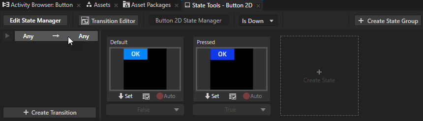
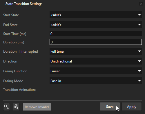
(Optional) To set Kanzi to transition instantly between the button states, in the State Tools click the Any -> Any transition, in the State Transition Settings set the Duration property to 0, and click Save.
In the Preview when you click the button, the button enters the Pressed state and its appearance changes. The button stays in the Pressed state as long as you hold down the mouse button. When you release the mouse button, the button returns to the Default state.
Controlling whether a Button node is in use
To control whether a Button node is in use, use the Input > Enabled property. A disabled Button node does not produce user events, such as button presses.
When you disable the Enabled property of a node, you effectively disable that node and its descendant nodes in the same overlay focus scope.
To observe whether a node is effectively enabled, use the Input > Effectively Enabled property in a state manager or a binding. For example, to visually indicate to the user whether a node is in use, create a state manager and use the Effectively Enabled property as its controller property.
Using the Button triggers
Use the Button triggers that come with Kanzi to define the behavior of Button nodes. To learn more about using triggers, see Using triggers.
Cancel trigger is set off:
When the user first presses down the button, then moves the pointer outside of the button area, and lifts the pointer.
When the user sets off a Long Press trigger.
Button: Click trigger is set off when the user presses down and then releases the button while the pointer is still within the button area.
Down trigger is set off when the user presses down the button.
Enter trigger is set off:
When the user presses down the button.
When the user presses down the button, moves the pointer outside of the button area, and then moves the pointer back to the button area while still holding down the pointer.
Leave trigger is set off:
When the user presses down the button and then lifts the pointer.
When the user presses down the button and then moves the pointer outside of the button area.
When the user sets off a Long Press trigger.
Long Press trigger is set off when the user presses down the button and holds the button pressed for the amount of milliseconds defined in the Hold Interval property of that button.
Enabling the double-click gesture for a Button node
Use the double-click gesture to enable users to double-click or double-tap buttons in your Kanzi application. Use the Multi-Click trigger to react to the double-click gesture. For example, you can change the appearance of a Button node when the user double-clicks or double-taps that node.
To enable the double-click gesture for a Button node:
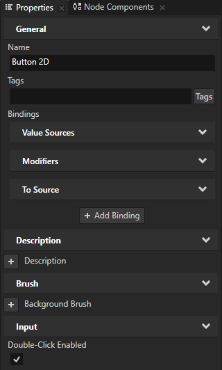
In the Node Tree or Prefabs select the Button node for which you want to enable the double-click gesture and in the Properties add and enable the Input > Double-Click Enabled property.
When you enable the Double-Click Enabled property, Kanzi installs in the Button node a multi-click manipulator that generates double-click messages.
In the Node Components press Alt and right-click Triggers and select Message Trigger > Multi-Click > Multi-Click.
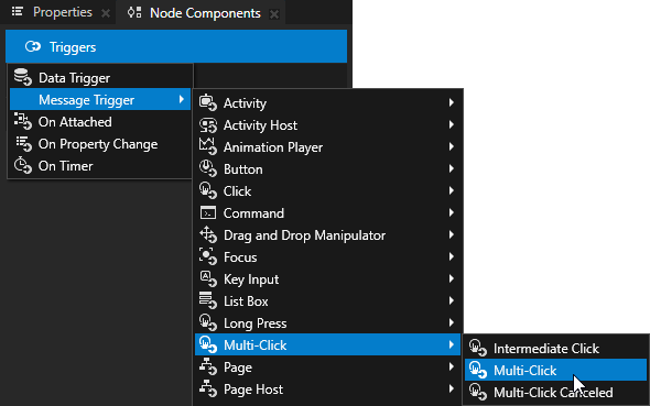
In the Node Components > Triggers press Alt and right-click the Multi-Click trigger, select an action, and configure the action. See Using triggers and Actions and messages reference.
Setting the appearance of a Button 2D node
To set the appearance of 2D nodes:
You can fill 2D nodes with a solid color, a texture, or a material. See Adjusting the appearance of 2D nodes.


You can apply a post-processing effect to a 2D node. See Effects for 2D nodes.
You can rotate a 2D node around all three axes to create a 3D perspective effect. See Creating a 3D perspective effect for 2D nodes.
You can apply custom rendering to 2D nodes to create post-processing effects. See Applying custom rendering to 2D nodes.
You can render a 2D node as pixel-perfect. See Rendering pixel-perfect 2D nodes.
Using the Button 3D node in the API
For details, see the Button3D class in the Kanzi Engine API reference.
Using the Button 2D node in the API
For details, see the Button2D class in the Kanzi Engine API reference.