Step 1 - Set nodes to handle focus
In this step you learn how to set nodes to handle focus and how to use focus triggers to recognize when a node receives or loses focus.
Assets for the tutorial
The starting point of this tutorial is the <KanziWorkspace>/Tutorials/Focus/Start/Focus.kzproj Kanzi Studio project.
You can find the completed tutorial in the <KanziWorkspace>/Tutorials/Focus/Completed directory.
The starting point project contains the content that you need to complete this tutorial:
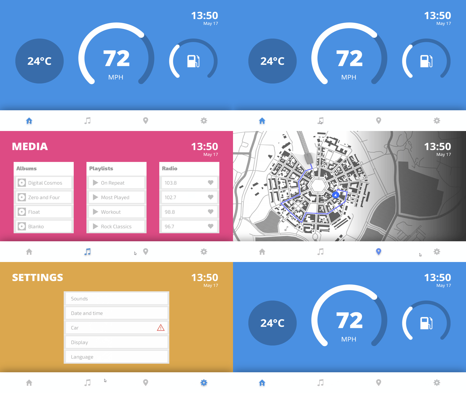
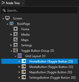
The Home, Media, Maps, and Settings nodes each represent an application that is shown when you toggle the Toggle Button nodes in the navigation bar. Each application is represented by an Empty Node 2D node. The Home and Maps nodes show static backgrounds, while the Media and Settings nodes contain List Box nodes. In this tutorial you use the focus features to enable the user to move between these different parts of the application using the keyboard keys.
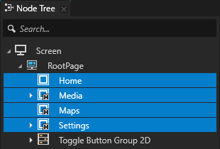
The Toggle Button Group 2D node contains Toggle Button nodes. You set the focus behavior of these Toggle Button nodes so that you can use the keyboard keys to move between the Home, Media, Maps, and Settings nodes.
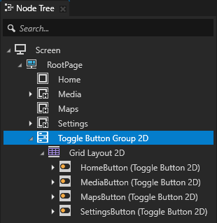
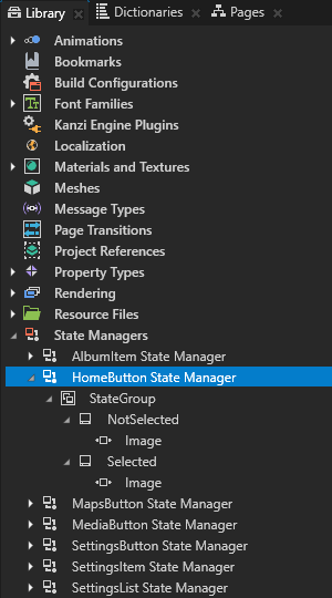
Each of the Toggle Button nodes is set to show the node that represents its application. In addition, each of the Toggle Button nodes uses a State Manager that controls the appearance of that button.
For example, when you toggle on the HomeButton node, it enables the visibility of the Home node, when you toggle it off, it disables the visibility of the Home node. The State Manager uses the Toggle State property to control the appearance of each Toggle Button.

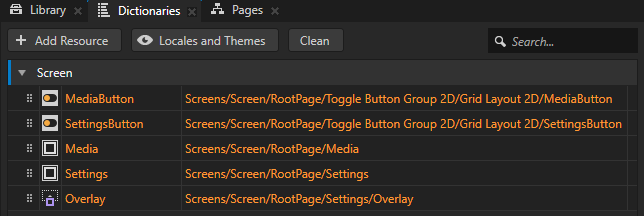
The resource dictionary of the Screen node contains aliases that point to nodes that you access from other nodes.
These aliases provide a convenient way to access these nodes.
Set focus at application startup
In this section you learn how to:
Set a node to be a focus scope, which handles focus between its child nodes.
Set which node receives focus when an application starts.
Set focus when the user clicks a node.
To set focus at application startup:
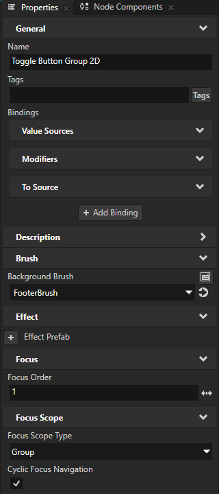
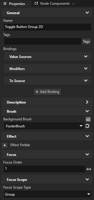
In the Node Tree select the Toggle Button Group 2D node, and in the Properties add and set:
Focus Scope > Focus Scope Type to Group
Focus scope is a node that helps navigation handling in a focus chain. You can set a node to be a focus scope to forward the focus from that node to a child node.
Focus group is a focus scope which forms a group of focusable nodes. When a focus group node receives focus, Kanzi forwards the focus to the focus node of that focus scope.
Focus > Focus Order to 1
This way you set the Toggle Button Group 2D node to receive focus when the application starts. The Toggle Button Group 2D node forwards the focus to its first focusable child node, the HomeButton node.

In the Node Tree select the Toggle Button Group 2D > Grid Layout 2D > HomeButton node, in the Node Components > Toggle Button: Toggled On trigger press Alt and right-click Actions, and select the Try Set Focus action.
With the Try Set Focus action you enable the application to set focus to the HomeButton toggle button also when the user clicks that button, not just when they use keyboard keys.

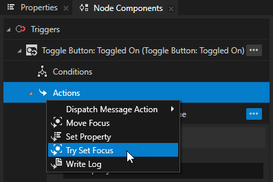
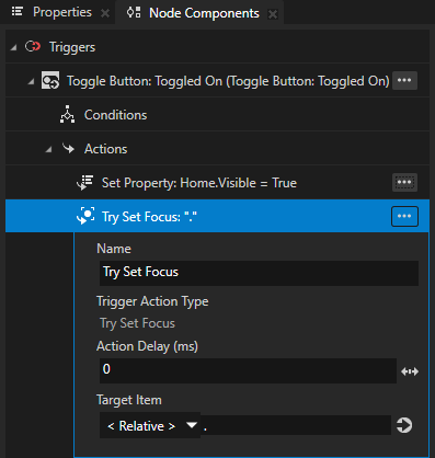
Repeat the previous step for the MediaButton, MapsButton, and SettingsButton nodes.
This way you enable the application to set focus to each toggle button also when the user clicks that button, not just when they use keyboard keys.
Tip
To copy an action:
In the Node Components right-click the action that you want to copy and select Copy.
Select the node where you want to use the action, in the Node Components right-click the trigger that you want to execute the action, and select Paste.
In this section you enabled moving the application focus between the navigation bar buttons, but you did not yet visualize the focus. In the next section you set the appearance of the navigation bar buttons based on whether they have focus.
Change the appearance of a node that has focus
In this section you use a binding to set the Toggle Button nodes in the navigation bar to change appearance based on whether they have focus.
Using a binding to show that a user interface element has focus is convenient when you want to change the value of only one property to visually indicate the focus. When you use a binding to show that a user interface element has focus, the change happens immediately without a transition animation.
To change the appearance of a node that has focus:
In the Prefabs select the Toggle Button 2D prefab, in the Dictionaries click + Add Resource and select Add Existing > Brushes > LightGreyBrush.
This way you add the LightGreyBrush brush to the resource dictionary of the Toggle Button 2D prefab. The resource ID of the brush is LightGreyBrush.
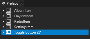


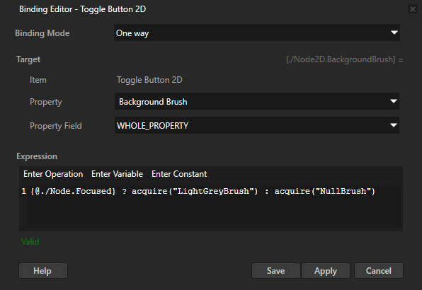
In the Properties click + Add Binding and in the Binding Editor set:
Property to Brush > Background Brush
Expression to
{@./Node.Focused} ? acquire("LightGreyBrush") : acquire("NullBrush")You use:
The acquire function to get the LightGreyBrush brush based on its resource ID.
The ? (conditional) operator to return the LightGreyBrush brush when the value of the Focused property in the Toggle Button 2D is true and no brush when the value is false. The Focused property reports whether a node has focus.
Click Save.
This way you change the background color of each toggle button when that toggle button receives focus.
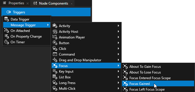
In the Node Components press Alt and right-click Triggers and select Message Trigger > Focus > Focus Gained.
Kanzi sets off the Focus: Focus Gained trigger when the node to which you add this trigger receives focus.
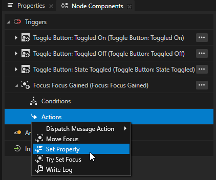
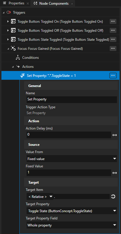
In the Focus: Focus Gained trigger create a Set Property action and set:
Target Property to Toggle Button > Toggle State
Value From to Fixed value
Fixed Value to 1
This way you toggle on a toggle button when it receives focus. When the value of the Toggle State property changes, the State Manager in the node changes the appearance of that toggle button.
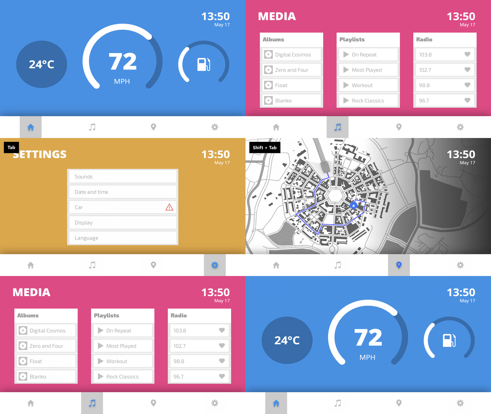
In Kanzi Studio after you restart the Preview and select the Preview window, you can now:
Press the Tab key to move the focus to the next node
Press the Shift Tab keys to move the focus to the previous node
Click the buttons in the navigation bar
See also
To learn more about focus, see Focus.
To learn more about triggers and actions, see Triggers.
To learn more about the Kanzi state manager, see State manager.
To learn more about the Toggle Button nodes, see Using the Toggle Button nodes.
To learn more about the Toggle Button Group nodes, see Using the Toggle Button Group nodes.
To learn more about resource dictionaries, see Using resource dictionaries.
To learn more about using bindings, see Using bindings and Bindings expressions reference.
